You are using an out of date browser. It may not display this or other websites correctly.
You should upgrade or use an alternative browser.
You should upgrade or use an alternative browser.
Tufts Dental School
- Thread starter Mike
- Start date
TheRifleman
Banned
- Joined
- Sep 25, 2008
- Messages
- 4,431
- Reaction score
- 0
I think it looks much better than the OLD piece of JUNK.
Good job Tufts
Good job Tufts
Boston02124
Senior Member
- Joined
- Sep 6, 2007
- Messages
- 6,893
- Reaction score
- 6,639
briv
Senior Member
- Joined
- May 25, 2006
- Messages
- 2,083
- Reaction score
- 3
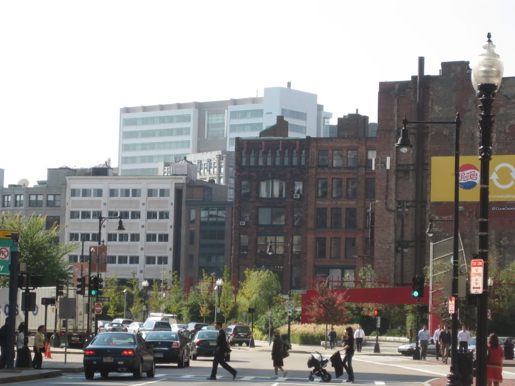
I really like the way this addition makes the Stuart-LeGrange stretch of Washington feel very tight and enclosed, even with the huge empty Gaiety lot. It's pretty impressive.
I also like the addition's utter disinterest in attempting any stylistic congruity with the throw-away concrete heap it's built upon. I think it's interesting.
I also like the addition's utter disinterest in attempting any stylistic congruity with the throw-away concrete heap it's built upon. I think it's interesting.
Lurker, cool mock-up of my pics. Personally, I like the addition. It's just a little more height density in the area to go with the recent additions of the W Hotel, Archstone apartments, and the Metropolitan. For what it is, it makes the existing complex just a bit more approachable and impressive.
On the other hand, if this was something more noticeable at say 500-600 feet, I would barf.
On the other hand, if this was something more noticeable at say 500-600 feet, I would barf.
JohnAKeith
Senior Member
- Joined
- Dec 24, 2008
- Messages
- 4,337
- Reaction score
- 82
Since it's a dental school, I think a color other than green would be appropriate. Mercury color?
Boston02124
Senior Member
- Joined
- Sep 6, 2007
- Messages
- 6,893
- Reaction score
- 6,639
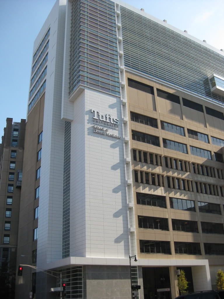
finnishing the base
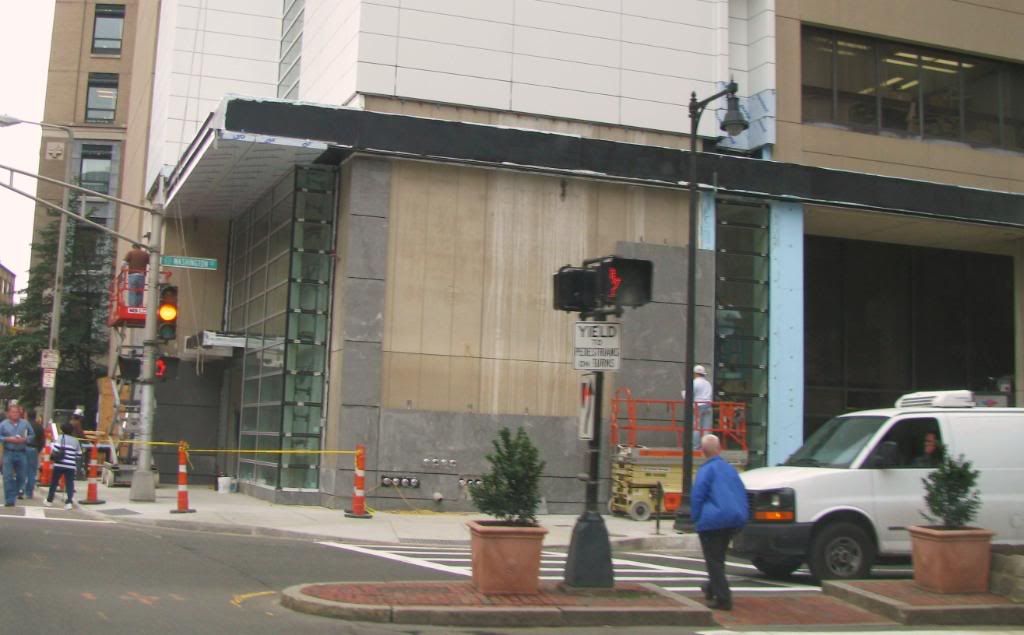

Meadowhawk
Active Member
- Joined
- Jun 16, 2007
- Messages
- 265
- Reaction score
- 0
This building IMO is truly Boston's ugliest.
- Joined
- May 25, 2006
- Messages
- 7,034
- Reaction score
- 1,865
This building IMO is truly Boston's ugliest.
Well there is ugly because it just doesn't try and ugly because it does and fails. I would put this in the latter.
Boston02124
Senior Member
- Joined
- Sep 6, 2007
- Messages
- 6,893
- Reaction score
- 6,639
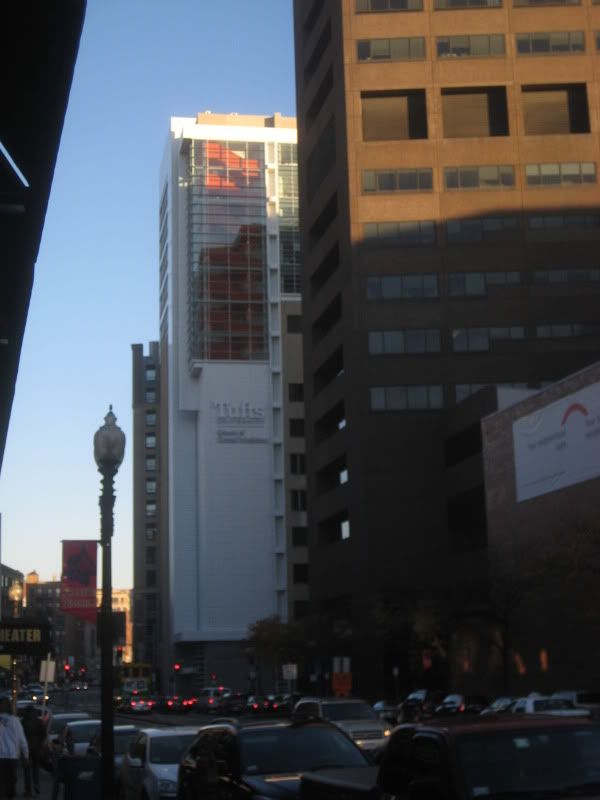
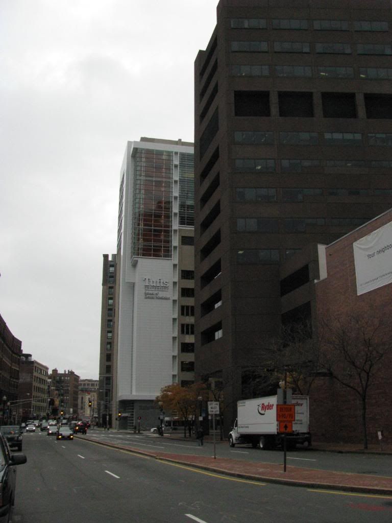
this morning from southie
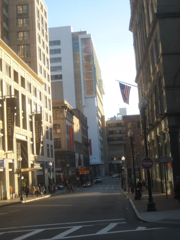
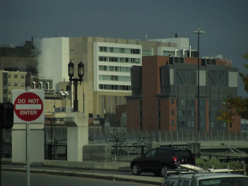 and from stuart st


AmericanFolkLegend
Senior Member
- Joined
- Jun 29, 2009
- Messages
- 2,214
- Reaction score
- 248
When you consider how brutal (pun intended) this building was before, I actually think this is a marked improvement. This whole project was the equivalent of taking a dump on a canvas and asking an artist to paint you a masterpiece.
JohnAKeith
Senior Member
- Joined
- Dec 24, 2008
- Messages
- 4,337
- Reaction score
- 82
Another from my Life of a City blog:


Beton Brut
Senior Member
- Joined
- May 25, 2006
- Messages
- 4,382
- Reaction score
- 338
If they were to re-clad the rest of the building, this would be a decent example of ersatz-Richard Meier.


