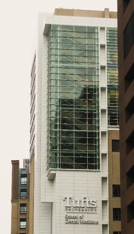
If they painted the original concrete white then the whole thing would actually work.
Agreed. Either that or they should have used a beige alcubond.
If they painted the original concrete white then the whole thing would actually work.
I assume you mean that the rendering and the executed design are similar?


Maybe they decided to keep the beige concrete color so it could serve as an apt symbol for the onset of tooth decay....?
BRUSH AFTER EVERY MEAL OR WHAT HAPPENED TO THIS BUILDING WILL HAPPEN TO YOU!!!
I think this building can be termed a disaster.
You think this is a disaster and yet Russia Wharf is the best new building in a decade? ftw.
I'm ready to just say we agree to disagree at this point.
This building actually achieves cohesion between new and old....
"I didn't think it was physically possible but this both sucks AND blows."
-Bart Simpson
What in gods name happened here?
I see we've changed our tune? ftw!
This facade looks like the walls of my unfinished basement....ugly grey with a random splash of white paint on one wall. Ugly.
I think the white kills the building. It would have looked better to just use a matching concrete for the new edition. The Tufts sign is too big and the font is dated. I think this building can be termed a disaster.
I see we've changed our tune? ftw!
