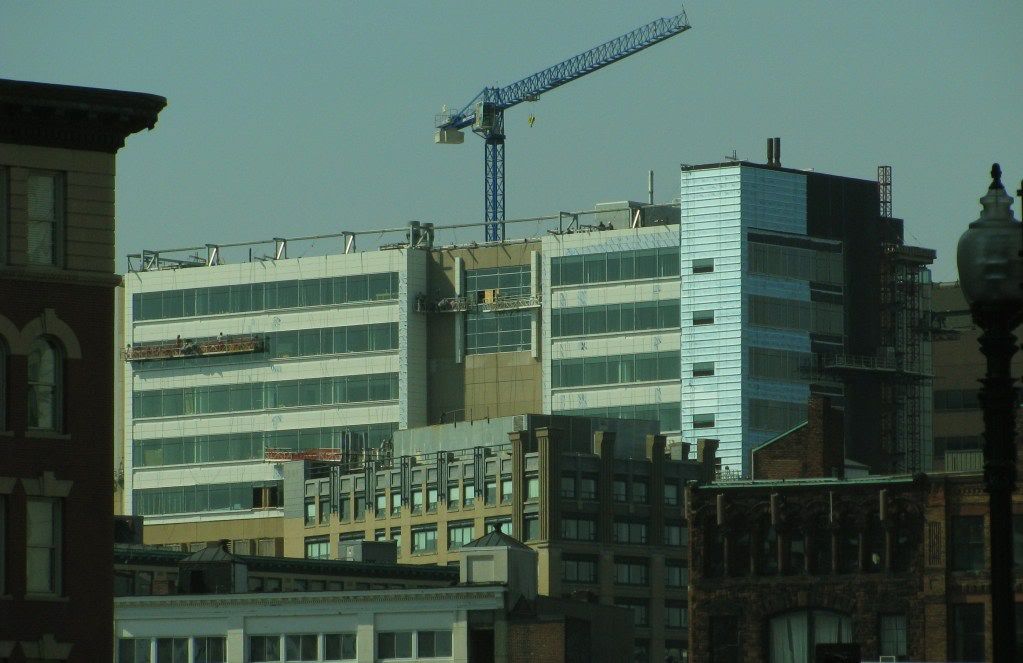
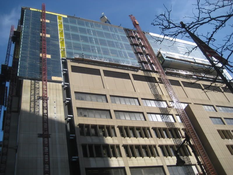
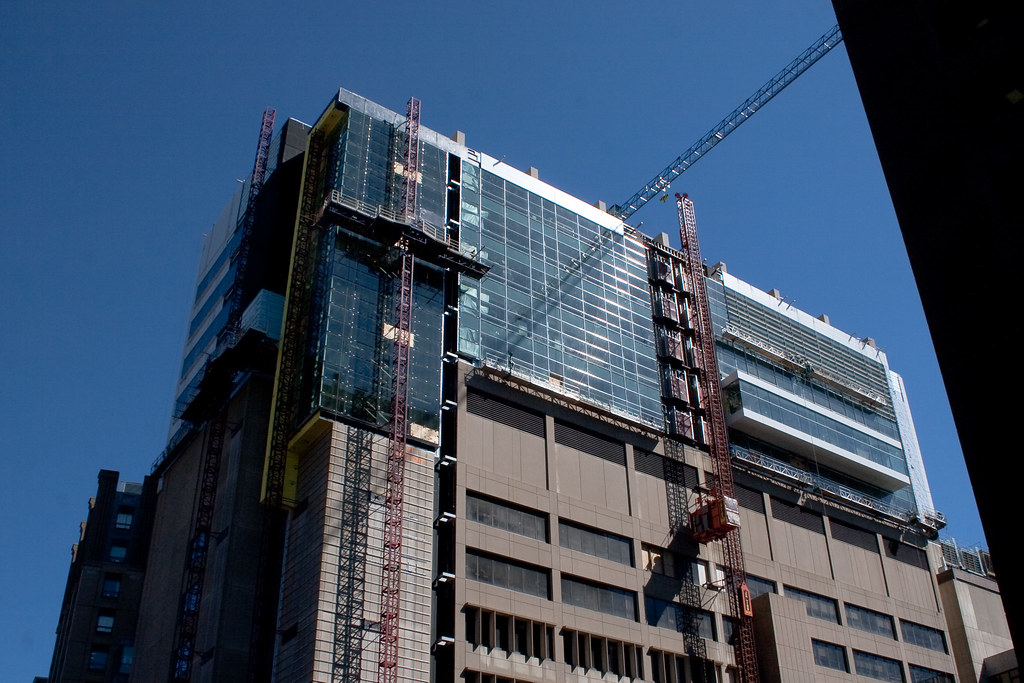
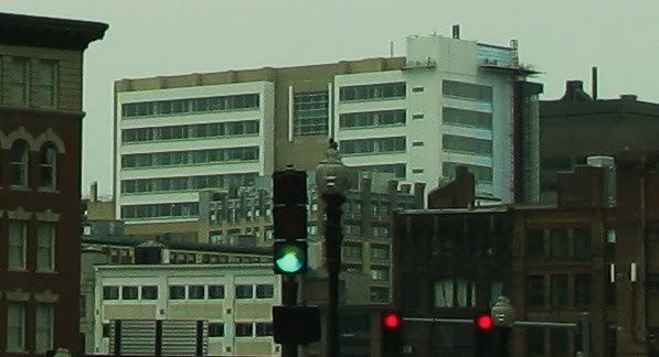
Tufts Dental School

IMO, the glassy top is a vast improvement over the bunker it's built on, and it's an improvement to the skyline/cityscape in that area. I wish Boston had a moratorium on concrete and bricks as exterior finishes, that's right I said bricks, at least for anything over 7 stories.
 
Red brick especially. Dark red brick is oppressive when used beyond a certain height.
 
lol at least its kind of interesting. when people pass by it theyll think, "uhh.. i wonder what the hell happened here?"
 
People thinking about this building? I think not.
 
03-18-09
004-8.jpg
 
I feel like they stole the glass design from the W. Or maybe they just used the same people?

3477037299_ff38be246c_b.jpg
 
This building has offically become the architectual embodiment of the 90's dry-humping the 60's....
 
This building has offically become the architectual embodiment of the 90's dry-humping the 60's....

Indeed! Behold! Alucobond Attack 2009!

I'm thinking the architect pitched it as a capped-tooth metaphor. I find it "infection" to be a more apt description.

tuftsdental1.jpg

tuftsdental2.jpg

tuftsdental3.jpg

tuftsdental4.jpg
 
Brick, stone, concrete, wood, glass, grass, baby seal pelts, orphans. Anything but Alucobond.
 
Again, clever. I guess this discussion will go nowhere. I will move on. Thanks.

cca
 
Wait. Don't go.

Aside from the two (three?) glib suggestions my post was perfectly serious. Alucobond is terrible stuff. Any other cladding material on the market today would be preferable (albeit presumably more expensive.)

Do you feel that it was the right material for this project? If so, why?
 
Again, clever. I guess this discussion will go nowhere. I will move on. Thanks.

cca

Just curious. Do you like the design? Is there anything you would change?
Thanks.
 
It seriously doesn't look bad imo, it's a pretty positive modification of an otherwise ugly building.
 

Back
Top