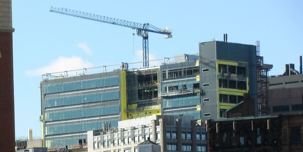
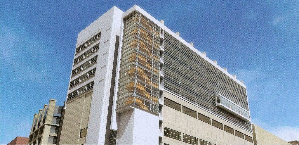
Tufts Dental School

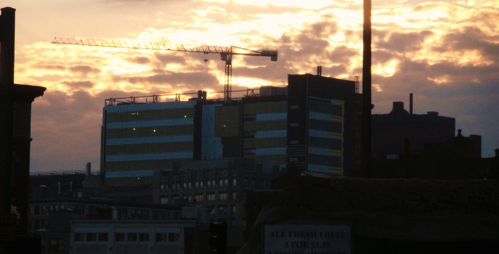
Where was this picture taken? I was originally thinking the Clarendon, but your view is further to the south and lower?
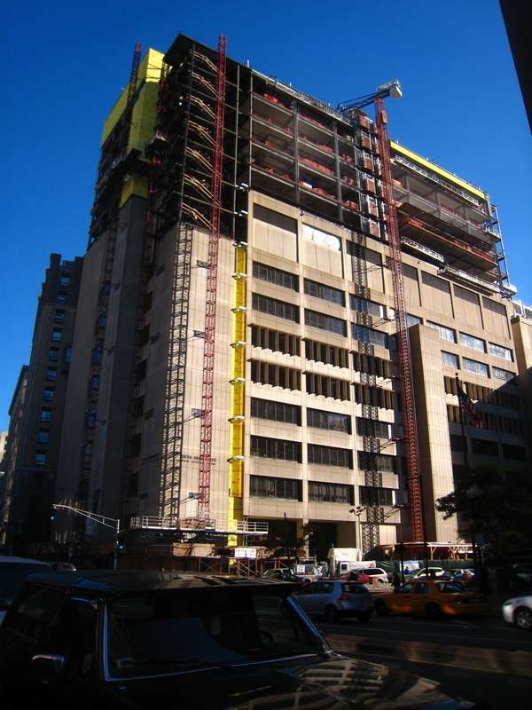
 
10/31:

img1375lt3.jpg


img1374tw1.jpg


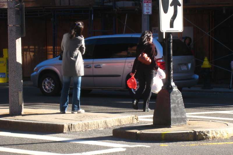
Right as I was walking away a strong gust came through and a plastic hardhat slammed into the ground about six feet from where the girl picking it up (in the picture below) was standing. Everyone at the intersection heard it and kinda froze for a minute, wearily looking up at the structure.

img1376wg4.jpg
 
windows 12-30-08 this seems to be taken longer than the 26 story building underconstruction next door!
117.jpg
 
vertical expansion + site constraints + swing staging

vs

two tower cranes + unitized curtainwall

=

Tufts is a slower construction speed.

cca
 
Yay, cheap, trashy white paneling. Haven't seen that used recently or anything.
 
Yay, cheap, trashy white paneling. Haven't seen that used recently or anything.
Cheap as it may be, it still improves the building.
 
Yay, cheap, trashy white paneling. Haven't seen that used recently or anything.

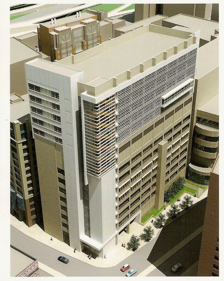
Are you basing this off of the rendering posted above? A bit hard to tell from that whether it is cheap, white, or trashy really isn't it?

What exactly is the critique of the project?
The addition of a few floors at this intersection is a good move, but much more than that, adding an additional material to the palette helps create a more interesting composition and helps relieve the monotony of the concrete.
 
Makes that building much more appealing. GREAT improvement.
 
"I didn't think it was physically possible but this both sucks AND blows."
-Bart Simpson

What in gods name happened here?


(Edit: My 2,000th post!)
 
Haha, yeah it's like: banal '70s, meet banal '00s.
 
The Dean of the school heard that kids today are into "mashups."
 
Are you basing this off of the rendering posted above? A bit hard to tell from that whether it is cheap, white, or trashy really isn't it?

What exactly is the critique of the project?
The addition of a few floors at this intersection is a good move, but much more than that, adding an additional material to the palette helps create a more interesting composition and helps relieve the monotony of the concrete.

Smothering a building in white / silver / grey Alucobond is an overdone scheme that was boring and uninspired the first time it was tried, then it became a recurring theme in Boston architecture. It's at a point where one pretty much expects it to be a part of every new project - even more so than generic precast concrete paneling.
 
If everyone continues to complain about Alucobond someone will decide to employ EIFS on a large scale. Then WE WILL have something to REALLY complain about.
 

Back
Top