You are using an out of date browser. It may not display this or other websites correctly.
You should upgrade or use an alternative browser.
You should upgrade or use an alternative browser.
Tufts Dental School
- Thread starter Mike
- Start date
palindrome
Senior Member
- Joined
- Jun 11, 2006
- Messages
- 2,281
- Reaction score
- 131
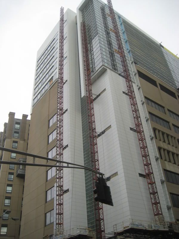
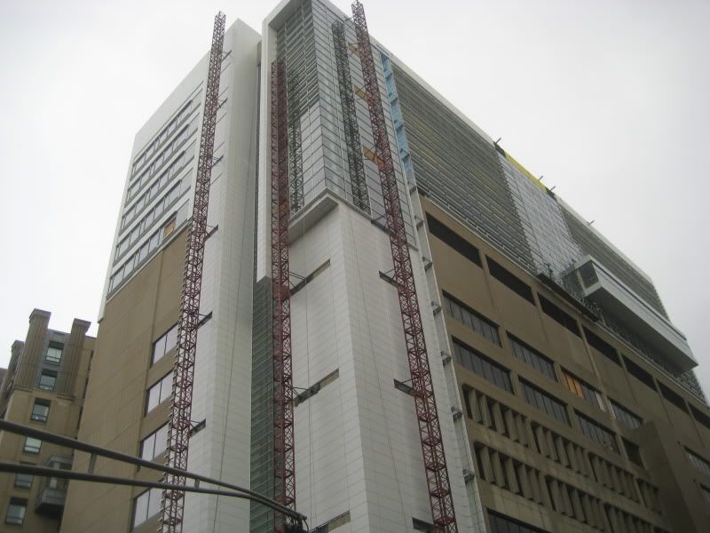
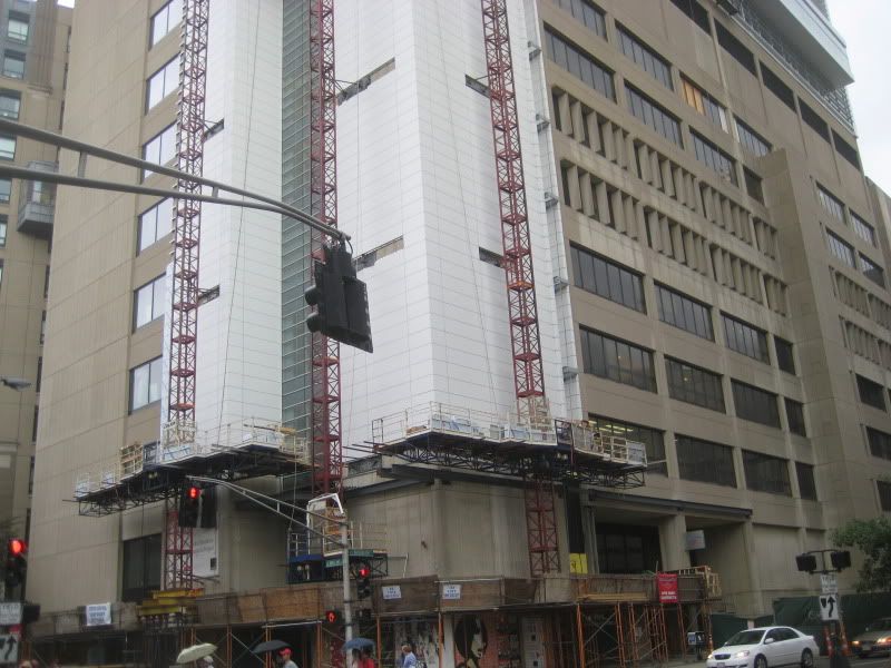
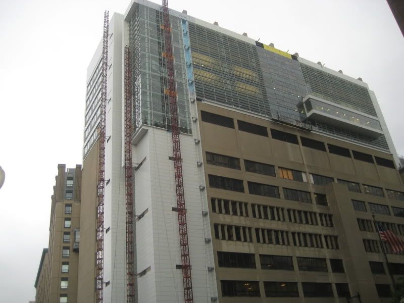
thats and awkward look.
Awkward, perhaps. But significantly better than what was there before.
Some posters in this forum clearly have a blind hatred of Alucobond, but otherwise I think the addition of a new material and new composition help this building overcome the relentless concrete cladding that previously existed.
Some posters in this forum clearly have a blind hatred of Alucobond, but otherwise I think the addition of a new material and new composition help this building overcome the relentless concrete cladding that previously existed.
Suffolk 83
Senior Member
- Joined
- Nov 14, 2007
- Messages
- 2,996
- Reaction score
- 2,403
Its sort of ugly, but its different. I think I like it.
Meadowhawk
Active Member
- Joined
- Jun 16, 2007
- Messages
- 265
- Reaction score
- 0
I like it. Very "Blade Runner"
kennedy
Senior Member
- Joined
- Feb 12, 2007
- Messages
- 2,820
- Reaction score
- 7
I don't hate Alucobond, it can just seem very bland and boring in many cases, even more so than concrete. However, it has it's merits, and is a very useful addition to an architects library of materials. See the Alucobond used at FP3, you'll most likely really like how it looks.
Boston02124
Senior Member
- Joined
- Sep 6, 2007
- Messages
- 6,893
- Reaction score
- 6,639
today from Back Bay


JohnAKeith
Senior Member
- Joined
- Dec 24, 2008
- Messages
- 4,337
- Reaction score
- 82
Not a good photo, but worth posting. This was the second day in a row I noticed the building, for the first time. It was lit up, last night. Looks cool in the skyline; from Back Bay it shows up right next to the Radisson, if I remember right.


Boston02124
Senior Member
- Joined
- Sep 6, 2007
- Messages
- 6,893
- Reaction score
- 6,639
could you post a nite shot!
Boston02124
Senior Member
- Joined
- Sep 6, 2007
- Messages
- 6,893
- Reaction score
- 6,639
today waiting to get on the pike

- Joined
- May 25, 2006
- Messages
- 7,034
- Reaction score
- 1,875
If they painted the original concrete white then the whole thing would actually work.
- Joined
- May 25, 2006
- Messages
- 7,034
- Reaction score
- 1,875
cca
Senior Member
- Joined
- Aug 19, 2008
- Messages
- 1,408
- Reaction score
- 12
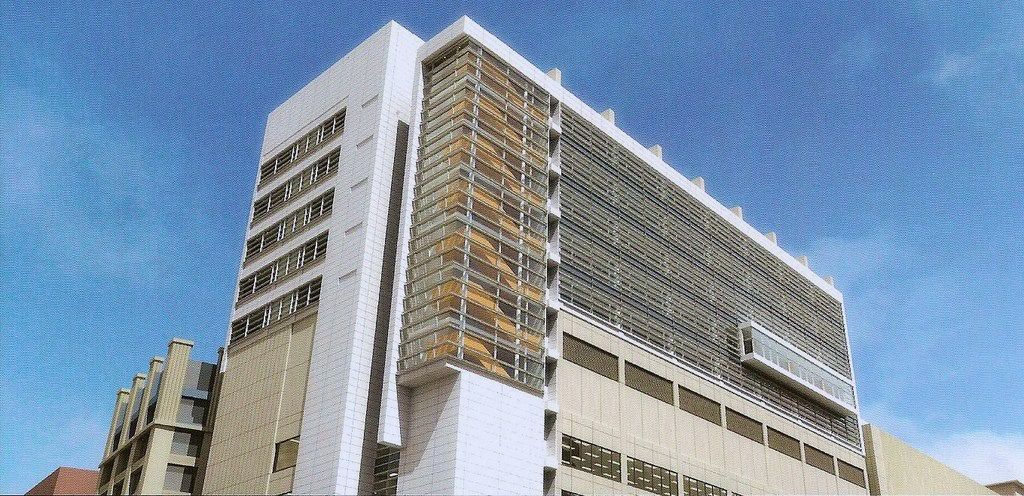
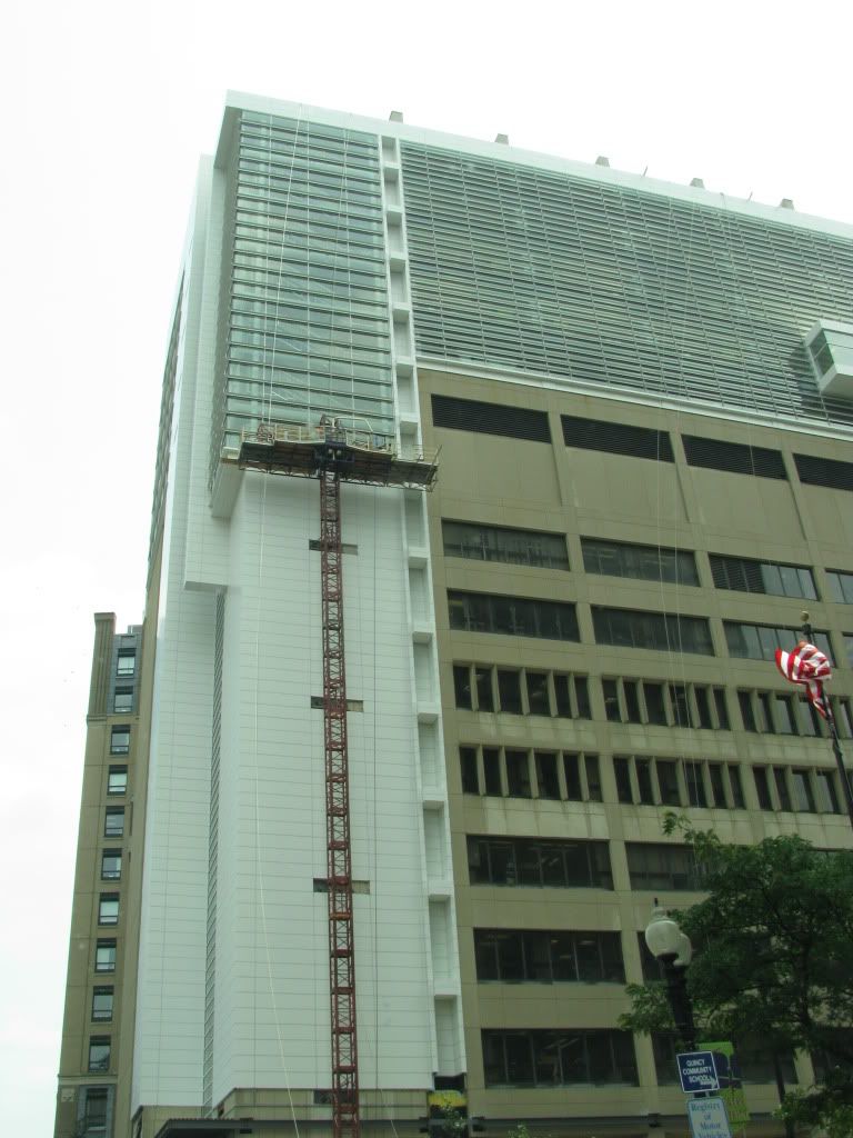
Rendering:
vs.
Reality:
That's quite impressive actually.
Impressive how? I assume you mean that the rendering and the executed design are similar?
cca

