You are using an out of date browser. It may not display this or other websites correctly.
You should upgrade or use an alternative browser.
You should upgrade or use an alternative browser.
- Status
- Not open for further replies.
Ron Newman
Senior Member
- Joined
- May 30, 2006
- Messages
- 8,395
- Reaction score
- 13
Re: W Hotel
How correctible is this in a year or two when the hotel owner sees things are not working out as planned?
How correctible is this in a year or two when the hotel owner sees things are not working out as planned?
Meadowhawk
Active Member
- Joined
- Jun 16, 2007
- Messages
- 265
- Reaction score
- 0
Re: W Hotel
It sells "things."
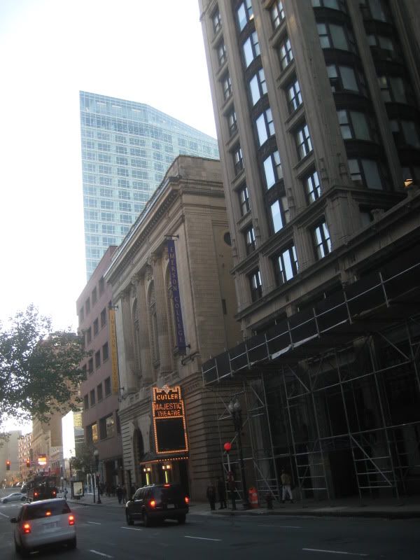
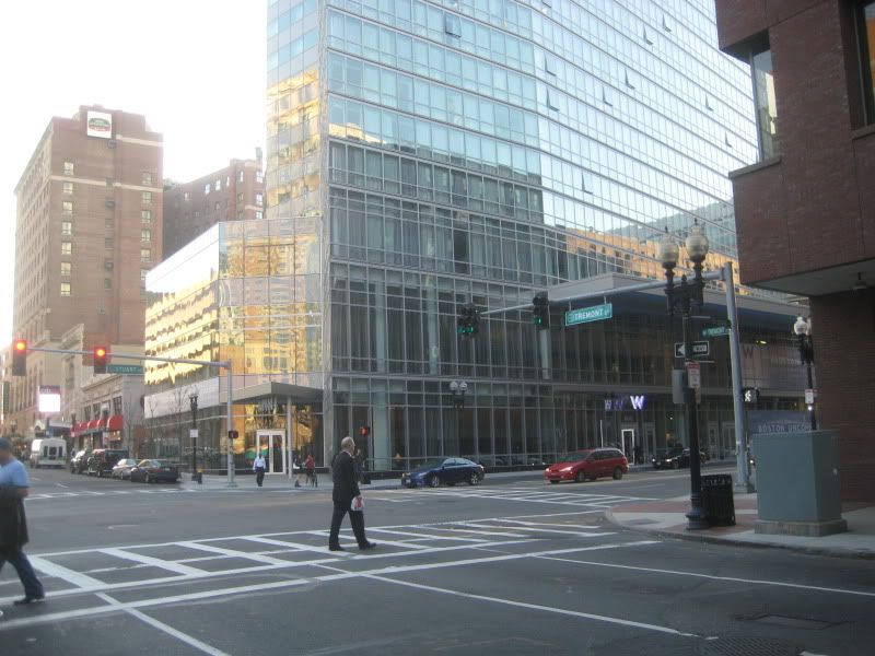
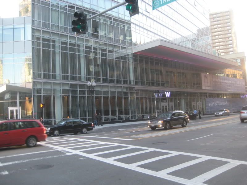
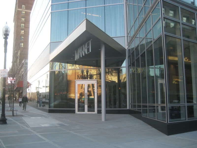
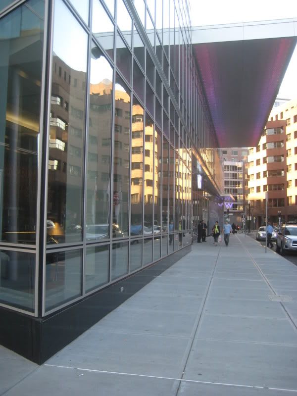
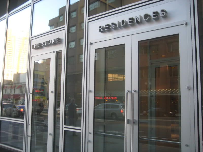
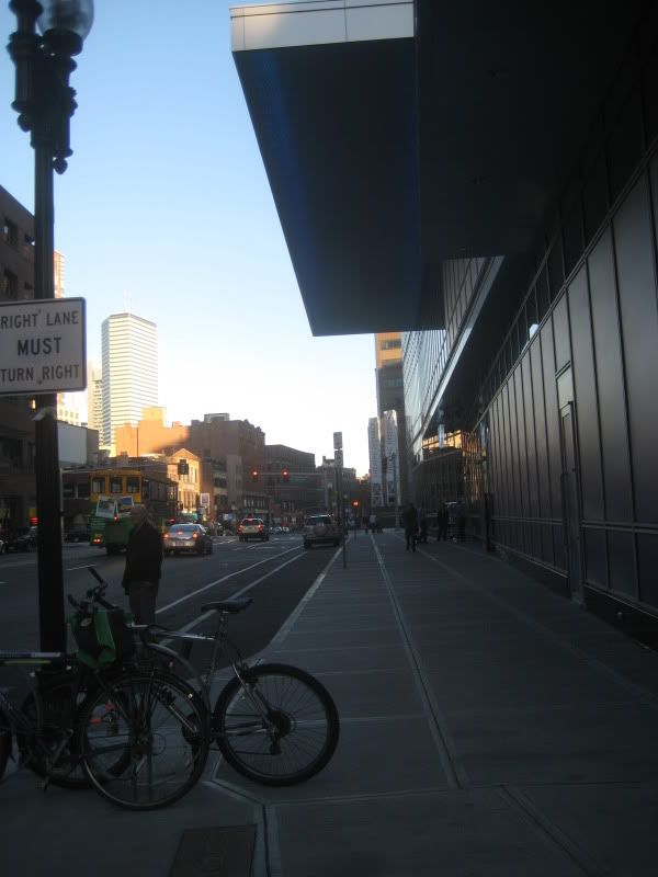
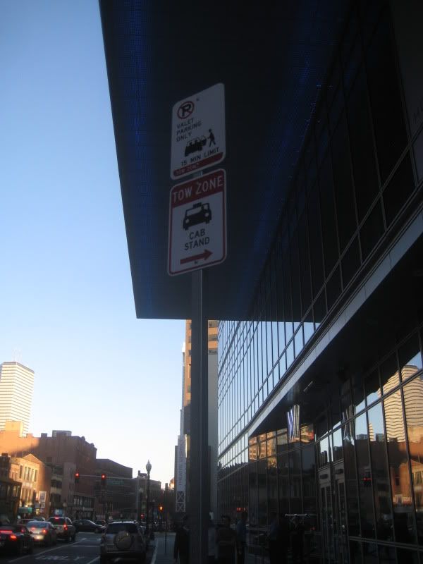
Pricey things at that. If you look on their web page under home accessories you'll find a nifty set of "spicey steak knives", very well designed, but at $124.00 a tad on the pricey side. Back to the entrance and ground level of this hotel; it is a disaster of epic proportion. Would it kill them to re-design the main entrance to actually look like a main entrance? Would it be too much to ask that they place outdoor planter groupings on either side of the main doors? For that matter some trees planted in the sidewalk wouldn't hurt either. IMO the facade of the ground level would have benefited by stone or marble cladding with a few glass windows to offset the tedium of glass. IMO as it appears now, it just doesn't do anything for me, it is not interesting, not inviting, it's just bland and blah. I hope somebody in charge over there realizes this. The only W Hotel I've stayed in was in San Francisco back in July and they had trees and planters and even outdoor furniture, I don't see why they can't do that here. It might help if Market opened the glass wall up in the summer months, ala Sonsie, and had outdoor seating with umbrella tables and planters, but I don't think the sidewalk is wide enough to handle that. I don't know, I think somebody needs to go back to the drawing board and re-design what is currently a big turnoff.
palindrome
Senior Member
- Joined
- Jun 11, 2006
- Messages
- 2,280
- Reaction score
- 130
Re: W Hotel
Probably has been answered early in this thread, but was there an affordable housing requirement for the residences here?
edit: also, anyone know how much these are going for?
Probably has been answered early in this thread, but was there an affordable housing requirement for the residences here?
edit: also, anyone know how much these are going for?
Ron Newman
Senior Member
- Joined
- May 30, 2006
- Messages
- 8,395
- Reaction score
- 13
Re: W Hotel
If the hotel patrons can't easily figure out how to get into the building, the hotel has got a big problem.
If the hotel patrons can't easily figure out how to get into the building, the hotel has got a big problem.
Tenenbaumster
New member
- Joined
- Nov 10, 2009
- Messages
- 4
- Reaction score
- 0
Re: W Hotel
Not a photogenic building; this looks better in person.
Not a photogenic building; this looks better in person.
JohnAKeith
Senior Member
- Joined
- Dec 24, 2008
- Messages
- 4,337
- Reaction score
- 82
Re: W Hotel
Sorry, I don't have the specifics. There are 123 condos priced from $430,000 ? $4,550,000. One-beds are in the $600,000+ range.
Sorry, I don't have the specifics. There are 123 condos priced from $430,000 ? $4,550,000. One-beds are in the $600,000+ range.
Re: W Hotel
I agree with you on this. I like this building at the street level, but I'm not sure why. I have some knowledge about architecture but I wish I knew more about what makes me FEEL like I do when experiencing how a building engages with the public space around it. I enjoy walking by the W, it makes me curious, I want to look inside and walk under that huge floating canopy. I don't like walking by the Mandarin. I always cross to the other side of the street when when I walk down that part of Boylston.
Not a photogenic building; this looks better in person.
I agree with you on this. I like this building at the street level, but I'm not sure why. I have some knowledge about architecture but I wish I knew more about what makes me FEEL like I do when experiencing how a building engages with the public space around it. I enjoy walking by the W, it makes me curious, I want to look inside and walk under that huge floating canopy. I don't like walking by the Mandarin. I always cross to the other side of the street when when I walk down that part of Boylston.
Last edited:
kennedy
Senior Member
- Joined
- Feb 12, 2007
- Messages
- 2,820
- Reaction score
- 7
Re: W Hotel
Glass? The Mandarin is very dark, the interior of the restaurant can hardly be seen from the street due to the dark wood accents, and the heavy stone doesn't help either. The relative weightlessness of the glass, perhaps, makes the building feel more open and transparent (like they always claim it does).
Of course, some stone buildings are far more appealing than the W. Could be the variety factor, or just quality of design. William Rawn vs. CBT?
Re: W Hotel
Subtle design elements at the W engage you at the street, and you feel them. The small neon "W" sign can be seen a few blocks away when approaching. Robert Stern new how signage could have an effect on pedestrian psychology when re-imagining Times Square/42 Street. This holds true at the W.
Less subtle, the W is a breathe of fresh...glass, in a sea of banal brick blockbusters.
Meadowhawk
Active Member
- Joined
- Jun 16, 2007
- Messages
- 265
- Reaction score
- 0
Re: W Hotel
Poetically stated, but you do not persuade. The use of extreme minimilism or subtlety as you call it, is unfortunate in this particular project. The absence of the presence of anything that engages the public is not subtle at all. There is nothing welcoming about the street level of the W Hotel. IMO a hotel should at least try to be visually welcoming as to say come in, stay here, rest here. This hotel clearly does not do that, not to me anyway.
Subtle design elements at the W engage you at the street, and you feel them. The small neon "W" sign can be seen a few blocks away when approaching. Robert Stern new how signage could have an effect on pedestrian psychology when re-imagining Times Square/42 Street. This holds true at the W.
Less subtle, the W is a breathe of fresh...glass, in a sea of banal brick blockbusters.
Poetically stated, but you do not persuade. The use of extreme minimilism or subtlety as you call it, is unfortunate in this particular project. The absence of the presence of anything that engages the public is not subtle at all. There is nothing welcoming about the street level of the W Hotel. IMO a hotel should at least try to be visually welcoming as to say come in, stay here, rest here. This hotel clearly does not do that, not to me anyway.
Meadowhawk
Active Member
- Joined
- Jun 16, 2007
- Messages
- 265
- Reaction score
- 0
Re: W Hotel
Yes, plenty. Plenty of empty space to engage ones imagination as to what could have been.
^Subjective...plenty to engage the pedestrian as has already been stated. Not perfect, but pretty good.
Yes, plenty. Plenty of empty space to engage ones imagination as to what could have been.
- Status
- Not open for further replies.

