W Hotel | 100 Stuart St | Theater District

Status
Not open for further replies.
Re: W Hotel

Attended "simulation" tonight ... unimpressive, predictably tacky, laziest/most inept hotel staff encountered thus far in Boston, doormen reminded me of statie goons on traffic detail. Needed four whiskeys at Foley's to de-whimsify.
 
Re: W Hotel

"Ron Newman Re: W Hotel

--------------------------------------------------------------------------------
The W Hotel will feature a restaurant called the Living Room ... except there's one big problem: an unrelated Living Room restaurant already exists on Atlantic Avenue, and it's been here since 2002. That Living Room has filed a trademark infringement lawsuit against W, and I think they've got an excellent case:

Suit: This town not big enough for two Living Rooms "
--------------------------------------------------------------------------
I think the lobby at ALL W hotels is called "The Living Room". Can the restaurant file lawsuit against ONE lobby at the Boston location??????
 
Re: W Hotel

And I've stayed at "W" hotels many times....no one calls it "The Living room". It called a lobby...just what it is.

Gimmicky, I realize.
 
Re: W Hotel

Cool photo. And of course, welcome.
 
Re: W Hotel

You have to link directly to the image .jpg file, so you should have put "http://farm3.static.flickr.com/2515/4056835629_1b29bf9c22_o.jpg" in between the img tags.
 
Re: W Hotel

I thought the auto-resize fixes that problem. Overzealous moderating much?

THat only goes so far, you still have to download a huge file and when you try to view it large size it is too big for the screen. I'm trying to think of all users here.
 
Re: W Hotel

Campbell review in today's Globe:

What a posh hotel and a new library share
Architect creates transparency in both sites

By Robert Campbell
Globe Correspondent / November 1, 2009

Glass buildings in Boston are often seen as shiny interlopers in a city that prides itself on its historic look and its natural materials: brick town houses, granite wharves, wood triple-deckers.

Maybe that?s changing. Glass, like anything else, can be done well or badly. In two buildings that opened on Thursday, it?s done well. The principal designer of both was the same architect, Boston?s William Rawn.

One building is a gem. The other isn?t quite that, but it?s interesting. The first is the new main branch of the Cambridge Public Library, and the second is the W Boston complex in Park Square.

Glass, as a building material, tends to convey two messages. One: ?We?re modern.?? Two: ?We?re transparent.?? Both messages are clear in the architecture of these buildings.

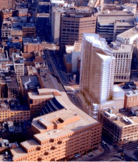
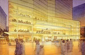
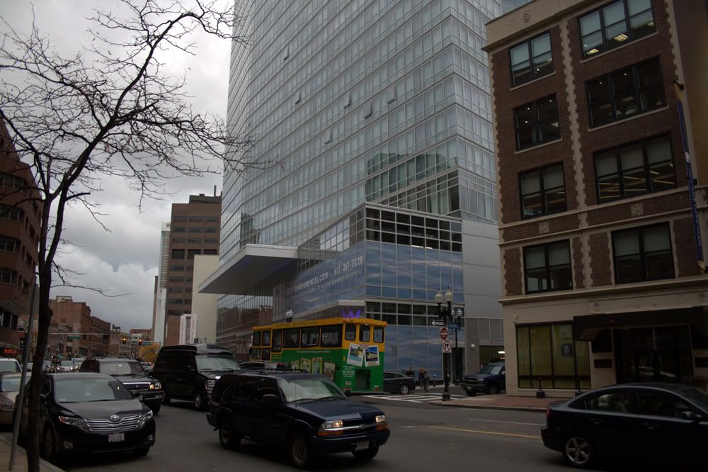
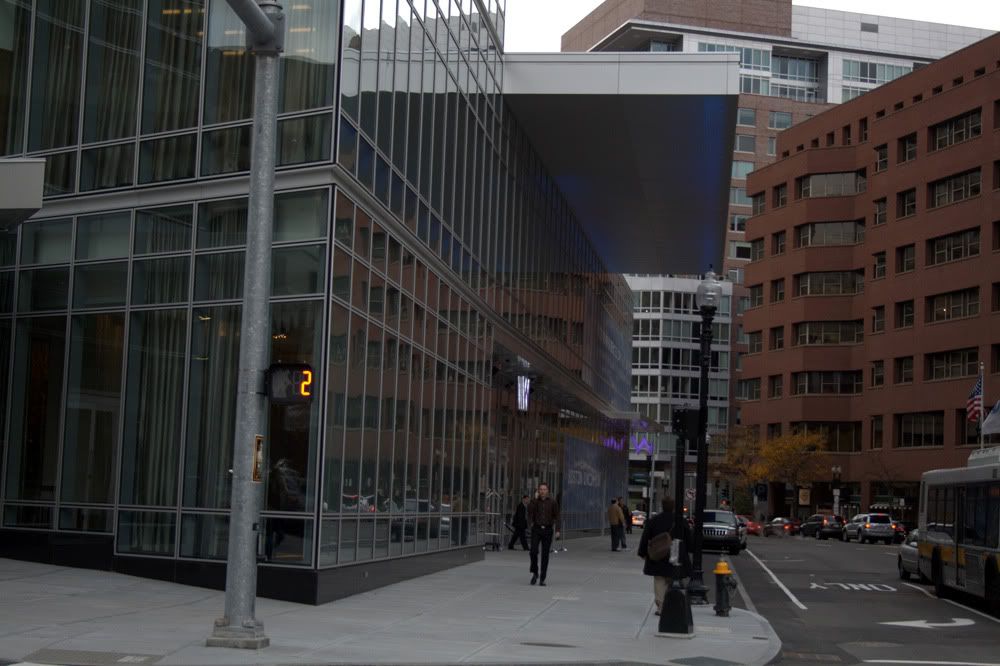
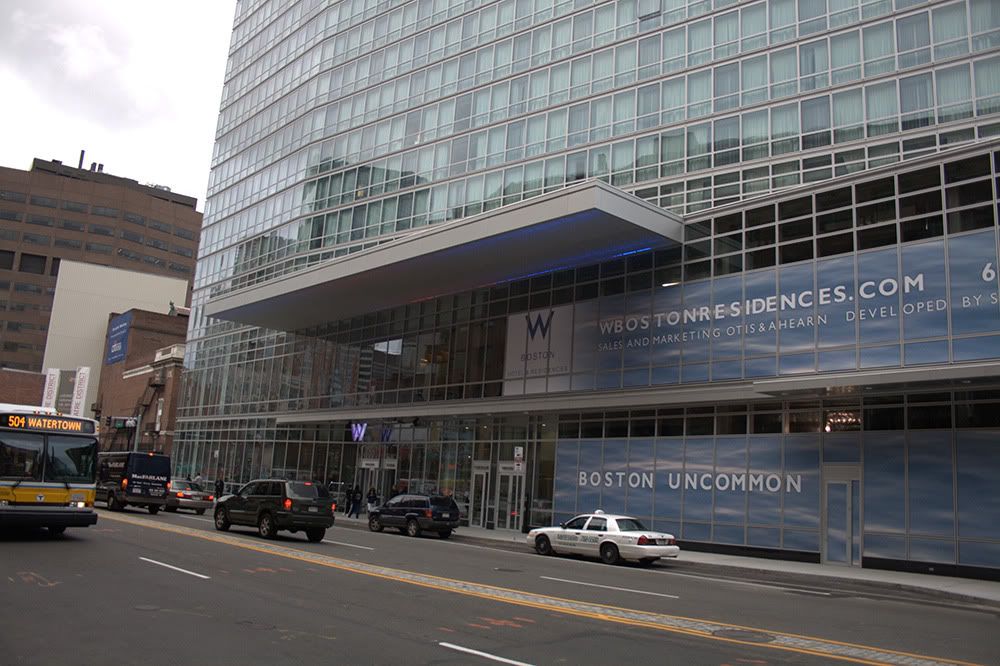
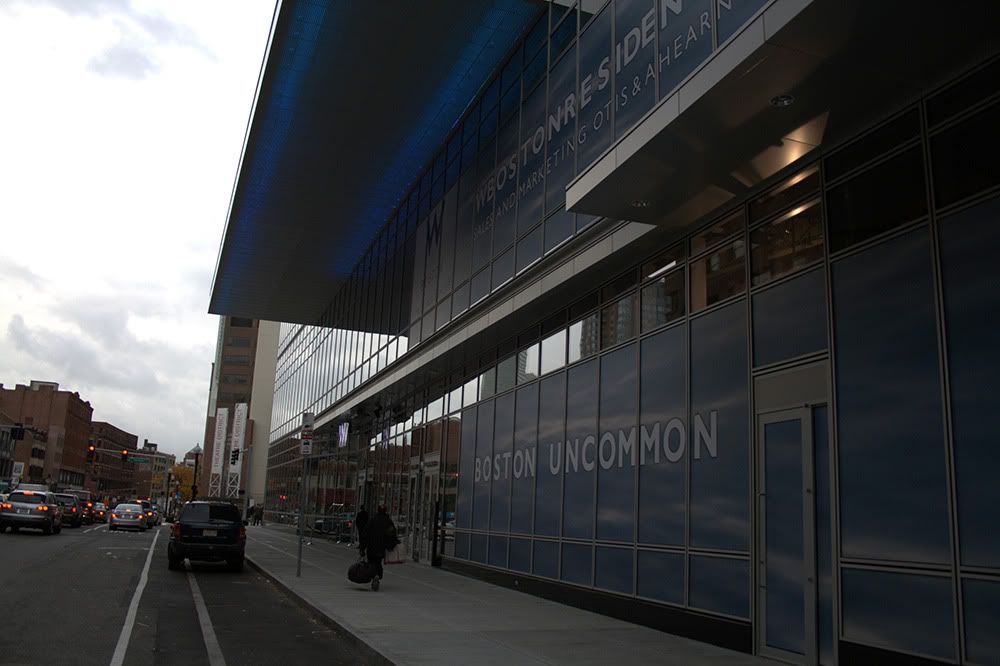
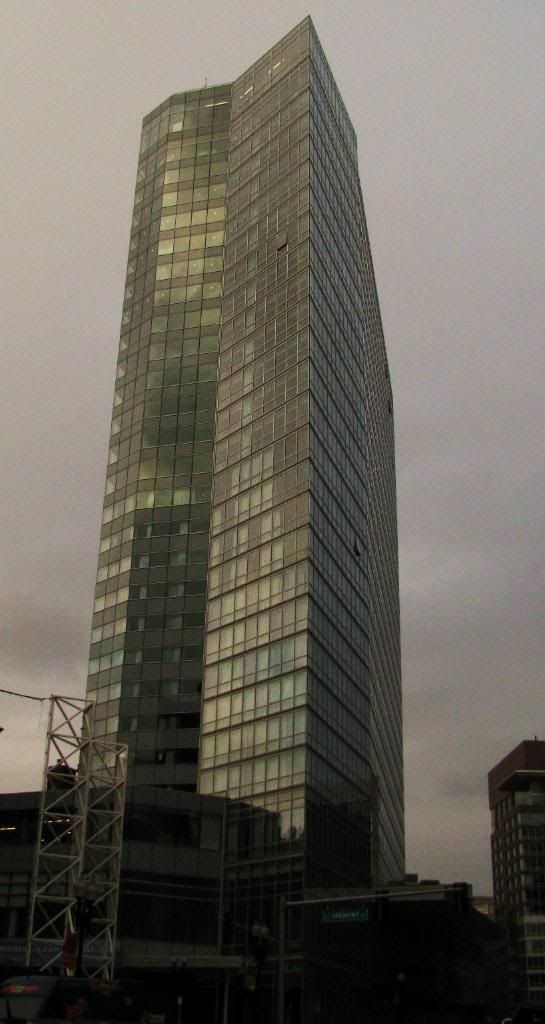
Let?s start with the W Boston Hotel and Residences. This is a 26-story combination hotel and condo tower at the corner of Tremont and Stuart streets in the middle of the Theatre District. There are 235 hotel rooms and 123 condos, plus two bars, a restaurant, underground parking, and such yet-to-be-finished amenities as a health club and a nightclub. Total cost is $234 million.

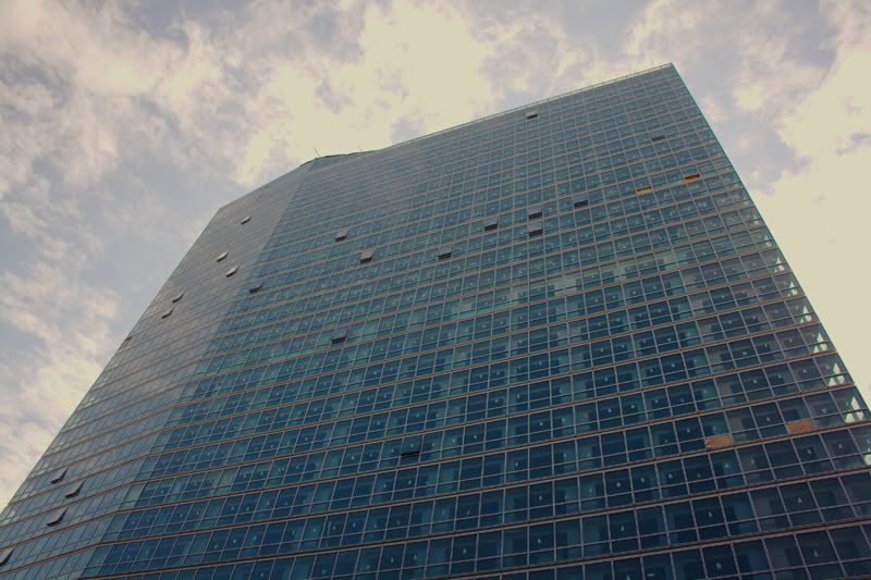
Transparency is what saves the W from feeling too big. When you look up at it from outside, daylight seeps through its sharply angled glass corners. These edges seem to dissolve into thin air. You can?t see the columns and beams of the structural frame, either, because they?re set back behind the glass. As a result, the clear glass with its white mullions feels like a delicate, open-weave fabric that?s been stretched taut across the facades.

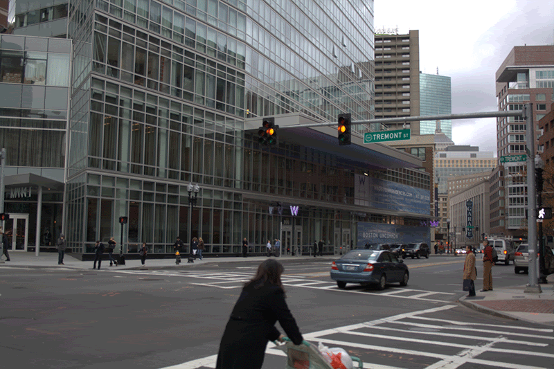
Transparency happens at the street, too. Walking past the glass facade you feel that the interior lobby - it?s called the Living Room - is a widened extension of the sidewalk. Indoor tables and lights feel like parts of an outdoor cafe. At night, streetscape and lobby merge through the glass when the interior is illuminated.

Not everyone loves high-rises, which can be disruptive. But the W takes its place in an urban design concept that?s long been part of Boston?s DNA. This is the so-called High Spine, the dorsal fin of towers that moves out from downtown along a seam between the Back Bay and the South End. It?s a corridor where high-rises cluster near public transit while leaving historic neighborhoods untouched. As part of this spine, the W strengthens the visual shape of Boston at the same time that it signals the presence of the Theatre District.

Rawn designed the tower, working with the firm TRO/Jung Brannen, but he didn?t do the interiors. All finishes and furnishings are by New York architects Bentel & Bentel, who did the marvelous Modern restaurant at the Museum of Modern Art. Here, though, they?ve done less well.

The W?s interior suffers from a mania for what the W folks call ?theming.?? I was told that the Living Room should remind me of stone garden walls, climbing ivy, campfires, paved sidewalks, the Public Garden, Harvard and MIT, Boston granite, village elm trees, neon lights, stage prosceniums, and I forget what else. Sheer metal drapes hang like vines and water slides down the backs of seats. A wall of rough granite blocks confronts you as you enter. Details are elegant, but the overall effect is crowded and the boxy seating is uncomfortable.

Bentel & Bentel?s hotel rooms upstairs are much better, sexy without being camp, and their restaurant, called Market (the theme here is the Massachusetts coast, though you?d never guess), is handsome in a noirish way.

The rest of the review discusses the new Cambridge Public Library addition:

http://www.boston.com/ae/theater_ar...gs_transparency_to_w_hotel_cambridge_library/
 
Re: W Hotel

I used to have a lot of respect for Robert Campbell, but his criticism has become flaccid and utterly lazy. It also annoys me that Boston's premiere architecture critic seems uninterested in the significant urban and architectural developments currently shaping the future of the city, like, the Seaport, the Greenway or virtually any other major building that doesn't have a marquee name attached to it.

His review of the W fails to point out what I believe are several glaring major shortcomings.

As I've posted earlier up-thread, for a vertically oriented building, the W is far too wide for its height. Rawn's initial design acknowledged this and attempted to break up its mass by adding a zigzagging articulation to its facade and varying the roof heights. But these elements were removed from the final design. As a result, the realized building feels oppressively vast and monotonous over Stuart St --it's also, unfortunately, very visible from the Common as an inelegant gridded glass slab hanging over the rooftops of Piano Row.

Initial Deseigns
w_rendering_1.jpg


As-built:
fat_w.jpg


boston02124 said:

Another real problem I have with the W as built is its total lack of integration with the surrounding fabric. Here again Rawn's initial design was altered for the worse. If you look at the initial design you will see the lowrise portion's height matched that of its neighbor, the New England School of Law building. This is something even One Charles acknowledged and incorporated into its design, and the effect is successful and apparent-- it helps make this stretch of Stuart feel like an integrated, cohesive whole, and adds to its sense of place. The built W, for some reason, decided to alter the original design and lower the lowrise portion to 2-3 stories?! The result here is a conspicuously disruptive break in the continuity of the Stuart St streetwall. IMO, this was a cynical and irresponsible design decision (incidentally, the Clarendon made a similar one as well).

As built:
W-stuart-streetwall.gif


Original design:
w_rendering_2.jpg


W_street_level_4.jpg


The lowrise portion along Stuart itself has its own problems. Like, for instance, the enigmatically placed awning hovering 30' above the sidewalk which creates an over-sized sense of scale. Amplifying this distorted scale is the sheer glass wall at ground-level that rises more or less unbroken the full 30' height. It lacks anything to visually engage the passerby or create a sense of human scale. It feels bare, impervious and uninviting and makes the passerby feel quite small walking along its side of Stuart St.

W_street_level_1.jpg


W_street_level_2.jpg


W_street_level_3.jpg


These are just a few of the building's most glaring shortcomings. Many of its others have been mentioned in this thread, like its drivewayification of Warrenton St. The thing that makes these problems so particularly bothersome is the fact that many of them were, in fact, addressed in the initial design, but ignored when the design was altered to the final iteration. Why?

That Campbell really has nothing to say about this building beside marching out a bunch of tiresome and weaselly old stereotypes like

Robert Campbell said:
Glass buildings in Boston are often seen as shiny interlopers in a city that prides itself on its historic look and its natural materials: brick town houses, granite wharves, wood triple-deckers.

or

Robert Campbell said:
Glass, as a building material, tends to convey two messages. One: ?We?re modern.?? Two: ?We?re transparent.?? Both messages are clear in the architecture of these buildings.

or
Robert Campbell said:
Not everyone loves high-rises, which can be disruptive.

and passing it off as architectural criticism saddens me greatly. I always thought it was the architecture critic's job to inform the public and help shape the public discourse in matters concerning our built environment. Considering our lazy architecture critic, it's really no wonder we continue to have lazy architecture.
 
Re: W Hotel

^
Your articulation of the deficiencies is spot on Briv. One of the best posts I've read in a long time. The globe should have you instead of Campbell. I too really despise the the low rise bases of the W Hotel and the Clarendon. Overall, the W is an improvement over the former parking lot, but the final product could have been so much better with minor adjustments.
 
Re: W Hotel

I agree, well done. Campbell has become a one-trick pony. His critique of Boston's overboard, reactionary embrace of lowrise, brick architecture during the 90s was trenchant and necessary, but now the city needs a more sophisticated critic who can take on different targets.

I'm not sure there's much more he can say about such gaping disasters as the Seaport and Greenway, though. He has surfaced in the past to mention how awful they are - but how do you even begin to go further? He traveled the world to find great precedents for planning the Greenway, but what he brought back would clearly never trump the vicissitudes of local politics.
 
Re: W Hotel

IMO the main entrance is too small. There is nothing inviting about the entrance or the ground level whatsoever. It might help if there were some outdoor planters, it is definitely too stark, too spartan.
 
Re: W Hotel

Briv's critique is right on the money. This could have been a fantastic building ... instead it's only OK. And the evidence suggests that it's not Rawn's fault, somewhere along the way the careful integration and great detailing was stripped off.

Campbell deserves to be beaten up a bit for not touching on this ... but the BRA should also be beaten over the head with Briv's critique. We've seen this time and again, and it leads to cynical NIMBYism: an original design executed with some subtlety is dumbed down to something closer to an anonymous box long after the initial BRA facilitated public process is finished. It's the Kairos Shen aesthetic, and it is absolutely maddening. The BRA seems actually to prefer buildings that look like they belong in office parks - they pushed the design of the proposed building at 210 Stuart in the same direction, and the result, if built, will bring Park Square a few steps closer to Kendall Square.

Admittedly, some of the pressure to strip off details comes from "value engineering" by developers to limit costs - but control of that seems to be of no concern to an agency that gives only lip service to good design and seems ultimately to have no pride. Moreover, the outcry over the Tinkertoy execution at the Hotel Commonwealth seems to have led the BRA to a horrible conclusion - "stick with the simplest boxes possible, as that's less likely to get us in trouble."
 
Re: W Hotel

IMO the main entrance is too small. There is nothing inviting about the entrance or the ground level whatsoever. It might help if there were some outdoor planters, it is definitely too stark, too spartan.
I agree ^. There are two doors, side by side, each very narrow and going into a different location. Neither is clearly marked as to which to use (One, I think, goes to a little cubby for the doorman). I found the lobby claustrophobic. The ceiling was too low, the levels of furniture too crowded, not leaving enough "moving around" space. It did not seem like a space where one was invited to relax with a drink. The front desks are understated to a fault. The ubiquitous "W" plastered everywhere, and the font used, calls to mind an endless series of Ladies' toilets. The real toilets I found (carefully hidden down several hallways from homeless people) are discreetly underlined letters W and M and are a hodge-podge of classy- and cheap-looking materials. The second floor meeting room area is also a very confusing set-up. The tower itself is intriguing, however, but of course, hotels are meant to be used by real people who not merely posing for a glossy magazine ad.
 
Status
Not open for further replies.

Back
Top