^ It was supposed to be attractive and relaxing for the drivers.
I'm pretty sure that was the idea behind The Greenway, as well.
^ It was supposed to be attractive and relaxing for the drivers.


that second picture makes me realise just how much urban renewal fucked up boston.The first plan for an elevated Central Artery in 1930. I like it, compact and preserving the dense neighborhoods it would thread through. A real city:
Here of course is the RKG corridor. I prefer the original plan above.
Check out Government Center - what an abominable waste.
I actually first caught the second picture without any context. I thought this was a rendering of what Boston would look like if sea levels rose and the city was put under 10 feet of water. The dead zones around City Hall, I assumed, were a result of buildings and, well, *things* being under flood water.
Not the case. Urban renewal just gave us a crumbling brick desert in the city's heart. Cool.
a good chance that we'll see this happen over the coming centuries.
Here's a link to the 1930 plan for road development in Boston. An absolutely fascinating document. In an alternative universe in which the Great Depression didn't happen, much of this could have been constructed:
http://archive.org/details/reportonthorough00bost
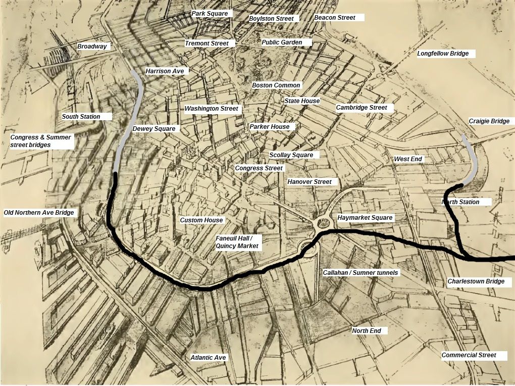
So the map in blue above is the "original" Shawmut peninsula? Amazing.
I'm losing my memory in my old age, but wasn't the Central Artery eventually built similar to as proposed up above? The big difference seems from Haymarket northward - a monstrous amalgam of twisty iron and steel, no?
I'm not sure what the blue map is... (?) I think it is just an aerial shot from a similar vantage as the drawn map. But it's not the original peninsula since the North End and Beacon Hill are not blue.

