Looks like Nichiha which is actually more expensive than you'd think. IMO, taste and arch details matter more than material cost.Oh, it's all cheap as shit. But that's why it's affordable.
You are using an out of date browser. It may not display this or other websites correctly.
You should upgrade or use an alternative browser.
You should upgrade or use an alternative browser.
Whittier Choice Neighborhood | 1158 Tremont Street | Roxbury
- Thread starter Equilibria
- Start date
- Joined
- Jan 7, 2012
- Messages
- 14,172
- Reaction score
- 23,677
 IMG_0993 by Bos Beeline, on Flickr
 IMG_0994 by Bos Beeline, on Flickr
 IMG_0996 by Bos Beeline, on Flickr
HBH
Senior Member
- Joined
- Apr 17, 2018
- Messages
- 1,557
- Reaction score
- 4,704
Ruggles Street is looking good, that contraflow lane is basically the nicest contraflow in the city. That plus this development has totally changed this little area, unrecognizable from just 6 years ago
stick n move
Superstar
- Joined
- Oct 14, 2009
- Messages
- 13,361
- Reaction score
- 23,947
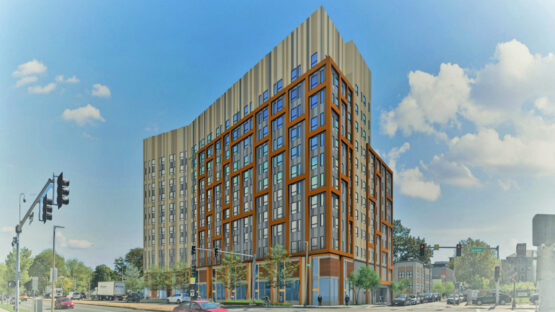
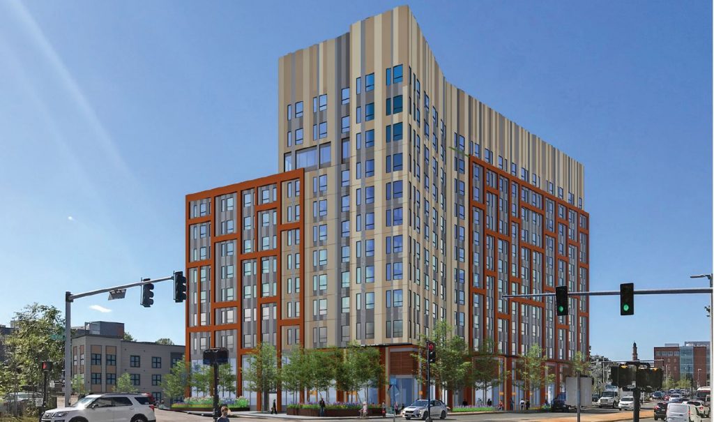
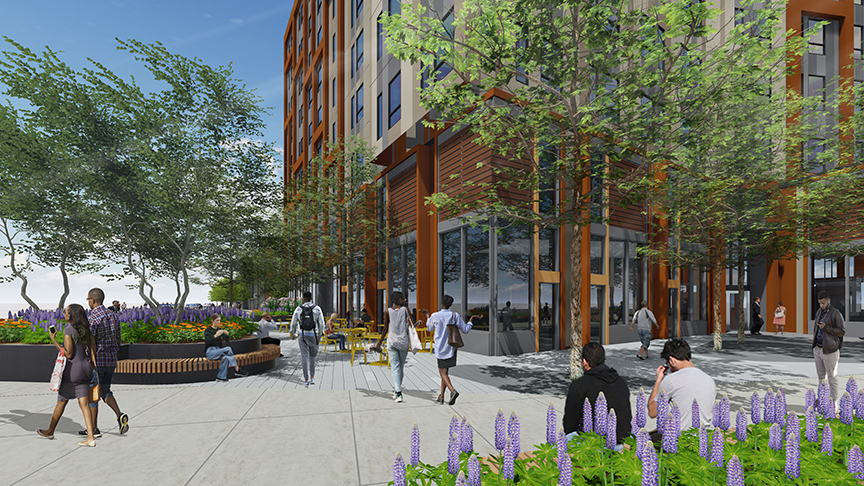
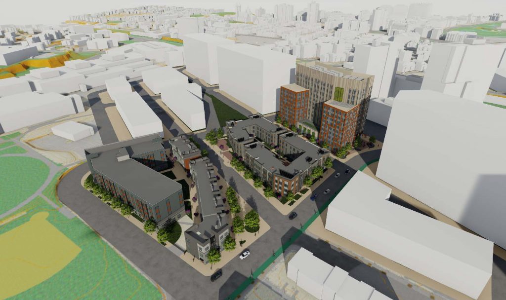
Phase 3 will at least add to the tremont st street wall, which is good. Though the facade appears very mediocre hopefully it will come across better in person.
TomOfBoston
Senior Member
- Joined
- Mar 29, 2007
- Messages
- 1,268
- Reaction score
- 507
It also improves the view from Northeastern's International Village.
? Maybe my standards are low because of the banality of a lot of what we see, but this facade is fine. It probably won't be great materials, which could break it, but its not too boring or random.Phase 3 will at least add to the tremont st street wall, which is good. Though the facade appears very mediocre hopefully it will come across better in person.
View attachment 38511
View attachment 38512
View attachment 38513
View attachment 38514
stick n move
Superstar
- Joined
- Oct 14, 2009
- Messages
- 13,361
- Reaction score
- 23,947
Its fine for affordable housing but I think instead of doing the random colossal order pattern on the red part of the facade it would have looked a lot better to just keep it the same as the pattern on the tan part.
Theres no need to make some wacky pattern on every single low rise facade, especially a background building like this. In this case less would have been more imo.
Theres no need to make some wacky pattern on every single low rise facade, especially a background building like this. In this case less would have been more imo.
With the crescent parcel next door (which may have been funded), Tremont will look a lot better. Of course, it'd be even better if the city could get it's act together on the Northeastern dorm proposal and P3...Phase 3 will at least add to the tremont st street wall, which is good. Though the facade appears very mediocre hopefully it will come across better in person.
View attachment 38511
View attachment 38512
View attachment 38513
View attachment 38514
TomOfBoston
Senior Member
- Joined
- Mar 29, 2007
- Messages
- 1,268
- Reaction score
- 507
I am not sure what is happening to that new Northeastern project. Now that the university has a long term lease on the entire tower 2 of the old Sheraton Boston (39 Dalton) they may be rethinking the whole project. Maybe more academic space, less housing?With the crescent parcel next door (which may have been funded), Tremont will look a lot better. Of course, it'd be even better if the city could get it's act together on the Northeastern dorm proposal and P3...
NorthshoreCity
Active Member
- Joined
- Sep 9, 2020
- Messages
- 135
- Reaction score
- 744
Saturday 7/8:
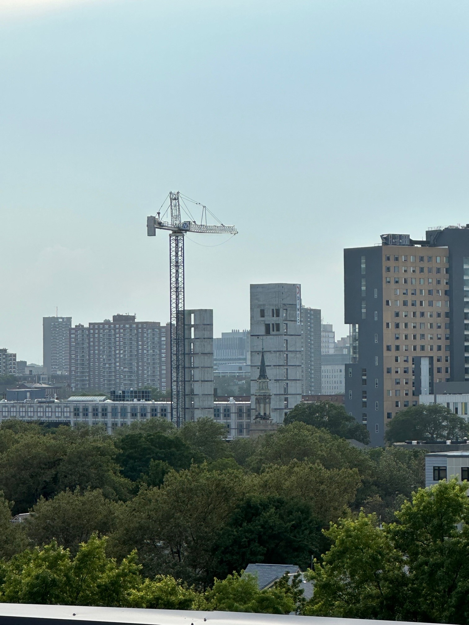
"It costs a lot of money to look this cheap." -Dolly PartonLooks like Nichiha which is actually more expensive than you'd think. IMO, taste and arch details matter more than material cost.
stick n move
Superstar
- Joined
- Oct 14, 2009
- Messages
- 13,361
- Reaction score
- 23,947
Is this an 8 over 2? Is that legal?


