You are using an out of date browser. It may not display this or other websites correctly.
You should upgrade or use an alternative browser.
You should upgrade or use an alternative browser.
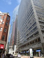
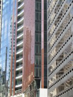
Winthrop Center | 115 Winthrop Square | Financial District
- Thread starter vanshnookenraggen
- Start date
Bill Blass
New member
- Joined
- Jun 19, 2023
- Messages
- 36
- Reaction score
- 102
I like the building. I think it looks good and subtly gothic-deco. It’s not going to turn the world upside down, but it’s a net positive I think.
citydweller
Active Member
- Joined
- Aug 23, 2019
- Messages
- 486
- Reaction score
- 766
if you go to the link ... (https://www.dezeen.com/2024/06/12/h...orlds-largest-passive-house-office-in-boston/) ...
and read the comments, there are some that completely trash the tower. I don't share that opinion mind you, I think it's a great addition to the skyline.
and read the comments, there are some that completely trash the tower. I don't share that opinion mind you, I think it's a great addition to the skyline.
Bananarama
Active Member
- Joined
- Mar 18, 2020
- Messages
- 609
- Reaction score
- 1,262
Wild to me that the stone clad entry column is still incomplete from the failed installation over a year ago.
type001
Senior Member
- Joined
- Jun 29, 2006
- Messages
- 1,839
- Reaction score
- 395
Come on. Really?I preferred the skyline w/o this thing -- and I'm both pro-development and pro-tall.
It's better than a vacant, decaying garage, but that's about the best to be said for it.
FormFollowsBudget
Senior Member
- Joined
- Jan 15, 2015
- Messages
- 2,318
- Reaction score
- 4,106
I mean, it's fine, but it's nothing really to write home about, or make a post about on Dezeen. Architecturally, it has some nice features, but again, nothing really inspiring. It fills in a "hole" in downtown, which is great economically, but isn't really what Dezeen or an architecture forum is focused on. It's part of the overall discussion and story of the project, and yes, I'd rather have this than a decrepit garage, but that's an extremely low bar to hold our developers with access to billions in capital to, for a building that will remain prominent for many decades beyond our lives.Come on. Really?
It makes it hurt more that they made a lot of sacrifices to get this built. The original proposal was much more dynamic and coherent in its facade, at least tried to envision a more lively base, and promised an observation deck. There's no denying we lost those. The facade has a nice ripple, but not to the extent their winning proposal showed. It remains to be seen how active the ground floor gets, but it currently reads as a lobby - when I walked through on a Wednesday afternoon a few weeks ago it felt like I shouldn't have been there.... And there's no observation deck.
I suspect these all come as a combination of COVID financing sacrifices and typical developer VE activities, but overall, in my opinion this is what "filler" architecture should strive to, while this site demanded more.
themissinglink
Senior Member
- Joined
- Jan 13, 2018
- Messages
- 2,035
- Reaction score
- 5,621
I really like how Winthrop Center looks up close, but some of the views from far away are kinda unflattering, especially if it's cloudy or overcast. Winthrop looks good from a distance when the sun is shining on it, IMO.
Last edited:
Sorry. This is not really architecture, not the sort that we aspire for our city. This is real estate development. Plain and simple. I have no doubt the interior programming here is of a higher standard than the exterior (corporate leasees, after all, make sterner demands than the city) - but that's still a pretty low bar, and a non-public realm at that. To my eye, this is a generic cube of glass that, yes, most cities would likely yearn for. For them, it demonstrates global arrival. We are not most cities. There were options. There were other choices. You want modern and provocative, fine, there were choices. This was the least of those choices. The city chose money.
We are eclectic smaller blocks made of brick, limestone and granite. We are people-scaled. We are walkable. We are the example city leaders all over the world refer to - we'd like a Back Bay, South End, Bay Village sort of thing. (Ask a taxi driver what tourists most often say: It's pretty, it's walkable, it's people-sized.)
Let me establish my bona fides, (since I don't come here often anymore), I love Hancock (former name) Tower. It is a work of art, strategically inserted in an historic block where it should not fit and yet it somehow it does. That's Boston! We're smarter.
The High Spine is a brilliant concept. A corridor of slender taller buildings - distinctive - standing like sign posts for our city. Not walling us in, signposting us. Towering walls of glass side-by-side do not amplify, honor or enhance our city, no matter how many LEED Awards they are granted. (Ask Chicagoans.) Glass has no depth, no texture, no time-worn patina - it is what it. The easier, cheaper choice.
This company did another bait-and-switch years ago with their tower on Washington. That's crying over spilt milk, I guess.
Now we're allowing them to redo the park. Seems to me, the only people who won here are the tax collectors.
Bill Blass
New member
- Joined
- Jun 19, 2023
- Messages
- 36
- Reaction score
- 102
I think it looks good and fits in nicely with the other styles of buildings. I don’t buy into the idea that Boston has to be dinky just because.
citydweller
Active Member
- Joined
- Aug 23, 2019
- Messages
- 486
- Reaction score
- 766
Sorry. This is not really architecture, not the sort that we aspire for our city. This is real estate development. Plain and simple. I have no doubt the interior programming here is of a higher standard than the exterior (corporate leasees, after all, make sterner demands than the city) - but that's still a pretty low bar, and a non-public realm at that. To my eye, this is a generic cube of glass that, yes, most cities would likely yearn for. For them, it demonstrates global arrival. We are not most cities. There were options. There were other choices. You want modern and provocative, fine, there were choices. This was the least of those choices. The city chose money.
We are eclectic smaller blocks made of brick, limestone and granite. We are people-scaled. We are walkable. We are the example city leaders all over the world refer to - we'd like a Back Bay, South End, Bay Village sort of thing. (Ask a taxi driver what tourists most often say: It's pretty, it's walkable, it's people-sized.)
Let me establish my bona fides, (since I don't come here often anymore), I love Hancock (former name) Tower. It is a work of art, strategically inserted in an historic block where it should not fit and yet it somehow it does. That's Boston! We're smarter.
The High Spine is a brilliant concept. A corridor of slender taller buildings - distinctive - standing like sign posts for our city. Not walling us in, signposting us. Towering walls of glass side-by-side do not amplify, honor or enhance our city, no matter how many LEED Awards they are granted. (Ask Chicagoans.) Glass has no depth, no texture, no time-worn patina - it is what it. The easier, cheaper choice.
This company did another bait-and-switch years ago with their tower on Washington. That's crying over spilt milk, I guess.
Now we're allowing them to redo the park. Seems to me, the only people who won here are the tax collectors.
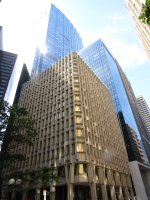
Yeah, Boston deserves great architecture but god forbid it cast shadows on the Common. I do agree that there were better choices put forward during the RFP to exemplify more appealing architecture but I would argue that this tower still enhances the skyline especially when compared to the dilapidated parking garage that once was.
Not to be a height fetishist, and I'm not, but if this tower was 100 feet taller then it would at least have made a significant impact on the skyline just for its size. As is, like many others have said, it's simply fine. With the completion of SST soon and nearby MT, this is really like a filler building that only stands out from certain perspectives. I personally like the design for the most part but it is not a stand-out in any meaningful way.
It draws one's eyes away from the Pregnant Building, which used to dominate this part of the skyline, so for me at least its a big win.Not to be a height fetishist, and I'm not, but if this tower was 100 feet taller then it would at least have made a significant impact on the skyline just for its size. As is, like many others have said, it's simply fine. With the completion of SST soon and nearby MT, this is really like a filler building that only stands out from certain perspectives. I personally like the design for the most part but it is not a stand-out in any meaningful way.
Randy N. Craven-Krawtch
New member
- Joined
- Feb 23, 2024
- Messages
- 46
- Reaction score
- 91
I love 100 Federal!It draws one's eyes away from the Pregnant Building, which used to dominate this part of the skyline, so for me at least its a big win.

same!I love 100 Federal!
- Joined
- Jan 7, 2012
- Messages
- 14,173
- Reaction score
- 23,688
atlantaden
Senior Member
- Joined
- May 31, 2006
- Messages
- 2,679
- Reaction score
- 3,344
bigpicture7
Senior Member
- Joined
- May 5, 2016
- Messages
- 4,068
- Reaction score
- 10,551
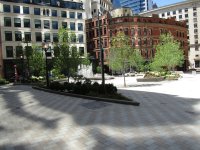
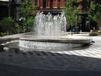
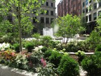
Today (6/19) - Part I of II, park views:


