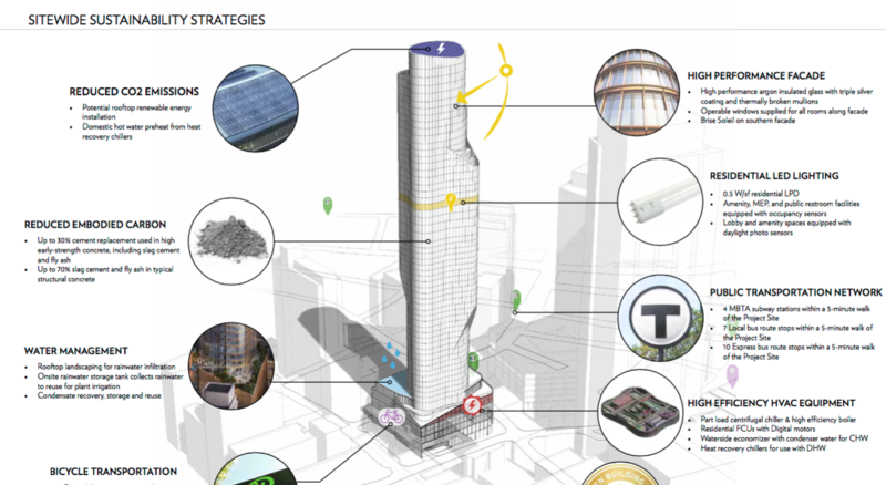
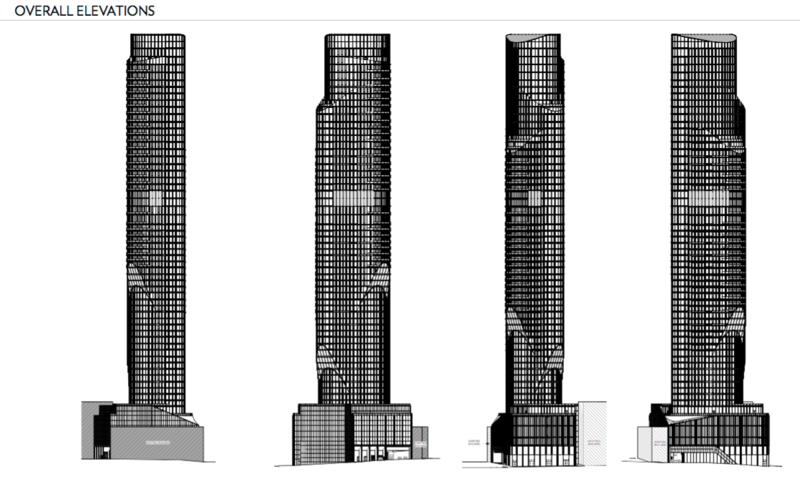
11-21 Bromfield Street | DTX | Downtown

I believe the "GEM" building stays, so it's not exactly an apples-to-apples comparison picture.

True, you can see the cornice of the GEM building, but I was referring to the giant gaping hole that was torn into what is currently a complete street wall for the sake of cars.
 
the jury is still out for me...a lot I like, some I'm not so sure of yet. I'd love to see the cantilevers shaved down a bit and maybe pick up the lost sf by going a few floors higher. This doesn't look like a cheap design though - from a complexity and cost standpoint how does something like this compare to Millennium Tower? (appreciating the fact that it's ball park assessment from limited renderings)
 
This won't pass BCDC..It's way too similar to Copley. It's a good start.

I need a spire or something more distinctive.

Ill be content if they put a spire on Winthrop. Would be nice here too but I feel that is the spot that absolutely has to have one. This needs big changes though we cant built a millennium tower and then go back 30 years with the parcel next door.

You both realize that Millennium Tower is a proud ripoff of a 45-year-old Back Bay tower, right?
 
Personal opinion, but I fucking HATE this.

Agree with you. This is the design's very soft underbelly. For an example of how this could turn out, look at what "One Financial Center" did to destroy Essex Street. An interesting fine grained area wiped out and now a traffic sewer.

Seriously, just walk that stretch of Essex. (The problem being that most of you will be too young to remember the buildings that had the Garcia y Vega cigar store, the Essex Café, the model store, the leather tailor...)
 
You both realize that Millennium Tower is a proud ripoff of a 45-year-old Back Bay tower, right?

It's going to be a lot different when they both finish in 2019( at the same time ) and people wonder how on earth the BRA/BCDC let them build twin elephant towers.

40 years later is fine. This is too close in both ways. You've got one blue and the other copper. Just saying, it could be a little more distinctive.
 
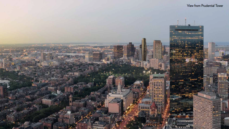
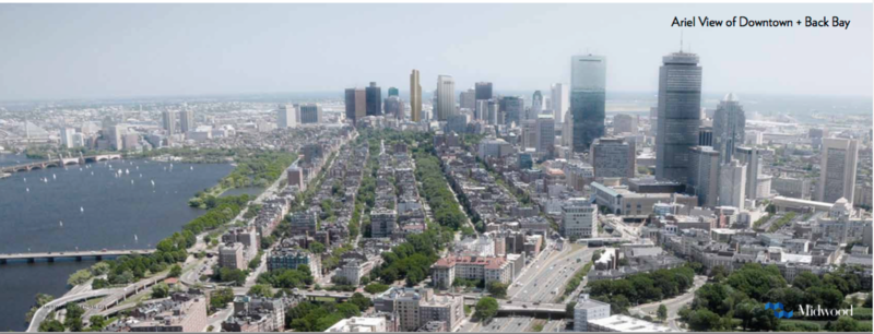
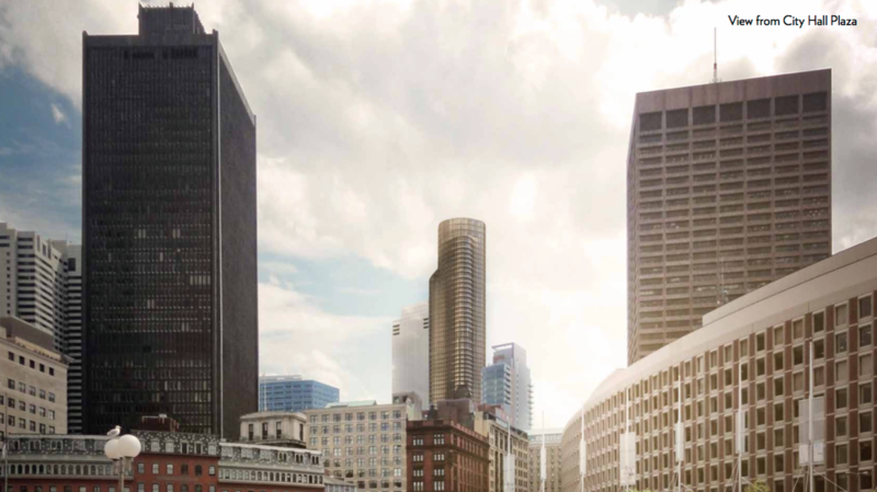
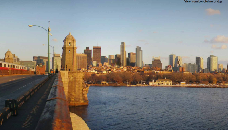
In the view from Memorial Drive from the last page it looks like Millenium Tower is built in Beacon Hill. Excellent photoshop.
 
You've got one blue and the other copper. Just saying, it could be a little more distinctive.

How many copper glass towers do we have in Boston right now? ZERO. I'd be a lot more disappointed if this was (nearly) the same color as Millennium next door, CSC Tower, Hancock, Exchange Place, etc. I like the darker color. It's brooding. Probably the closest thing we will get to NYC's Metropolitan Tower. (always wanted one in Boston!!!)
 
Ripped from the BRA.


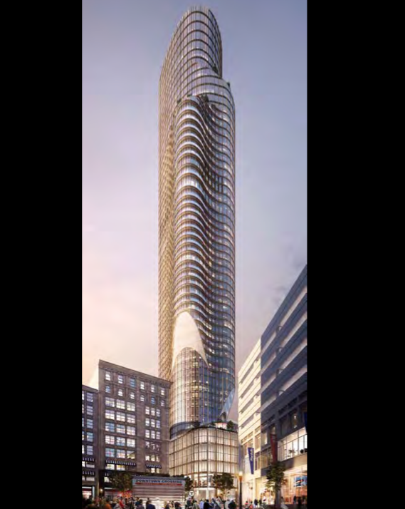
I have no idea if I like this or not. I like the height and the ground level looks very good. The cladding looks a bit aged and I don't like the cantilevers but we all know this will be redesigned a few times before it is ever built so lets see where they go from here. I would rather see them stick with a thin tower like they are doing in NYC than try to add these bulges to it.

^^I agree 100%!...looks dated...vintage late 70's-ish. I am very disappointed with this. I do love how this adds a new high profile peak, it will really stand out in the skyline, I just can't get my arms around that design.
 
I like it, but I'd gladly trade subtler cantilevers for more height (and that vehicle cut-through really, REALLY needs to disappear)
 
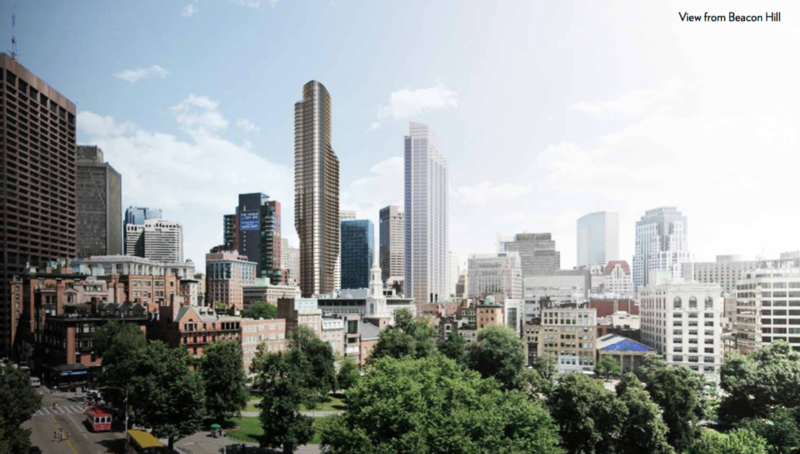
Nice to see some curves behind Beacon Hill to contrast all the squareness of everything visible from Cambridge looking east

Screen%20Shot%202016-04-04%20at%201.53.55%20PM.png


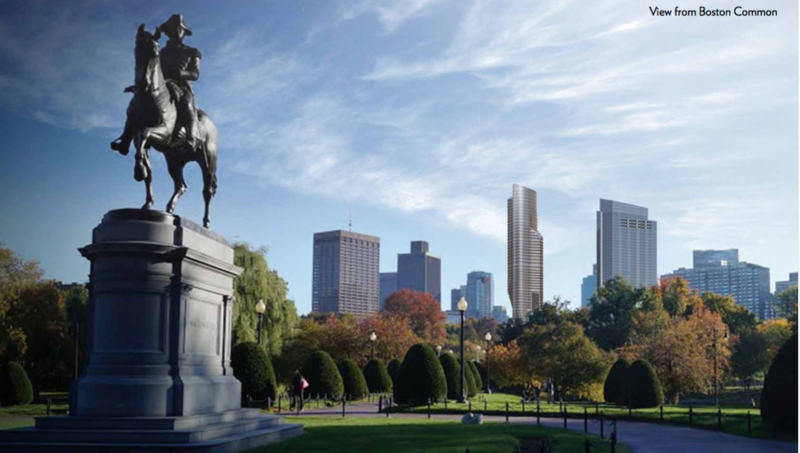
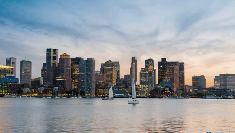
could serve as a nice curvy balance to MT's muscular angularity from the Public Garden view -- aka the "King and Queen" of DTX's chessboard [George in the Garden is the Knight of course]

Screen%20Shot%202016-04-04%20at%201.54.02%20PM.png
 
This seems to play pretty well with MT.

But it doesn't play well with Bromfield at all.

Honestly really disappointed with this as it currently stands. It looks incredibly dated. The curvy cantilevers are straight out of the 60s and 70s futurist movement.
 
You both realize that Millennium Tower is a proud ripoff of a 45-year-old Back Bay tower, right?

Yes but they did it in a way to compliment the Hancock. Its really only similar because it has thin sides and a slit(the blue glass doesn't even count because everything is blue glass these days). The Hancock has no balconies, no crown, no folds, no podium, no setback...etc. The Hancock is also a parallelogram and this is just a rectangle. I wouldn't call it a ripoff I would say its an homage. Im not even saying this is a ripoff of copley its just not good. If they went by your logic this would expand on the Copley tower in a positive way. This does not.
 
But it doesn't play well with Bromfield at all.

Honestly really disappointed with this as it currently stands. It looks incredibly dated.

Midwood made really big mistake in the Bromfield rendering by zooming in/stretching out the carport/pass-through. It's not really any bigger than the City Sports, an edifice that isn't doing Bromfield many favors as-is.

This one goes in the "well, people keep saying they want something interesting" camp for me. I don't love it, but I definitely like it more than Millennium Tower. I'll always be in the minority for not understanding what people see in that building.

Actually, they made some really questionable lighting choices in general in these renders. It's like they want to show the building at its most dank.

Yes but they did it in a way to compliment the Hancock. Its really only similar because it has thin sides and a slit(the blue glass doesn't even count because everything is blue glass these days). The Hancock has no balconies, no crown, no folds, no podium, no setback...etc. The Hancock is also a parallelogram and this is just a rectangle. I wouldn't call it a ripoff I would say its an homage. Im not even saying this is a ripoff of copley its just not good. If they went by your logic this would expand on the Copley tower in a positive way. This does not.

You're nitpicking, and I'll take the Hancock over Millennium every day to Saturday. Millennium is slab-sided and only attractive from its thin angles (one of which, thankfully, I can see from my living room).
 
I dont mind darker glass...we need more of it. Just needs to be done right.
 
But it doesn't play well with Bromfield at all.

Honestly really disappointed with this as it currently stands.

I mean the tower. The tower itself actually looks pretty awesome. (next part not directed at DD) Doesn't look 70's at all. They would never do these types of cantilevers back then either. Also, it's not like we're getting 70's cladding. Just because it's a similar shape to Lake Point Tower, BFD. Like wow, they're both curvy, BFD!!! Not the same.

In terms of the base, as I said, I'm not a fan. I want a Payless facadectomy to preserve the old building on the corner, with this tower rising behind it. We already lost the 1905 facade diagonally across the street, which makes it that much more urgent to me. Keep the historical character of DTX. Also, the garage on Bromfield is a total downer.
 
True, you can see the cornice of the GEM building, but I was referring to the giant gaping hole that was torn into what is currently a complete street wall for the sake of cars.

Yeah. It's a turd worthy of pitchforks, torches, and a lot of rabble rabble.

I'd definitely argue that at least the facade of the Payless building could be incorporated into the new structure to provide some historical context. The scale of the facade on the Washington/Bromfield corner as proposed is actually pretty good, but including the Payless facade would make it better.

The gaping hole on Bromfield? Deal breaker in my opinion. I know we're willing to sacrifice a few side streets and alleyways in order to better some of our more urban primary streets. Bromfield deserves better.
 
Personally I actually appreciate the sort of retro futurist look this building has I think it is interesting and something that can contrast in a positive manner with the rest of the downtown skyline. I do hope they remove the driveway that connects from Bromfield to Province Ct but aside from that I am pretty happy with this design.
 
It's got a little Seafirst Center in Seattle to it. The tint is similar, except everything is convex instead of concave. The protruding sides seem too exaggerated from some angles. The best elevation view is from the East and West, where it is most slender. The car-port is terrible and needs to be rethought. If they were to redesign, and slim down the cantilevers in favor of additional height, just how high can they go? It already appears to be around 740-750' to the top. It would be great to do one more setback with the additional height. Would look slimmer and more attractive for sure.
 
I seem to be in the minority here, but I quite like this proposal, with the exception of the massive hole blown through the streetwall on the Bromfield side.
 
Its not the worst but I know they can do better. They have to do better here. I really wish they would jump on this slender tower trend we are seeing everywhere before its too late. Im not talking about that other tower in DTX or the one on the common Im saying tall and slender.
 

Back
Top