You are using an out of date browser. It may not display this or other websites correctly.
You should upgrade or use an alternative browser.
You should upgrade or use an alternative browser.
Atlantic Wharf (née Russia Wharf) | Atlantic Ave | Waterfront
BostonUrbEx
Senior Member
- Joined
- Mar 13, 2010
- Messages
- 4,340
- Reaction score
- 130
Re: Atlantic Wharf (formerly Russia Wharf)
Best New Development 2011
Best New Development 2011
briv
Senior Member
- Joined
- May 25, 2006
- Messages
- 2,083
- Reaction score
- 3
Re: Atlantic Wharf (formerly Russia Wharf)
That building, the Peabody & Stearns, was not a facadectomy. It was, for the most part, preserved. The other two were facadectomies. This doesn't change the sentiment of your post, which I agree with, whatsoever.
Look at those 1st three pictures and tell me the facadectomy was a bad idea.
That building, the Peabody & Stearns, was not a facadectomy. It was, for the most part, preserved. The other two were facadectomies. This doesn't change the sentiment of your post, which I agree with, whatsoever.
Boston02124
Senior Member
- Joined
- Sep 6, 2007
- Messages
- 6,893
- Reaction score
- 6,639
Re: Atlantic Wharf (formerly Russia Wharf)
@ Jass really like the last pix of Fan Pier,seeing it with the floors lit up at night change's the building abit,and make's a nice reflection on the channel. yesterday>
@ Jass really like the last pix of Fan Pier,seeing it with the floors lit up at night change's the building abit,and make's a nice reflection on the channel. yesterday>

- Joined
- Sep 15, 2010
- Messages
- 8,894
- Reaction score
- 271
Re: Atlantic Wharf (formerly Russia Wharf)
And yet ONE Marina Park Drive is still half empty, despite opening a year before.
Based on the lights, this building filled up FAST. As did the retail.
And yet ONE Marina Park Drive is still half empty, despite opening a year before.
whighlander
Senior Member
- Joined
- Aug 14, 2006
- Messages
- 7,812
- Reaction score
- 647
Re: Atlantic Wharf (formerly Russia Wharf)
A lot of nice pix of Fort Point area
unfortuately, a lot of human litter -- i think I like dogs better -- it will be more work to clean-up from the humans
A lot of nice pix of Fort Point area
unfortuately, a lot of human litter -- i think I like dogs better -- it will be more work to clean-up from the humans
KentXie
Senior Member
- Joined
- May 25, 2006
- Messages
- 4,195
- Reaction score
- 766
Re: Atlantic Wharf (formerly Russia Wharf)
I think this was due to the fact that Wellington planned and rented space in this building before it was finished. Did Fan Pier have a major tenant as it was going up?
And yet ONE Marina Park Drive is still half empty, despite opening a year before.
I think this was due to the fact that Wellington planned and rented space in this building before it was finished. Did Fan Pier have a major tenant as it was going up?
tmac9wr
Senior Member
- Joined
- Jun 14, 2006
- Messages
- 1,446
- Reaction score
- 68
Re: Atlantic Wharf (formerly Russia Wharf)
I thought there was a bunch of chat on this board because it was built on pure speculation. I don't believe there was an anchor tenant for the building.
Anyways, this building is a huge success. The facadectomy works, the materials are all good...it's just a very good project.
I think this was due to the fact that Wellington planned and rented space in this building before it was finished. Did Fan Pier have a major tenant as it was going up?
I thought there was a bunch of chat on this board because it was built on pure speculation. I don't believe there was an anchor tenant for the building.
Anyways, this building is a huge success. The facadectomy works, the materials are all good...it's just a very good project.
Re: Atlantic Wharf (formerly Russia Wharf)
Asked before completion, and asked again...
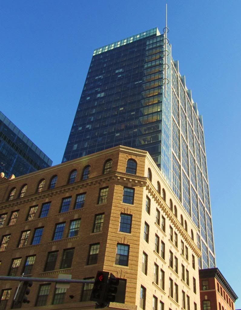
Does a modern building standing in strong contrast to its base, especially one with such starkly sloped faces really benefit from additional adornments including:
1. Multi-colored LED uplighting
2. Cocktail sword shaped spire, diminutive in scale
3. Large white grids over both sides
4. Bright white cap
I'd suggest these flourishes are what generally define "gaudy" (no pun intended) and often distinguish bad art. My guess is that these elements were added to an original design by the property owner or at the request of a City official.
From the archive:

Beton Brut
Senior Member
- Joined
- May 25, 2006
- Messages
- 4,382
- Reaction score
- 338
Re: Atlantic Wharf (formerly Russia Wharf)
"Anything less than the best is a felony..."
The scheme that was actually built was not the best. The earlier iteration with the V-braces was much more interesting. The gridded sides were resolved when they went around the corners.
"Anything less than the best is a felony..."
The scheme that was actually built was not the best. The earlier iteration with the V-braces was much more interesting. The gridded sides were resolved when they went around the corners.
- Joined
- Sep 15, 2010
- Messages
- 8,894
- Reaction score
- 271
Re: Atlantic Wharf (formerly Russia Wharf)
Damn, I forgot how nice the original was.
"Anything less than the best is a felony..."
The scheme that was actually built was not the best. The earlier iteration with the V-braces was much more interesting. The gridded sides were resolved when they went around the corners.
Damn, I forgot how nice the original was.
TheRifleman
Banned
- Joined
- Sep 25, 2008
- Messages
- 4,431
- Reaction score
- 0
Re: Atlantic Wharf (formerly Russia Wharf)
I like the base of the building but what you describe up above for Atlantic is exactly what I don't like.
4. Bright white cap is extremely annoying
Asked before completion, and asked again...
Does a modern building standing in strong contrast to its base, especially one with such starkly sloped faces really benefit from additional adornments including:
1. Multi-colored LED uplighting
2. Cocktail sword shaped spire, diminutive in scale
3. Large white grids over both sides
4. Bright white cap
I'd suggest these flourishes are what generally define "gaudy" (no pun intended) and often distinguish bad art. My guess is that these elements were added to an original design by the property owner or at the request of a City official.
I like the base of the building but what you describe up above for Atlantic is exactly what I don't like.
4. Bright white cap is extremely annoying
kz1000ps
Senior Member
- Joined
- May 28, 2006
- Messages
- 8,980
- Reaction score
- 11,798
Re: Atlantic Wharf (formerly Russia Wharf)
"Bright white caps" have been popping up more and more these past ten years, the earliest example I know of being the ex-Bear Stearns tower in Midtown Manhattan; another high profile case would be Philadelphia's Comcast Center. They almost all universally suck--Atlantic Wharf included--and are an affront to buildings that actually have some nuance to their nighttime lighting schemes.
"Bright white caps" have been popping up more and more these past ten years, the earliest example I know of being the ex-Bear Stearns tower in Midtown Manhattan; another high profile case would be Philadelphia's Comcast Center. They almost all universally suck--Atlantic Wharf included--and are an affront to buildings that actually have some nuance to their nighttime lighting schemes.
- Joined
- May 25, 2006
- Messages
- 7,034
- Reaction score
- 1,875
Re: Atlantic Wharf (formerly Russia Wharf)
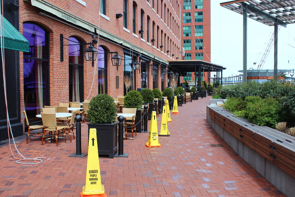
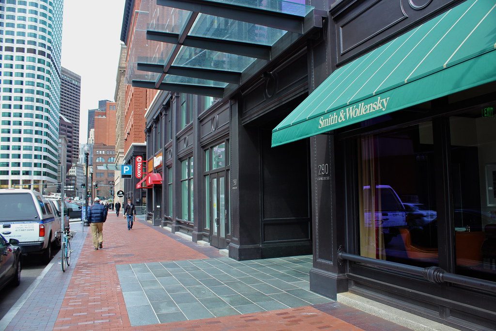
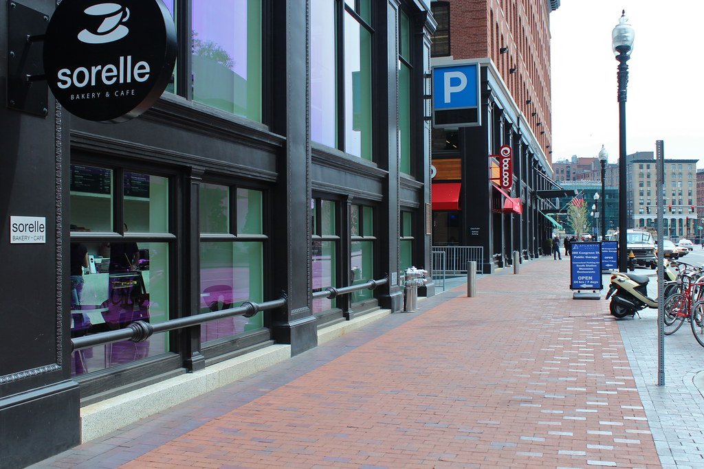
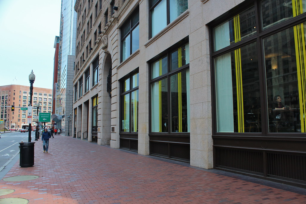
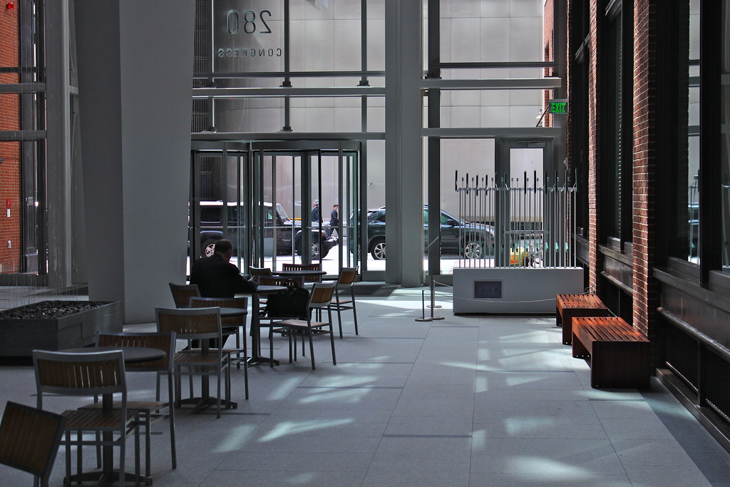
I finally walked around this building for the first time this weekend and I have to admit that the street level interaction between the new structure and the old buildings is really great. Also they did a VERY nice job on the renovations of the existing buildings. I still hate the tower section but I have to give credit where credit is due.
I finally walked around this building for the first time this weekend and I have to admit that the street level interaction between the new structure and the old buildings is really great. Also they did a VERY nice job on the renovations of the existing buildings. I still hate the tower section but I have to give credit where credit is due.
found5dollar
Senior Member
- Joined
- Aug 27, 2007
- Messages
- 1,149
- Reaction score
- 404
Re: Atlantic Wharf (formerly Russia Wharf)
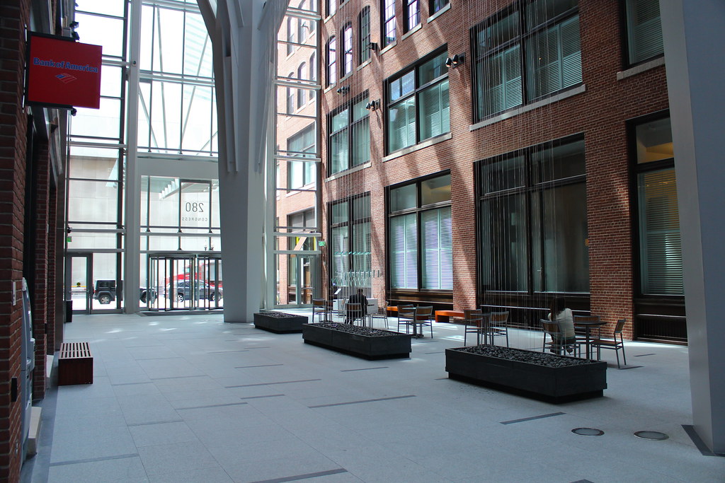
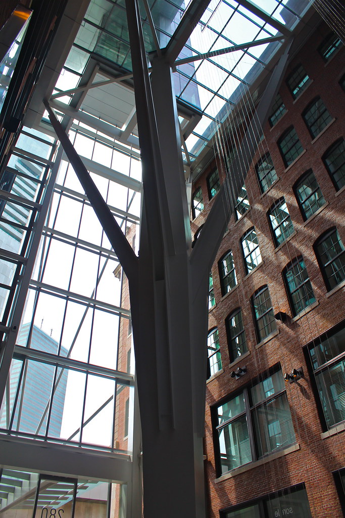
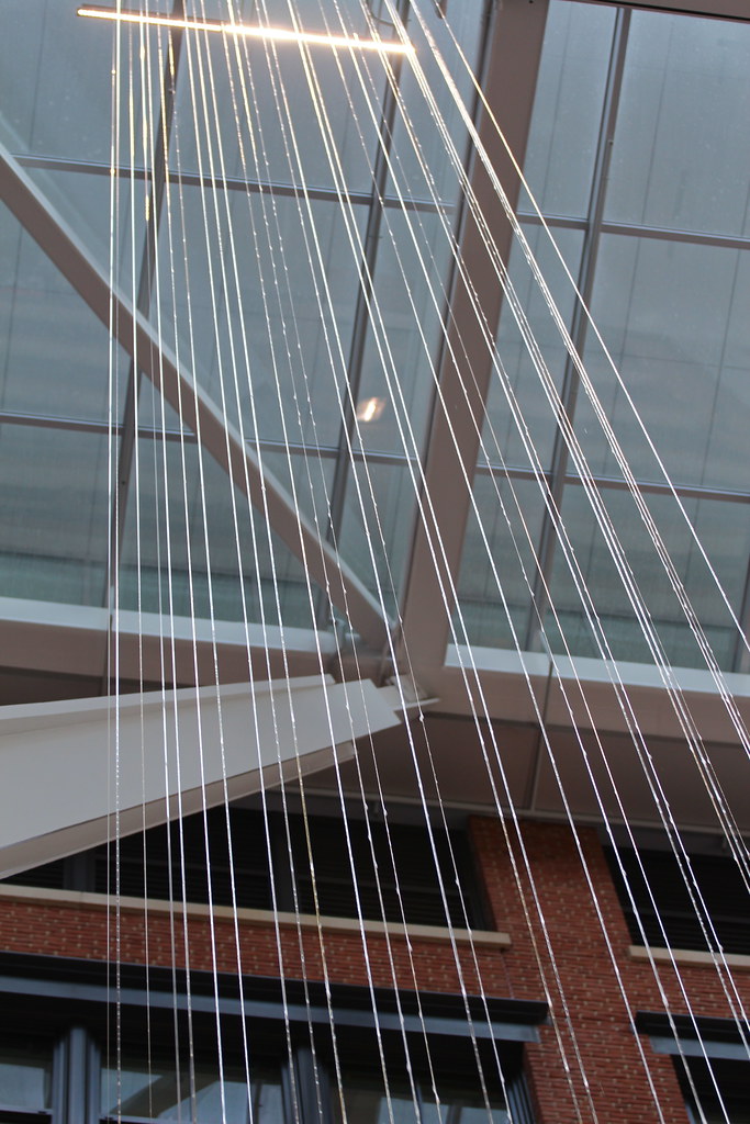
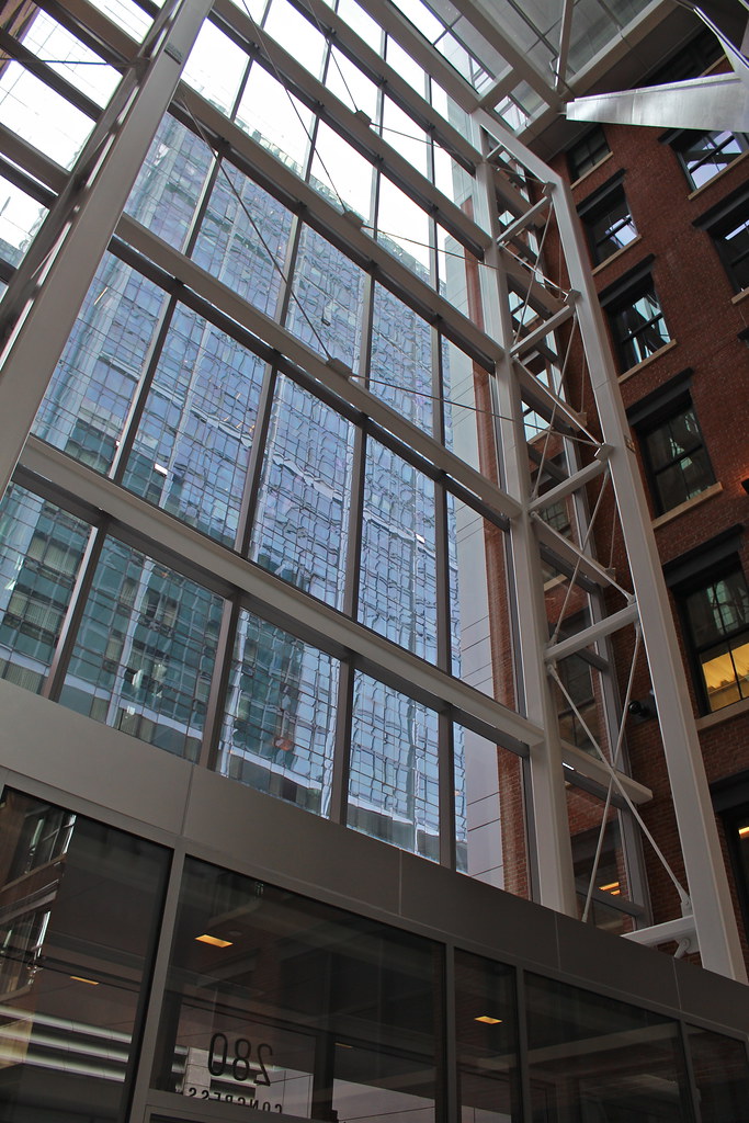
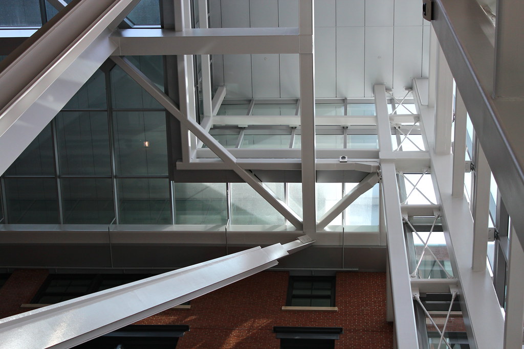
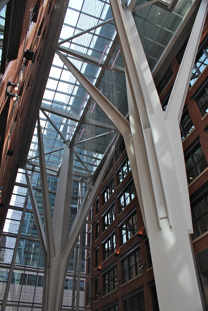
I love the sort of "elegant structural expressionism" of that lobby.
I love the sort of "elegant structural expressionism" of that lobby.
AmericanFolkLegend
Senior Member
- Joined
- Jun 29, 2009
- Messages
- 2,214
- Reaction score
- 248
Re: Atlantic Wharf (formerly Russia Wharf)
I wonder if the sidewalk is too narrow for outdoor seating on Congress.
I wonder if the sidewalk is too narrow for outdoor seating on Congress.
KentXie
Senior Member
- Joined
- May 25, 2006
- Messages
- 4,195
- Reaction score
- 766
Re: Atlantic Wharf (formerly Russia Wharf)
I think that might pull attention away from the RFKG, something that the BRA does not want.
I wonder if the sidewalk is too narrow for outdoor seating on Congress.
I think that might pull attention away from the RFKG, something that the BRA does not want.

