You are using an out of date browser. It may not display this or other websites correctly.
You should upgrade or use an alternative browser.
You should upgrade or use an alternative browser.
Atlantic Wharf (née Russia Wharf) | Atlantic Ave | Waterfront
J
Justin7
Guest
Re: Atlantic Wharf (formerly Russia Wharf)
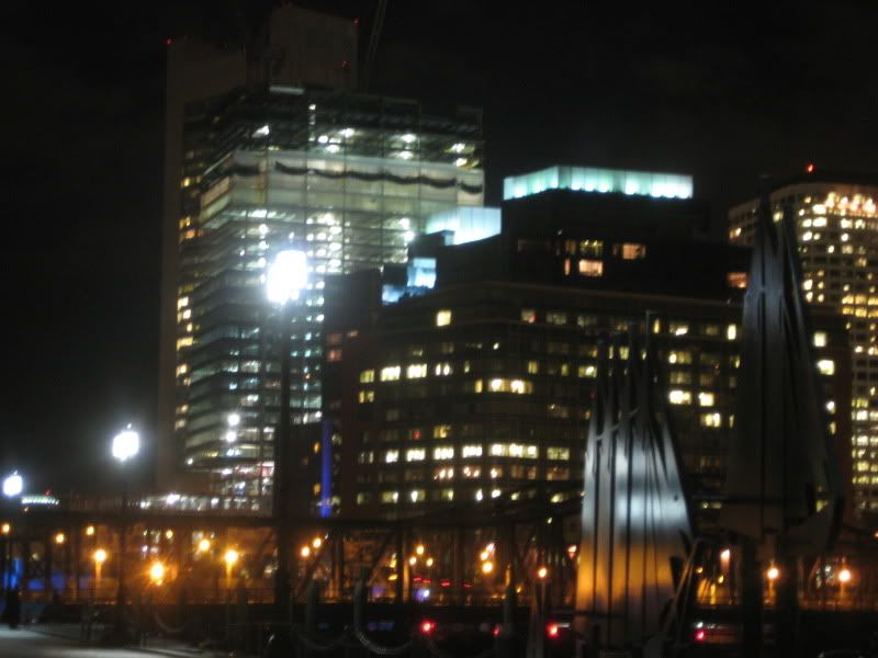
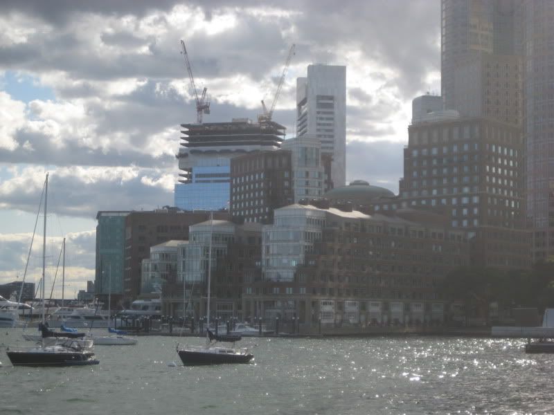
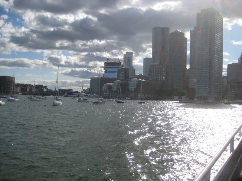
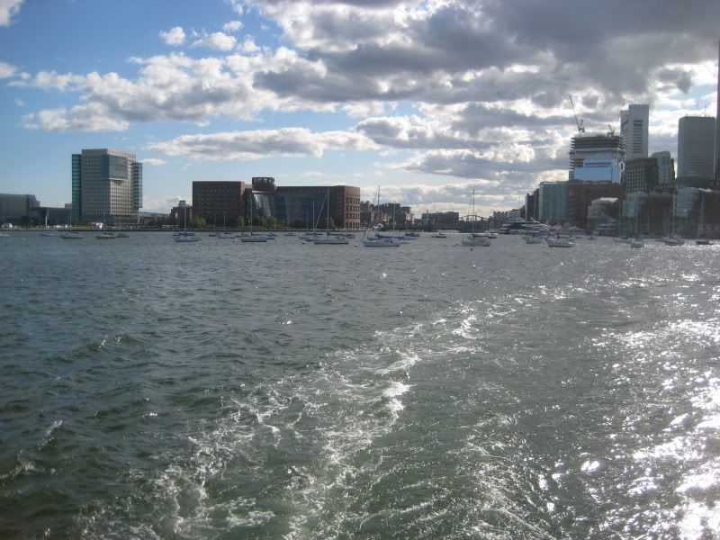
The glass in these pictures is the Intercontinental.
The glass in these pictures is the Intercontinental.
Suffolk 83
Senior Member
- Joined
- Nov 14, 2007
- Messages
- 3,021
- Reaction score
- 2,489
Re: Atlantic Wharf (formerly Russia Wharf)
This building wins in many other locations, its lost here. When this building is finished we're going to be saying... "If only it was 15 stories taller." Great location squandered. I wonder how many great locations are left that we can squander before the city wises up and realizes opportunities that don't come around every year.
This building wins in many other locations, its lost here. When this building is finished we're going to be saying... "If only it was 15 stories taller." Great location squandered. I wonder how many great locations are left that we can squander before the city wises up and realizes opportunities that don't come around every year.
kennedy
Senior Member
- Joined
- Feb 12, 2007
- Messages
- 2,820
- Reaction score
- 7
Re: Atlantic Wharf (formerly Russia Wharf)
Oops.
The glass in these pictures is the Intercontinental.
Oops.
Boston02124
Senior Member
- Joined
- Sep 6, 2007
- Messages
- 6,934
- Reaction score
- 7,068
Re: Atlantic Wharf (formerly Russia Wharf)
more pixs from today around the city
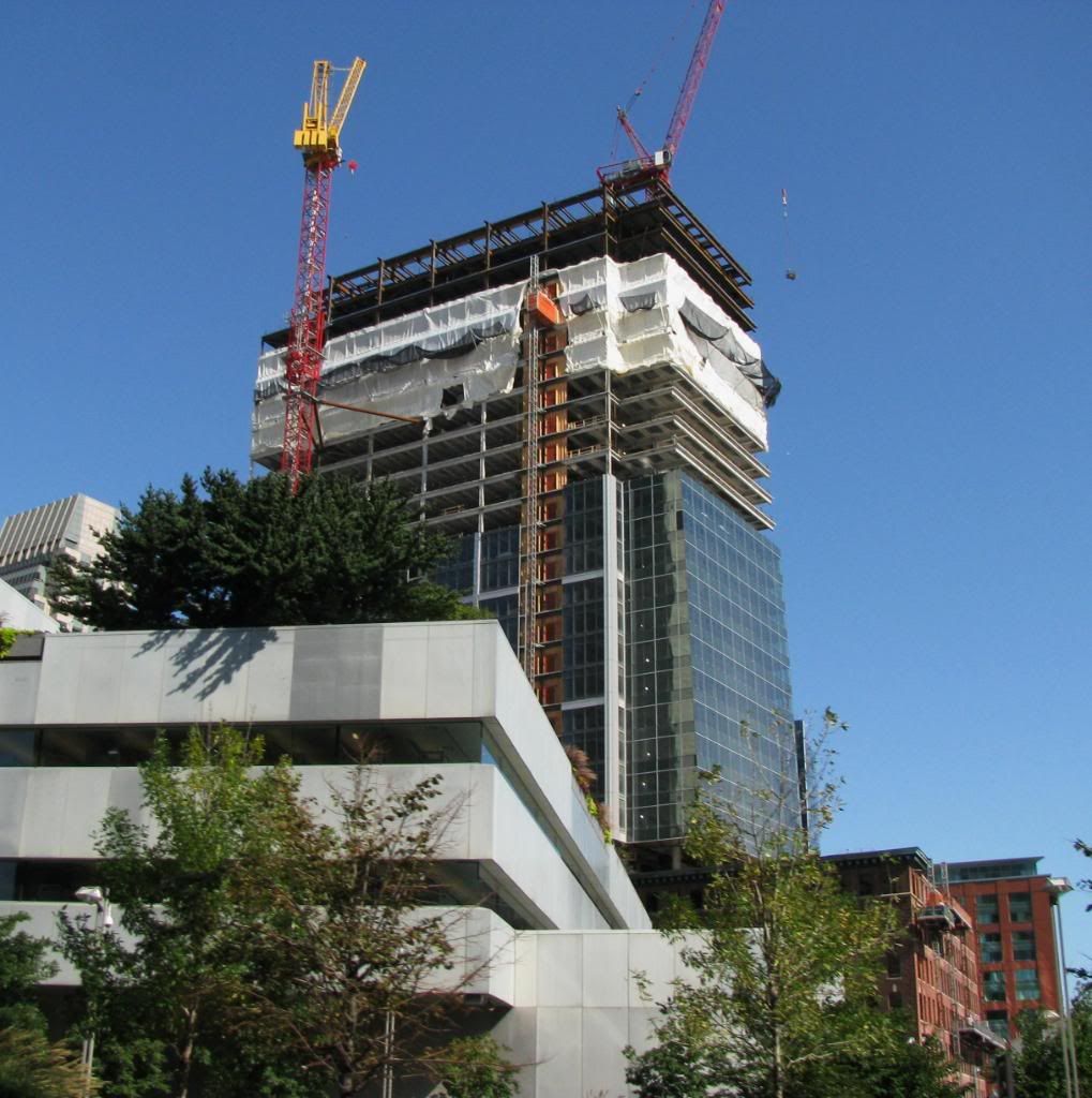
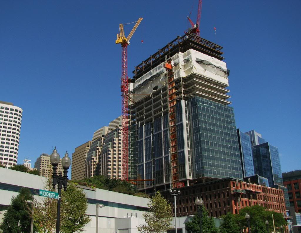
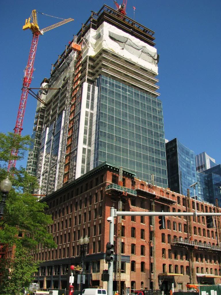
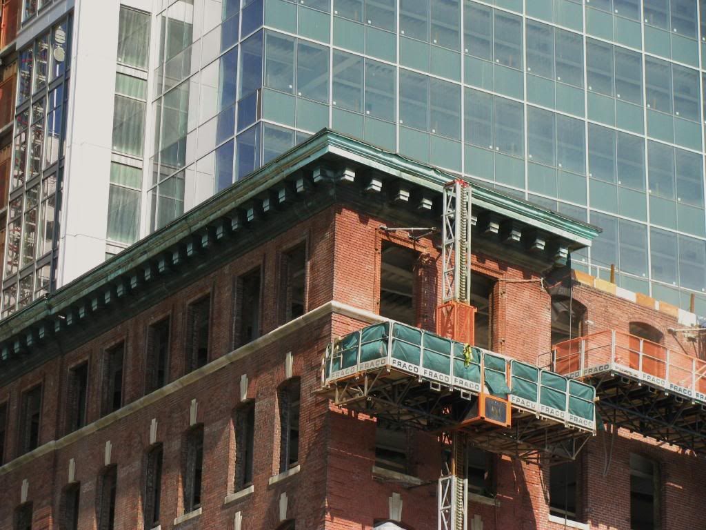
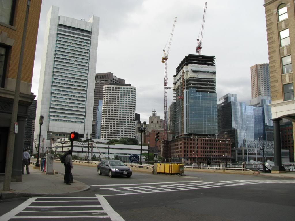

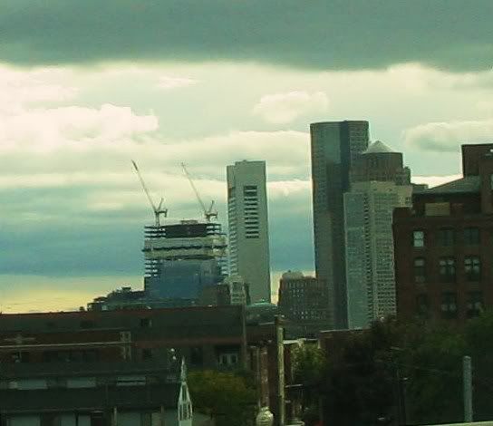


more pixs from today around the city


JohnAKeith
Senior Member
- Joined
- Dec 24, 2008
- Messages
- 4,365
- Reaction score
- 115
Re: Atlantic Wharf (formerly Russia Wharf)


- Joined
- May 25, 2006
- Messages
- 7,062
- Reaction score
- 1,976
Re: Atlantic Wharf (formerly Russia Wharf)
Great pics! Looking at that "design" I really think we would have been better off with a minimalist glass box with none of the extra "details" like that strange grid or random flag poll thing (in the renderings). The problem is the architects didn't have to balls to do such a thing, not in Boston anyway. The design we are left with is the most watered down snore fest on the Greenway (and that is saying something).
Great pics! Looking at that "design" I really think we would have been better off with a minimalist glass box with none of the extra "details" like that strange grid or random flag poll thing (in the renderings). The problem is the architects didn't have to balls to do such a thing, not in Boston anyway. The design we are left with is the most watered down snore fest on the Greenway (and that is saying something).
GMACK24
Active Member
- Joined
- Dec 29, 2007
- Messages
- 609
- Reaction score
- 2
Re: Atlantic Wharf (formerly Russia Wharf)
Taken yesterday from the "Break Room"
185 Franklin Street

Again go LARGE
http://www.flickr.com/photos/gmack24/3971090769/sizes/l/
Taken yesterday from the "Break Room"
185 Franklin Street

Again go LARGE
http://www.flickr.com/photos/gmack24/3971090769/sizes/l/
kennedy
Senior Member
- Joined
- Feb 12, 2007
- Messages
- 2,820
- Reaction score
- 7
Re: Atlantic Wharf (formerly Russia Wharf)
As the street level facade is being preserved, I don't think we can really complain too much. If the glass box went down to the street, we'd have a problem. But it doesn't, so as long as there are some decent tenants, this building is successful in my mind.
And personally, I don't mind the glass box. It's not great, it's not awful; it's not too detailed, it's not too boring. It's the Goldilocks tower.
J
Justin7
Guest
Re: Atlantic Wharf (formerly Russia Wharf)
I'm still loving this. The fact that I'm a huge sucker for just about anything which builds new on top of old may have something to do with it, but I honestly think they've done a nice job. The color of the glass in an entirely new building would likely be too dark and green, but it goes well with the brick. The whole thing looks nice.
It's not ground breaking or iconic (and we could certainly use something with those characteristics... garage projects please), but I think this building is close to perfect for it's location.
underground
Senior Member
- Joined
- Jun 20, 2007
- Messages
- 2,390
- Reaction score
- 3
Re: Atlantic Wharf (formerly Russia Wharf)
So you're suggesting the problem is that it's not enough of a glass box? How many pages of this website are taken up with criticisms of building's for being glass boxes?
So you're suggesting the problem is that it's not enough of a glass box? How many pages of this website are taken up with criticisms of building's for being glass boxes?
JohnAKeith
Senior Member
- Joined
- Dec 24, 2008
- Messages
- 4,365
- Reaction score
- 115
Re: Atlantic Wharf (formerly Russia Wharf)
Who knows the details on this project? The building in front is not the building on which the new high-rise is built, right? It's behind that, based on what I've seen. The building in front (with the Menino banner) is also being renovated but is it the same developer?
Who knows the details on this project? The building in front is not the building on which the new high-rise is built, right? It's behind that, based on what I've seen. The building in front (with the Menino banner) is also being renovated but is it the same developer?
tmac9wr
Senior Member
- Joined
- Jun 14, 2006
- Messages
- 1,446
- Reaction score
- 68
Re: Atlantic Wharf (formerly Russia Wharf)
At first glance, I thought that was a pic of Fan Pier! haha
The lighting on the white building in the background makes it almost look precast, which is what confused me.
Is anyone else seeing this?
At first glance, I thought that was a pic of Fan Pier! haha
The lighting on the white building in the background makes it almost look precast, which is what confused me.
Is anyone else seeing this?
- Joined
- May 25, 2006
- Messages
- 7,062
- Reaction score
- 1,976
Re: Atlantic Wharf (formerly Russia Wharf)
I'm saying it doesn't have the balls to be a pure glass box and tries to dampen the effect by adding all these useless elements that do nothing for it.
So you're suggesting the problem is that it's not enough of a glass box? How many pages of this website are taken up with criticisms of building's for being glass boxes?
I'm saying it doesn't have the balls to be a pure glass box and tries to dampen the effect by adding all these useless elements that do nothing for it.

