Atlantic Wharf (née Russia Wharf) | Atlantic Ave | Waterfront

Re: Atlantic Wharf (formerly Russia Wharf)

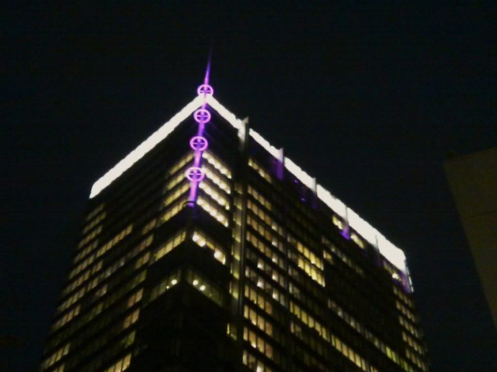
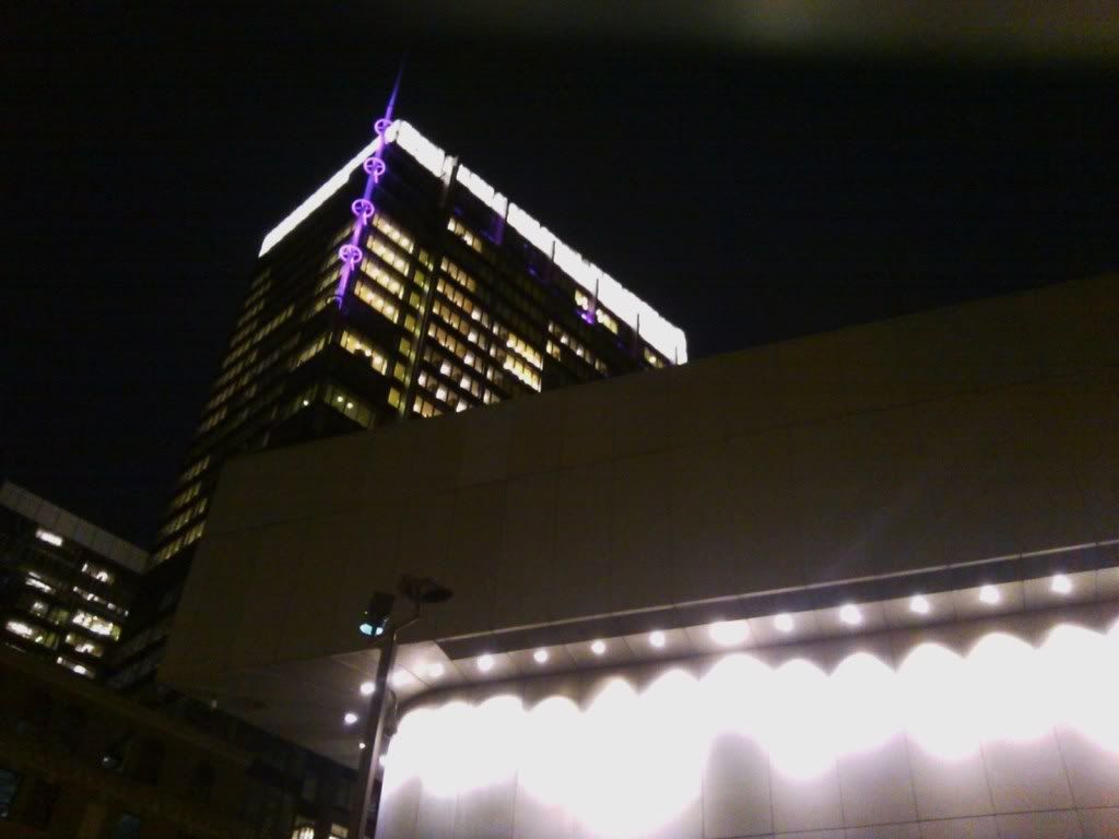
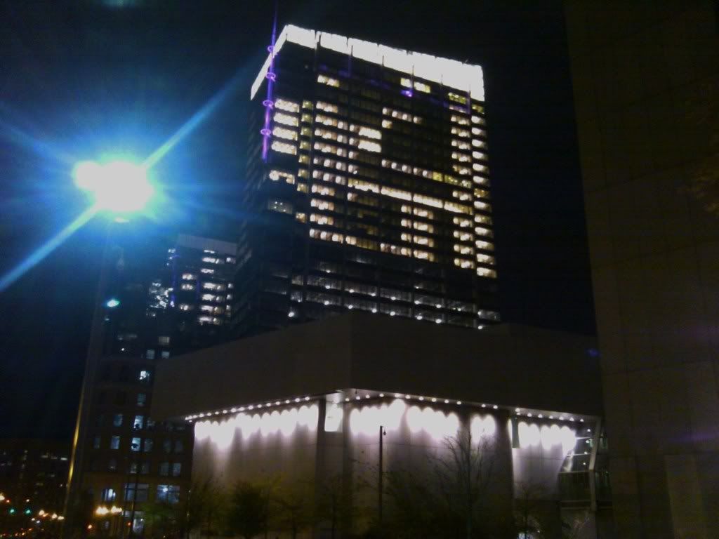
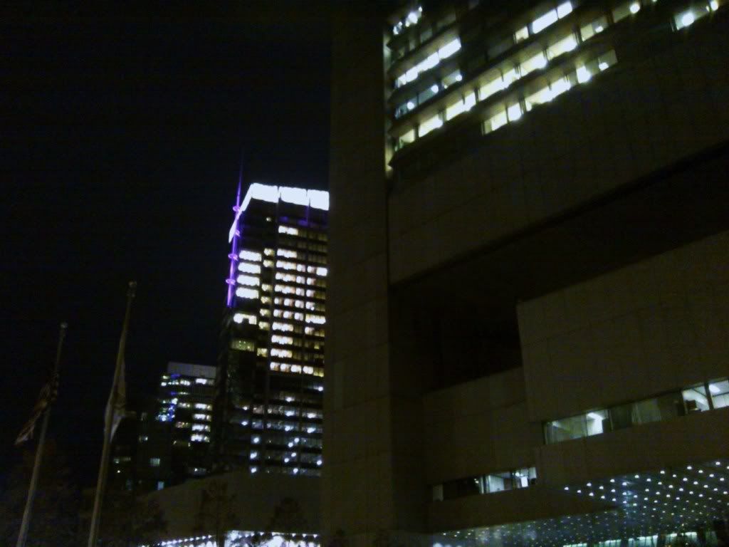
some I took tonite w/my cell phone(my camera is on the mend)
IMAGE_210.jpg
IMAGE_213.jpg
IMAGE_216.jpg
IMAGE_217.jpg
IMAGE_219.jpg
this one needs more lighting added
IMAGE_220.jpg
IMAGE_221.jpg
IMAGE_222.jpg
IMAGE_223.jpg
 
Re: Atlantic Wharf (formerly Russia Wharf)

Fenway park + clouds = lots of ground level light in the whole neighborhood.

Not a bad thing at all, downtown could use that efefct as well.
 
Re: Atlantic Wharf (formerly Russia Wharf)

I was hoping it'd be a bit more colorful. I really dislike that the bottom bit of the spire isn't lit and I think the roof needs to be toned down a bit, though I'll reserve that judgement for when the building is photographed on a clear night and doesn't have low-level clouds reflecting back down on it.

I long felt that the Boston skyline was way too dark so this does help brighten a bit. But the roof might be going a bit too far. I think a dark skyline contributes to a feeling of a sleepy city. I know that's not necessarily the case, but where I live in Toronto, I can walk a few blocks and get a great view of downtown at night. And despite the fact that I know some of those blocks in the Financial District are a dead as any you'd find at the same time in Boston, the fact that the buildings either have logos or some other lighting feature, it gives a bit more light and a feeling of vibrancy, even if it is just an illusion. Decorative lighting just contributes to the effect of something's happening. Again, it may not be rooted in reality, but it's an impression I get.

Do the colors stay the same? I notice that in some, the spire was blue, and in the others, purple. Do they stay the same and change nightly or do they periodically change throughout the course of the night?

Anyway, thanks for the nighttime photos, guys. I've wanted to see this lit up for a while. Now that I have, I'm a bit underwhelmed. The roof was a surprise, but I think this misses the mark just a bit. A little tinkering and it should be a nice addition to the nighttime skyline and does help to brighten the city a bit.
 
Re: Atlantic Wharf (formerly Russia Wharf)

^I agree. Night shots of the skyline, or time spent on the harbor at night looking towards the city leave an empty feeling. A more diverse and colorful skyline could benefit Boston IMO. Did anyone grab pictures of the Pru lit up on Veteran's Day? It rotated red white and blue and looked great!

boston-city-tours.jpg


san-diego-skyline.jpg
 
Re: Atlantic Wharf (formerly Russia Wharf)

I think what it also does is provide a focal point and helps to delineate buildings, rather than them almost look like one when viewed from afar. For instance, in the first photo above, despite the JH being the tallest building, my attention is immediately drawn the Pru and 111 Huntington due to the lighting.

I'm not sure that the new "Atlantic" Wharf can be that focal point completely on it's own, given it's relatively low stature on the skyline. Also, I'm afraid that it being so bright it may overwhelm, rather than complement the lighting on IP, One Lincoln (possibly my favorite with the strips of blue) and, most importantly, the Custom House. I fear it washes out the more subtle lighting elsewhere. That's why I'd like to see the roof lighting toned down a bit, so the colors along the side can be more noticeable.

On a related note, I'm sad no lighting (either in the form of a logo or just some rooftop lights) ever replaced the old STATE STREET BANK sign on 225 Franklin. That's one case where the city actually got darker in recent years.
 
Re: Atlantic Wharf (formerly Russia Wharf)

I think the blank walls on the Fed building could use some good lighting. Colors might be a bit cheesy, but some nice white lights reflecting off those walls would be nice.

What's it made out of anyways?
 
Re: Atlantic Wharf (formerly Russia Wharf)

Colored lights? Come onnnn!!! We're not Atlanta....
 
Re: Atlantic Wharf (formerly Russia Wharf)

So Boston has to have dull lighting then?

It's the typical Boston dilema... We have to complain about how we wish Boston had X/Y/Z compared to other cities, but when something new is actually built here, it is an assault on what it means to be 'Bostonian'.

Personally, I think they should have pushed the lighting design further.
 
Re: Atlantic Wharf (formerly Russia Wharf)

Personally I feel like the attitude many Bostonians are no different than the Chinese isolationist back in the late 1800s. Looking down on other cities, refusing to acknowledge superiority in certain aspects, and keeping the status quo.
 
Re: Atlantic Wharf (formerly Russia Wharf)

^ Boston has actually been this way since it was surpassed by New York in the 1790s.

It's only really ever looked up to Paris - the one thing its 19th century architects agreed on was the need for more mansard roofs - and it seems to be going the same way (let's see...static, ca. 1880 museum of a city center, with a ghastly 20th century Corbusian intervention here or there - out of deference to overacademic leaders' genuflections to abstract principles like "reason", crime and minorities shoved out of the way in inaccessible banlieues like Dorchester and Lynn). It almost makes you wonder how Boston managed to fall short in some respects. It could have at least saved the old financial district and banished all those 1960s boxes to a La Defense in, say, Kendall Square.
 
Re: Atlantic Wharf (formerly Russia Wharf)

Boy would that have been wonderful, if they had banished all the 1960s boxes to a specific area. But funny enough, the adherence to tradition in a way destroyed the traditional. In all of the planning of that time, the goal was to keep the financial district in its traditional place downtown, and to keep city hall in its traditional place downtown. So they kept the wrong tradition--place--and discarded the right tradition--style--and ended up demolishing much of Boston and replacing it with stylistically inappropriate buildings.
 
Re: Atlantic Wharf (formerly Russia Wharf)

While lighting may be a subjective issue, the number of animated, multi-color LED uplit crowns on so many recent buildings can't be seen as a positive trend.

Within sight of each other these include Atlantic Wharf, One Marine Park Drive, Rennaissance Hotel, Westin Hotel. Maybe others?

As for Atlantic Wharf, just like bad op-art it has just too much going on. Once the architect was faced with the design of a modern building standing atop an older facade, why was a large white grid, a multicolor spire, an upper grid portion lit by colored LEDs, and the high-power white lighting on the roof all necessary? I suppose even if one liked the architecture (which I personally don't) wouldn't a modestly lit white roof have sufficed as an adornment?

Admittedly, I'm not a fan of this project on many levels -- starting with the process by which it's original owner went about doing business to gain approvals, later trimming back on the public realm obligations. From what I understand is planned, we'll have the "Town Square" office building lobby and public media galleries in second-tier spaces above the ground floor. Far from what was presented in years 1-3. Nice to know the BSA secured their new digs in the process.
 
Re: Atlantic Wharf (formerly Russia Wharf)

Within sight of each other these include Atlantic Wharf, One Marine Park Drive, Rennaissance Hotel, Westin Hotel. Maybe others?

And despite this, Boston hasn't exactly started to resemble some garish Las Vegas-meets-Hong Kong, so I don't think it's worth getting up in arms over.
 
Re: Atlantic Wharf (formerly Russia Wharf)

For my money, I'd love to see some interesting lighting on City Hall's brise soleil.
 
Re: Atlantic Wharf (formerly Russia Wharf)

Lighting is the reverb of architecture. Gives Depth.
 
Re: Atlantic Wharf (formerly Russia Wharf)

The "Light Boston" site is super; love seeing so many landmarks illuminated! Frankly, Boston is just now playing catch-up to what many other cities worldwide have been doing for years now, that is, illuminating their monuments and landmark buildings! It's a trend I'm happy to see!
 

Back
Top