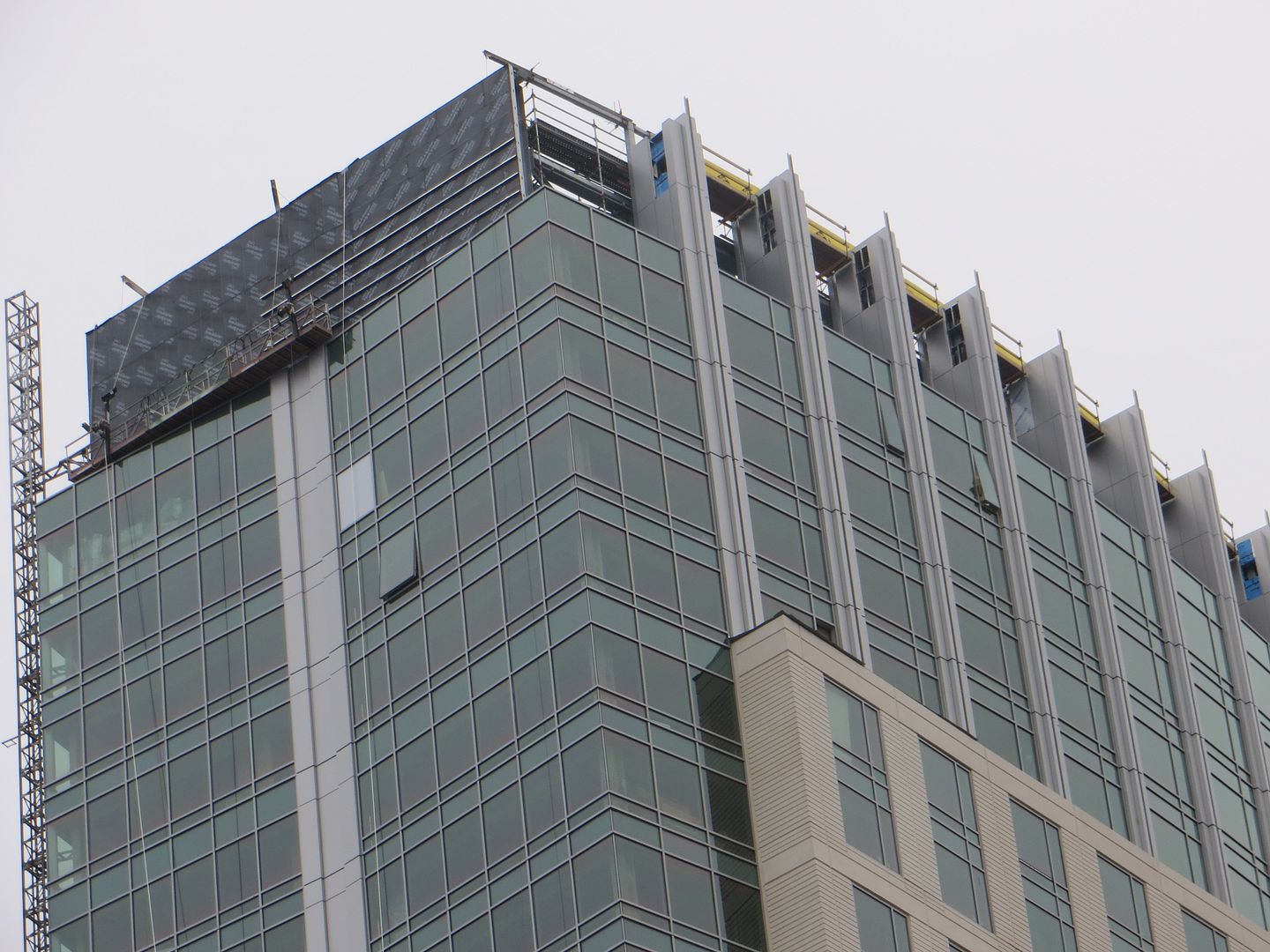
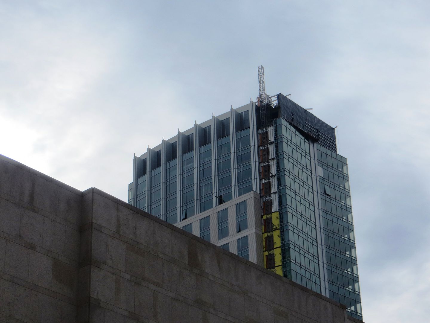
Avalon Exeter | 77 Exeter Street | Back Bay

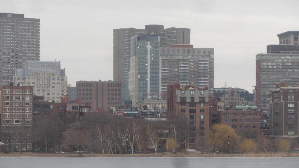
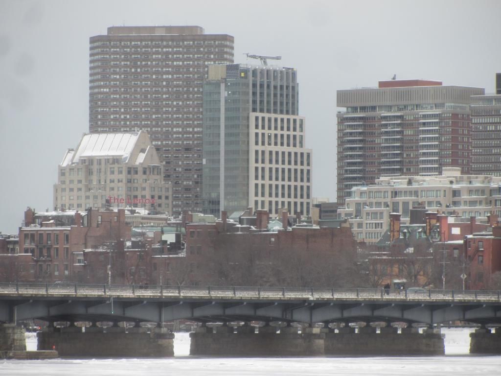
There are many fine qualities in the design of this building. Two things that I appreciate: a) how the texture of the precast [unfortunately the aforementioned texture is invisible in this picture] complements the texture of the facade of Lenox; and b) the Lenox now has a friend on Exeter St.

138_5054.jpg
Lenox+Lobby.jpg

TheLenoxHotel2.jpg


The Lenox while a frequently ignored mid-sized hotel is one of the finest hotel buildings in Boston -- great attention during the intial construction was paid to both the exterior and the interior common areas. Since the initial period, its been renovated several times and each time the work has preserved and sometimes even enhanced the basic structure.

What is the secret?

1) it was built in the era of Symphony Hall, Horticultural Hall, South Station by someone with taste -- Lucius Boomer in 1900 -- he also built the Waldorf Astoria in NYC
2) becomes known as the home in Boston of the famous and those who want to be treated like them -- Enrico Caruso, Judy Garland
3) Since 1963 -- for 50 years it has been owned and operated by one family as their signature property

We need a few more Lenox's -- where an individual or a family invests in the property for the long-haul and treats the building as the family jewels
 
Last edited:
Hear, hear!

One thing we can all agree on, Trinity Place should be torn down.
 
I really like this one, and think it would have been an incredible addition to the skyline at ~600 ft or so, right around Copley Tower height. Its still nice, but at its current height it will blend it more to its surroundings than stand out.
 
I think it's perfectly great on the scale it's at--really perfect. I think anything aspiring to 600' should be trying to make a statement and I don't think this can carry those expectations (not that most the other 600-footers on the drawing boards capture the imagination).
 
I think it's perfectly great on the scale it's at--really perfect. I think anything aspiring to 600' should be trying to make a statement and I don't think this can carry those expectations (not that most the other 600-footers on the drawing boards capture the imagination).

Tomb -- I think that the "Statement" depends on where

If you have other 600-ers' near by such as the Financial District the "Statement" is less critical than if you are hanging-out by yourself or if you become a key part of a linear skylines view such as the "High Spine" from across the Charles @ MIT

Thus the top few floors of the Millennium Tower are less critical than the Christian Science Tower or the Copley Place Tower
 
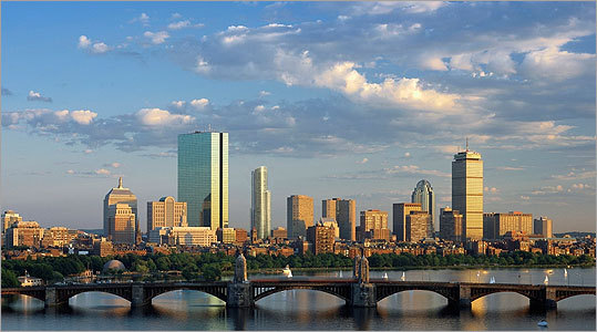
^ At the same time though the millennium tower is going to create a peak and focal point for the downtown skyline when viewed from across the charles/MIT so I would argue that the top few floors are probably more important on the millennium tower because it will be the tallest tower in that view. The copley tower will still be trumped by the hancock that is right next to it. Filenes tower will create a focal point sort of how LA has the US Bank Tower as the tallest in a cluster of many similar height buildings........woops back on topic, I cant wait until the crown on this is finished and we get to see what this thing will really become.

19540520_BG1.jpg


copley1__1313524772_5743.jpg
 
I agree MT will be the dominant tower downtown when viewed from the park or coming 93 N. The problem is that those are two vantage points of the city it will be most dominant. CPT will be viewed from every angle and will fill a gap that the city had since JH and the Pru rose say 40 year hole! Whenever there are "glamour shots" of Boston there from the Charles or the Seaport. Downtown has changed drastically in 30 years the Back Bay.. not so much Who knows maybe MP will create a new glamour shot to have the city viewed as a whole.

Oh and thanks curbed Boston of great glamour shots of AE
http://boston.curbed.com/archives/2014/01/mandarin-oriental-terraces.php
:)
 
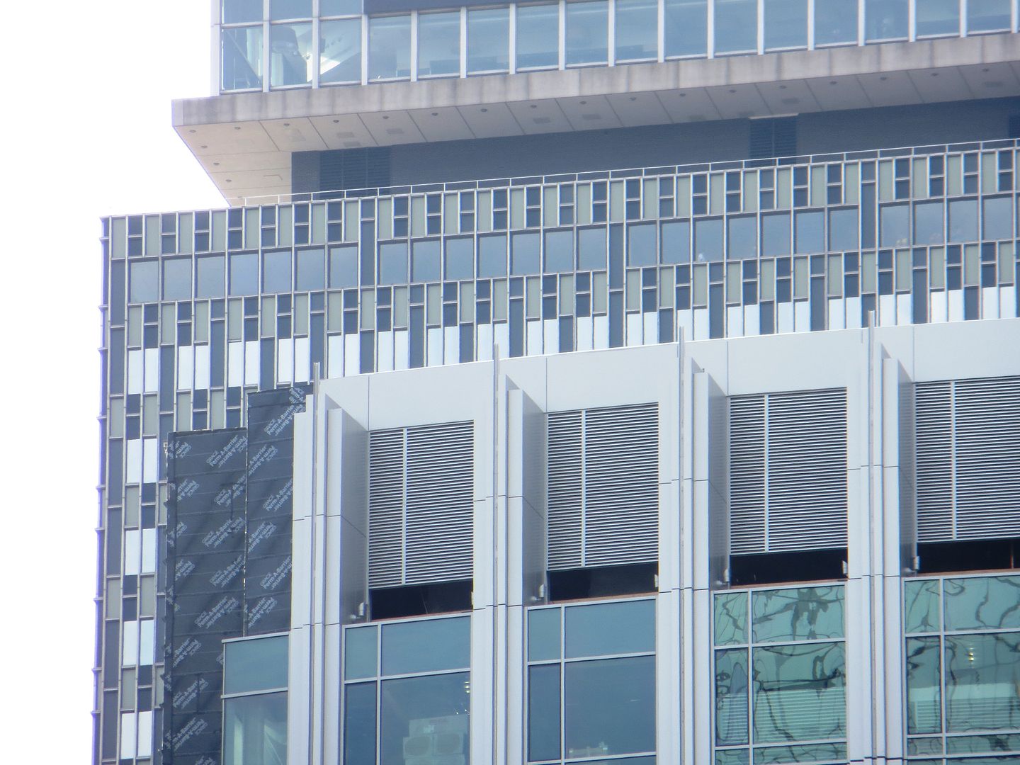
I like the way this building turned out. Decent proportions and a simple but mostly elegant design. The gray strip on the side is a bit wonky: although I like it more with it than without it I just think it could have been executed a bit better
 
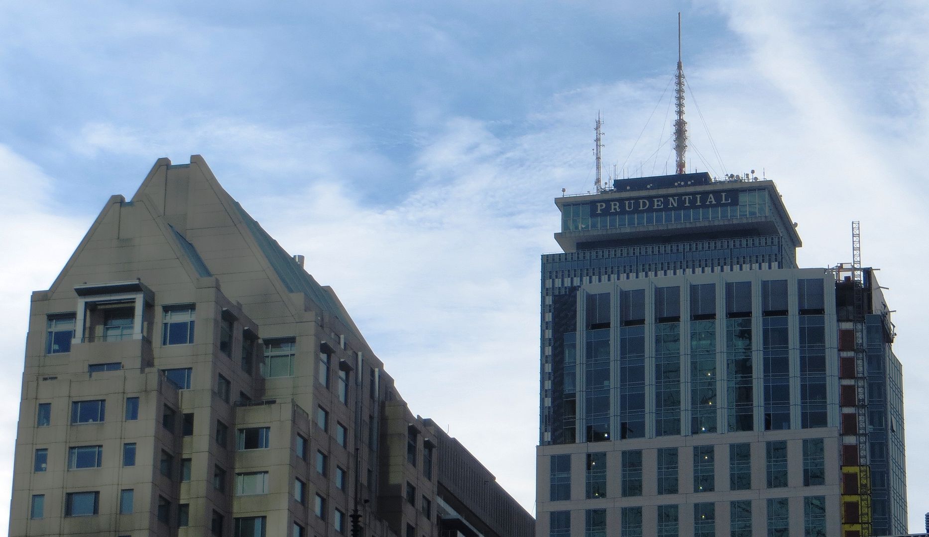
I really like this one too. Just like , it is elegant and fits right into the existing skyline.

If they could leave the side crane and convert it into a spire, that would be a bonus.
 
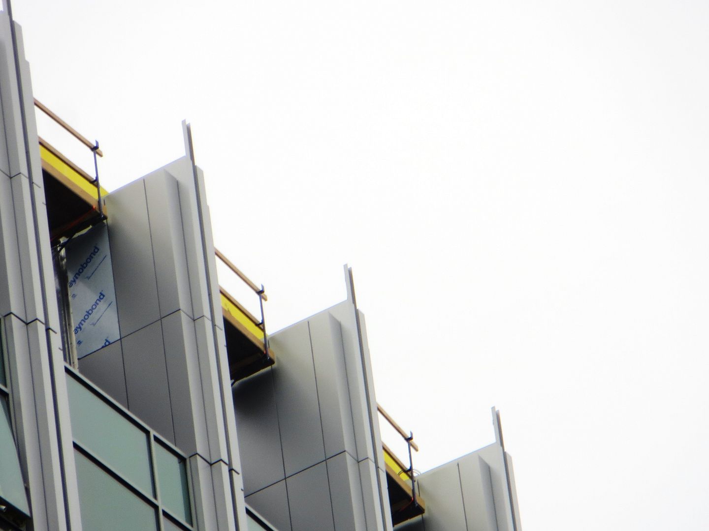
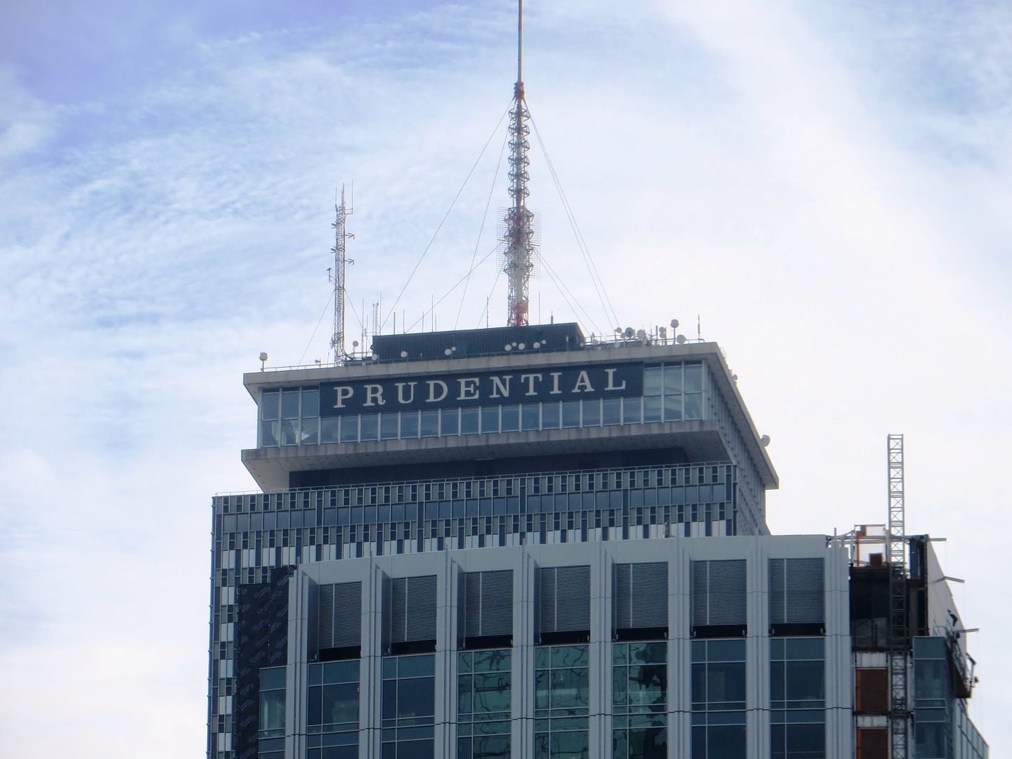
Finally! The top looks much better with those final details implemented. The small details such as the vertical strip in the vents really pulls this project together.
 
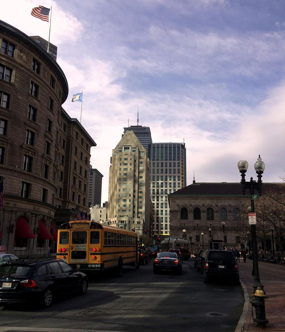
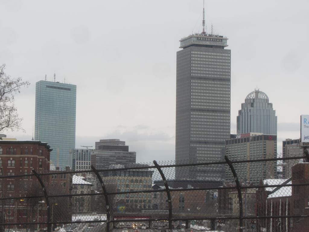
This project is nice and fits in real well- standing out just enough to cover some of the other horrible towers in between the hancock and pru but not enough that you are really drawn to it. I hope avalon's jacob writh project has a similar result and impact on that portion of the skyline (looking at you Kensington).
 
Now THAT is how you integrate louvers into the design.
 
Not a wildly impressive building in most respects, but one of the most understatedly refined and contextually satisfying buildings I've seen built in Boston in the three years I've lived here. More please.
 
Oh wow, that top really lifts. Imagine if the whole tower had the top's sense of verticality.
 

Back
Top