You are using an out of date browser. It may not display this or other websites correctly.
You should upgrade or use an alternative browser.
You should upgrade or use an alternative browser.
Avalon Exeter | 77 Exeter Street | Back Bay
- Thread starter quadratdackel
- Start date
stick n move
Superstar
- Joined
- Oct 14, 2009
- Messages
- 12,066
- Reaction score
- 18,807
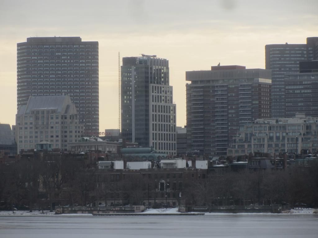
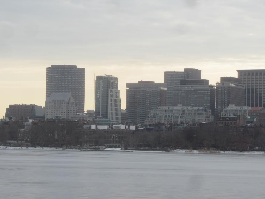
Good filler building, not ugly, adds some glass to the boring back bay skyline, id say its a win.
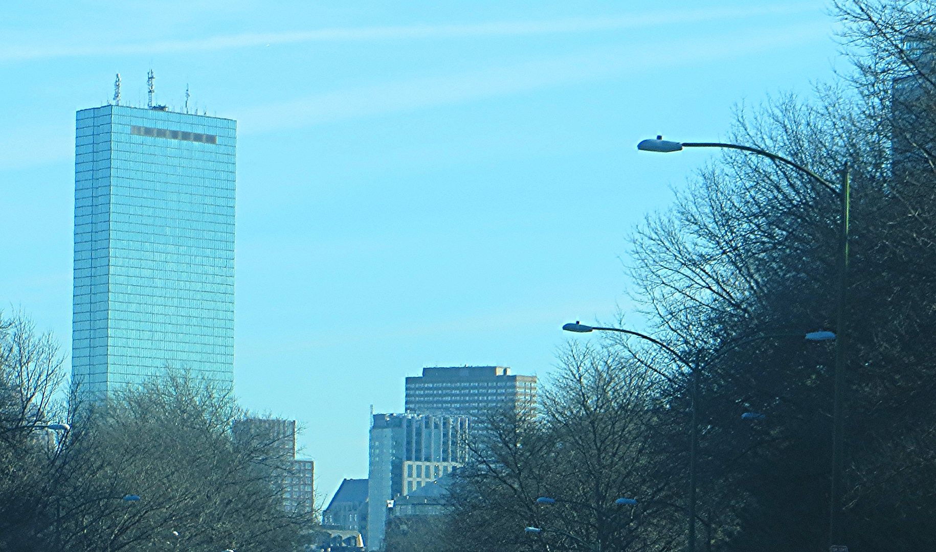
^^^Yes!!! Green Pru!!! I was staring at it last night. Probably the best color, although I have been a fan of most of the new lighting on it. This is great filler as we await the larger towers to come. The Back Bay is going to have a heck of a skyline in a few years!
whighlander
Senior Member
- Joined
- Aug 14, 2006
- Messages
- 7,812
- Reaction score
- 647
Red Pru > Green Pru
All Thanks to the technology developed by a local company -- Phillips Lighting [formerly Color Kinetics] located in Burlington on Rt-128
Hoping that this trend spreads to more tops of buildings -- particularly for Holidays
Czervik.Construction
Senior Member
- Joined
- Apr 15, 2013
- Messages
- 1,932
- Reaction score
- 1,162
Is that lit up crown on the Pru permanent or just for NYE? That would great if they did what NYC did on the top of the Bank of America tower and had the changing lights on the spire going to midnight every night.
One from New Years Eve:

- Joined
- Sep 15, 2010
- Messages
- 8,894
- Reaction score
- 271
Is that lit up crown on the Pru permanent or just for NYE? That would great if they did what NYC did on the top of the Bank of America tower and had the changing lights on the spire going to midnight every night.
December is special because the Shops at Prudential Center sponsors the 31 Nights of Light (different colored lights each night representing charities), but throughout the year the Pru is often lit in various colors.
Boston02124
Senior Member
- Joined
- Sep 6, 2007
- Messages
- 6,893
- Reaction score
- 6,639
gooseberry
Active Member
- Joined
- Nov 24, 2009
- Messages
- 550
- Reaction score
- 3
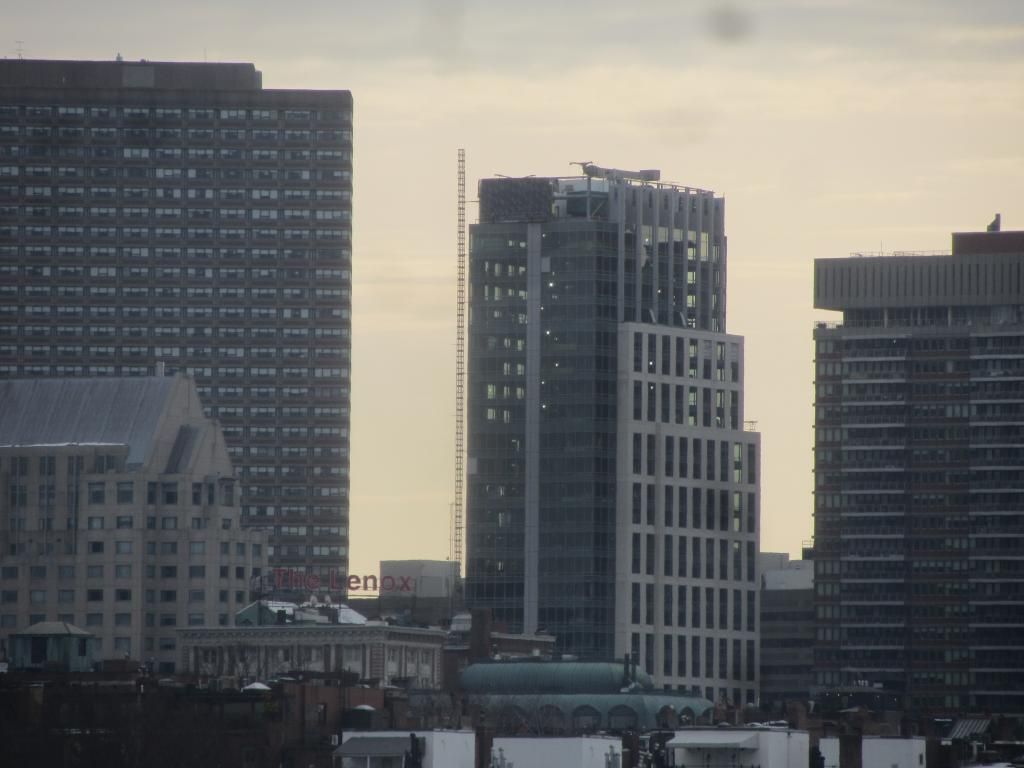
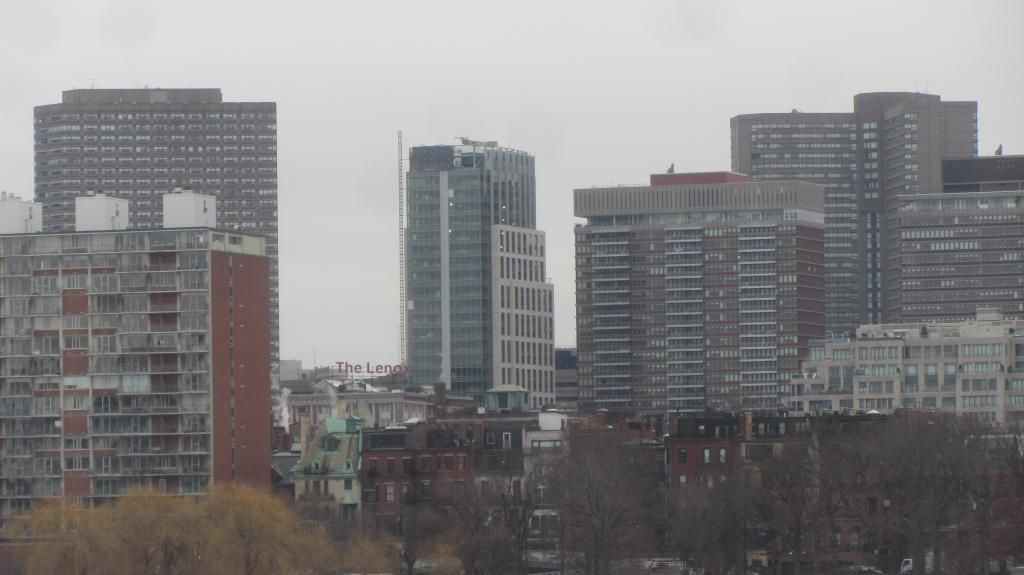
There are many fine qualities in the design of this building. Two things that I appreciate: a) how the texture of the precast [unfortunately the aforementioned texture is invisible in this picture] complements the texture of the facade of Lenox; and b) the Lenox now has a friend on Exeter St.


- Joined
- Sep 15, 2010
- Messages
- 8,894
- Reaction score
- 271
I really want to like this building, but I just can't for some reason. Something just feels off to me. The proportions of the facade are a bit wonky. The colossal order definitely plays into it. This building is simply afraid to show that it is tall, despite it standing right next to the Pru and 111 Huntington. I like the building much more at night when the floors are lit individually and the colossal order of the facade is less noticable. It looks so much taller.
fattony
Senior Member
- Joined
- Jan 28, 2013
- Messages
- 2,099
- Reaction score
- 482
The 2 short sides of this building are much more attractive than the broad sides.
The glass end gives up the colossal order and would be completely forgettable except for the bold vertical stripe. Its a strong contrast, but not uncomfortable to look at like the broadside.
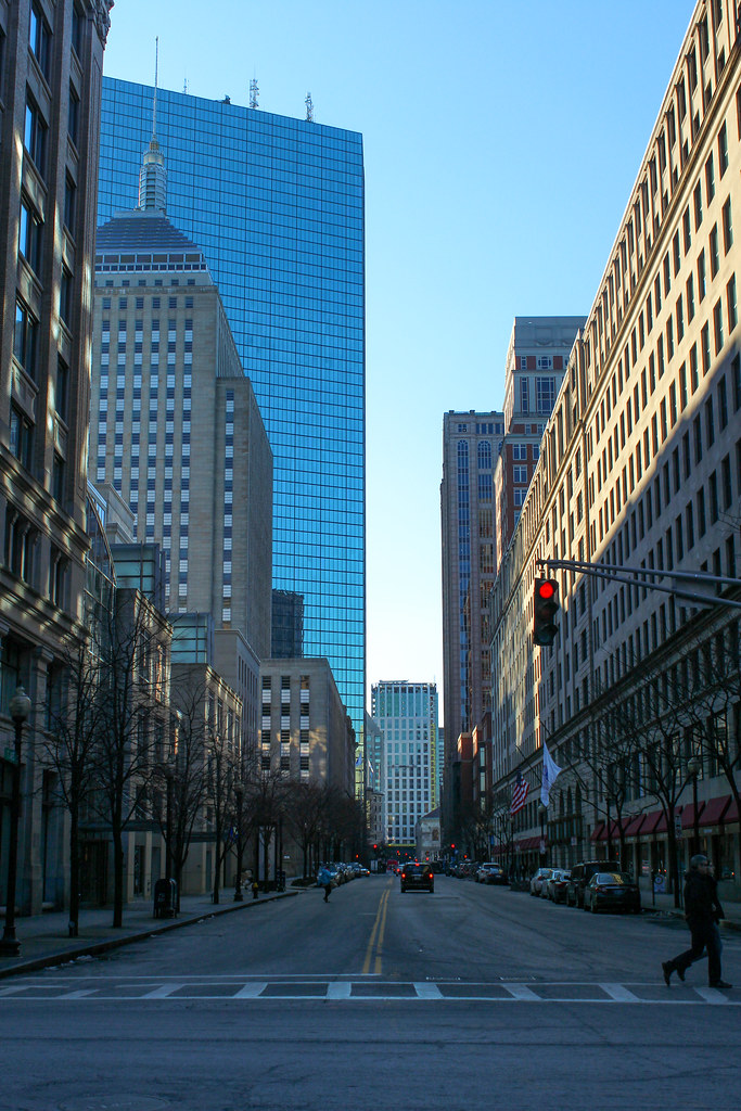
On the other short side, the slender width combined with the tall windows give a smooshed-in and stretched-up look that draws the eye up until you reach the nicely proportioned setbacks near the top with forced perspective making the building look even taller. Art deco light?
See what I mean from this angle:


