Avalon North Station | Nashua Street Residences | West End

The only thing that bothers me is the color of the mechanical screen.
 
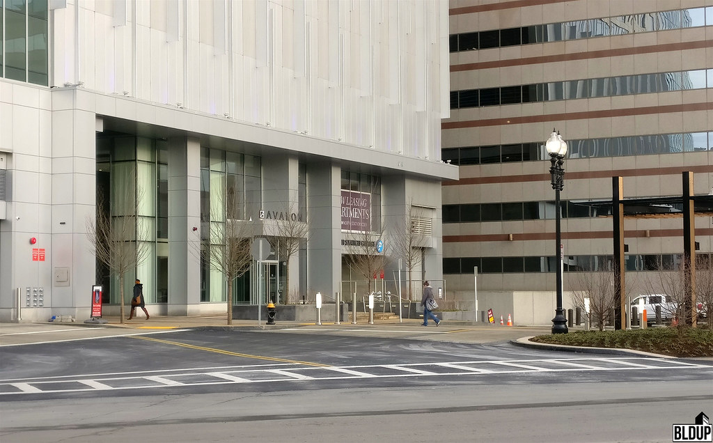
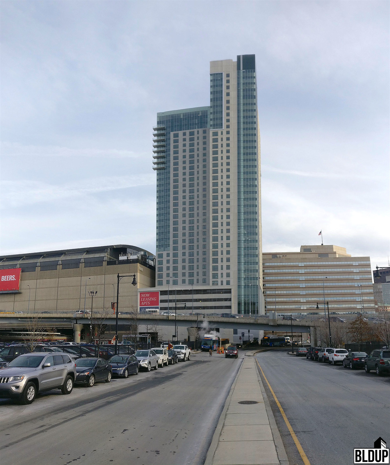
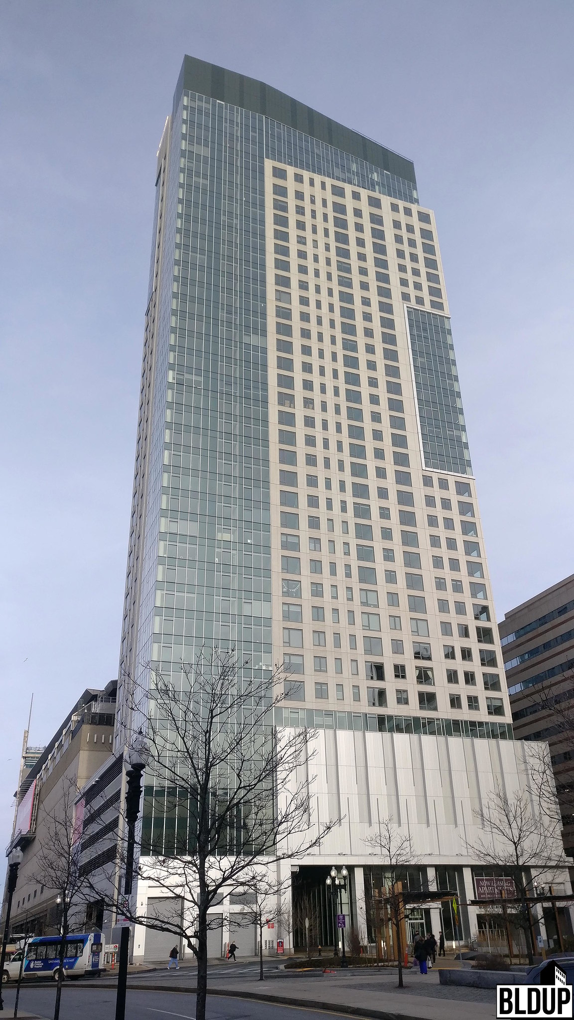
I gotta say I like this. It's strange because it isn't far off from a lot of what's gone up in Chinatown which has been less successful. The girth of the thing actually helps. It's not dramatic but it works well.
 
It has almost everything that usually makes a dud. White precast, podium parking garage, gimmicky boxes around windows, weird shape, random balconies, but somehow it all ties together and comes out good. I feel like 88 ames st is about to be the same, good architects can make average materials look good.
 
We need 10 more towers like this. Reasonably priced market rate housing.

Not to mention sitting on top of a transit hub.

Bulfinch Crossing residential tower is apartments, and on a transit hub...is it the next version of this?
 
^ seems like it, remember theres two towers going in there and they both seem to be pretty similarly cheap enuogh but effective designs.
 
It's a great building, but a TOTAL FAILURE!!! until they open up the Tasty Burger they promised me.
 
It looks almost the same to me. It is the same color and the pattern of clear and opaque glass seems really similar.
 
I think we can all agree this was a success.

It speaks to the glacial pace of architecture in Boston these days that you can build something that looks like it went up 15 years earlier and it's considered cool and good.

I can't imagine a 1975 design going up in 1990, but a 2002 design in 2017 is no problem at all.
 
dGqbxYLl.jpg


Evening light...from Friday, 10 March.
 
It speaks to the glacial pace of architecture in Boston these days that you can build something that looks like it went up 15 years earlier and it's considered cool and good.

I can't imagine a 1975 design going up in 1990, but a 2002 design in 2017 is no problem at all.


Um, when was this project first approved. The thread started in 2006. I think it's an overly painful approval process, NIMBYs, and the recession at work here that literally gave us a 2002 design as you call it.
 
I can't imagine a 1975 design going up in 1990, but a 2002 design in 2017 is no problem at all.

This is going to be a little off topic and I know some of you will resent that, so I will follow up soon with some pictures of this (and a couple others) that I have been lazily sitting on.

I was actually thinking yesterday about the distinct identity of certain decades across all different facets of life, (examples music, clothing/style, architecture) specifically the 50's-90's. Then I was thinking, what is the identity of 2000-2009, and is there a marked difference between that decade and the current one? It all kind of blends together for me, the true mark of getting old. However, as Arborway alluded to, 2002 seems a lot more similar to 2017 than 1975 was to 1990. Maybe history will uncover a greater differentiation in the 2000's-2010's than I am giving it credit for.
 

Back
Top