stick n move
Superstar
- Joined
- Oct 14, 2009
- Messages
- 13,482
- Reaction score
- 24,540
Damm looks like it's tilting.
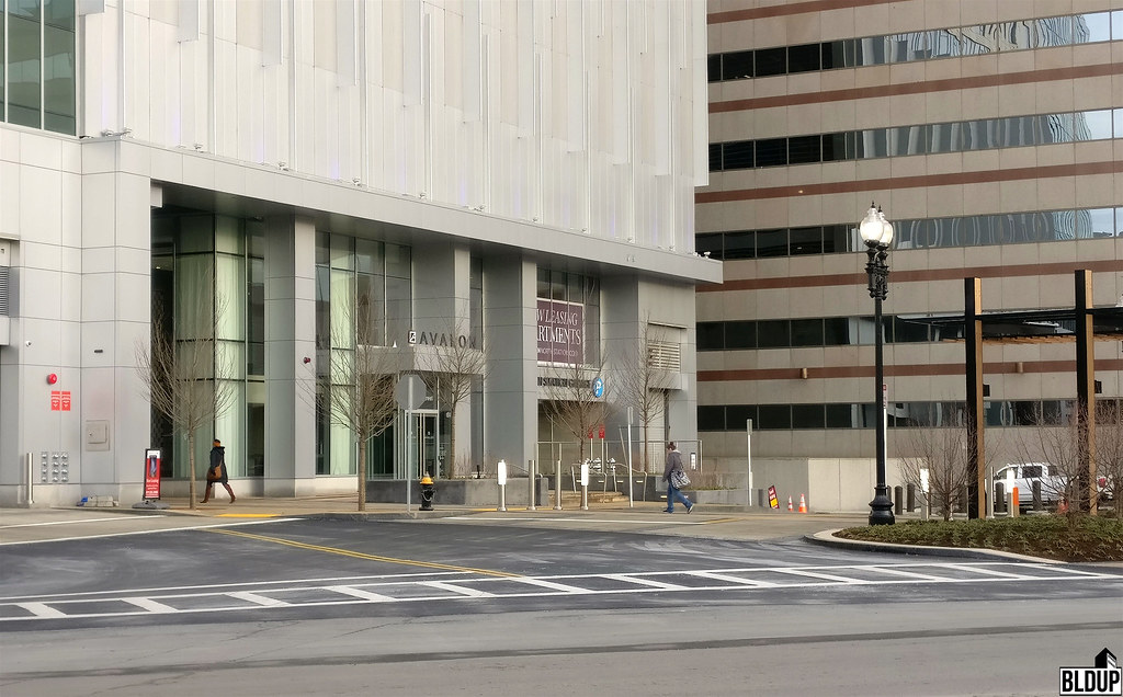 Ground Floor by BLDUP Boston, on Flickr
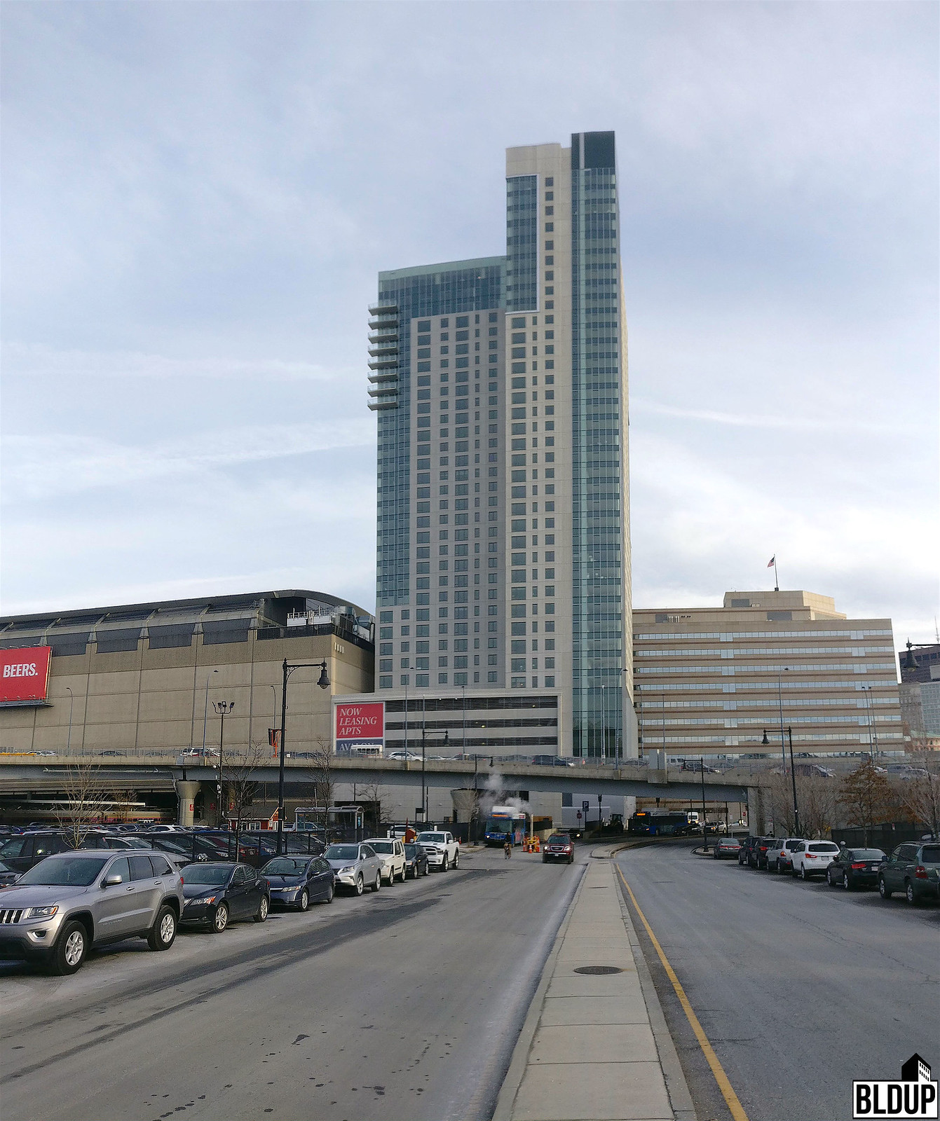 View From Nashua Street by BLDUP Boston, on Flickr
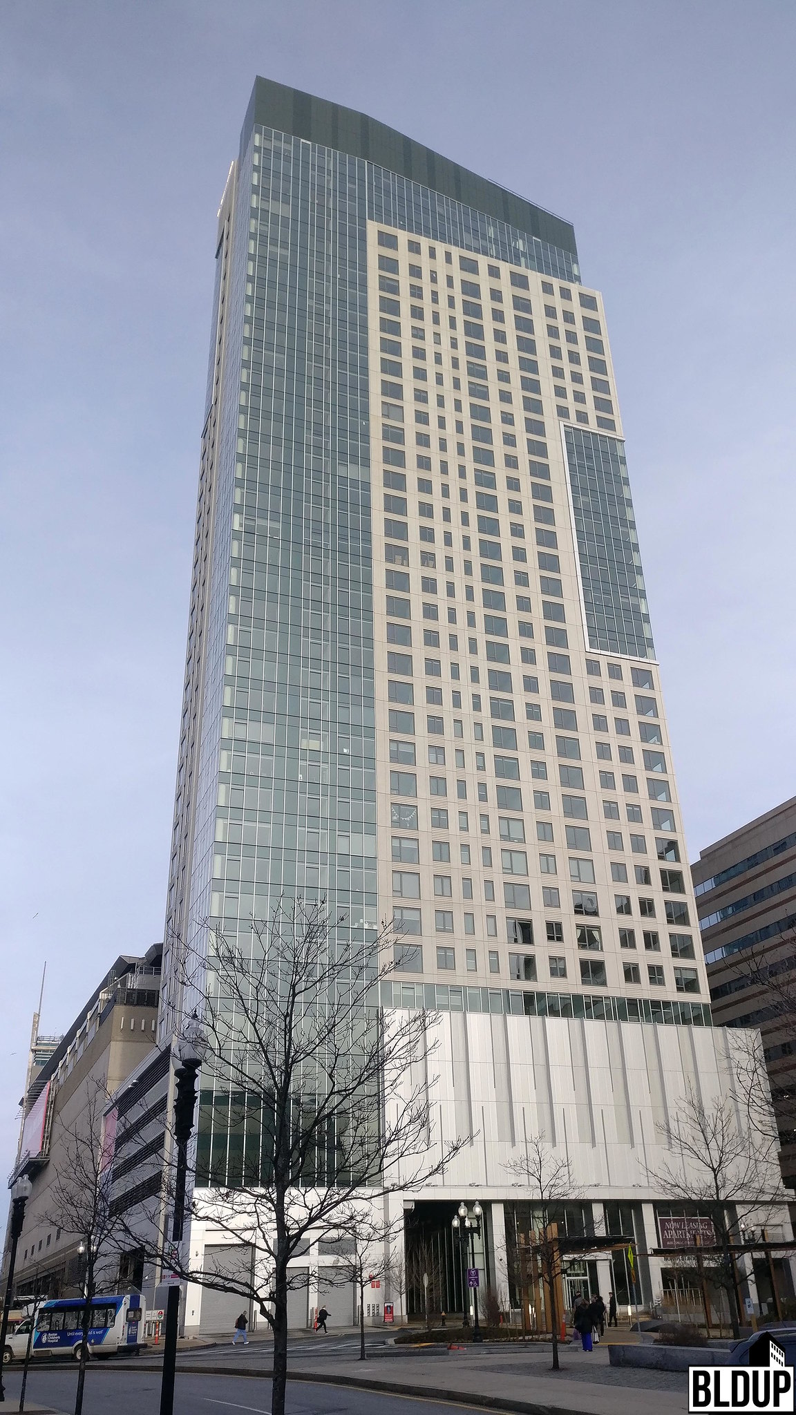 View From Lomasney Way by BLDUP Boston, on Flickr
I think we can all agree this was a success.
We need 10 more towers like this. Reasonably priced market rate housing.
I think we can all agree this was a success.

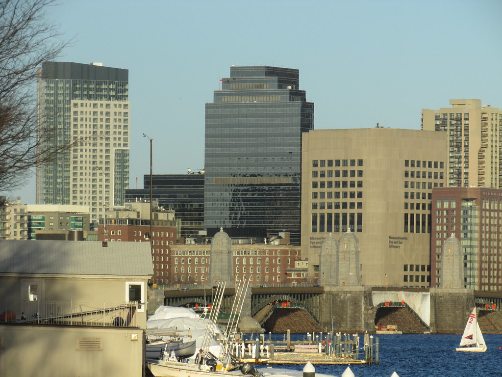
Evening light...from Friday, 10 March.
It speaks to the glacial pace of architecture in Boston these days that you can build something that looks like it went up 15 years earlier and it's considered cool and good.
I can't imagine a 1975 design going up in 1990, but a 2002 design in 2017 is no problem at all.
I can't imagine a 1975 design going up in 1990, but a 2002 design in 2017 is no problem at all.