You are using an out of date browser. It may not display this or other websites correctly.
You should upgrade or use an alternative browser.
You should upgrade or use an alternative browser.
Channel Center | Fort Point
- Thread starter BostonUrbEx
- Start date
czsz
Senior Member
- Joined
- Jan 12, 2007
- Messages
- 6,043
- Reaction score
- 7
I saw some pretty epic traffic jams in Austin. The streets are too damn wide as well. I thought they were smarter than that but I saw plenty of surface lots and parking lots going up downtown. They're going to have some major problems unless they get a clue about transit, and subways are unlikely to happen. My friend tells me that underground construction is almost impossible, for some reason, there. Their Red line makes you appreciate the Green line here, remarkably.
It's Texas. Austin gets too much credit for what it is because of its context alone.
^ Totally agree that the streets are too wide, each and every one of them.
Many of the streets in downtown Austin are under construction to reduce car lanes and to widen sidewalks in what the city calls the "Great Streets" program.
I've lived in Austin almost seven years, and I think the city deserves a lot of credit for the strides we've made to improve the urban fabric. Obviously, Austin is nowhere nearly as walkable or as densely populated as Boston, and it's never going to be. That model of urbanity will never be possible here today. However, I think most of the new developments around town are getting a lot of things right and are creating engaging streetscapes: retail, wider sidewalks, trees, public art, benches, etc.
Transportation in Austin is a serious problem for which there is no obvious solution, but I'm not going to derail this thread further trying to explain that very complicated subject. I'll just say a lot of good people are trying very hard to make things better, but to get the job done, it's going to take a lot of funding that no one is sure we can get.
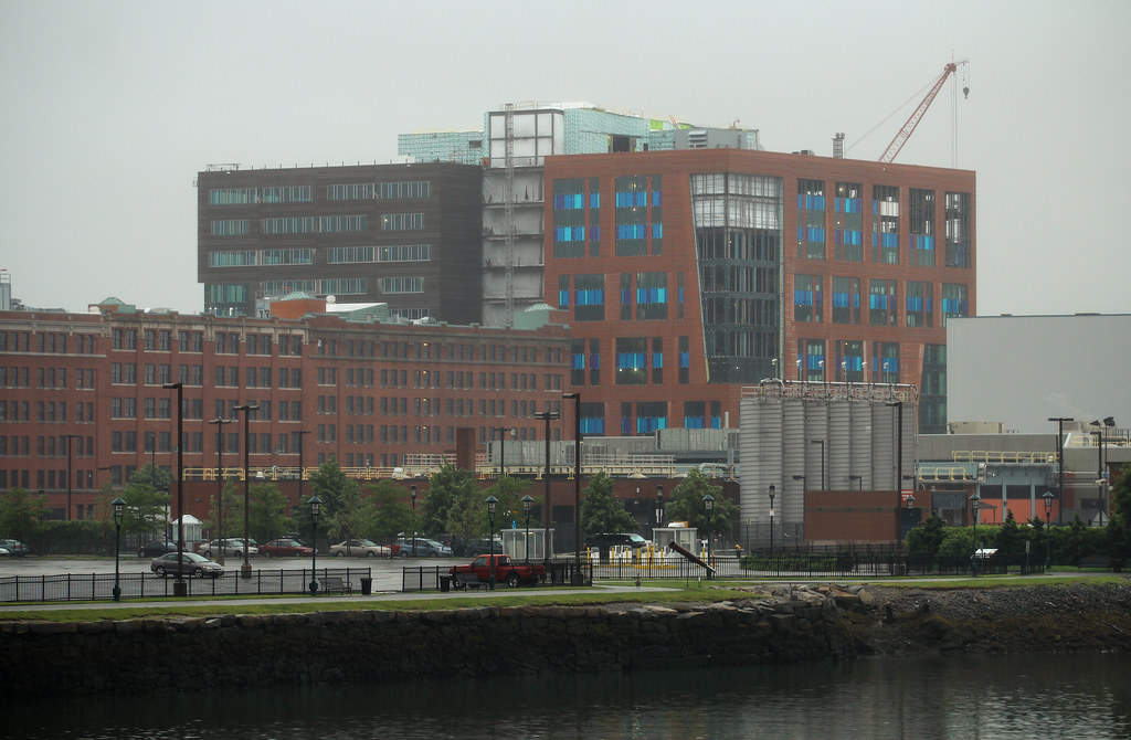
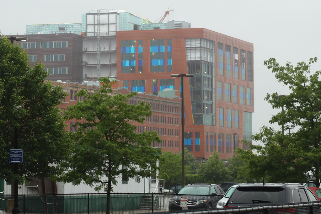
On topic, Channel Center looks pretty good. Massing isn't bad. The only thing I don't like is the bigger scale created by the window groupings on the red part of the building. That looks particularly unappealing next to the old building next door.
SeamusMcFly
Senior Member
- Joined
- Apr 3, 2008
- Messages
- 2,050
- Reaction score
- 110
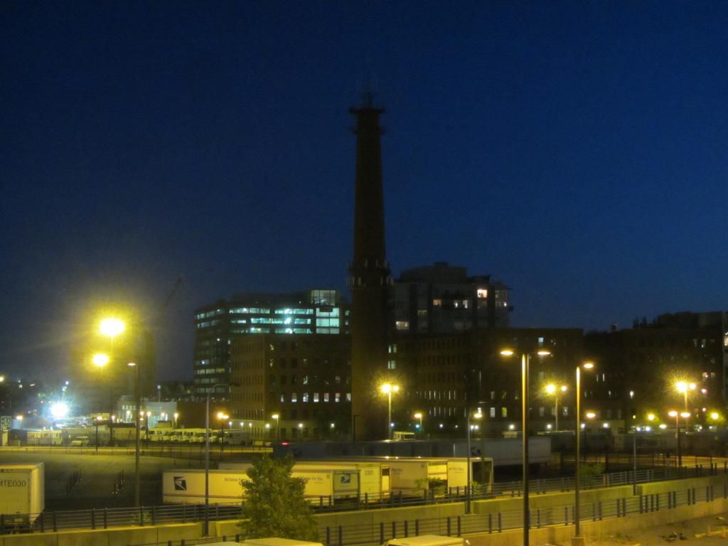
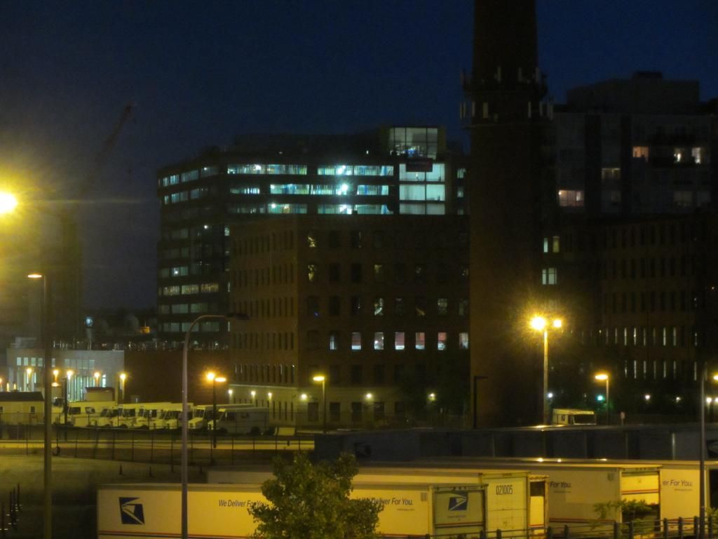
This thing is really quite the behemoth when approaching from the south coming up A.
These pictures are not from that view however.
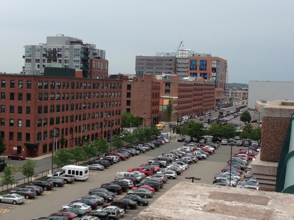
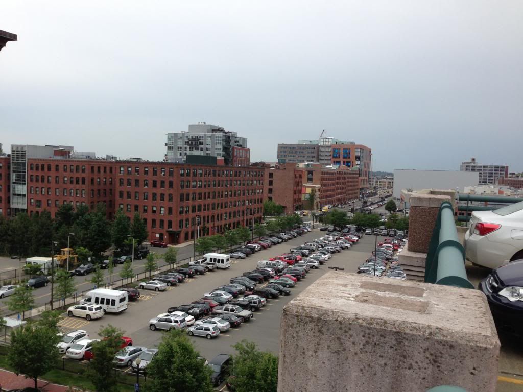
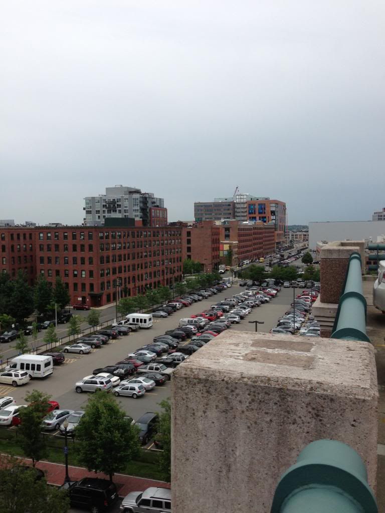
These pictures are not from that view however.


It is a monster, but the facade is interesting and seems to use quality materials. Given what we have seem some developers do and other things happening, i am very happy that its not just like ribbon windows. I say a quality addition.
AmericanFolkLegend
Senior Member
- Joined
- Jun 29, 2009
- Messages
- 2,214
- Reaction score
- 248
From that view you can't see the hulking parking garage that basically gives a big "F You!" to traditional southie.
Joe_Schmoe
Active Member
- Joined
- May 25, 2006
- Messages
- 374
- Reaction score
- 0

They could have continued the nice rhythm of the streetwall, but nooooooooooo, they had to be bastards.
- Joined
- Jan 7, 2012
- Messages
- 14,072
- Reaction score
- 22,813
Final color. Check out #124 of this thread for a closer look.Does anyone know if the bright blue windows are peel-away film for protection during construction, or is that the final color?
SeamusMcFly
Senior Member
- Joined
- Apr 3, 2008
- Messages
- 2,050
- Reaction score
- 110
Did someone pay a visit to our favorite geniuses at Elkus Manfredi??
Not today. B's game had me up too late, so I slept in and got in late. So parking on the roof it is.
SeamusMcFly
Senior Member
- Joined
- Apr 3, 2008
- Messages
- 2,050
- Reaction score
- 110
From that view you can't see the hulking parking garage that basically gives a big "F You!" to traditional southie.
True. I drove by it last night on my cab ride home... it's friggin uuuge!!!
- Joined
- Jan 7, 2012
- Messages
- 14,072
- Reaction score
- 22,813
- Joined
- Sep 15, 2010
- Messages
- 8,894
- Reaction score
- 271
UH, OH...
Originally rendered as:

found5dollar
Senior Member
- Joined
- Aug 27, 2007
- Messages
- 1,149
- Reaction score
- 404
What the!
i don't know if i am going to absolutely love the new cladding or despise it.
i don't know if i am going to absolutely love the new cladding or despise it.
Tombstoner
Active Member
- Joined
- Mar 5, 2010
- Messages
- 707
- Reaction score
- 2
I think it's kind of cool in a devil-may-care way.
Of course, it will get dated very quickly but then it can probably be replaced relatively easily.
Of course, it will get dated very quickly but then it can probably be replaced relatively easily.
palindrome
Senior Member
- Joined
- Jun 11, 2006
- Messages
- 2,281
- Reaction score
- 131
Could be interesting. The new ConRAC has something similar minus the colors.
stellarfun
Senior Member
- Joined
- Dec 28, 2006
- Messages
- 5,711
- Reaction score
- 1,544
Those look like test panels to me, and probably don't reflect the design motif that will actually appear.

