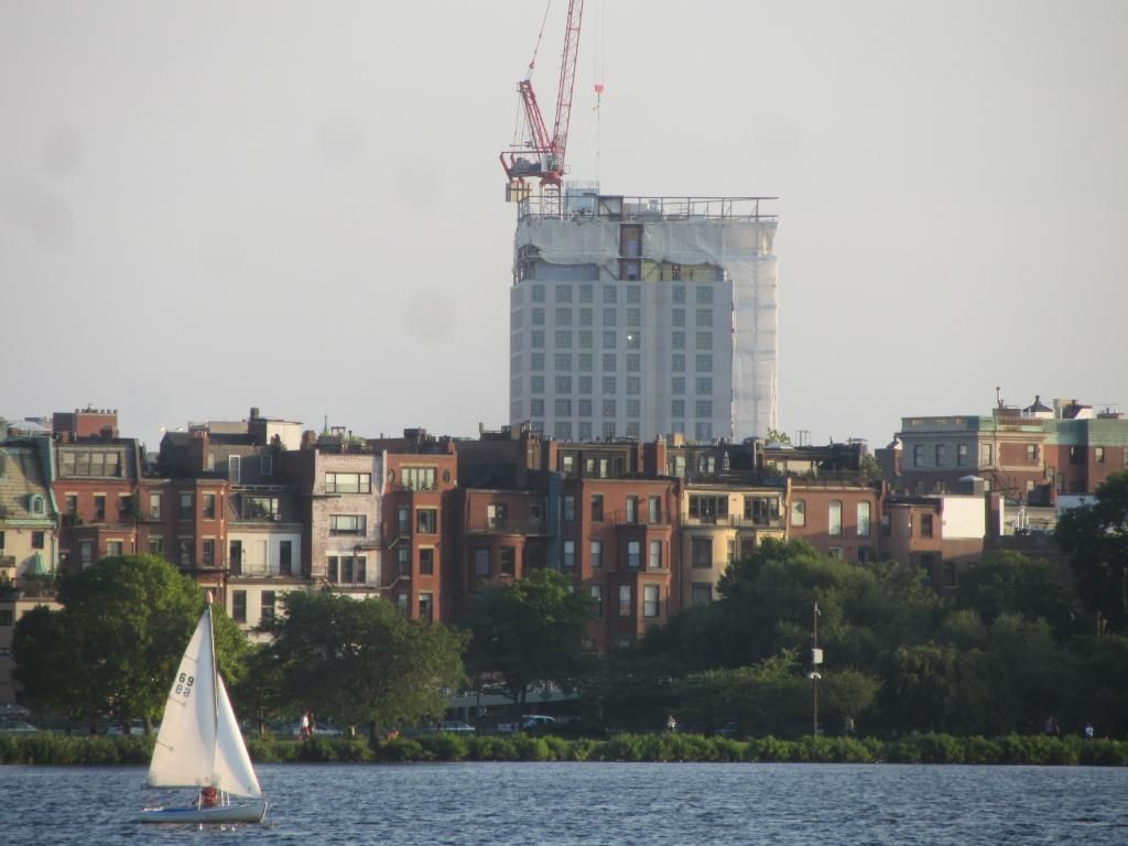
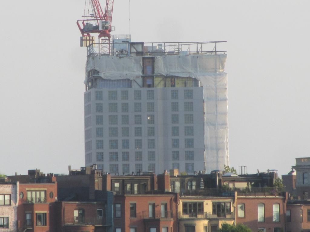
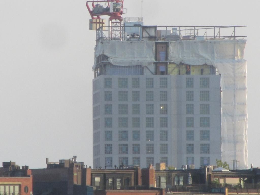
Dorm Tower @ Berklee College of Music | 168 Mass Ave | Back Bay

Re: Berklee Expansion Plans

This may not be a huge success but at least the developer and architect tried and we are getting something interesting to look at for the next 50 years which is a lot more than can be said for many developments around town.
 
Re: Berklee Expansion Plans

Was that corrugated metal panel always the plan here? I've seen that cladding (or cladding of a similar style) look dirty and cheap rather quickly. I hope this is a superior grade, but it doesn't look top notch to me.
 
Re: Berklee Expansion Plans

Some of the old renderings show, what appears to be, a light colored stone block facade. I don't know at what point that changed or whether the university went back to the BRA during the construction shut down and did some value engineering. Either way, the alternative appeared much better.
 
Re: Berklee Expansion Plans

Was that corrugated metal panel always the plan here? I've seen that cladding (or cladding of a similar style) look dirty and cheap rather quickly. I hope this is a superior grade, but it doesn't look top notch to me.

Some of the old renderings show, what appears to be, a light colored stone block facade. I don't know at what point that changed or whether the university went back to the BRA during the construction shut down and did some value engineering. Either way, the alternative appeared much better.

The change appears to have happened Spring 2012. It originally caught me off guard too, which prompted me a few months back to dig through the thread and figure out where I missed the news.

On page 17, AdamBC posted the new renders (which are broken links now) on May 8, 2012.
 
Re: Berklee Expansion Plans

The glass and the corrugated metal/loft windows are oil and water. They're more of an odd hybrid than a coherent whole.
 
Re: Berklee Expansion Plans

Cladding is most of the way up


Re: Berklee Expansion Plans

its unique, its not an eyesore, its not tall so so wont ruin the skyline, looks kinda cool verdict is still out until is fully cladded, I think its an overall success.
 
Re: Berklee Expansion Plans

I think that you have to work with what you have. Cladding isn't anyone's first choice. But it's cheap. And anything that gives the Fenway Skyline "Character" is fine with me.
 
Re: Berklee Expansion Plans

Today. Cladding nearly finished.


Re: Berklee Expansion Plans

I thought I was going to hate this when they changed the design, but I really like the way this has turned out. The shot looking up Mass Ave is great!
 
Re: Berklee Expansion Plans

Running through my head any time I scroll through this thread:

Do I like it?
Do I hate it?
Do I like it?
Do I hate it?
Do I like it?
Do I hate it?
 
Re: Berklee Expansion Plans

9697125386_3fe175dcf9_b.jpg


9693886095_f9158d3334_b.jpg
 
Re: Berklee Expansion Plans

Interesting/unique vantage point! It actually does a pretty decent job of hiding the Sheraton and Hilton.
 
Re: Berklee Expansion Plans

^ Agreed. It almost looks like it was meant to go there all along.

9707660382_bbf6794340_b.jpg


9704423071_712f51b92d_b.jpg


9707650302_1f31e66115_b.jpg


9704420423_011d24a93d_b.jpg


9707646520_c531e4e9d6_b.jpg


9704409239_2e2ed61fb6_b.jpg


9704406647_9ebab13e91_b.jpg


9707639902_4224dbc19f_b.jpg


9704399949_ab8bf7dd3c_b.jpg


Right then this man told me to take his picture, so here you go, sir.

9704396771_bf55c921cb_b.jpg


9704391387_0b1b3ae5f4_b.jpg


9707618116_b249e67802_b.jpg


Funky clouds!

9704380761_a8797e1253_b.jpg


9704374679_f458fab9b6_b.jpg
 
Re: Berklee Expansion Plans

I really like this one.
 
Re: Berklee Expansion Plans

The "levitating tower" effect is unnerving, especially on the back and side with the lone stripe of glass. I can't decide yet if that creates drama and tension in the building or if it just looks careless and out of place. Time will tell.
 
Re: Berklee Expansion Plans

Looks careless to me. Yes there's a change of program for that floor (the 4th, which has practice rooms and a fitness center) and it seems they tried to express this but it's hard to tell since that flat glazing looks like so much half-assery.

Still, I'm with JSic...somehow I manage to like it, and I still stand by my earlier comments how this one feels so lightweight and insubstantial.
 
Re: Berklee Expansion Plans

I really like the transition. I think that's exactly the way you do it on a VE budget. If money wasn't an option, maybe they could have made the jagged glazed base morph into the tower over the span of a few floors, but that's just superfluous spending for aesthetic effect. I think the effect here would be a bit stronger if the tower cladding was more monolithic and heavy like a stone cladding or something instead of the storage warehouse sheet metal. The tension between lightness and monolithic would be rather dramatic. Overall, we made out pretty damn well here for VE changes.
 
Re: Berklee Expansion Plans

I really liked it at first. Now I'm less sure. I think I need to go stand across the street from it with a cup of coffee in my hand for about a half hour.
 

Back
Top