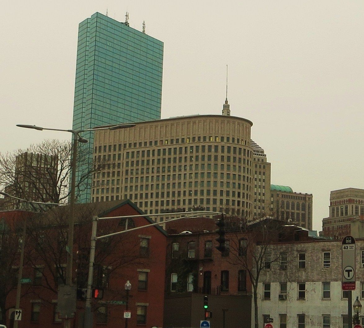
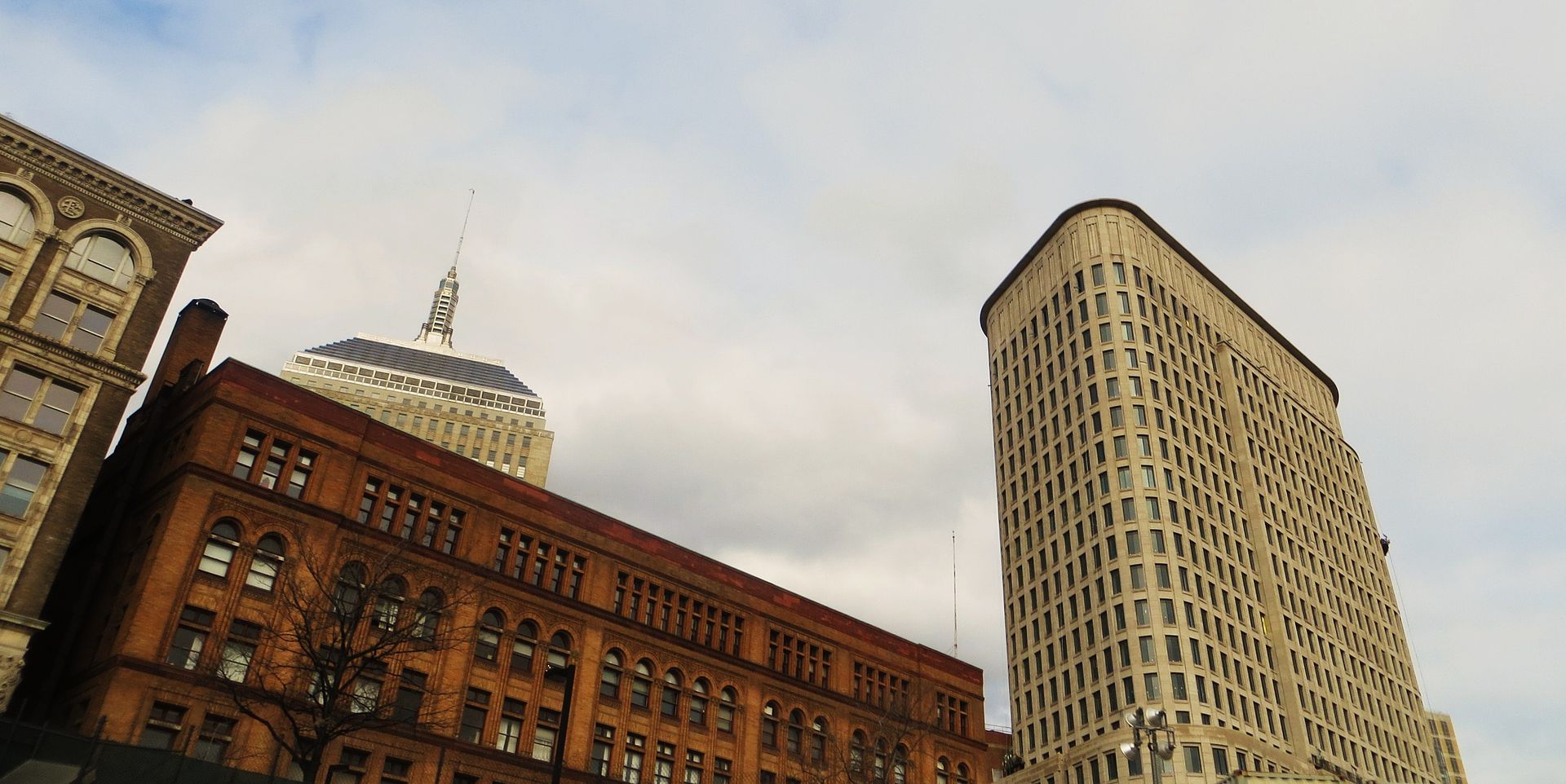
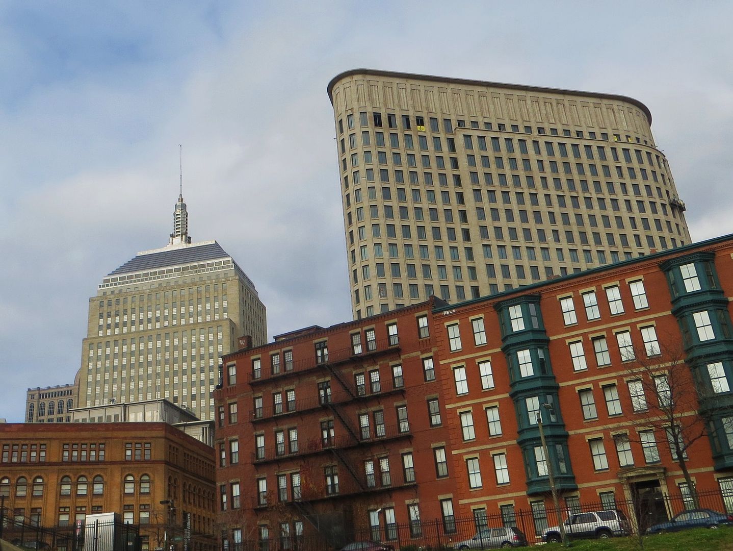
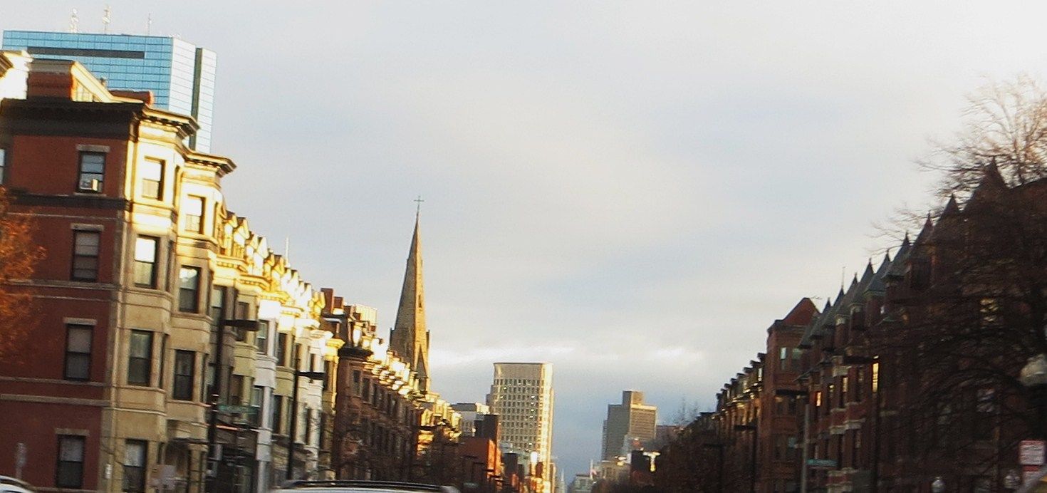
Liberty Mutual Tower | 157 Berkeley Street | Back Bay

Re: Liberty Mutual plans major Boston expansion

That's a handsome look.

I'd like something jutting at the top of ground level. Some kind of structural awning. Of course located above actual retail entrances would be ideal as well.

Looks naked right now.

Theyve placed neon awnings over every retail entrance
 
Re: Liberty Mutual plans major Boston expansion

There are no retail entrances. The only retail is going to be in the form of a coffee cart, or maybe something a little more permanent, inside of the lobby.
 
Re: Liberty Mutual plans major Boston expansion

correct. hence the statement above.
Having actual retail on the street. This would be ideal. And, said awnings could/would be above them.
 
Re: Liberty Mutual plans major Boston expansion

068_zpsf035560c.jpg
 
Re: Liberty Mutual plans major Boston expansion

Looks fatschist from this angle. Would make a great Secret Police headquarters.
 
Re: Liberty Mutual plans major Boston expansion

I know quite a few of you guys tend to dislike glass curtain walls but this is one building where a nice glass curtain wall (or at the very least, quite a bit more glass to lighten up the heaviness look look and feel) would have fit in much better.
 
Re: Liberty Mutual plans major Boston expansion

I know quite a few of you guys tend to dislike glass curtain walls but this is one building where a nice glass curtain wall (or at the very least, quite a bit more glass to lighten up the heaviness look look and feel) would have fit in much better.

I couldn't disagree more. I think that would have taken this building from the general consensus of "solid" to the opinions being floated around about the Kensington. If it wasn't for the strong vertical lines of this buildings exterior it would be far more of a stump then it appears, especially at street level. It is also an insurance company headquarters, and the architecture speaks to that. If anything, the materials are the one saving grace of this building. Other then a conspicuous lack of greater detailing (which I believe speaks more to Liberty Mutual's alleged corporate culture then anything else) it has some of the best workmanship of many of the recent projects. The glass gerbil tube also wouldn't be nearly as stunning if it was between glass buildings versus the contrast of heavy limestone to virtually clear glass. The fact that this building could feel at home in any photograph taken since 1940 also speaks to its merit.
 
Re: Liberty Mutual plans major Boston expansion

I couldn't disagree more. I think that would have taken this building from the general consensus of "solid" to the opinions being floated around about the Kensington. If it wasn't for the strong vertical lines of this buildings exterior it would be far more of a stump then it appears, especially at street level. It is also an insurance company headquarters, and the architecture speaks to that. If anything, the materials are the one saving grace of this building. Other then a conspicuous lack of greater detailing (which I believe speaks more to Liberty Mutual's alleged corporate culture then anything else) it has some of the best workmanship of many of the recent projects. The glass gerbil tube also wouldn't be nearly as stunning if it was between glass buildings versus the contrast of heavy limestone to virtually clear glass. The fact that this building could feel at home in any photograph taken since 1940 also speaks to its merit.

Great post. These are my exact feelings too. Plus, it allows for the Hancock and 111 Huntington to stand as the only shining spires on this part of the skyline. A (fat) glass Liberty Mutual tower would only ruin the presence these two glass towers command on the skyline.
 
Re: Liberty Mutual plans major Boston expansion

Please stop posting photos of this POS stump. Thanks.
 
Re: Liberty Mutual plans major Boston expansion

I know quite a few of you guys tend to dislike glass curtain walls but this is one building where a nice glass curtain wall (or at the very least, quite a bit more glass to lighten up the heaviness look look and feel) would have fit in much better.

Is that like when a fat lady wears a moo-moo?
 
Re: Liberty Mutual plans major Boston expansion

Looks like buildings can be obese too
 
Re: Liberty Mutual plans major Boston expansion

The only thing in davem's post I question is where are these strong vertical lines he speaks of? I've never gotten much of any sense of vertical thrust from this thing.
 
Re: Liberty Mutual plans major Boston expansion

The fact that this building could feel at home in any photograph taken since 1940 also speaks to its merit.

Asked this in another post: why on earth would it be considered a virtue for a new building to look like it's already 70 years old? Does it somehow represent old-fashioned goodness and quality? No. I see it as a failure of imagination and creativity. Past:1 Future:0
 
Re: Liberty Mutual plans major Boston expansion

Asked this in another post: why on earth would it be considered a virtue for a new building to look like it's already 70 years old? Does it somehow represent old-fashioned goodness and quality? No. I see it as a failure of imagination and creativity. Past:1 Future:0

Because it's a building that was built in 2011 that is not a post-modern mess. It actually has some classical order to it and really carries a monolithic presence that rivals buildings of the 30s and 40s. It speaks to Liberty Mutual as a company.
 
Re: Liberty Mutual plans major Boston expansion

Go! 02124 Go! 02124 Go! 02124!...
 

Back
Top