You are using an out of date browser. It may not display this or other websites correctly.
You should upgrade or use an alternative browser.
You should upgrade or use an alternative browser.
Lovejoy Wharf | 131 Beverly Street | West End
- Thread starter goldenretrievers
- Start date
DigitalSciGuy
Active Member
- Joined
- Apr 14, 2013
- Messages
- 670
- Reaction score
- 421
palindrome
Senior Member
- Joined
- Jun 11, 2006
- Messages
- 2,286
- Reaction score
- 138
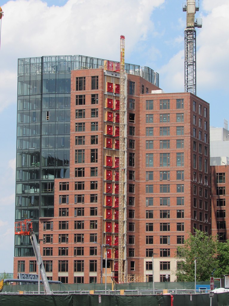
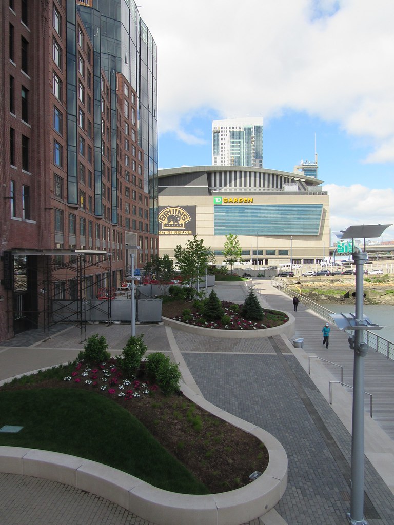
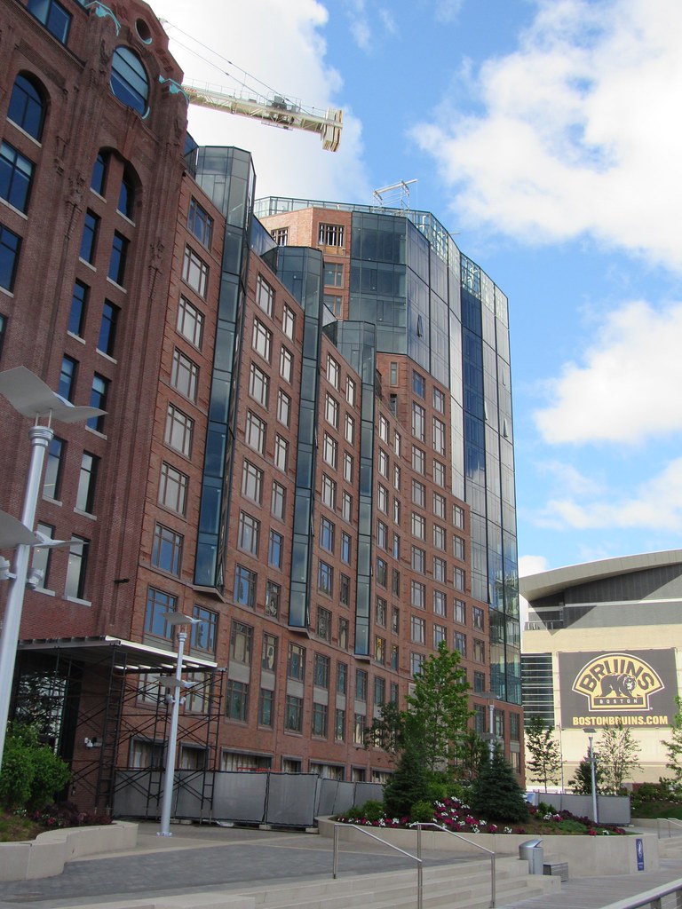
This place looks so good in person. You can really tell the quality of the materials.
stick n move
Superstar
- Joined
- Oct 14, 2009
- Messages
- 13,361
- Reaction score
- 23,947
This building reminds me that were not just a bunch of savages on here. How many people have talked badly about this? This, Millennium tower, bpl upgrades, 101 seaport, 1 greenway, liberty mutual, seaport square, hayward place all universally praised as great additions...If its good its good. Its not anyones fault on here that 888 boylston is a jumbled together glass mess of awkwardness. Hell even North Station and 1 canal have received bare minimum complaints. 57 people in a row say 888 boylston sucks and then everyones an asshole. This along with a few notable turds like 1mpd and waterside, rightfully get bashed. I dont like 888 Boylston either but I just ignore the building now and pray that the street life pulls thru and parcel 15 blocks it one day, but noone should just get a pass.
In this case. Not a single complaint on here do I ever remember reading. Not 1, from anyone. We demand greatness here and when it delivers it is recognized. This is greatness. Yes its no rowes wharf but in the context of the west end it may very well be an equal and even top it. Maybe. Rowes wharf was the "finishing touch"(stay tuned for harbor garage) on the waterfront. This is the shot of adrenailne directly into the heart of a dead person who had an epiphany and will now change his ways. I give a standing ovation to this developer for not going the easy route here and really getting this thing right. This is after all..a precast facade. They just gave a shit.
In this case. Not a single complaint on here do I ever remember reading. Not 1, from anyone. We demand greatness here and when it delivers it is recognized. This is greatness. Yes its no rowes wharf but in the context of the west end it may very well be an equal and even top it. Maybe. Rowes wharf was the "finishing touch"(stay tuned for harbor garage) on the waterfront. This is the shot of adrenailne directly into the heart of a dead person who had an epiphany and will now change his ways. I give a standing ovation to this developer for not going the easy route here and really getting this thing right. This is after all..a precast facade. They just gave a shit.
whighlander
Senior Member
- Joined
- Aug 14, 2006
- Messages
- 7,812
- Reaction score
- 647
This building reminds me that were not just a bunch of savages on here. How many people have talked badly about this? This, Millennium tower, bpl upgrades, 101 seaport, 1 greenway, liberty mutual, seaport square, hayward place all universally praised as great additions...If its good its good. Its not anyones fault on here that 888 boylston is a jumbled together glass mess of awkwardness. Hell even North Station and 1 canal have received bare minimum complaints. 57 people in a row say 888 boylston sucks and then everyones an asshole. This along with a few notable turds like 1mpd and waterside, rightfully get bashed. I dont like 888 Boylston either but I just ignore the building now and pray that the street life pulls thru and parcel 15 blocks it one day, but noone should just get a pass.
In this case. Not a single complaint on here do I ever remember reading. Not 1, from anyone. We demand greatness here and when it delivers it is recognized. This is greatness. Yes its no rowes wharf but in the context of the west end it may very well be an equal and even top it. Maybe. Rowes wharf was the "finishing touch"(stay tuned for harbor garage) on the waterfront. This is the shot of adrenailne directly into the heart of a dead person who had an epiphany and will now change his ways. I give a standing ovation to this developer for not going the easy route here and really getting this thing right. This is after all..a precast facade. They just gave a shit.
Stick -- good points
This building is successful because it can relate to people from near and from far
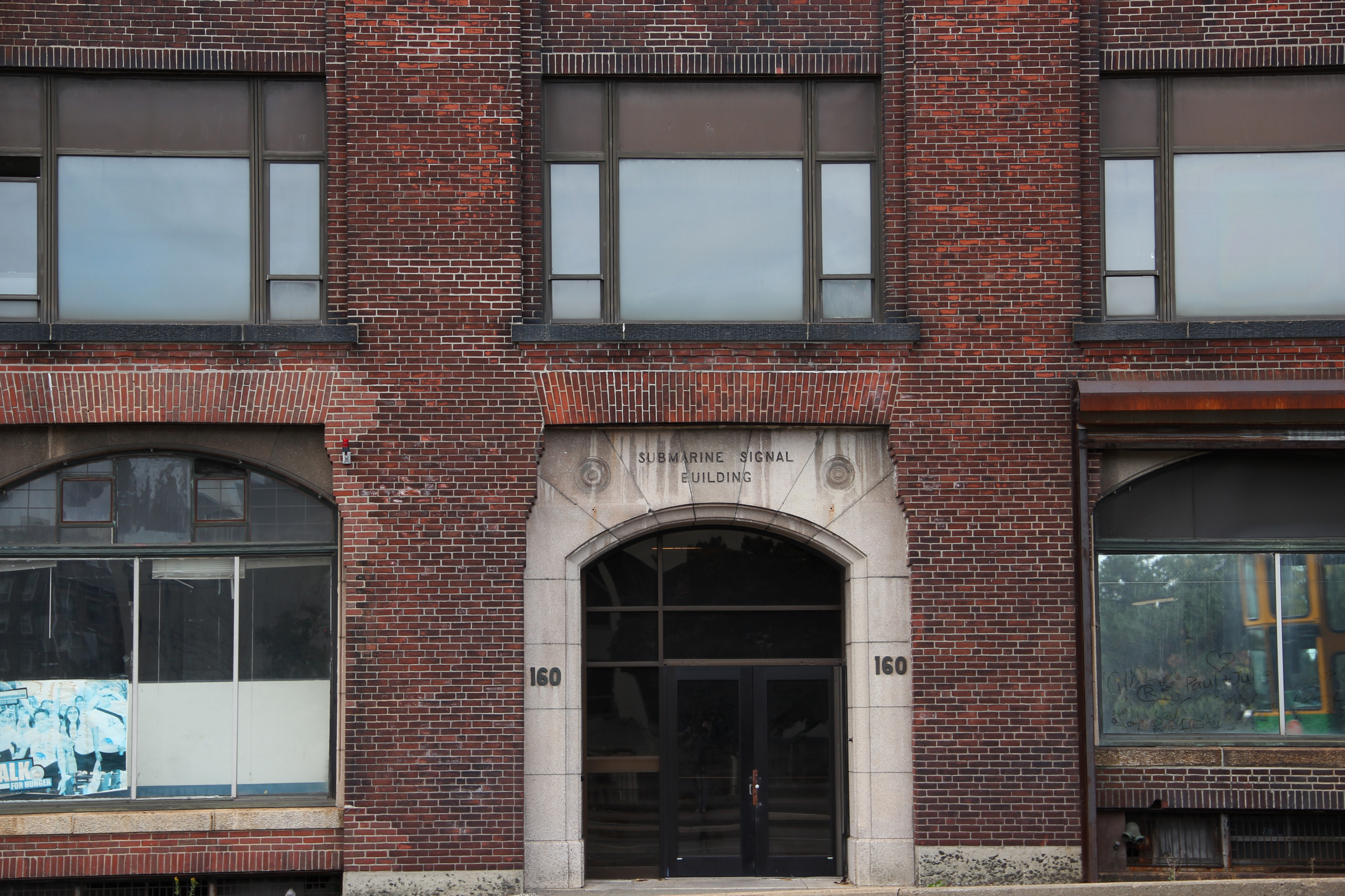
It helps that it sits on the edge of water == but still not only is the new stuff well done -- it also meets the gold standards for reno-new of a historically significant building
Note that the old building is not just archtectuarally significant -- it was the HQ of Submarine Signal -- rhe first modern era "High Tech"]


stick n move
Superstar
- Joined
- Oct 14, 2009
- Messages
- 13,361
- Reaction score
- 23,947
I take back the "change of ways" quote upon waking up to garden garage towers news. But none the less this thing is built and theres nothing anyone can do about it.
- Joined
- Jan 7, 2012
- Messages
- 14,172
- Reaction score
- 23,677
goldenretrievers
Active Member
- Joined
- Nov 14, 2014
- Messages
- 883
- Reaction score
- 634
- Joined
- Jan 7, 2012
- Messages
- 14,172
- Reaction score
- 23,677
bigpicture7
Senior Member
- Joined
- May 5, 2016
- Messages
- 4,043
- Reaction score
- 10,371
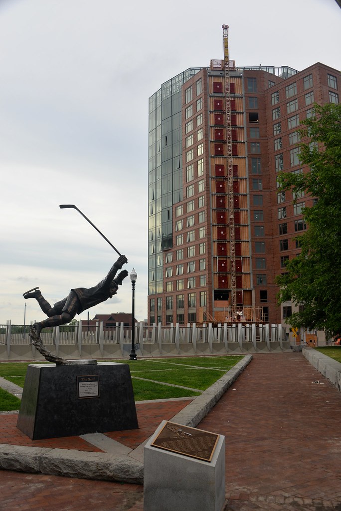
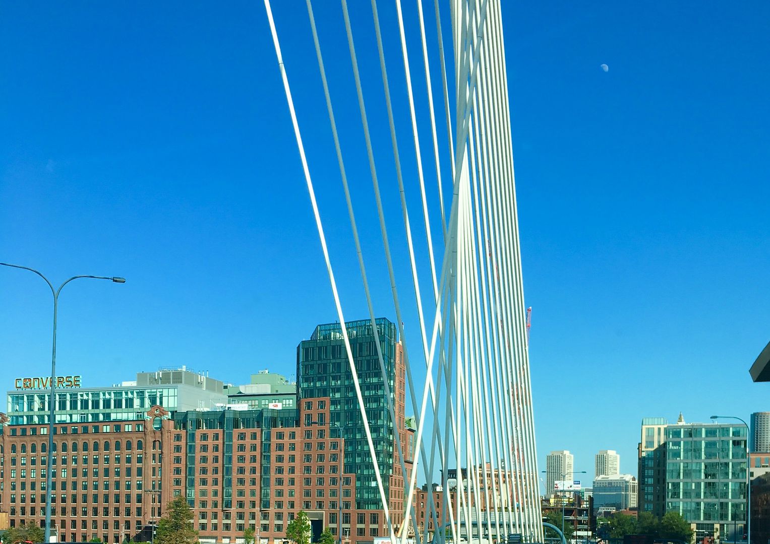
Thanks BeeLine. Hardscaping alongside the boardwalk looks fantastic. Nice to see that opened up. I love the entirely new pedestrian experience from north station, via this boardwalk, in front of the Converse HQ, into Charlestown. That was not a "walking" area for most of my life.
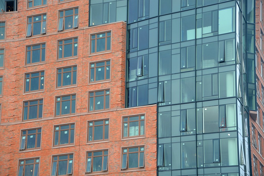
These 'turret windows' are really cool
commuter guy
Active Member
- Joined
- Feb 1, 2007
- Messages
- 930
- Reaction score
- 152
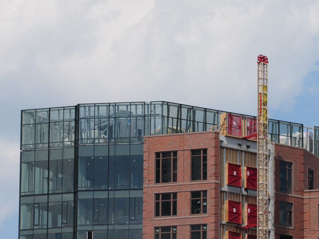
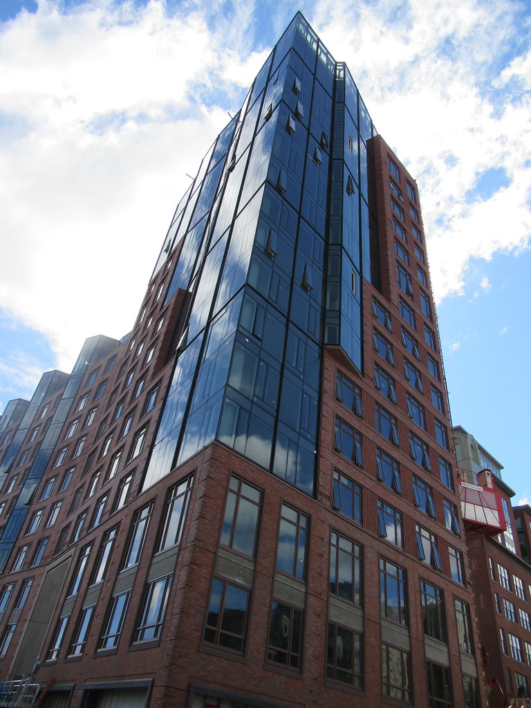
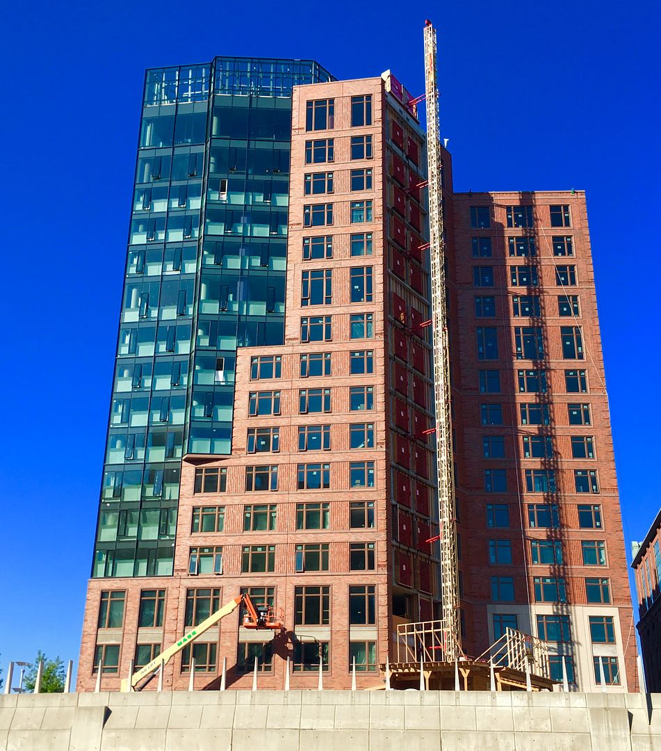
The glass corner portion of the high rise looks better in these photos than in the renderings. For this project, the subtle variations are a welcome relief to typical sheer glass curtain walls.
bigpicture7
Senior Member
- Joined
- May 5, 2016
- Messages
- 4,043
- Reaction score
- 10,371
Something about those glass/brick "steps" that make me think 1980's but otherwise it's a very solid project.
I've at times thought that too, but the key features that un-do the 80's vibe (for me, anyway) are the vertical sharp corner/crease in the glass curtainwall, as well as the non-uniform texture/pattern to the framing of the curtainwall and windows, and the cornices.
DigitalSciGuy
Active Member
- Joined
- Apr 14, 2013
- Messages
- 670
- Reaction score
- 421
odurandina
Senior Member
- Joined
- Dec 1, 2015
- Messages
- 5,328
- Reaction score
- 266
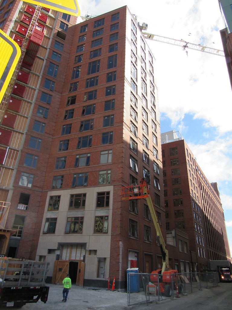
This superblock of 4 buildings is incredible.
Thanks for posting the photos.
Thanks for posting the photos.
Boston02124
Senior Member
- Joined
- Sep 6, 2007
- Messages
- 6,934
- Reaction score
- 7,068


