You are using an out of date browser. It may not display this or other websites correctly.
You should upgrade or use an alternative browser.
You should upgrade or use an alternative browser.
Millennium Tower (Filene's) | 426 Washington Street | Downtown
- Thread starter KentXie
- Start date
- Status
- Not open for further replies.
- Joined
- Sep 15, 2010
- Messages
- 8,894
- Reaction score
- 271
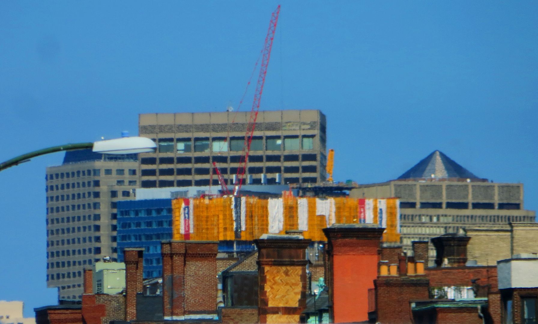
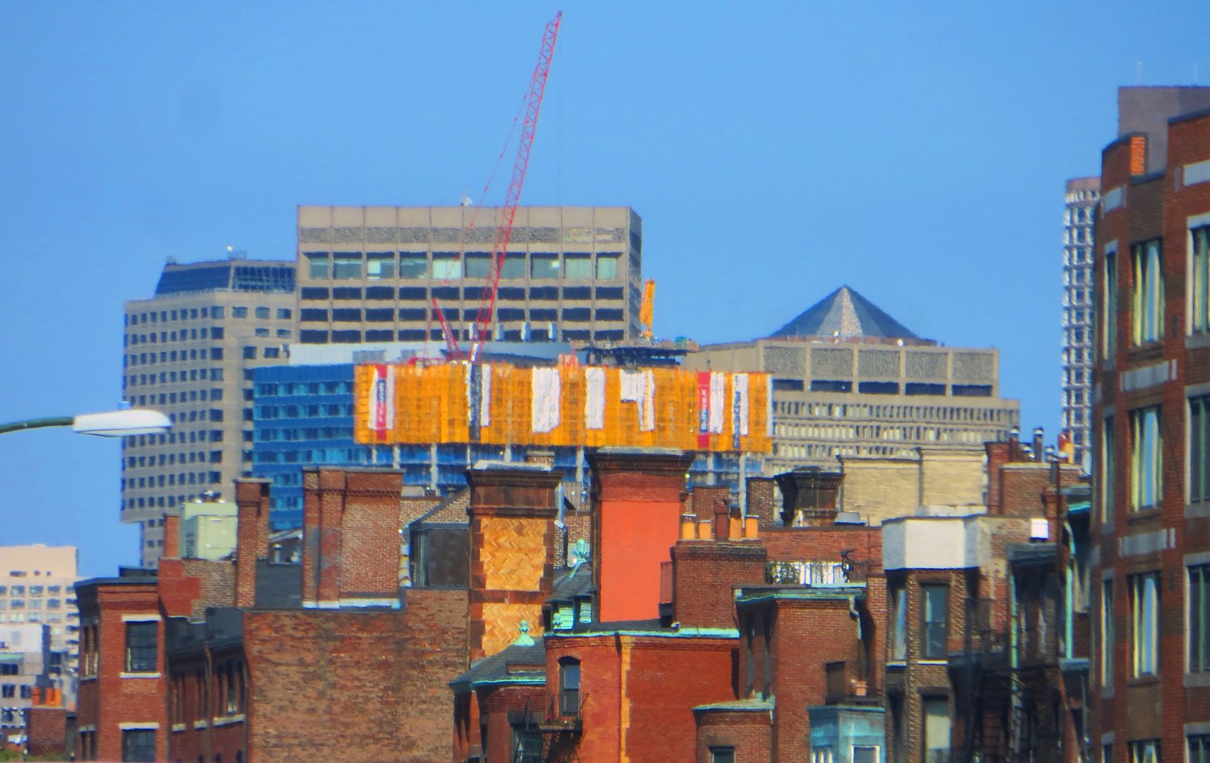
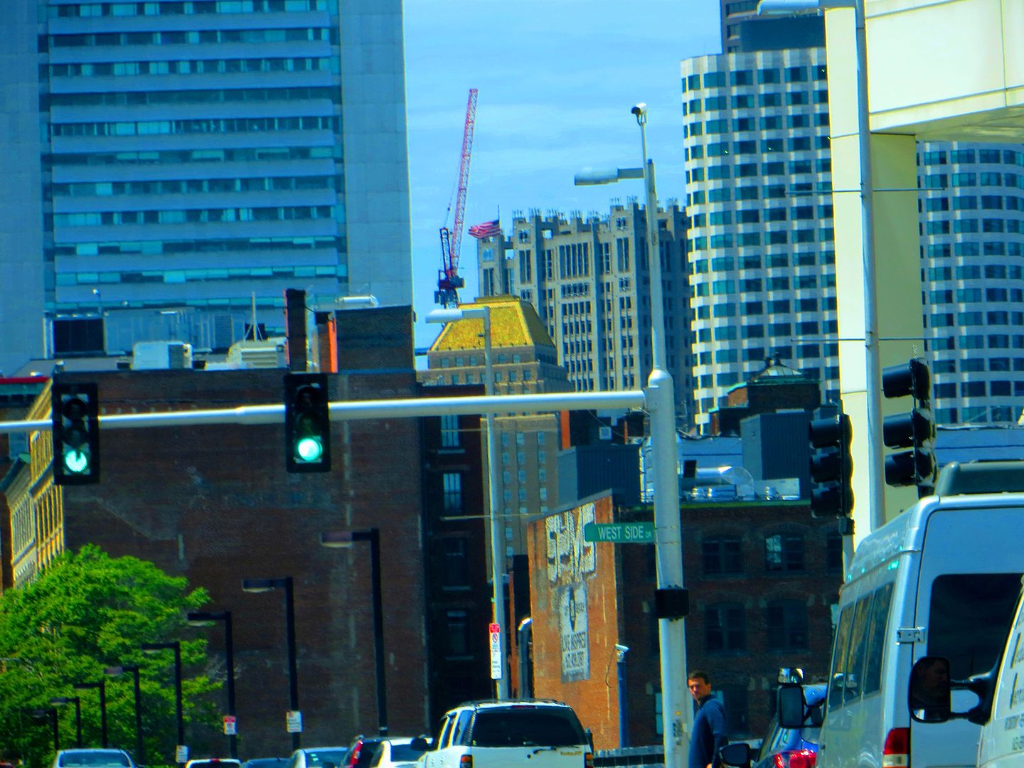
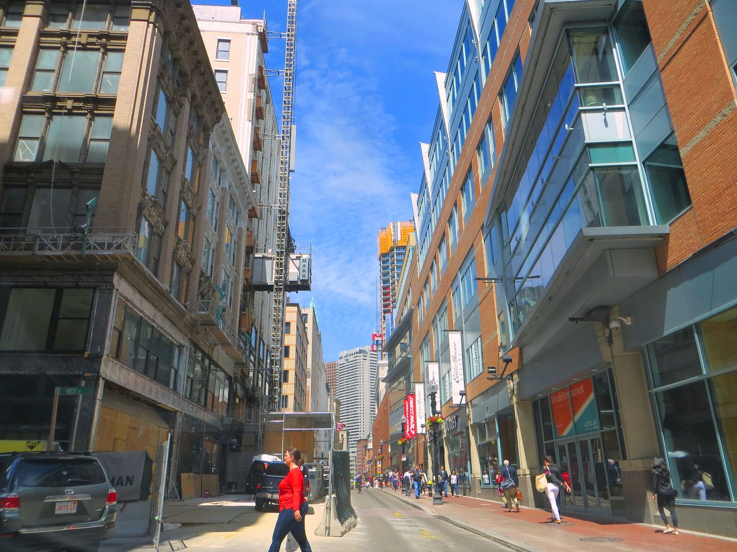
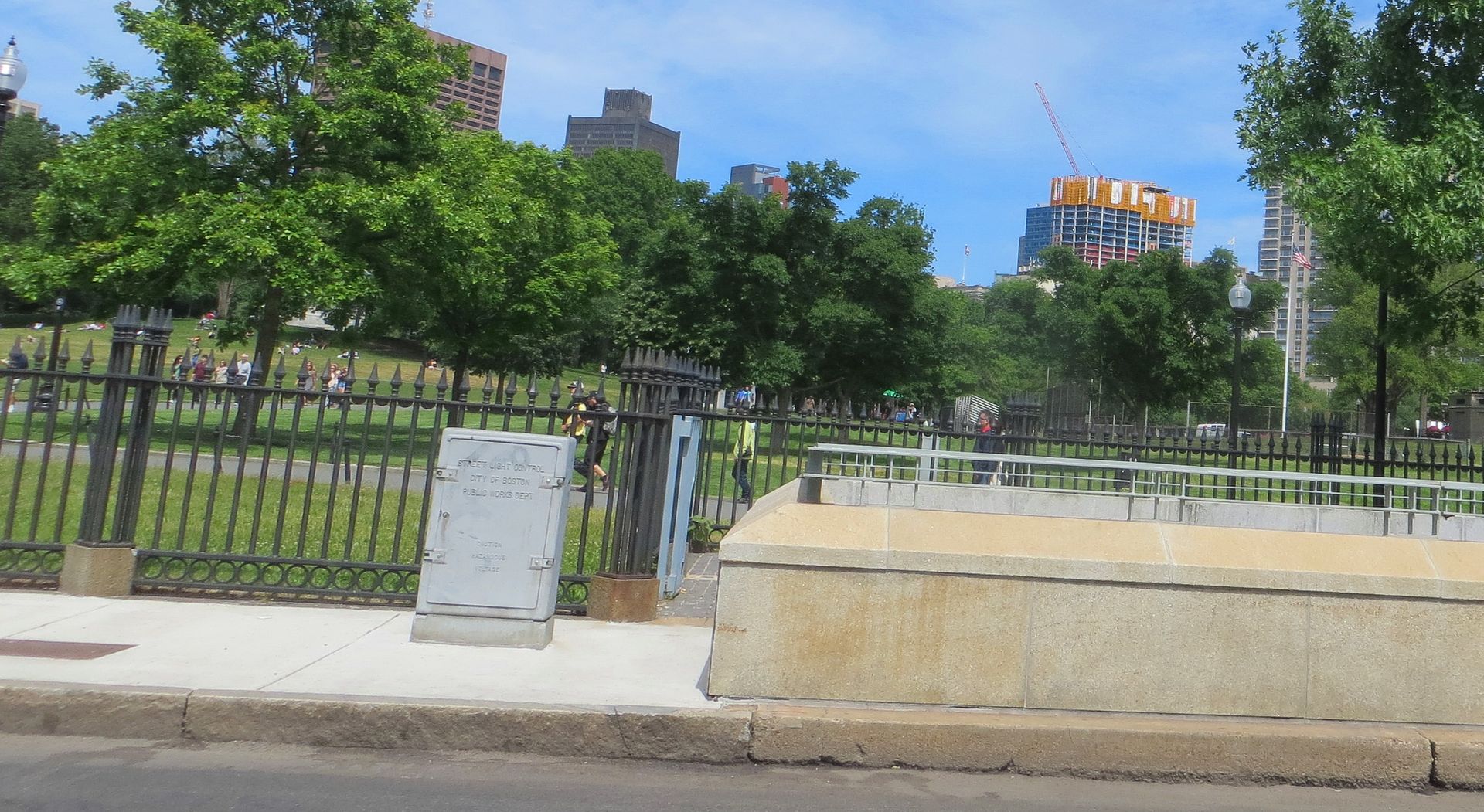
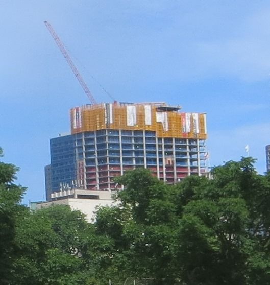
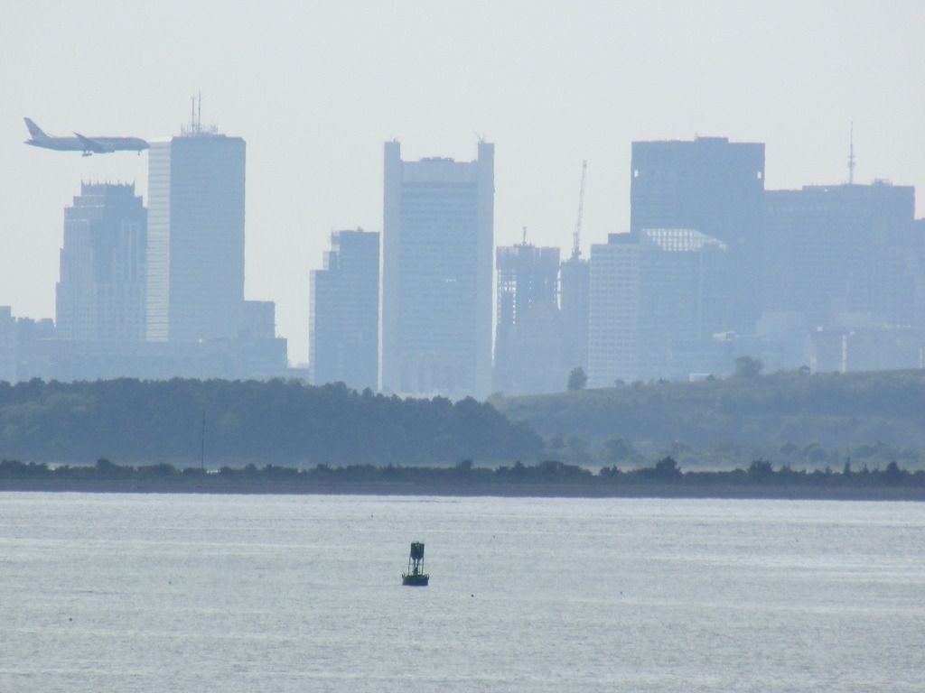
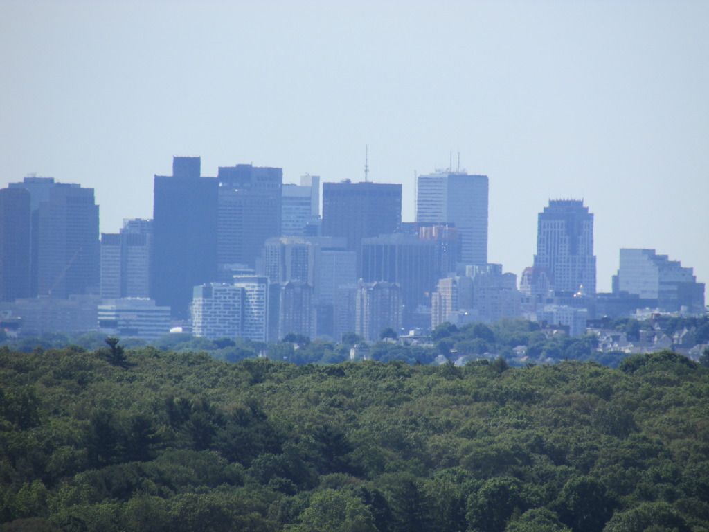
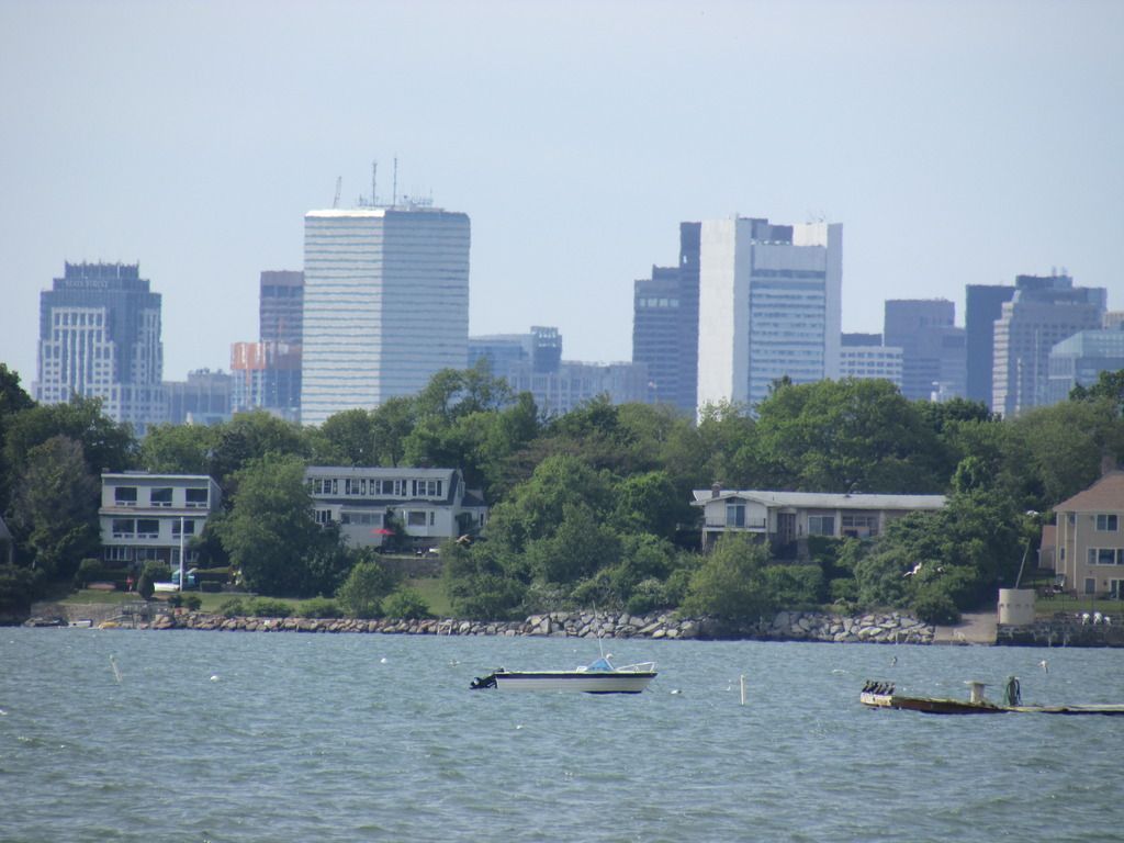
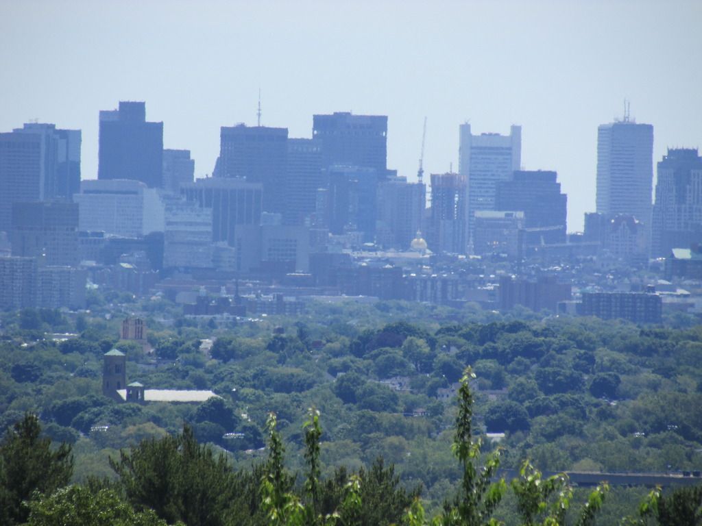
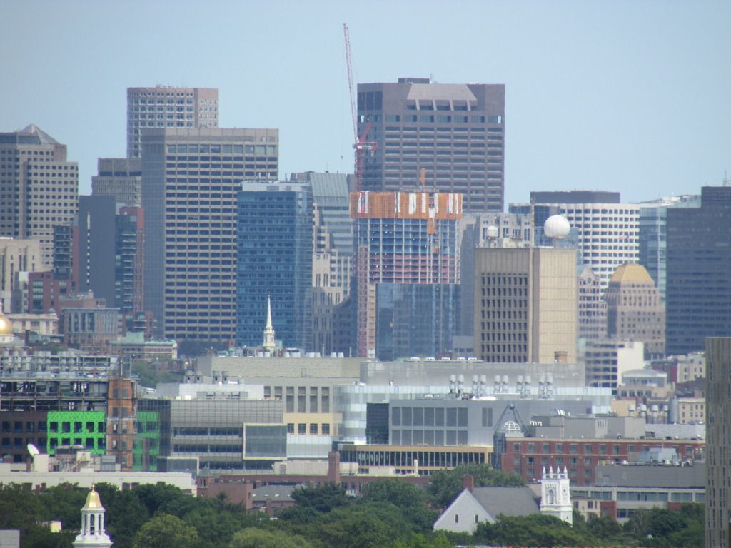
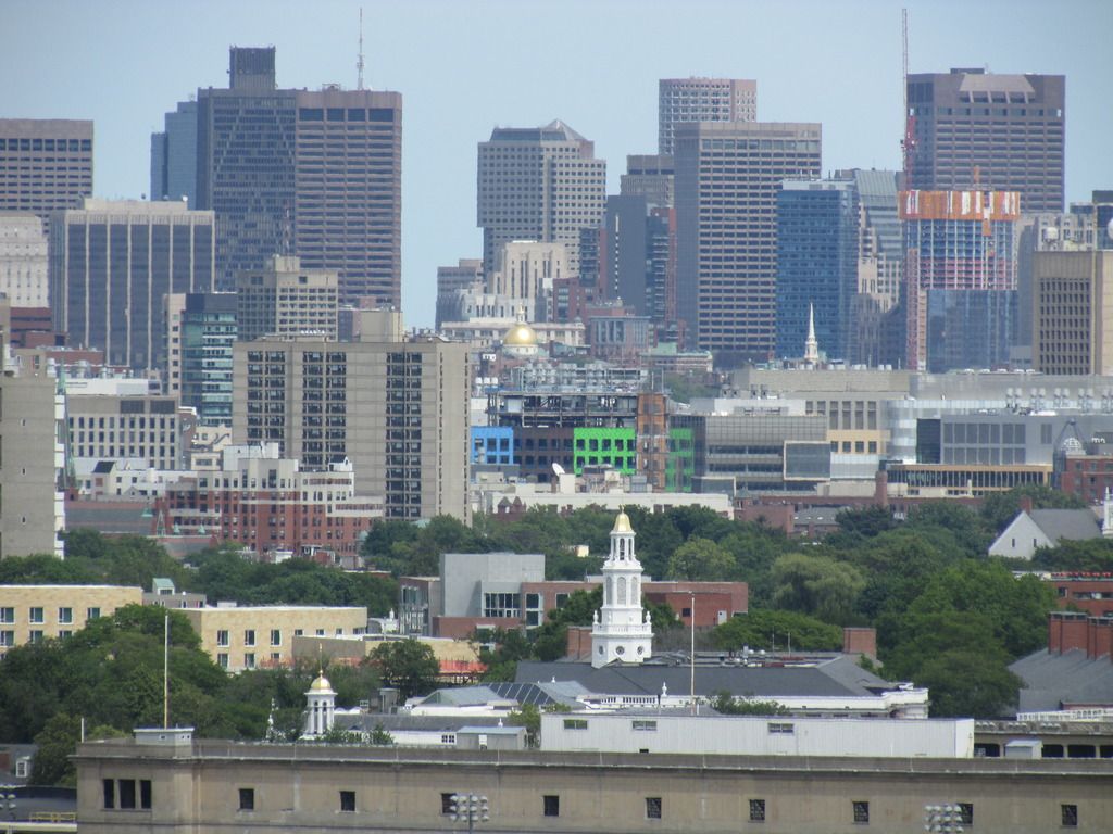
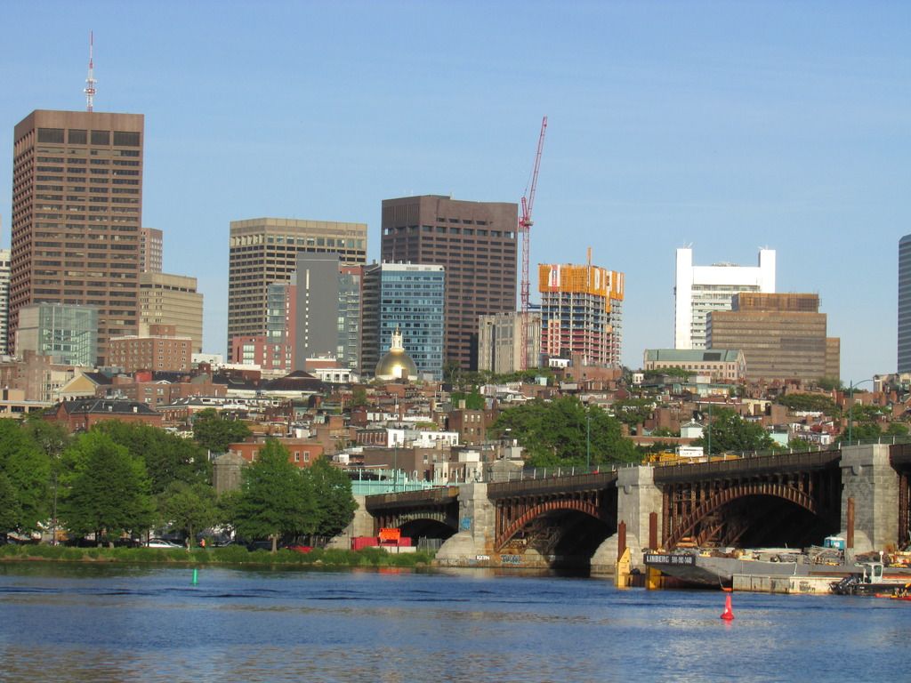
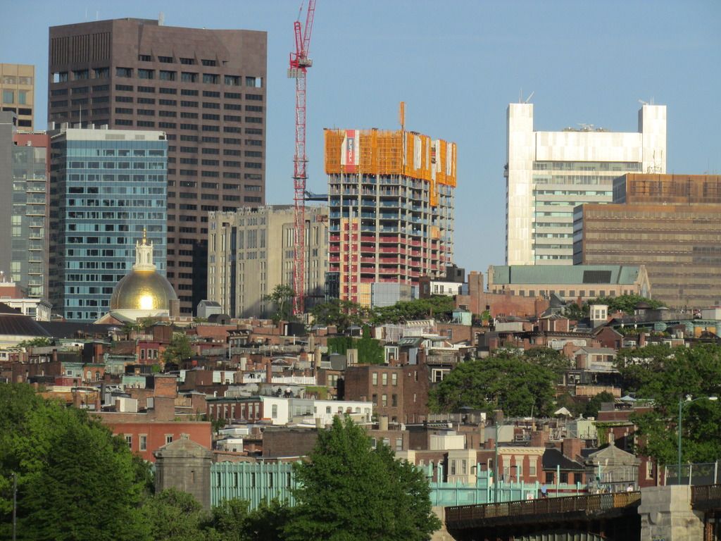
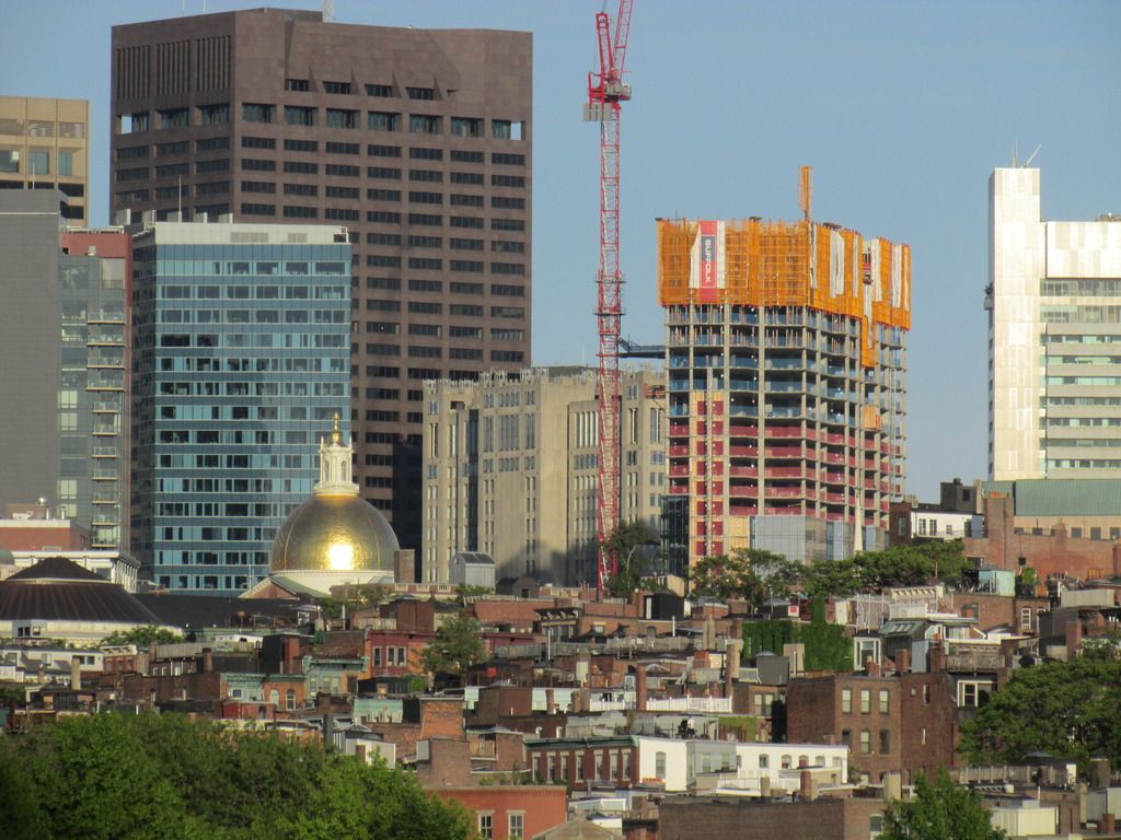
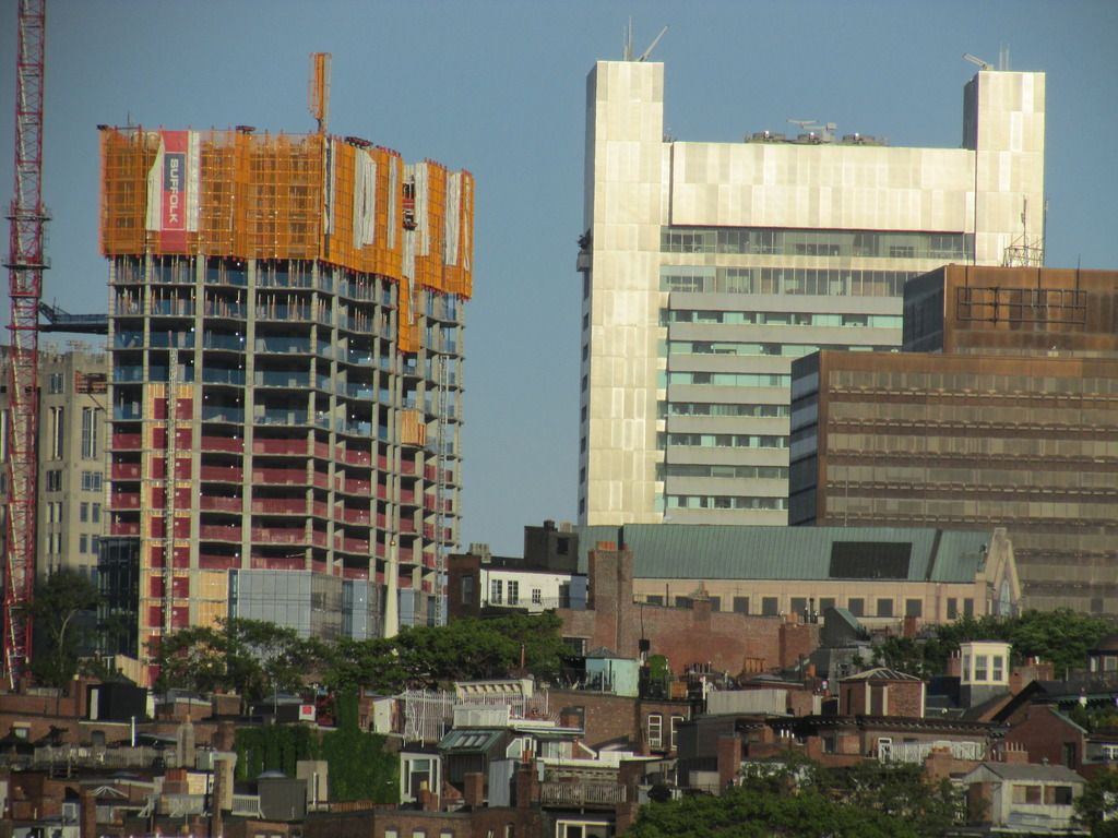
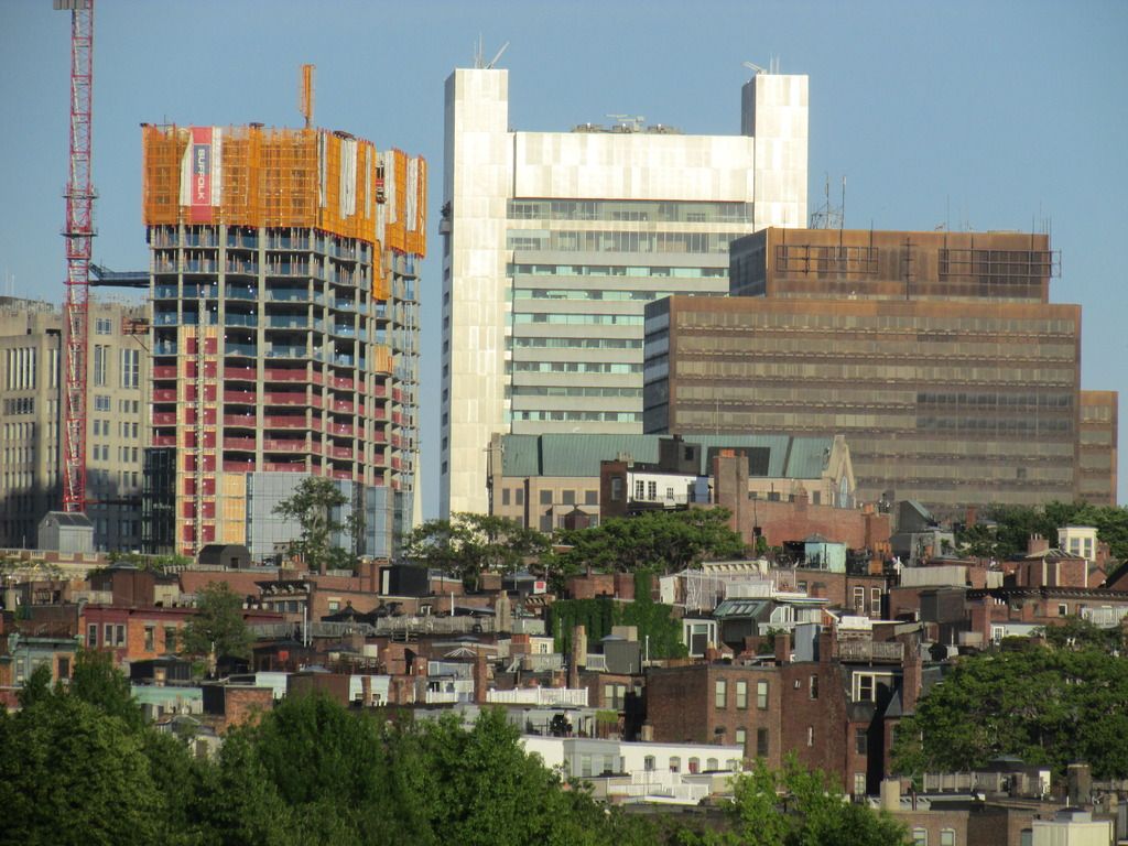
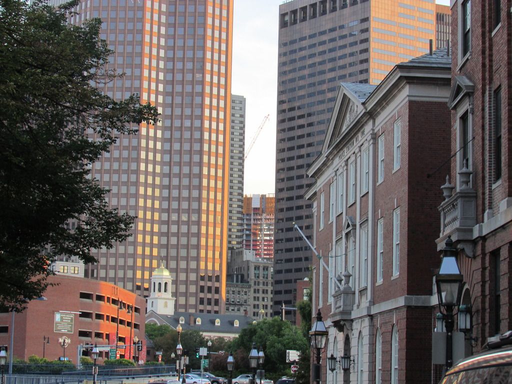
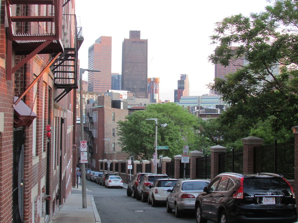
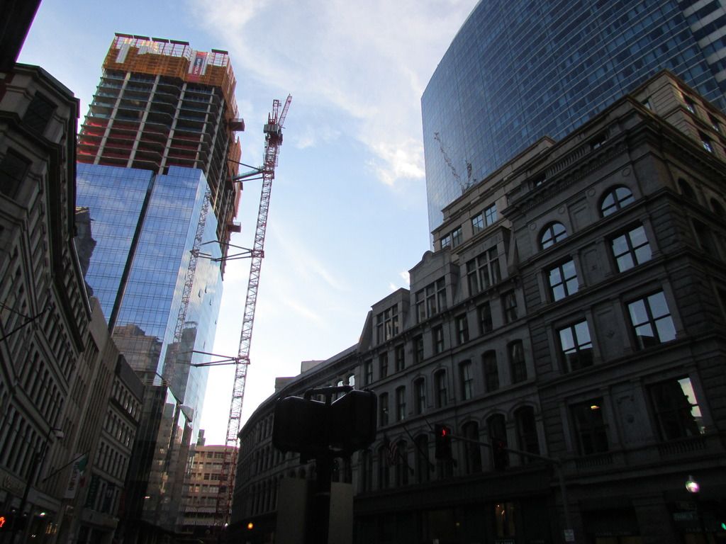
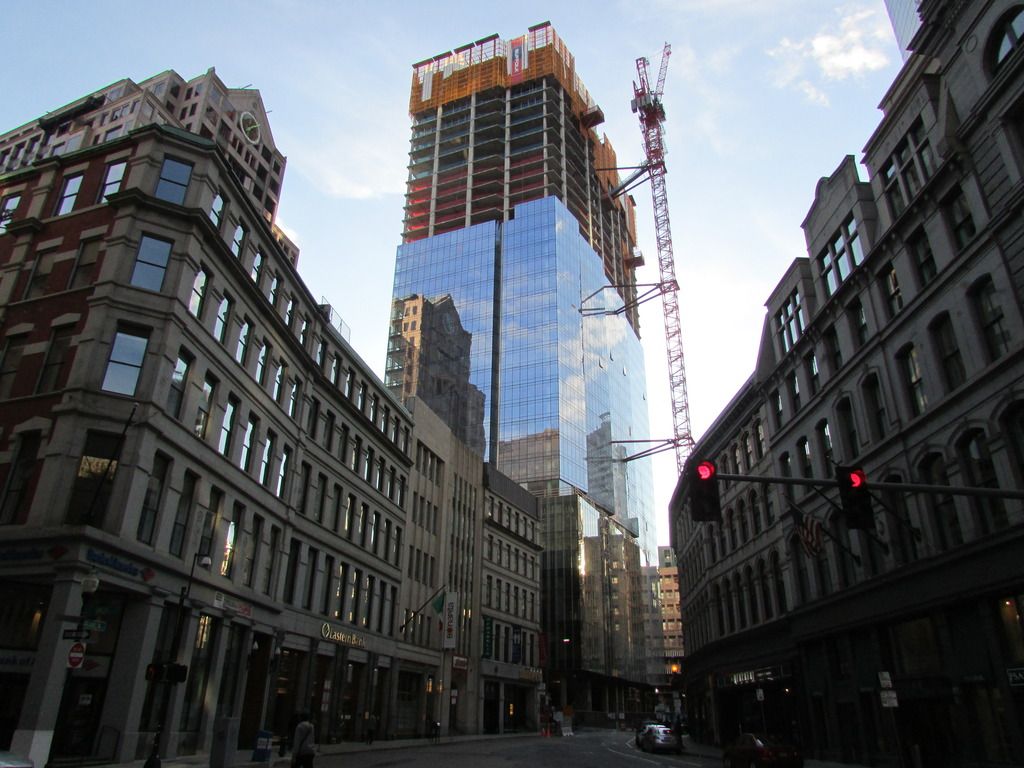
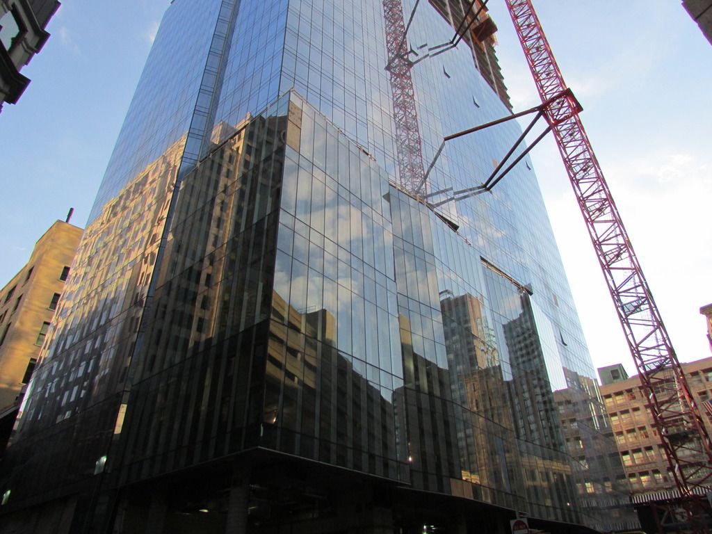
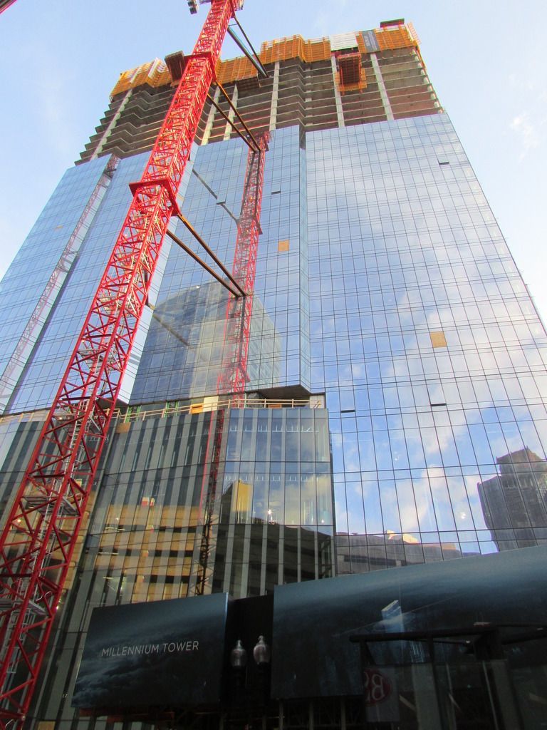
Crane jump!! (Taken just now)


bolehboleh
Active Member
- Joined
- Nov 28, 2011
- Messages
- 413
- Reaction score
- 27
I'll be in Boston next week...you think it'll be finished by then 
Boston02124
Senior Member
- Joined
- Sep 6, 2007
- Messages
- 6,893
- Reaction score
- 6,639
Suffolk 83
Senior Member
- Joined
- Nov 14, 2007
- Messages
- 2,996
- Reaction score
- 2,402
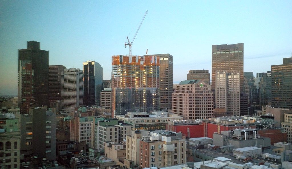
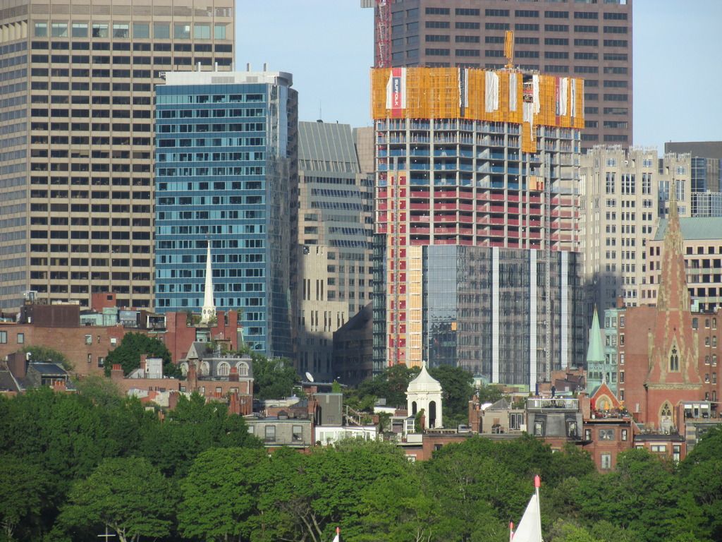
I like how the podium or part with the different glass more or less meets the height of the buildings on franklin it satisfies the eye even though its subtle.
JeffDowntown
Senior Member
- Joined
- May 28, 2007
- Messages
- 4,795
- Reaction score
- 3,660
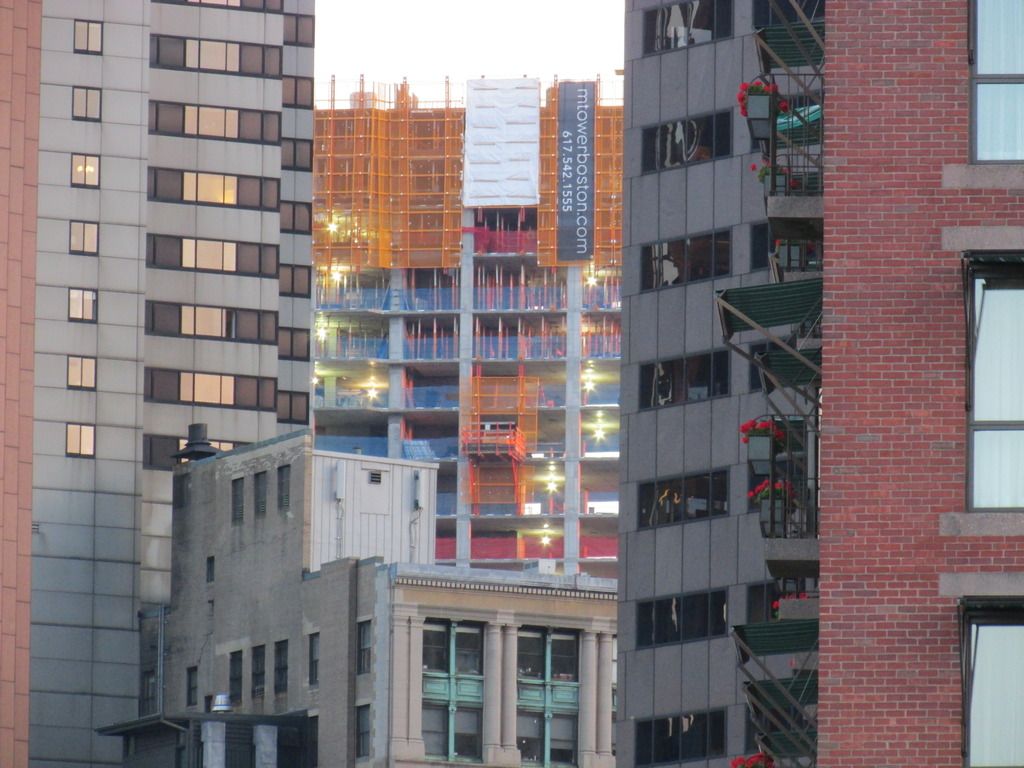
I think it is interesting how they have had the advertising banner up throughout the rise (website link and phone number on the yellow protection fences) -- very different than the recent rental buildings who waited for near completion.
Although now, I think it is a little useless, since it is so high you need a telephoto lens to see it.
citylover94
Senior Member
- Joined
- Oct 27, 2012
- Messages
- 1,140
- Reaction score
- 58
That is probably why they put it up so early so that when the tower was shorter and you could still see the sign it was already up.
- Joined
- Sep 15, 2010
- Messages
- 8,894
- Reaction score
- 271
I like how the podium or part with the different glass more or less meets the height of the buildings on franklin it satisfies the eye even though its subtle.
This is a great observation and speaks to how you can contextually design a tower within low-mid rise urban fabric. It's certainly not a coincidence. It's moments like this that set Millennium Tower away from its glassy box counterparts in the midwest and south.
This is a great observation and speaks to how you can contextually design a tower within low-mid rise urban fabric. It's certainly not a coincidence. It's moments like this that set Millennium Tower away from its glassy box counterparts in the midwest and south.
I just got back from San Francisco and happened to look at the Millennium Tower there (built by the same developers) and this is miles ahead of it in terms of street activation and presence.
- Joined
- Sep 15, 2010
- Messages
- 8,894
- Reaction score
- 271
I just got back from San Francisco and happened to look at the Millennium Tower there (built by the same developers) and this is miles ahead of it in terms of street activation and presence.
Wow. You're right. It's abysmal. Millennium royally screwed SF.
https://www.google.com/maps/@37.790...!1e1!3m2!1scbQwtA11-hB53p3kfRQ9ag!2e0!6m1!1e1
Mission @ Fremont:

Fremont:

Mission:

Mission (better stretch with some retail, unknown if it's been filled since):

Mid-rise along Beale St:

Wow. You're right. It's abysmal. Millennium royally screwed SF.
Mission (better stretch with some retail, unknown if it's been filled since):

The mission side has a restaurant with a fairly uninspired menu (mainly focused on the business lunch crowd I think) and a bank. So there is very little activation there.
I realized this was completed in 2009, but it really is going to be considered a travesty once the sales force tower opens across the street and the trans bay transit center opens RIGHT NEXT DOOR.
BosDevelop
Senior Member
- Joined
- Jul 25, 2006
- Messages
- 1,511
- Reaction score
- 351
In fairness, Millennium hasn't delivered much in terms of street activation of Avery Street at the Ritz towers. There has to be thousands and thousands of square feet of empty retail space on the ground floors of the Ritz development that has been empty for a decade now. Obviously the side of the street with the hotel has some activity but the other side of Avery is awful.
- Status
- Not open for further replies.


