Mixed Use Complex | 345 Harrison Ave | South End

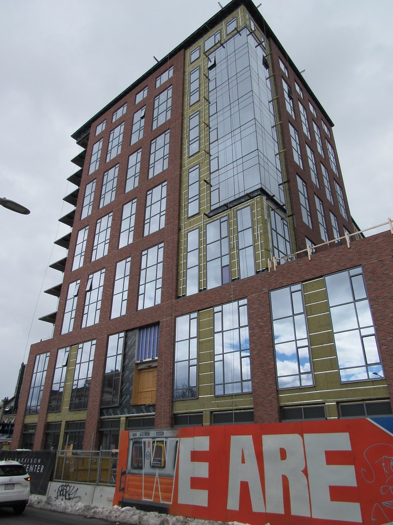
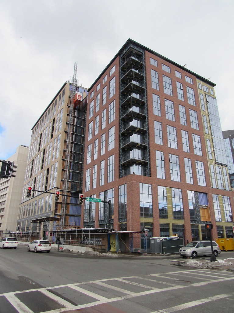
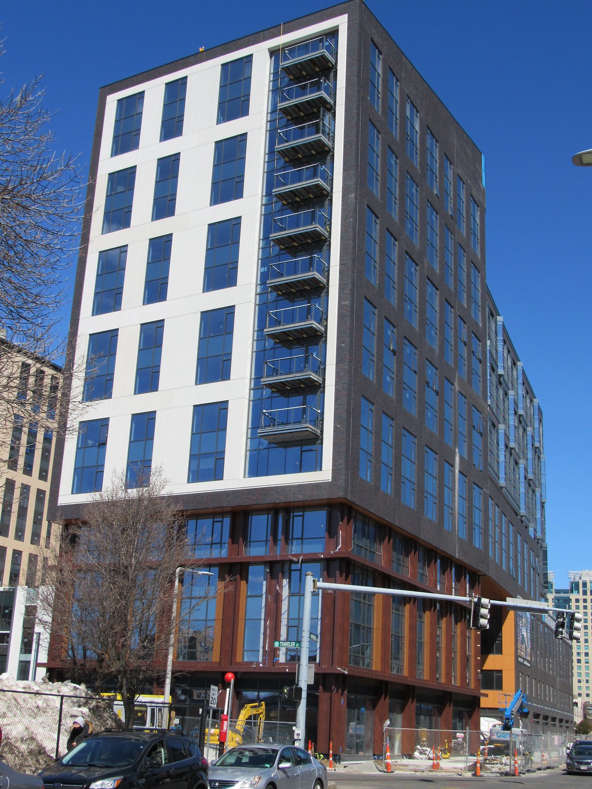
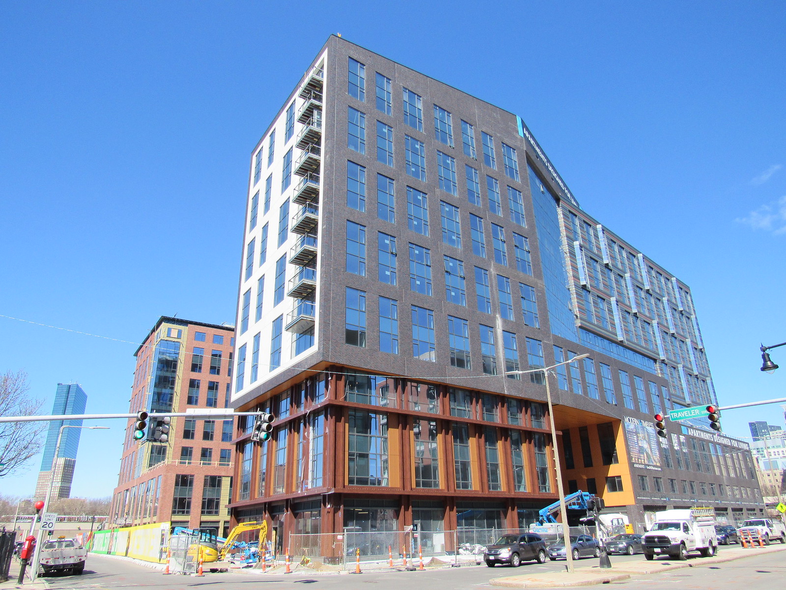
i agree. something i hate? 888 Boylston.... the back side of the Yotel (that faces toward the general direction of Congress St).

& the windows popping out at the Bullfinch Triangle residences.

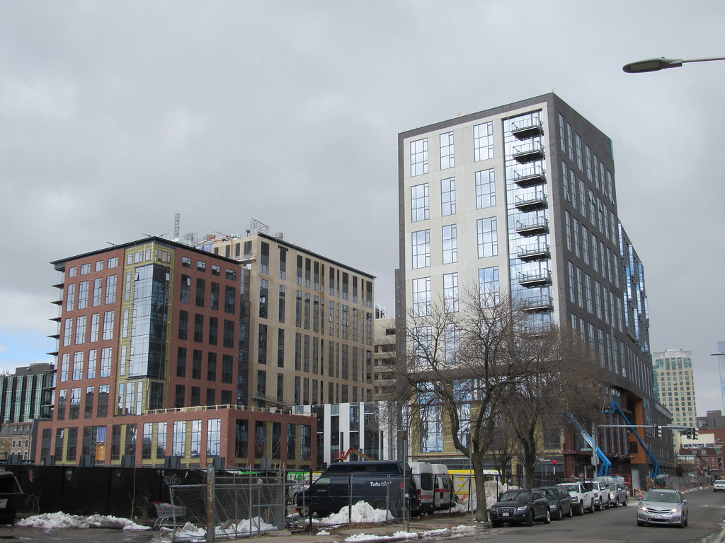
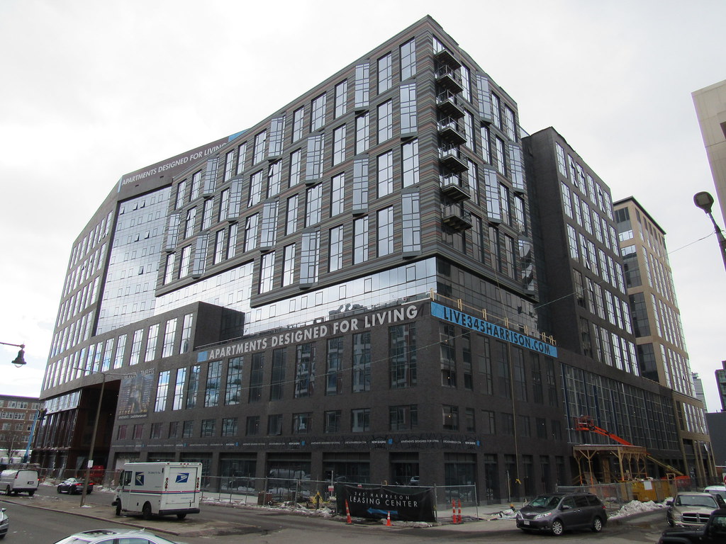
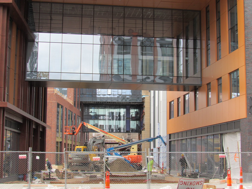
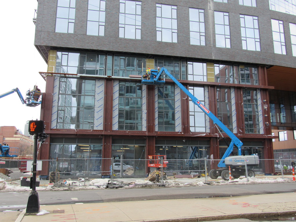
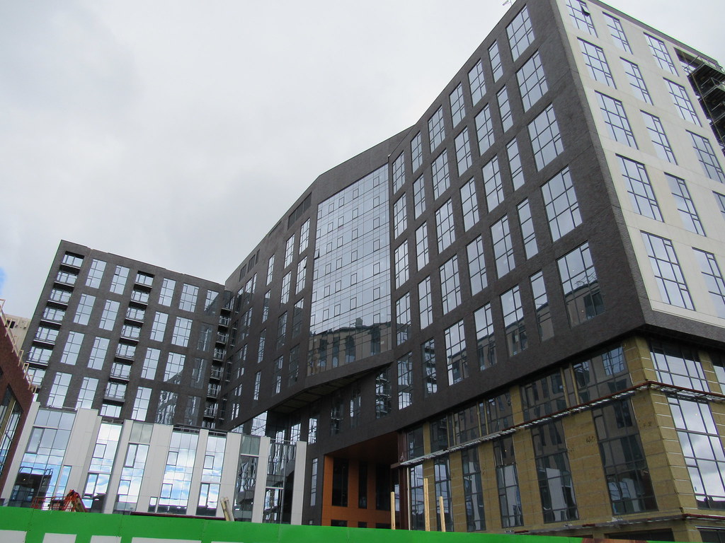
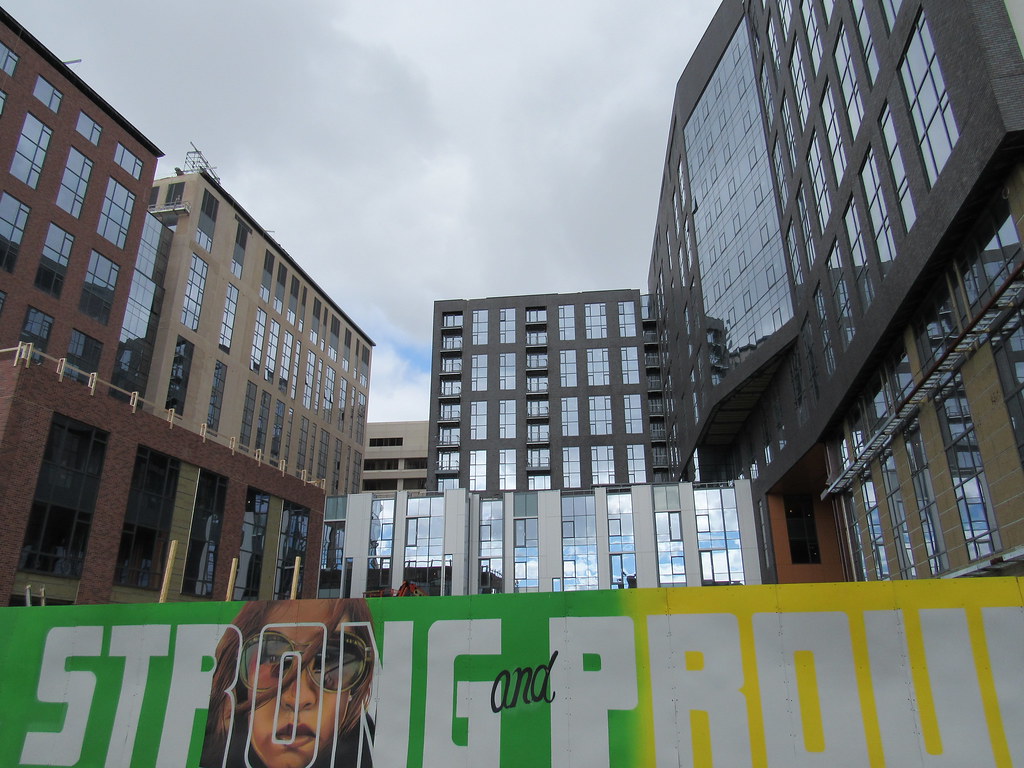
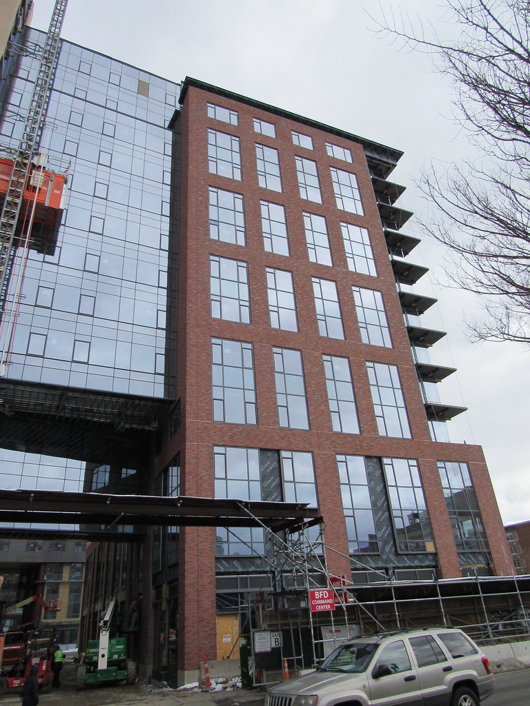
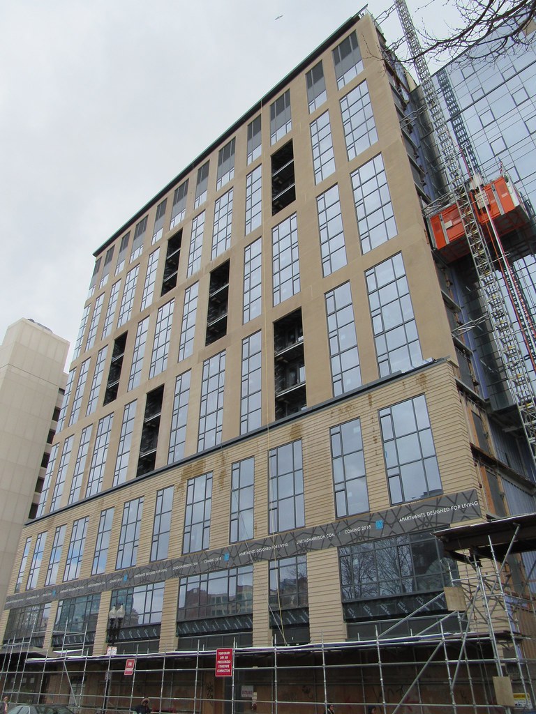
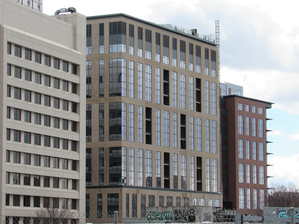
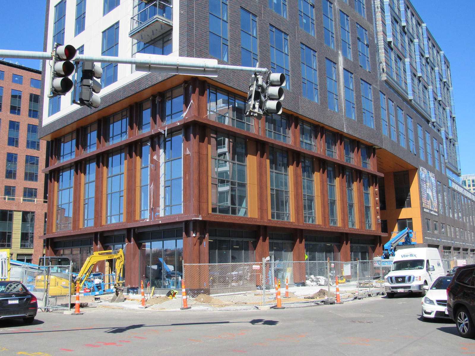
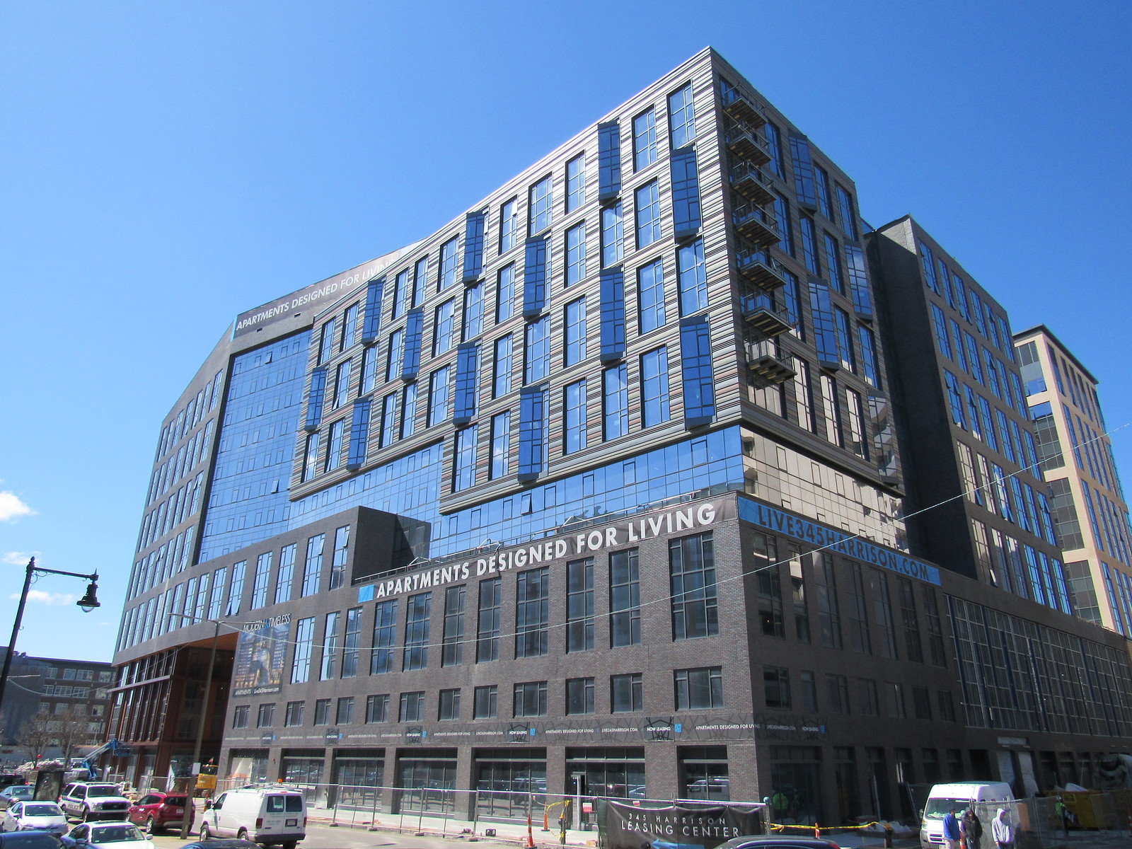
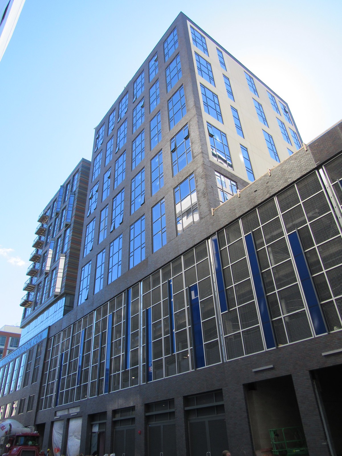
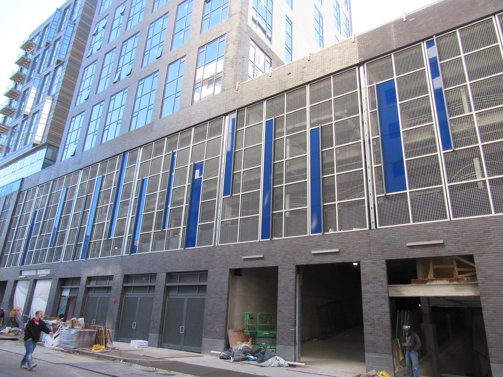
For a megablock complex, it seems OK to me. Not great architecture, but not hate worthy. And there is a lot of residential packed into that megablock!
 
This obviously isn't an instant classic. But, its the kind of perfectly fine background building Boston needs to put up en masse to house its growing population. The real test for me will be will the streetlevel execution. Hopefully it has an interesting mix of uses and attract a steady stream of pedestrian activity.
 
Yes the CVS was announced in December at the Old Dover Neighborhood Association.

https://thebostonsun.com/2017/12/22/udr-residential-project-seeking-retail-tenants-lands-cvs/

“A major retail tenant has signed on to the UDR project at 345 Harrison Ave...

Alexandra Ong of UDR briefed the Old Dover Neighborhood Association on the project Tuesday night, the first update in a number of months and since the project started last April.

The big news from the update came in the announcement that CVS has signed on to take about 10,000 sq. ft. of the 25,000 square feet of retail space available on the ground floor.”
 
Little red section is fine. Yellow part less so, and I guess I appreciate the effort on the grey part's massing but it just looks off. I'd still live here if I was in the market (I'm guessing their income requirements are going to be $70k+).

I think it's the skybridge sections that look the most off. The one next to the red section clashes completely while the one on the grey section is decent.
 
Windows and walls are practically flush with each other making this seem as flat and insubstantial as cardboard. Some depth and dimensionality to emphasize the bone and muscle of the steel skeleton would have done wonders to make this come alive.
 
This tries waaaaay too hard, but doesn't know what it's trying to be.

I'm already in the mode of "fuck it, bring back the beige boxes of 2007" and it's only been a decade. Today you get either zero-effort boxes, or zero-effort boxes with self-imposed, self-conscious nips and tucks as to appear eDGy. Yeeaaahh nope.
 
Damn, I'm loving this, there's a surprise, a splash of color, crazy quirkiness of angles, fun outcroppings around every corner! Not a boring moment around this big girl! If Cindy Lauper could be a building, this is she!
 
There's a lot of interesting things happening here, but the move of smashing them all together is what I can't get past.
 
It's such an exuberant chaotic mess. Most buildings that employ the multi-facade motif do so to minimize their presence by pretending to be several different buildings fading into the backdrop. This seems to draw attention to itself instead, flamboyantly declaring, "Look at me!" I kind of love it.
 
It's such an exuberant chaotic mess. Most buildings that employ the multi-facade motif do so to minimize their presence by pretending to be several different buildings fading into the backdrop. This seems to draw attention to itself instead, flamboyantly declaring, "Look at me!" I kind of love it.

A chaotic mess for sure, but I don't love it like you kind of do. To me, it looks like a much more extreme example of franken-building architecture than the Seaport Square buildings. I can picture the decision makers literally picking whatever available materials and colors are left from a bin and applying to these buildings. Jarring. But we'll see.
 
From the website, the largest unit is about 1646 sqft asking for $7,789/mo. (before any "special" offers). That's about the mortgage, tax, and insurance pmt on a $1.7M home, assuming the most generic down payment %, term, and rate. Whew. At that point, you might as well buy a place, unless you know you are transient.
 
in a not so long ago derelict neighborhood no less. amazing.

A chaotic mess for sure, but I don't love it like you kind of do. To me, it looks like a much more extreme example of franken-building architecture than the Seaport Square buildings. I can picture the decision makers literally picking whatever available materials and colors are left from a bin and applying to these buildings...

Yes, yes, yes. This came out so much weirder than expected. And i still, don't hate it. Crazy how i look at photos from 10 different angles and still find myself saying, 'this is all the same project... but i have to convince the last few marbles rattling around.
 
The Western side is a bit too uniform - in general, though, I like it. It will look much better when it has neighbors across the streets to the South, North, and West
 

Back
Top