You are using an out of date browser. It may not display this or other websites correctly.
You should upgrade or use an alternative browser.
You should upgrade or use an alternative browser.
One Canal (formerly Greenway Center) | Bullfinch Triangle | West End
- Thread starter Justin7
- Start date
SeamusMcFly
Senior Member
- Joined
- Apr 3, 2008
- Messages
- 2,050
- Reaction score
- 110
Re: One Canal (formerly Greenway Center, Bullfinch Triangle)
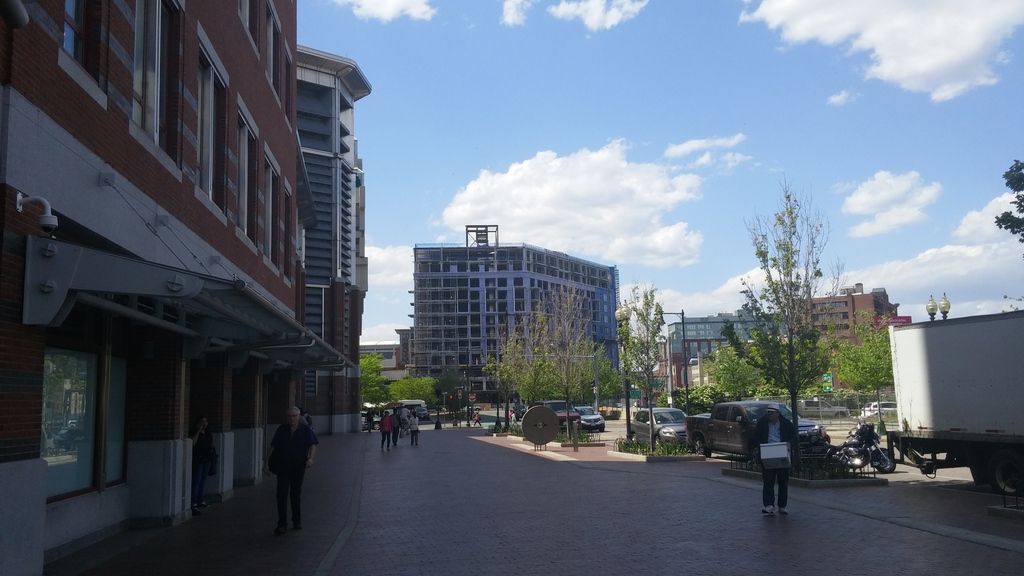
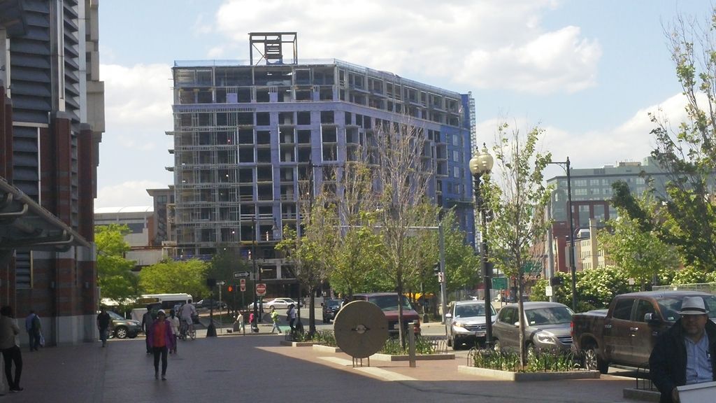
A couple from last Friday.


A couple from last Friday.


- Joined
- May 25, 2006
- Messages
- 7,033
- Reaction score
- 1,865
This really could have used a clock tower.
Padre Mike
Active Member
- Joined
- Jan 27, 2007
- Messages
- 681
- Reaction score
- 1
And some neighbors...from this last view it looks intrusive and isolated. The ongoing legacy of the expressway.
This really could have used a clock tower.
Brilliant: make that happen, good sir!
dshoost88
Senior Member
- Joined
- Apr 14, 2008
- Messages
- 2,168
- Reaction score
- 2,589
This really could have used a clock tower.
With the Custom House (ehhemm... Marriott's Custom House) three blocks away, wouldn't a clock tower be redundant?
Maybe some sort of media tower, though, like that LED tower out front of the BCEC. It could just stream video highlights about Boston sports news all evening.
With the Custom House (ehhemm... Marriott's Custom House) three blocks away, wouldn't a clock tower be redundant?
Maybe some sort of media tower, though, like that LED tower out front of the BCEC. It could just stream video highlights about Boston sports news all evening.
Metromediaplatz 2.0?!
The custom house would no more make a clocktower here redundant than would your smartphone make an LED videoscreen redundant. Its more about defining a place, and less about broadcasting the time of day....
...In fact, this whole area doesn't know where its focal points are - the apex of the bullfinch triangle in particular is begging for something that can work as a terminal vista, but the granite-circle shadow of the haymarket circle isn't doing the trick, the ramps remain a conundrum, and even the garage redevelopment proposal seems introverted...
..but i think you hit the nail on the head Van, this building is all 'sides' with no front / center...
- Joined
- Sep 15, 2010
- Messages
- 8,894
- Reaction score
- 271
Wow that is terrible. Impressive that those 3D models were done in 1998 though.
But to the point of a clock tower here... no. A clock on a building in the 21st century is patently fake and imitative of a time gone by. We all have clocks on our phones now. Our architecture should look toward the future rather than imitate the past.
But to the point of a clock tower here... no. A clock on a building in the 21st century is patently fake and imitative of a time gone by. We all have clocks on our phones now. Our architecture should look toward the future rather than imitate the past.
...didn't 'everyone' have clocks on their wrist / in their breast pocket in 1905 (custom house tower)? Don't we all have video screens (many showing infinite streams of boston sports highlights) in our pockets now too?
Shouldnt 'our architecture' strive to establish a sense of place and an atmosphere appropriate to the conditions of the neighborhood, regardless of whether its futuristic, nostalgic, or indifferent?
The character of an analog clock face is defined by its pace and relentlessness, and the contrast between those characteristics and the life of the city below can be very satisfying. There we all go, rushing through the train station or the busy downtown district as fast as possible, present for only a moment or two on our way somewhere else, while the hands of the clock glide relentlessly along high above us, placidly minding the boundary between the earth and the sky. When you glance at them from within the turbulence of your own hectic rush, they appear static. But you know they're moving. The contrast in paces is enlightening - especially when Time, eternal, is up in the air on a tall column or steeple, and we the People are all, right now, scurrying around on the ground. (fun fact, many early-modern churches have clocks at the base of their steeples, and they're not just there to let people know when the services are about to start).
And they call it a clockface for a reason.
Videoclips, on the other hand, amplify the hectic-ness. Or, more often, they struggle to create the superficial impression of a hectic, lively space in an otherwise barren, anonymous location (cf. the front door of the convention center; most Jumbotrons in most venues most of the time; most TVs in most bars and restaurants most of the time)
Last edited:
- Joined
- Sep 15, 2010
- Messages
- 8,894
- Reaction score
- 271
I want what you had for breakfast.
...and to continue the thought process:
...the problem, however, is that a clocktower on this 'residential' building would be not nostalgia per se, but kitsch.
It would be kitsch because an (analog) clocktower belongs on an institutional building. It's a symbol that says 'this institution derives its power from objective and rational sources, and that power transcends this particular location, pervading time and space throughout eternity'. It says that 'this building is just one manifestation of that power, and the activities this building contains are just particular iterations of eternal principles." ... So while there is an element of enlightenment, as I described in the previous post, there are also hints of menace, awe, and terror (in the archaic sense - the experience of trembling before an all-powerful force that you can perceive but not comprehend). Somewhat like gazing at the blazing sun, or contemplating the face of the moon - those other luminous orbs suspended in the heavens.... (The Observer in the tower at the center of Bentham's Panopticon was not concealed behind the face of a clock -if I recall correctly - , but perhaps he should have been.... )
So, with this in mind, how to make sense of where we have historically built clocktowers?
-Railroad stations ... Embassies built by the empires of rational management as they bound the wild countryside in a web of iron fetters; (corporate HQs in different industries would later adopt the symbol in the same spirit)
- Churches ... especially early modern (i.e 19th century: intellectually modern, but not architecturally Modernist) Protestant ones, punctuating their claim to demystified, transcendent piety (especially in contrast to quasi-pagan Catholic clericalism)...(and on that note, go and Google the new and otherwise awful clocktower in Mecca)
- Government Buildings ... The Customs House itself advertises incorruptible federal authority over the teaming harbor, in implicit contrast to the ancient entanglements of the local government lurking in the crooked streets above which Federal power is elegantly elevated.
To be clear, the clockface serves a functional purpose in each of these contexts as well - and far from being obsolete, it is obviously the apotheosis of graphical data display (the distinction between old and obsolete is essential and almost always overlooked).
But the symbolism matters. If there is going to be a clocktower in this 'hood, it should be at North Station, or appended to a renovated Federal Building or to the Adams Courthouse annex 'tower' (which would be a very elegant terminal vista for Hanover Street once it is reconnected to Cambridge St., by the way).
Or - to extend the theme - you could make an analogous move by locating a * non-mechanical & non-digital* time piece closer to earth at any of several nearby containers for democratic chaos ... something like a sundial or a Stonehenge-like-physical calendar to mark the 'order-embedded-in-chaos, imminent rather than abstract, effective though without authority' ethos that characterized the traditional Haymarket, or to mark the heart of the city at the core of a democratized & revitalized City Hall Plaza ....
..But none of that symbolism is appropriate on a residential building like this one. They could simply have just gone with a pitched roof and dormers like the ones on the friendly brick giants that stand shoulder to shoulder on the other side of canal street. i.e. the language of domesticity, at least in this neck of the woods - not necessarily easy to do without any condescension, but it would have been the right clothing for the occassion.
Last edited:
- Joined
- Jan 22, 2012
- Messages
- 5,078
- Reaction score
- 1,661
^^
And lunch as well apparently.
I want what you had for breakfast.
And lunch as well apparently.
...and to round out the series:
What does a videoscreen say? It says: where you are right now does not matter, and the continuity of your experience is a burden that constrains your capacity for amusement, rather than the thread that gives coherence to your existence. It says: you are not the author of your own experience, you are its consumer, or at best its curator. It says: the people around are you not your collaborators in a collective project, not your companions in a shared journey; they are just the aggregate material of the audience in which you are yourself immersed, there to magnify the potency of the video presentation by contributing their gazes to its breadth of broadcast.
If the clock is about Transcendence, with Domination lurking in its Dark Side, then the Video Screen is about escape, and the risk is that everything coherent dissolves upon contact with the rainbow-surfaced puddles it splashes indiscriminately across the landscape.
So yeah, as I've said elsewhere, these choices matter a lot, not least because there are implications for politics, dignity and power relations embedded in the way we build and re-build this city.
Last edited:
whighlander
Senior Member
- Joined
- Aug 14, 2006
- Messages
- 7,812
- Reaction score
- 647
How about a Roman-style Sun Dial
The Romans repurposed Egyptian Obelisks for us as a Gnomon of Sundials
The Romans repurposed Egyptian Obelisks for us as a Gnomon of Sundials
- Joined
- Jan 7, 2012
- Messages
- 14,062
- Reaction score
- 22,726
goldenretrievers
Active Member
- Joined
- Nov 14, 2014
- Messages
- 877
- Reaction score
- 615
- Joined
- Jan 7, 2012
- Messages
- 14,062
- Reaction score
- 22,726
Boston02124
Senior Member
- Joined
- Sep 6, 2007
- Messages
- 6,893
- Reaction score
- 6,639
- Joined
- Jan 7, 2012
- Messages
- 14,062
- Reaction score
- 22,726
 https://flic.kr/p/vwHWVy
 https://flic.kr/p/vwHMeE
Entrance @ One Canal taking shape.
 https://flic.kr/p/vhyZoV


