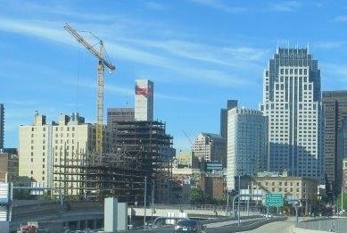
One Greenway (Parcel 24) | 0 Kneeland Street | Chinatown

That didn't work for the new building in the west end(should have) even though displaced west enders pushed the project forward so I hope it doesn't happen here.

I am not exactly sure what you are saying, but I do not believe that the West End had the kind of affordable set asides that One Greenway has. Part of what took this project so long to get off the ground is that it has a very large affordable component (40% of the units).
 
So then, will this development similar to what Charlesgate is all about meaning a variety of income levels and prices, from affordable to market rate?
 
You'd have to dig through the affordable housing agreement to check the various % AMI dedications (X units at market rates, X units at 80% AMI, X at units 60% AMI, etc.). My guess is that with a 40% affordable housing component (IIRC) and with a goal of providing housing to the displaced population (which generally earns a very low % of AMI) this is a bit closer to what you are thinking.
 
You'd have to dig through the affordable housing agreement to check the various % AMI dedications (X units at market rates, X units at 80% AMI, X at units 60% AMI, etc.). My guess is that with a 40% affordable housing component (IIRC) and with a goal of providing housing to the displaced population (which generally earns a very low % of AMI) this is a bit closer to what you are thinking.

I have seen but do not have handy the %AMI breakdown, but the affordable component definitely targets multiple % AMI levels.

Also the units are split up between rentals and condos:

217 market rate rentals (in North building)
95 affordable rentals (in North building)
51 affordable condos (in South building)

North building is the one currently under construction. South building will be a mid-rise extending on down Hudson Street. Construction to start in 2015.
 
I am not exactly sure what you are saying, but I do not believe that the West End had the kind of affordable set asides that One Greenway has. Part of what took this project so long to get off the ground is that it has a very large affordable component (40% of the units).

It's the building at the start of Merrimack St. Right up till it was finished the former west enders thought they would have first chance to move in.
 
14837062507_59350fd94b_b.jpg
 
anyone else have a problem with thier Iphone not focusing? piss's me off!!
 
As with EVERY SINGLE development except waterside place, give it time to come together because they usually end up coming out better than it seems.
 
As far as faux texture goes, I like this more than most I've seen recently.
The terra cotta coloring looks better to me I guess. The slight variations (almost gradual) in color make it look like a real product.

As above... will see when it's done. All opinions, including the one I just threw out there, are subject to change.
 
Why not just actually use brick? That looks awful imo.

Hiring masons is very expensive and takes much longer than using alternative facade materials. The Apartments at 525 Huntington (WIT) was supposed to have a masonry facade, but the project fell behind and a decision was made to switch to precast panels in order to get back on schedule. The majority of the facade was able to go up in a matter of a couple weeks with the panels compared to the months it would have taken to lay brick.
 
Last edited:
My first impression is that this looks really good. It's got texture and depth, and it's not white. There is some subtle variation in the shading and I like the terra cotta color. Of course I haven't seen it in person. Kz could make a turd look like a work of art with his camera skills, so it's hard to be sure. But so far it's encouraging.

There's a seam running up the corner tier in the middle of what should be a single column of faux "bricks". Little details like that are undesirable, but the overall effect is positive.
 
There's a seam running up the corner tier in the middle of what should be a single column of faux "bricks". Little details like that are undesirable, but the overall effect is positive.

That seam is horrid IMO. It is so glaringly out of place that I can't peel my eyes off it.
 
That seam is horrid IMO. It is so glaringly out of place that I can't peel my eyes off it.

What is strange is that there is a seam on both sides of that corner (harder to see the one to the left due to the lighting). So the seams appear to be very much on purpose??? WHY???
 
I like the color at least. The seams are glaring, but I'm not hating the facade so far...
 

Back
Top