Quaker Lane + Congress Square | Downtown

... I think its going to be a bold contemporary gesture that we often say on this board that Boston does not do.

Here's the problem I'm having: like a lot of modernism, I like it more the less I see of it. In this shot it's rather likable because it acts as a foil to its surroundings.

39169247315_c5925a50f4_z.jpg


Whereas when I see the bulk of its mass, like in this shot, it shows it for what it is: a minimum-effort nip and tuck job with a zero-effort facade.

39169254005_a6577c553c_z.jpg


Which immediately calls to mind this zero-effort addition from a few years back. The difference between blatant laziness and "bold contemporary gesture" is apparently razor thin.
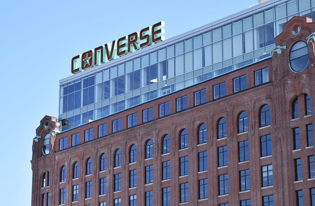
40122423672_7ca75e3f3a_z.jpg
 
Done all the time. Old buildings have lots of "extra" gravity load available as they were seriously over designed ....

cca

Oh wait did I get this wrong? How embarrasing if so. I really thought they'd got down to ground level inside the old facades - is the old building really bearing the load of the new bit?
 
I was holding out hope this would turn out ok but that glass work looks like a tumor.
 
It looks goofier in person if you actually look at it. But the good news is that mostly the streets are narrow and busy, so there is less time to contemplate the silliness. Also, the anodyne 2-D quality of the glass helps it recede somewhat.
 
It’s so decoupled from the base architecturally that it creates effect of the top being from another building behind the base. And that’s the best thing I can say about this...
 
They should have darkened the material behind the whiter portion of the glass.
 
Damn, I love that cap and this whole development. Between this and the new glass addition to 100 Federal, it's a welcome bit of showy flash to the very traditional Financial District.
 
Wish they'd done something to conceal the underside of the decking in the overhangs but all in all I'm on the pro side for this one.
 
Damn, I love that cap and this whole development. Between this and the new glass addition to 100 Federal, it's a welcome bit of showy flash to the very traditional Financial District.

I see this as incredibly awkward and arbitrary, the new addition doesn't even seem to want to relate to the original building - - like topping an ice cream sundae with wheat toast. The corners of the two buildings don't line up in a way that looks like an unkempt bed. Looking at that closer up pic from below of the two buildings' corners, I want to reach up and rearrange the positioning of the new one (but, perhaps that was the architect's intent - - to instigate that feeling).

I respect your opinion, and I'm trying real hard to like it. Is it trying to make a 'disruptive innovation' statement like Stata or the EF One building?
 
I am into this. I was holding my comments until I went down there and saw it for myself. It is pretty nicely done. One can argue (as is done above) that this is discordant with the existing ... but I think that is not the right way of reading this one. It is COMPLETELY foreign. So foreign that it has to be on purpose. The new "floats" above the existing without visually touching. It has its own footprint, it has its own materiality. Whether you agree with the aesthetics or not can be argued subjectively ad nauseam, this is solid design thinking and well executed. Thumbs up from me.

cca
 
just saw it in person this past weekend and your assessment matches my own to a T.
 
+1 as well. I walked by it recently and it's good. It's a frankenstein's monster but it looks pretty good.
 
I have no idea what to think of this. Ill wait till I see it in person, but probably still wont know...either way its here.
 

Back
Top