Quaker Lane + Congress Square | Downtown

i think they botched this. Should have gone faux period correct like Lovejoy and Rowes Wharf. It would codify.... and in 60 years none would be the wiser, much less care.
 
+1 as well. I walked by it recently and it's good. It's a frankenstein's monster but it looks pretty good.

I went by a few weeks ago and think it's inoffensive in person, at least when viewed from Post Office Square. You don't really notice it because it blends into the other buildings unless you're trying to look at it. Zoomed pictures highlight it in the worst possible way IMO.

I didn't see it from the Congress Street angle so no opinion there.

From most angles it simply looks like an adjacent taller building hovering over it. I agree this will be inoffensive to almost everyone.
 
Looks like the architect lackey's coming to the rescue on this board.

I have not seen this in person but this looks awful from the pics.

So not Boston
 
So not Boston

Worst possible reason to not try something new.

I like to use the London Measuring Stick when deciding if something is "appropriate" for Boston or not. Would this work in London? If yes, then it will be just fine in Boston. London is chock full of this type of development, and the majority are fantastic IMO.

The scale of this project is perfect as a test, too. Not big enough to be truly offensive if it doesn't work out, but big enough so that if it does work out, it will turn heads. Let's wait until the second aspect of the project seen in BeeLine's last pic gets wrapped up. I am personally more interested in seeing how this part comes out.
 
There's something incredibly Boston about this to me: downtown is so good at doing that layered, oblique thing where every era of the city's history is visible at once. These pictures reinforce that from nearly every angle, the observer's eye is tricked into thinking these are two different buildings, with the base building occluding the addition. Even up close it somehow appears that the new building is behind the old one. I think it adds depth to the fabric.

This is a counterfactual because we don't know what it would have looked like for this addition to respond to its host with imitation, but I think it makes a convincing case that having no architectural response at all can be a successful strategy. I don't think it could work everywhere but in our windy downtown it does.

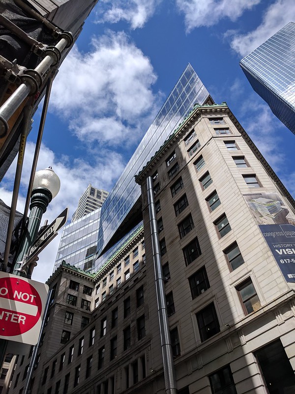
I think that Exchange Place and Atlantic Wharf are better examples of reusing historic facades into modern towers. I like what they did at ground level here, but the glass portion is fairly disappointing to my eye. Still being in downtown the glass portion isn't that prominent. Bigger buildings block it from a few different sides so I guess the development isn't too bad.

But I still like this trend and hope it continues. I wish the developer near the Citgo sign would preserve the facade of the corner building, we'll see though.
 
Yah, I feel like this isn't really visible on the skyline. Most angles that people will see will be right next to the building, and it looks great from there.

The only angle where you can really see its ugliness is from Congress Street.
 
Got too close to the building before thinking to take out my phone, which just shows that you really can't see much from the ground level:


40877029504_fd7626d3fc_c.jpg


26719893617_421218e85f_c.jpg
 
Facade of the hotel addition is being installed (you can see the first floor of it in the last picture). It’s definitely different than what I was expecting but I like it.
 
There's something incredibly Boston about this to me: downtown is so good at doing that layered, oblique thing where every era of the city's history is visible at once. These pictures reinforce that from nearly every angle, the observer's eye is tricked into thinking these are two different buildings, with the base building occluding the addition. Even up close it somehow appears that the new building is behind the old one. I think it adds depth to the fabric.

This is a counterfactual because we don't know what it would have looked like for this addition to respond to its host with imitation, but I think it makes a convincing case that having no architectural response at all can be a successful strategy. I don't think it could work everywhere but in our windy downtown it does.

Agree. There are multiple good ways to approach this. This one works.
 

Back
Top