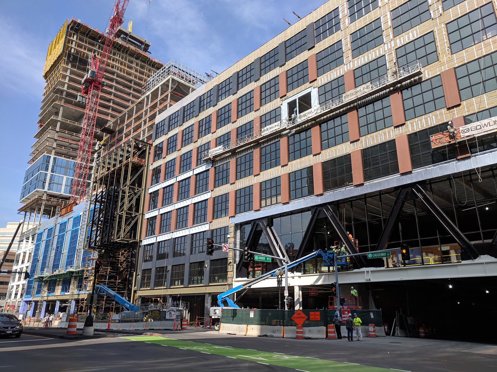
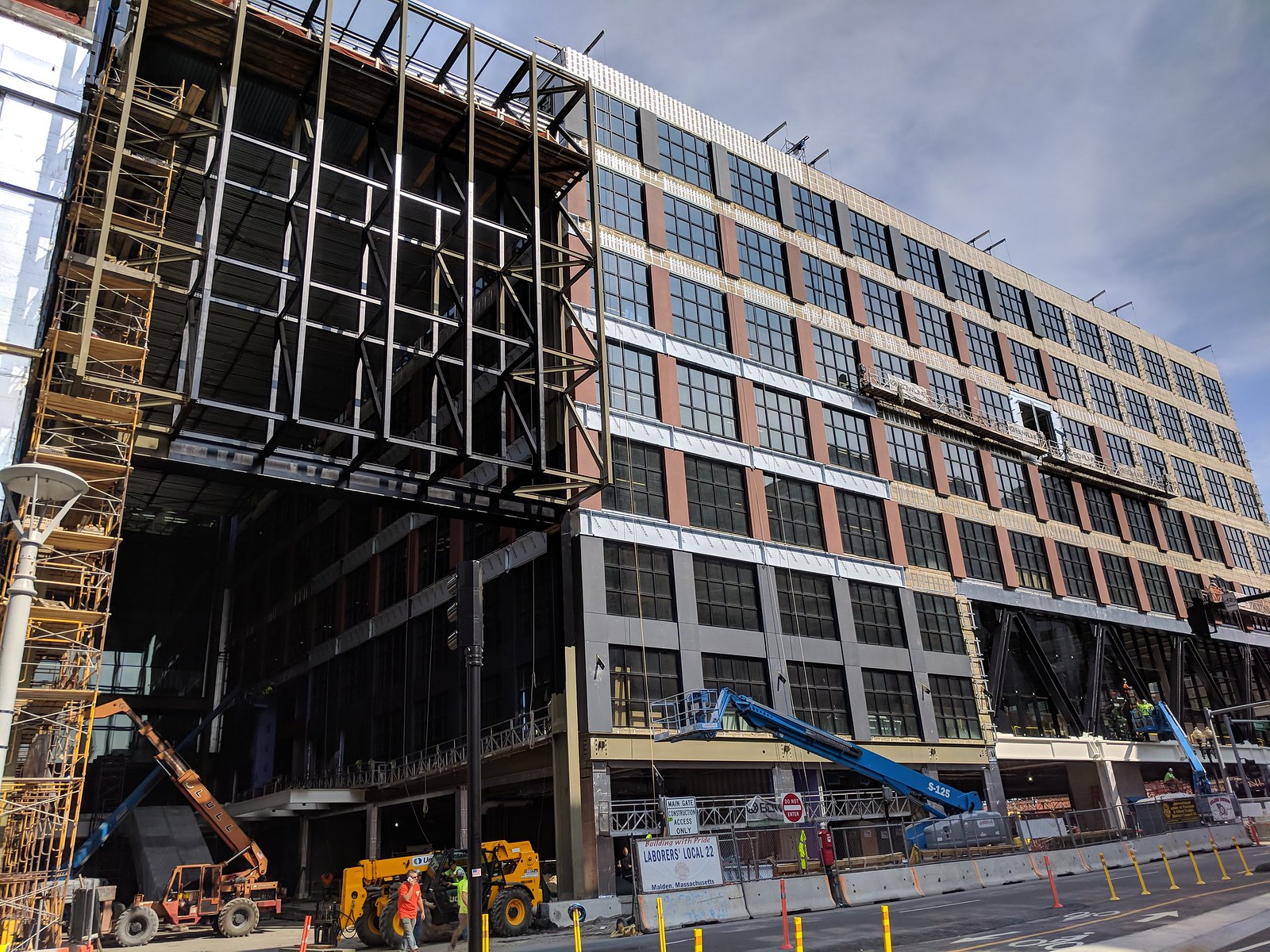
The Hub on Causeway (née TD Garden Towers) | 80 Causeway Street | West End

You guys really think this is a "damn fine development" already from what we can see? That right podium looks sketchy at best but I'm reserving comment until its closer to finished.
A weather protected subway-CR connection, expanded rail concourse, main entrance to NS for the first time, 600ft of new streetwall, gobs of retail, office, and residential directly on top of a transit hub. It would take really bad architecture to outweigh the functional benefits of the project.
 
Agreed. Apparent manufacturing defects with the terra-cotta cladding was a problem earlier this summer. Now I think the issue is with the proportions of these elements, and their featureless surface. They may as well be Alucobond. With the V-braces (which I like), this is a very "busy" facade. But what's it busy doing?

Its busy doing


A weather protected subway-CR connection, expanded rail concourse, main entrance to NS for the first time, 600ft of new streetwall, gobs of retail, office, and residential directly on top of a transit hub. It would take really bad architecture to outweigh the functional benefits of the project.


On a different note though they should have brought the office tower facade to street level like the residential. Its going to look like its half as tall as it really is.
 
I just think it looks cool right now because it's one building but every part of it is in a different stage of construction.

I agree with this, its a fun one to see go up. The final product may be a different story, others are too high on this. Its a big empty lot on a transit hub still located in the core in a very strong economy and people happy getting a couple concourses and some retail. Gotta aim higher.
 
I think we all know what
(i)t's busy doing...
Not to be pedantic, but my question (and perhaps Suffolk83's misgivings) are about the look and expression of this project, not in its transformative functions and amenities to this part of the city. Urbanistically, it's a win; the same could be said about the three turds across Causeway Street that fill out the Bullfinch Triangle. Complete streets are awesome, a goal we should aspire to across Boston. I still think the entire project looks feebly unfocused.
 
Looking at the render again the horizontal beams on the right podium are going to be painted like the cross braces are at the bottom couple floors.


43547511954_188a2fbfb9_h.jpg


43358840805_a70c8fa744_h.jpg

^ In the doorway you can see half of one of the greyish green columns half painted and the silver horizontal beams which are newly installed and not painted yet.
 
They white is just protective film. When they peal it off you will see the dark gray color.

cca
 
some people were giving this project CRAP 1, 2 years ago.....

i predicted almost everyone would fall in love with it.

myself included. well, here we are and it's looking more fantastic by the day.

granted, the office is going to be the next fat, 510' turd. worse than we could have dreamed. and too bad the residential tower didn't go the full 659'.... that would have been appropriate--and epic.

but this dead cavity in the gateway to the City is filling in.

not bad.
 
A reminder of what this is supposed to look like. The dark color should help tie in the V braces.

Hopefully the Rapid7 sign is just mockup marketing (if they're even still attached).

pbMTOBW.jpg


I know this is one massive development, but I appreciate the fact that the two sides are completely visually disconnected. If I didn't know better and someone told me these were two separate older buildings that were later connected with a pedestrian realm in the center I'd believe it.
 
Aren't they in fact, two separate buildings? I thought the two sides of the atrium were structurally distinct from one another. Regardless, I agree that they certainly credibly look like two different buildings as far as the street wall is concerned. This kind of thing has been done a lot in Fenway, but not as well as it is executed here.
 
Aren't they in fact, two separate buildings? I thought the two sides of the atrium were structurally distinct from one another. Regardless, I agree that they certainly credibly look like two different buildings as far as the street wall is concerned. This kind of thing has been done a lot in Fenway, but not as well as it is executed here.

I consider this to be 2 separate buildings with 5 distinct parts: office podium, residential podium, office tower, residential tower, hotel component.
 
and Winthrop Square will be called 2 bldg's by the dirty, unwashed masses.

i'll be joining them.

:)
 
Last edited:
and Winthrop Square will be called 2 bldg's by the dirty, unwashed masses.

i'll be joining them.

:)

2 radically different examples. Winthrop Square is more like Tokyo City Hall. It's fully connected for too much of the way up to be considered 2 separate buildings. This is more of a loosely connected complex. Think of a less extreme version of, say, the Pru Mall where you would never consider the Pru and 111 Huntington to be the same building, even though they both connect to the mall. This is like a much closer version of that, but still 2 separate buildings with a loose connection at the very bottom that isn't structurally necessary so that each building could stand on its own without the other.
 
Now I have a headache.

My point was that despite being a single development, on a single lot, built at one time, and despite behind a similar length to the three buildings across the street, the decision was made to keep these to sections/buildings/whatever visually distinct. This didn't need to be the case.

I'm not really sure why it matters how many buildings we call it, but let's argue about that some more anyway.
 
I think the multi-building style complements well the line of old and diverse buildings across Causeway Street.
 
A reminder of what this is supposed to look like. The dark color should help tie in the V braces.

Hopefully the Rapid7 sign is just mockup marketing (if they're even still attached).

pbMTOBW.jpg


I know this is one massive development, but I appreciate the fact that the two sides are completely visually disconnected. If I didn't know better and someone told me these were two separate older buildings that were later connected with a pedestrian realm in the center I'd believe it.
I still think of that arcade as the world's fanciest alley.

Is there something specifically wrong with Rapid7, or do you just not like the perpendicular office signage in general?
 

Back
Top