You are using an out of date browser. It may not display this or other websites correctly.
You should upgrade or use an alternative browser.
You should upgrade or use an alternative browser.
The Hub on Causeway (née TD Garden Towers) | 80 Causeway Street | West End
- Thread starter choo
- Start date
 IMG_9495
 IMG_9509
 IMG_9533
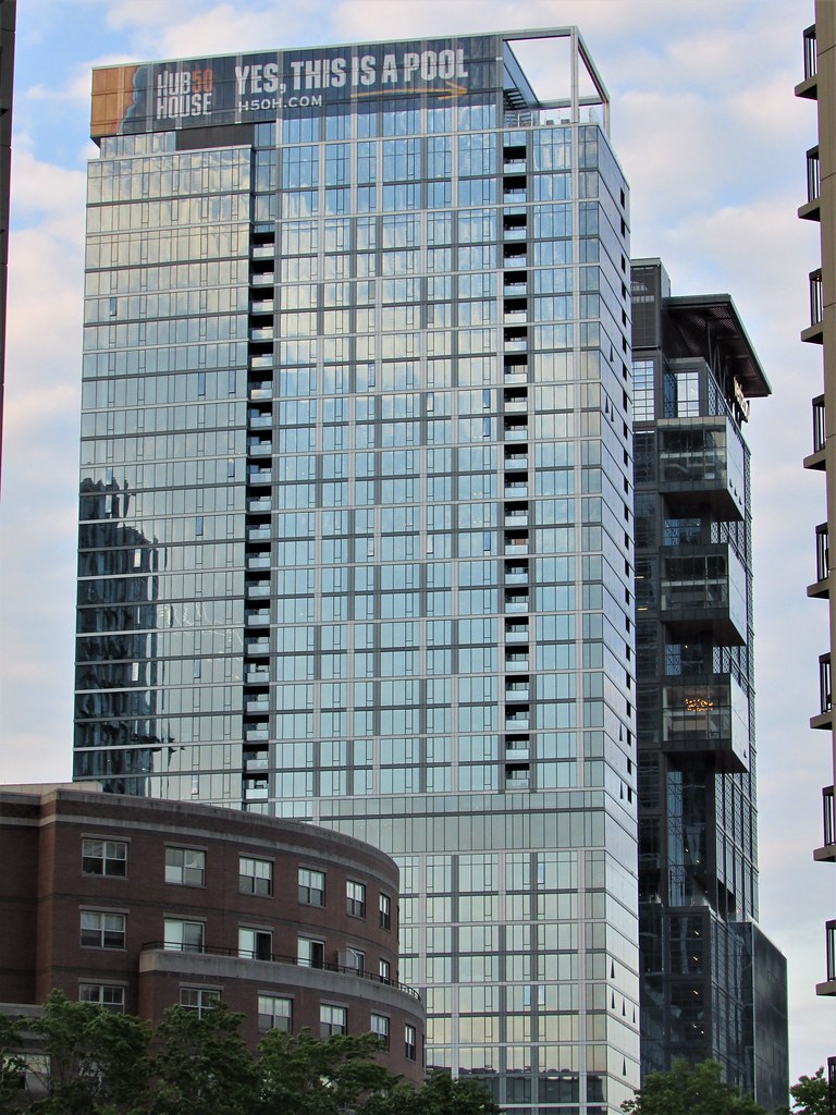 IMG_9534
 IMG_9579
 IMG_9594
 IMG_9822
JeffDowntown
Senior Member
- Joined
- May 28, 2007
- Messages
- 5,048
- Reaction score
- 4,225
It looks like the Frank Gehry version of the Verizon building!
ccole
Active Member
- Joined
- Apr 4, 2016
- Messages
- 172
- Reaction score
- 1,357
Did anyone else notice that they finally fixed that out-of-place panel? The last image I could find with it was one posted on 1/30:
stick n move
Superstar
- Joined
- Oct 14, 2009
- Messages
- 13,480
- Reaction score
- 24,524
Finally
Did anyone else notice that they finally fixed that out-of-place panel? The last image I could find with it was one posted on 1/30:
The crisis is over!
")
Charlie_mta
Senior Member
- Joined
- Jul 15, 2006
- Messages
- 5,150
- Reaction score
- 7,778
Is it just me or does this tower still look unfinished? Just slipshod and sloppy with bits of crap stuck here and there.
stick n move
Superstar
- Joined
- Oct 14, 2009
- Messages
- 13,480
- Reaction score
- 24,524
Nope its the worst tower in the area by a mile, in my opinion worse than the longfellow towers as well. Its the classic case of boring glass box but a million different cheap tricks going on to try to make it better. One or the other would have been much better. If it were actually just a plain glass box with high quality glass with its aspect ratio it would have looked perfectly fine.
Instead it has a notch up here, a notch down there, some stilts over here, a couple balconies over there, different glass over here, than over there, and to top it has colossal order windows... on one half. Theres just no rhyme or reason to any of it. They clicked yes on everything under facade options.
Instead of doing that weird exposed beam thing in the base to try to continue the tower to the ground they should have brought it down the side of the base all the way to the street to enhance its verticality. Then after that instead of doing a million things they could have kept it simple and instead of those half assed notches added something striking like this and made the glass darker to differentiate it from its neighbors.

Overall though as an entire complex with the base especially and the verizon tower its still a home run. It just could have been a grand slam with minimally more effort.
Instead it has a notch up here, a notch down there, some stilts over here, a couple balconies over there, different glass over here, than over there, and to top it has colossal order windows... on one half. Theres just no rhyme or reason to any of it. They clicked yes on everything under facade options.
Instead of doing that weird exposed beam thing in the base to try to continue the tower to the ground they should have brought it down the side of the base all the way to the street to enhance its verticality. Then after that instead of doing a million things they could have kept it simple and instead of those half assed notches added something striking like this and made the glass darker to differentiate it from its neighbors.
Overall though as an entire complex with the base especially and the verizon tower its still a home run. It just could have been a grand slam with minimally more effort.
Last edited:
Nope its the worst tower in the area by a mile, in my opinion worse than the longfellow towers as well. Its the classic case of boring glass box but a million different cheap tricks going on to try to make it better. One or the other would have been much better. If it were actually just a plain glass box with high quality glass with its aspect ratio it would have looked perfectly fine.
Instead it has a notch up here, a notch down there, some stilts over here, a couple balconies over there, different glass over here, than over there, and to top it has colossal order windows... on one half. Theres just no rhyme or reason to any of it. They clicked yes on everything under facade options.
Instead of doing that weird exposed beam thing in the base to try to continue the tower to the ground they should have brought it down the side of the base all the way to the street to enhance its verticality. Then after that instead of doing a million things they could have kept it simple and instead of those half assed notches added something striking like this and made the glass darker to differentiate it from its neighbors.
Overall though as an entire complex with the base especially and the verizon tower its still a home run. It just could have been a grand slam with minimally more effort.
Understood, it's a matter of taste, but to me, that alternate option would have been just another fat guy with a Boston crew cut. Personally, I've had enough of the JH, Millenium, Loews, Winthrop Square, Raffles, every third building in the Seaport, etc. glass rectangles. The Hancock was special when it was unique. Too many of these anonymize the city. Boston is too distinct to be dragged down to a Charlotte or Houston.
North Station should have historically celebrated its sense of place with Art Deco spires.
Last edited:
North Station should have historically celebrated its sense of place with Art Deco spires.
preach!
stick n move
Superstar
- Joined
- Oct 14, 2009
- Messages
- 13,480
- Reaction score
- 24,524
I agree, I was just saying for it being a glass box it could have been better.
Boston02124
Senior Member
- Joined
- Sep 6, 2007
- Messages
- 6,936
- Reaction score
- 7,088
Boston02124
Senior Member
- Joined
- Sep 6, 2007
- Messages
- 6,936
- Reaction score
- 7,088
 IMG_0150
- Joined
- Jan 7, 2012
- Messages
- 14,173
- Reaction score
- 23,688
 IMG_7931 by Bos Beeline, on Flickr
 IMG_0288
 IMG_0293
 IMG_0320
 IMG_0333
 IMG_0345
 IMG_0359
Boston02124
Senior Member
- Joined
- Sep 6, 2007
- Messages
- 6,936
- Reaction score
- 7,088