SeamusMcFly
Senior Member
- Joined
- Apr 3, 2008
- Messages
- 2,050
- Reaction score
- 110
do you see? DO YOU SEE!?!
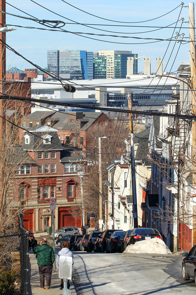
I have a question to blog: will Vertex fall down and be replaced by a stadium before Boston turns into Detroit?
do you see? DO YOU SEE!?!
"Oh God, stop! It's so boring!"
Thread derailment complete; Long live South Park.
This thread should go down in AB history as the first thread that derailed seamlessly and simultaneously into 2 different topics.
Now to bring it back..
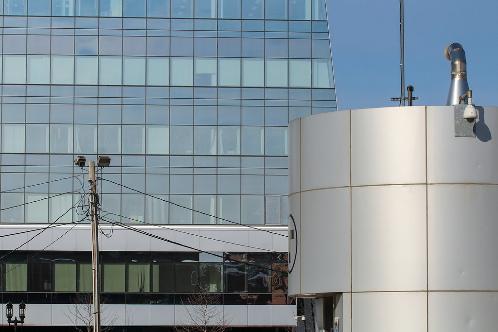
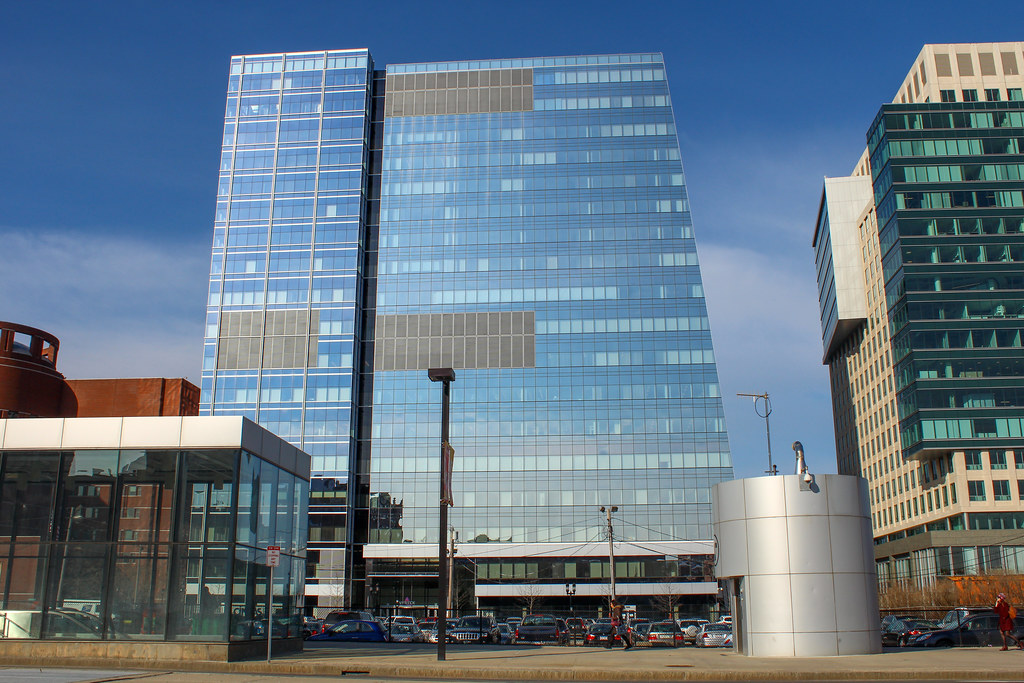
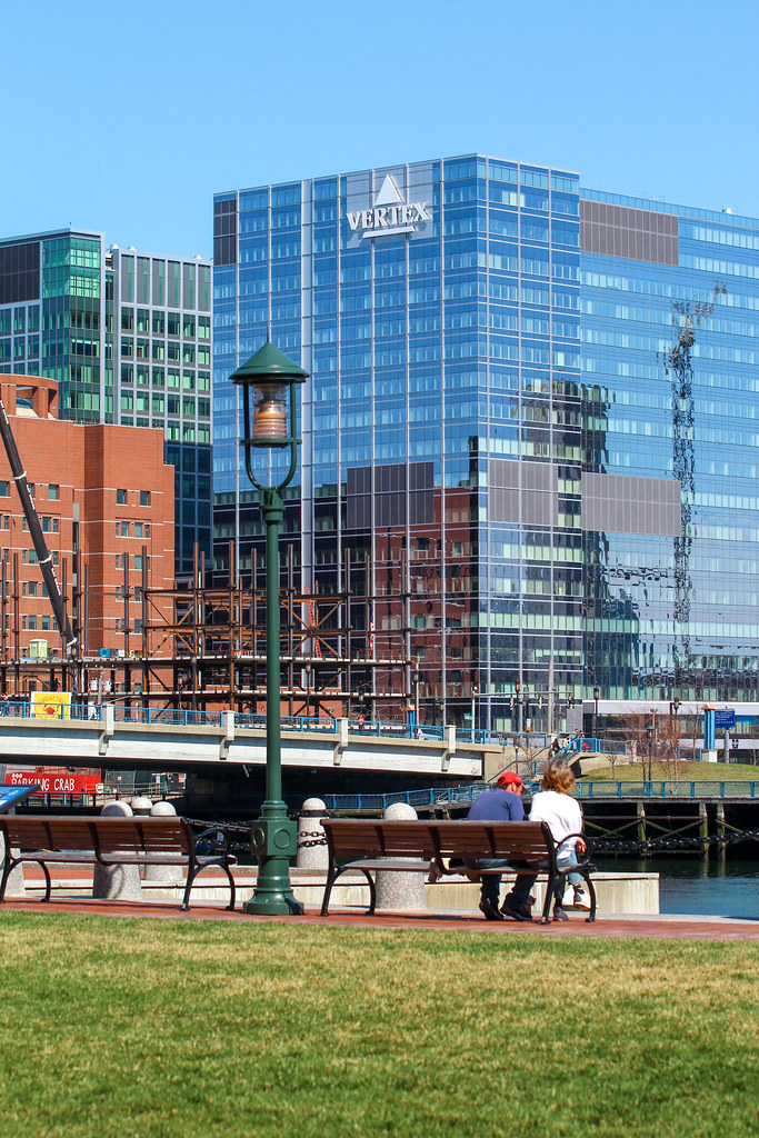
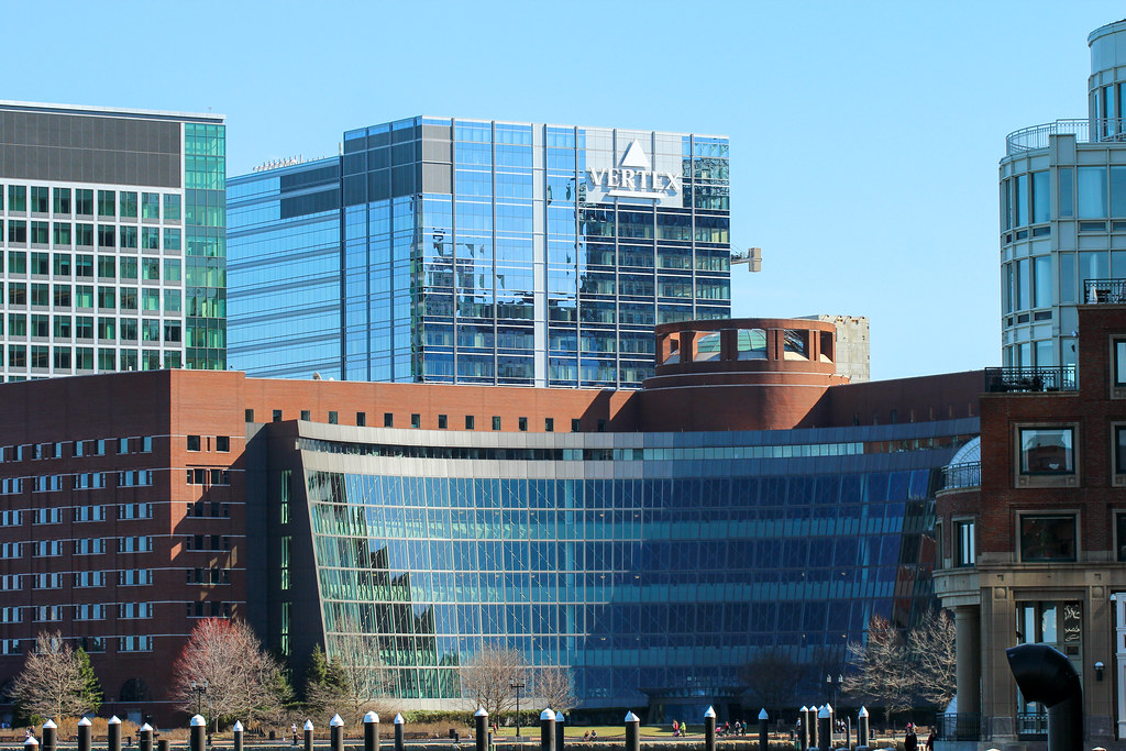
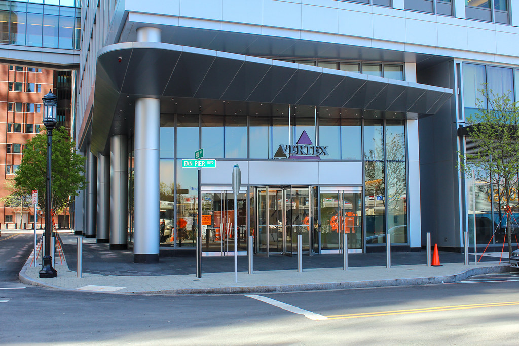
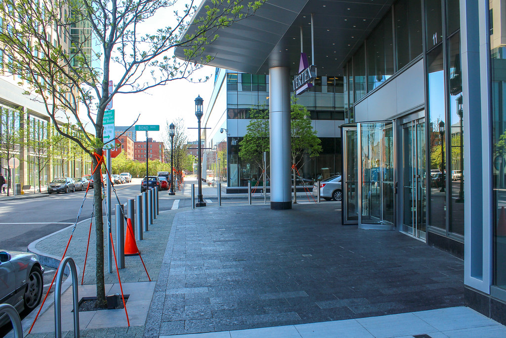
I like the Vertex logos, but isn't there some recent ordinance that forbids companies from attaching their names to buildings? I believe State Street was grandfathered in?
Vertex buildings sold to REIT for $1.1 billion.
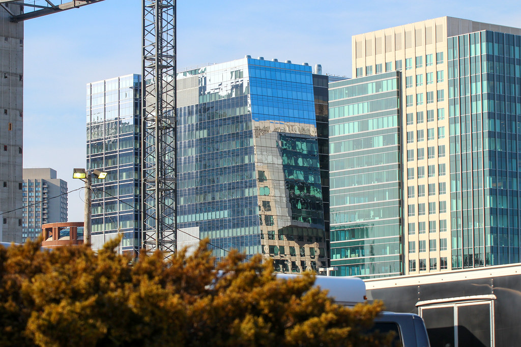
Could this help Fallon in financing the yet-to-be-developed Fan Pier parcels?
 I hope something taller gets built behind Fan pier

Great tribute. Thanks for sharing this photo!
While I appreciate that the facade of this building has *some* sort of architectural lighting, the 80s called and wants its lighting scheme and neon logo back. That logo is just so awful and tacky. Serif fonts are so out. It's 2014, c'mon.