bigpicture7
Senior Member
- Joined
- May 5, 2016
- Messages
- 4,043
- Reaction score
- 10,368
...
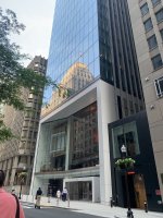
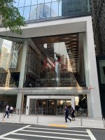
Your last sentence in that post is there for a reason. Not having too many people is EXACTLY how the developer finally wanted it. They purposely changed the interior around by placing all those furniture obstacle hurdles and the entry doorways are not exactly large archways or anything like that but small individual doors.
They purposely by design killed the "public connector" aspect. I hate that. We have enough small clubby atmospheres in Boston - - and need large civic spaces/connectors.
But yes, like many gated communities in Florida suburbs, it is "nice". The "Banned in Boston" parochial small reputation of the 50's and 60's still exists in the tendency to bunt instead of swing. I still prefer a future where Boston has 1+ million residents, is 24/7 and dynamic - - -instead of the "ya can't move here, we're closed " attitude.
shmessy, I always appreciate your candor and willingness to state your mind and buck the groupthink that sometimes materializes here. While all of your observations about the bait-and-switch are valid here, I think you're picking the wrong fight on this one.
First off, van qualified his statement by first acknowledging the bait-and-switch...
My take: I want downtown Boston revitalized, and with throngs of people hanging out, passing through, enjoying what there is to offer. I am angered that a developer can make a mockery of the design review process by submitting renders that aren't even physically possible (i.e., the grade between streets is not level here, the hall could have never even looked like what your render shows). I am also angered that they can just change their programming on a whim (of what is supposed to be a dedicated public benefit component of their design), rather than re-assessing the value of their revised design with stakeholders.
That said: A) their initial design was not physically possible, B) we had a once-a-century global catastrophe between then and now causing the "throngs of people" to not even exist at the moment, C) most of the "obstacles" you are referring to are portable and can be moved to clear out the hall at any time, allowing the whole physical experience of this place to basically be reset at some point. I know this because I have eaten here and observed it. If and when the whole context (this place and its surroundings) results in there actually being throngs of people, the interior layout can be substantively altered (not to the point of the original render -- but substantively nonetheless)
Neither the original proposal (impossible and flawed) nor the current state (invalidly sprung on us without adequate re-review IMO) make sense. BOTH were poor examples of human-centered design -- note that in your old render, there are food vendors, but hardly a place to sit. How popular of a food vending experience was this going to be with virtually no places to sit in the whole place?
Given the hand the designers were dealt (note that I am saying designers, not the developer) after the project was started and pandemic hit, they did a nice job with the design.
Not everyone who has a hand in how a place turns out is in fact the blameworthy bad guy, much as blameworthy bad guys exist.


