You are using an out of date browser. It may not display this or other websites correctly.
You should upgrade or use an alternative browser.
You should upgrade or use an alternative browser.
691 Mass Ave | South End
- Thread starter briv
- Start date
gooseberry
Active Member
- Joined
- Nov 24, 2009
- Messages
- 550
- Reaction score
- 3
Re: 691 Mass Ave
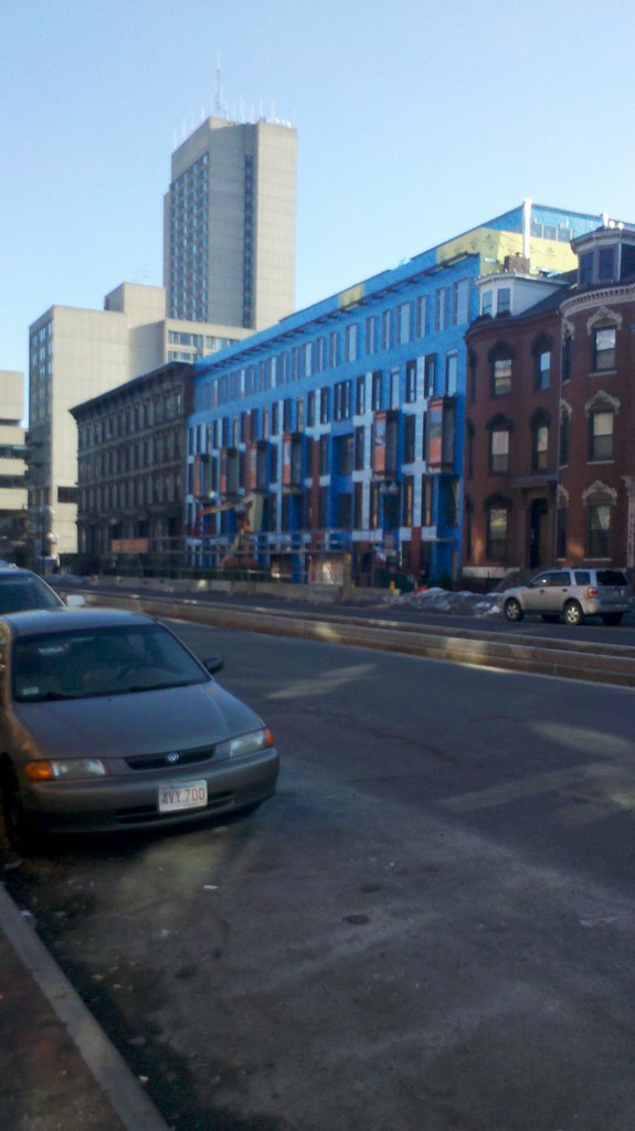
It's nice to see a building just make sense. The scale is right, it fills the site and maintains the street wall. It dosn't need to be any more complicated than that.
It's nice to see a building just make sense. The scale is right, it fills the site and maintains the street wall. It dosn't need to be any more complicated than that.
found5dollar
Senior Member
- Joined
- Aug 27, 2007
- Messages
- 1,149
- Reaction score
- 404
Re: 691 Mass Ave
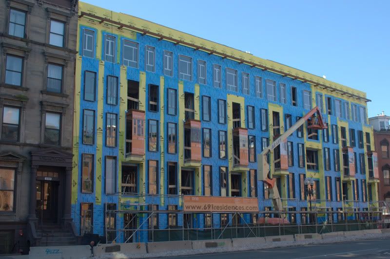
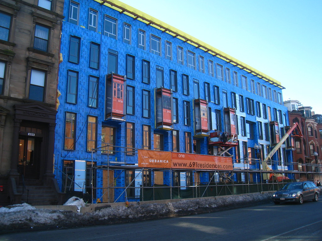
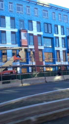
is there a reason for the blue vs. the yellow in that pic? i cant seem to find a pattern.
is there a reason for the blue vs. the yellow in that pic? i cant seem to find a pattern.
found5dollar
Senior Member
- Joined
- Aug 27, 2007
- Messages
- 1,149
- Reaction score
- 404
Re: 691 Mass Ave
ahh that makes sense... just doesn't look like it is being done in any sort of order.
ahh that makes sense... just doesn't look like it is being done in any sort of order.
Re: 691 Mass Ave
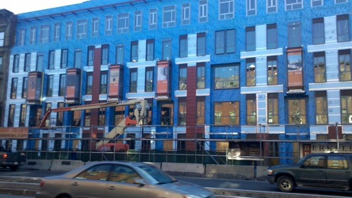
from the pictures, it looks like the waterproofing is following the window receptors..i could be wrong ...anyways...it will be all blue soon, pattern or no pattern....it is just a functional thing...not for aesthetics...it would be interesting to see when the terracotta panels go up the facade...
from the pictures, it looks like the waterproofing is following the window receptors..i could be wrong ...anyways...it will be all blue soon, pattern or no pattern....it is just a functional thing...not for aesthetics...it would be interesting to see when the terracotta panels go up the facade...
Suffolk 83
Senior Member
- Joined
- Nov 14, 2007
- Messages
- 2,996
- Reaction score
- 2,403
Suffolk 83
Senior Member
- Joined
- Nov 14, 2007
- Messages
- 2,996
- Reaction score
- 2,403
Re: 691 Mass Ave
That's what it looked like to me
That's what it looked like to me
Re: 691 Mass Ave
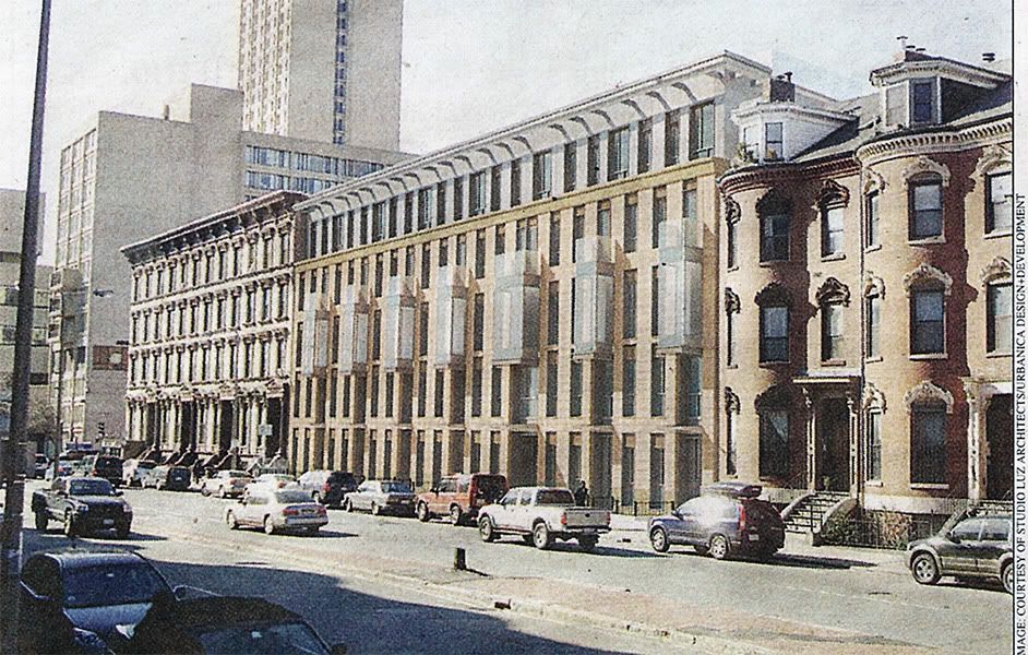
the scanned washed-out newspaper copy is quite misleading and the photos are in shadow too.this rendering from their sales site is probably closer to the color they want. i am sure the choice of materials was the result of the constraints made by landmarks and BRA on the sizing, color and type of materials. it is unfair to say that the architects was just following the fad of using terracotta.

the scanned washed-out newspaper copy is quite misleading and the photos are in shadow too.this rendering from their sales site is probably closer to the color they want. i am sure the choice of materials was the result of the constraints made by landmarks and BRA on the sizing, color and type of materials. it is unfair to say that the architects was just following the fad of using terracotta.

Boston02124
Senior Member
- Joined
- Sep 6, 2007
- Messages
- 6,893
- Reaction score
- 6,639
Re: 691 Mass Ave
hmm not sure I still like this project?
hmm not sure I still like this project?
- Joined
- Sep 15, 2010
- Messages
- 8,894
- Reaction score
- 271
Re: 691 Mass Ave
It was too good to be true. I really wish it was a lighter color.
hmm not sure I still like this project?
It was too good to be true. I really wish it was a lighter color.
Joe_Schmoe
Active Member
- Joined
- May 25, 2006
- Messages
- 374
- Reaction score
- 0
Re: 691 Mass Ave
Is there only one door for the entire building or does each unit have its own door like its neighbors?
Terracotta might be a fad, but its a good fad: matches the existing palette, but isn't fake brick. I agree that varying the slab sizes would be welcome.
Is there only one door for the entire building or does each unit have its own door like its neighbors?
Terracotta might be a fad, but its a good fad: matches the existing palette, but isn't fake brick. I agree that varying the slab sizes would be welcome.
Re: 691 Mass Ave
There is one entrance for all the upper level units. The building will have what the developer is calling soho or small office/home office on the ground level. There will be a separate entrance for each ground floor unit that can be all residential or commercial. The neighborhood, talked him into having entrance canopies at each entrance.
There is one entrance for all the upper level units. The building will have what the developer is calling soho or small office/home office on the ground level. There will be a separate entrance for each ground floor unit that can be all residential or commercial. The neighborhood, talked him into having entrance canopies at each entrance.

