You are using an out of date browser. It may not display this or other websites correctly.
You should upgrade or use an alternative browser.
You should upgrade or use an alternative browser.
Bay Village Apartment Tower | 212 Stuart St. | Bay Village
- Thread starter statler
- Start date
Not sure I would want such ugliness to be so largely visible throughout the city. I would like it twice as tall with a different cladding. Trying to figure out a pattern and any semblance of cohesion to the ribbing makes my brain hurt.I feel like this building would look better if it was twice as tall.
guitarguynboston
Active Member
- Joined
- Dec 11, 2009
- Messages
- 254
- Reaction score
- 318
The cladding is horrible. And the window design makes the building look so much shorter than it is.
Brad Plaid
Senior Member
- Joined
- Jan 17, 2013
- Messages
- 1,310
- Reaction score
- 1,559
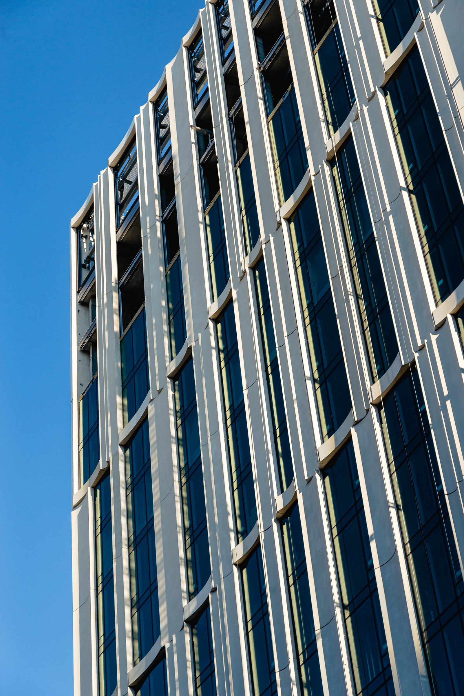
Not bad at all, a quiet dignity rather than look-at-me shouty. And the scalloped panels will make interesting shadow effects throughout the day when it's sunny.
Downburst
Senior Member
- Joined
- Jul 20, 2012
- Messages
- 1,452
- Reaction score
- 347
Walked by this a couple of weeks ago at the right time--I have to believe this wonderful pattern of light and shadow was the architects' vision when designing the façade. It's great to look at, but not sure if it's worthwhile when it seems this quality of light only occurs briefly each day, if at all.

BostonObserver
Active Member
- Joined
- Dec 26, 2006
- Messages
- 573
- Reaction score
- 103
This picture by taketern may explain the design. Looks like it references the old Boston Gas Building.
...or at least less of a loserAlign the windows, drop the colossal order framing of the windows and this building becomes a winner.
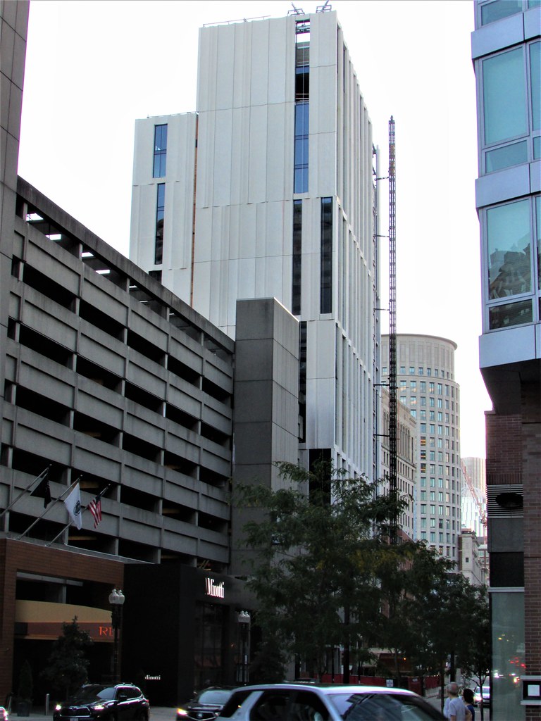
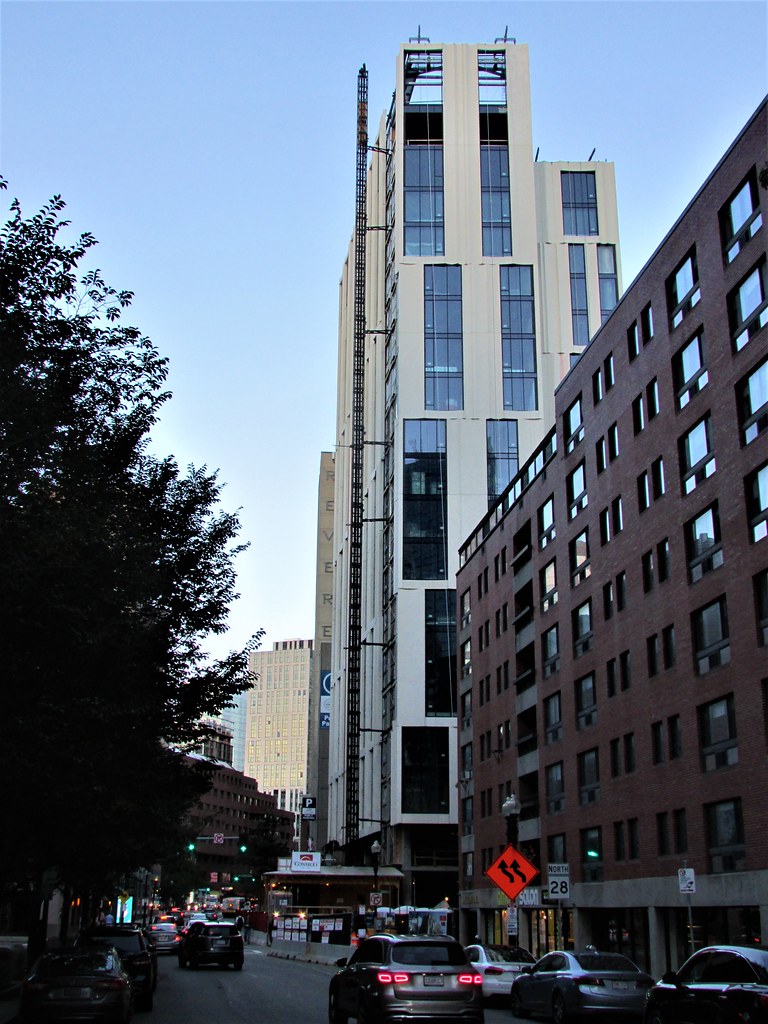
^^ This photo sums up everything that is wrong with this building. Aesthetically I don't think the designers can look at this and feel proud. The color is so light it adds to the cheapend and aged appearance.
Yup. Just like the one next to Jacob Wirth — would’ve been more attractive by being longer, taller and thus sleekerI feel like this building would look better if it was twice as tall.
Suffolk 83
Senior Member
- Joined
- Nov 14, 2007
- Messages
- 3,021
- Reaction score
- 2,489

 IMG_4067
 IMG_4070
 IMG_4071
 IMG_4072
 IMG_4073
 IMG_4079