You are using an out of date browser. It may not display this or other websites correctly.
You should upgrade or use an alternative browser.
You should upgrade or use an alternative browser.
Boston Properties Office Tower | 888 Boylston Street | Back Bay
- Thread starter Rick
- Start date
Boston02124
Senior Member
- Joined
- Sep 6, 2007
- Messages
- 6,893
- Reaction score
- 6,639
Shepard
Senior Member
- Joined
- Mar 20, 2009
- Messages
- 3,518
- Reaction score
- 68
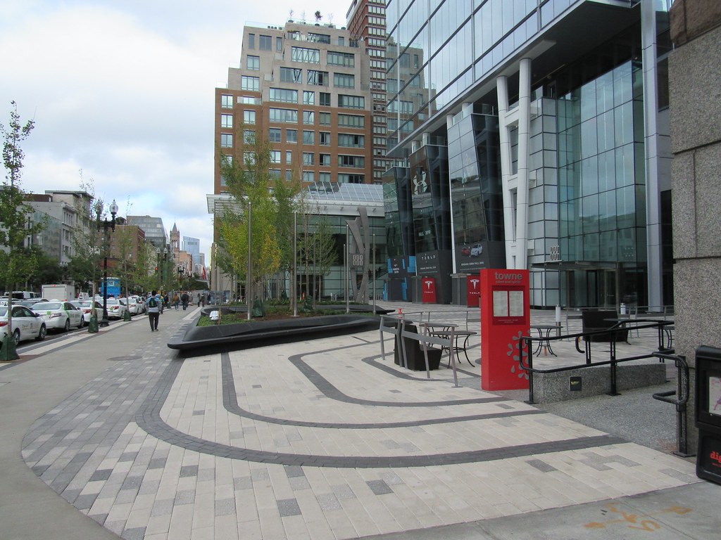
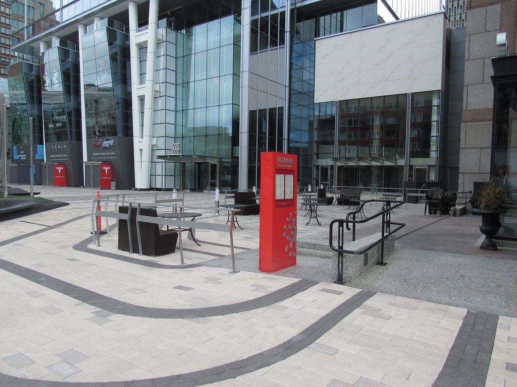
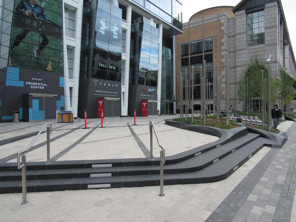
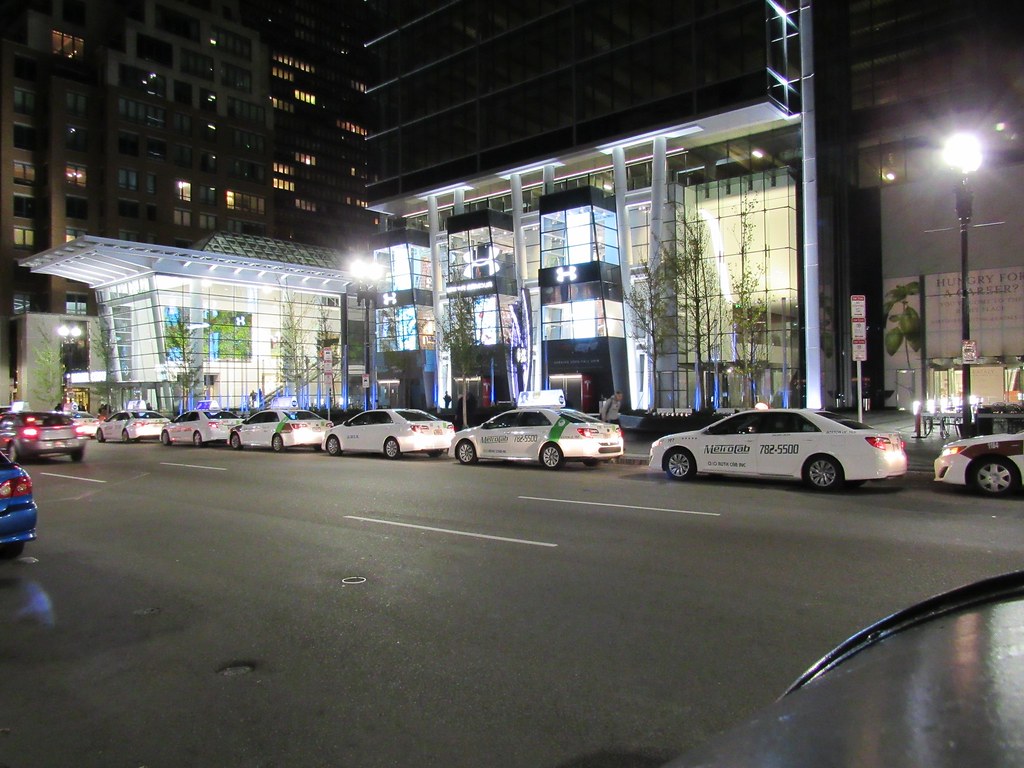
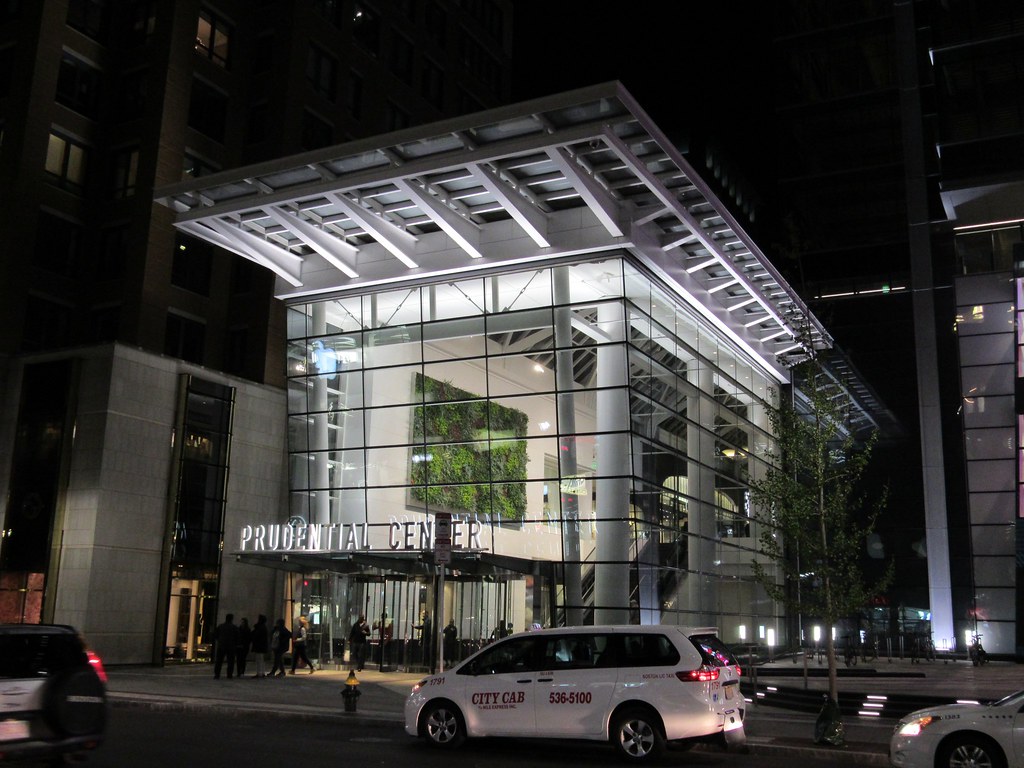
Now that the plaza is open, I think I can start to comment on how it turned out. Really, this was the one piece of this project I actually looked forward to. And, to be honest, now that it's open, it doesn't meet the high expectations I had.
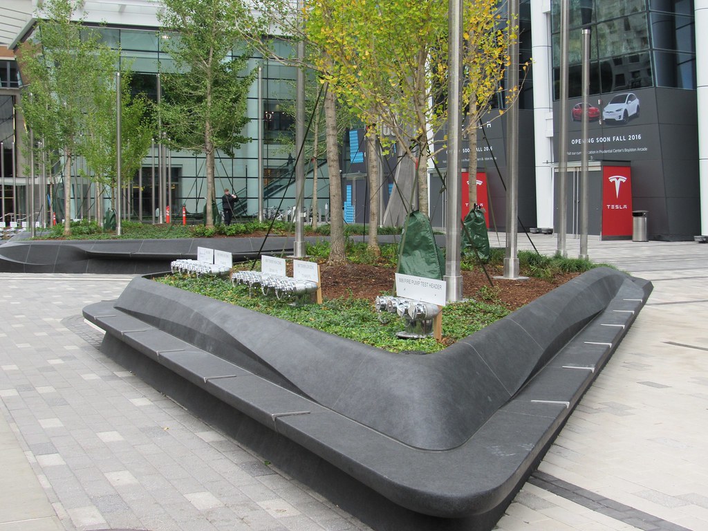
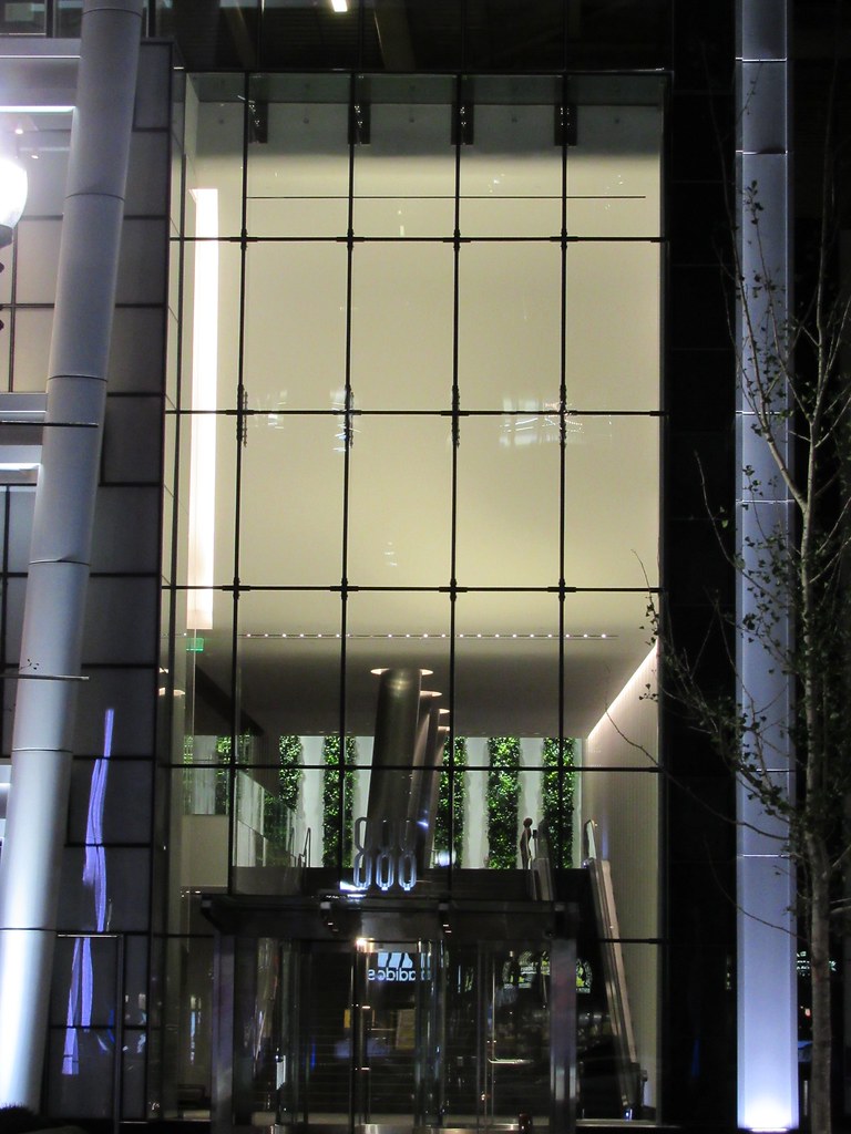
There's much more of a walled-garden Corporate feel to this plaza than the previous iteration. Gone is the soaring bronze statue, replaced now by an abstract sculpture bearing the number 888. The planters are somewhat overscaled and overbearing. You want to stay on the sidewalk, rather than venture into the plaza.
The light-features-on-poles are off-putting during the day. They look more like infrastructure extensions of the (Note to aB: go easy on me here) exposed pipe-ends that poke out of the planters for emergency access. The feel is rough, and incomplete. Also, the PoMo wall of the Hynes - and the blank brick wall beyond it - detracts quite a lot from the plaza's cohesion.
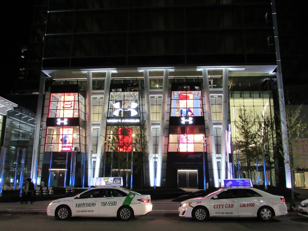
Finally, I'm personally not too happy about the fact that the ground floor of 888 will be anchored by a car dealership. I can see a Tesla store anchoring something "cool" in a small town in the midwest. But for Boston, isn't it a bit gauche?
JumboBuc
Senior Member
- Joined
- Jun 26, 2013
- Messages
- 2,659
- Reaction score
- 1,558
I made my way by the plaza for the first time late last week, and I was struck by how lacking it felt as a "place". Like, there is no "there" there. The old plaza felt like a place in and of itself, the new plaza feels like a couple of planters in front of an office building. In pictures it looks and feels much more substantial than it does in person.
I don't follow. No small town in the Midwest has a Tesla store. When it comes to retail, Tesla's image is just about as sophisticated, high-tech, and refined as you can get; it's the opposite of "gauche".
Finally, I'm personally not too happy about the fact that the ground floor of 888 will be anchored by a car dealership. I can see a Tesla store anchoring something "cool" in a small town in the midwest. But for Boston, isn't it a bit gauche?
I don't follow. No small town in the Midwest has a Tesla store. When it comes to retail, Tesla's image is just about as sophisticated, high-tech, and refined as you can get; it's the opposite of "gauche".
Now that the plaza is open, I think I can start to comment on how it turned out. Really, this was the one piece of this project I actually looked forward to. And, to be honest, now that it's open, it doesn't meet the high expectations I had.
There's much more of a walled-garden Corporate feel to this plaza than the previous iteration. Gone is the soaring bronze statue, replaced now by an abstract sculpture bearing the number 888. The planters are somewhat overscaled and overbearing. You want to stay on the sidewalk, rather than venture into the plaza.
The light-features-on-poles are off-putting during the day. They look more like infrastructure extensions of the (Note to aB: go easy on me here) exposed pipe-ends that poke out of the planters for emergency access. The feel is rough, and incomplete. Also, the PoMo wall of the Hynes - and the blank brick wall beyond it - detracts quite a lot from the plaza's cohesion.
Finally, I'm personally not too happy about the fact that the ground floor of 888 will be anchored by a car dealership. I can see a Tesla store anchoring something "cool" in a small town in the midwest. But for Boston, isn't it a bit gauche?
So the plaza sucks and the building is totally uggo. Nice job, Boston Properties!
Tombstoner
Active Member
- Joined
- Mar 5, 2010
- Messages
- 707
- Reaction score
- 2
Agreed. You feel kind of lost walking around on the Plaza. I think they needed more seating or something...
With that said, when Tesla/Under Armour/Eataly are open, this may feel better.
Now there's a thought! Maybe when the building is open its plaza may feel more activated...
atlantaden
Senior Member
- Joined
- May 31, 2006
- Messages
- 2,603
- Reaction score
- 2,731
http://www.bostonglobe.com/lifestyl...e-open-jobs/Oo8r2X9zedn6tDOVBNZtfL/story.html
Can't wait for Eataly!
Can't wait for Eataly!
Randomgear
Active Member
- Joined
- Jul 7, 2012
- Messages
- 362
- Reaction score
- 45
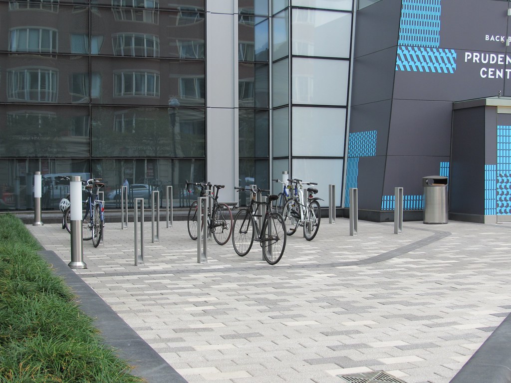
Bike parking on the new plaza - 16 oddly shaped racks (not sure if a mini U-lock will fit through these) with a rough surface designed to scratch a bikes finish. These replace the roughly 100 bike parking spaces that were here before this project started. A well earned LEED point for Boston Properties!


Bike parking on the new plaza - 16 oddly shaped racks (not sure if a mini U-lock will fit through these) with a rough surface designed to scratch a bikes finish. These replace the roughly 100 bike parking spaces that were here before this project started. A well earned LEED point for Boston Properties!

It's a better aesthetic than the 100 bike parking spaces that were there before though, no? I don't know if this is the case with 888, but I'm noticing a lot more bike parking areas in new underground garages.
- Joined
- Jan 7, 2012
- Messages
- 14,062
- Reaction score
- 22,726
^ I think most would much prefer having 100 accessible, functional spots for bikes over 16 modernist sculptures.
I can understand that. Thus my comment about seeing a lot of bicycle spots moved to underground garages. I'll admit I don't know if that's been the case with garages in this particular surrounding area.
Pavers really should have been run out to the street. Would have created a greater sense of place.
The city is bound (mandated?) to create a more handicap accessible environment. Notice the treatment of the the sidewalk across the the street at 699 Boylston or at the library. There is a clear sense of concrete where people of limited mobility can move without getting caught up in the disaster that is a misplaced stone.Pavers really should have been run out to the street. Would have created a greater sense of place.
Last edited:
whighlander
Senior Member
- Joined
- Aug 14, 2006
- Messages
- 7,812
- Reaction score
- 647
Pavers really should have been run out to the street. Would have created a greater sense of place.
Justin -- this is a private development -- it needs its own sense of place -- yes it is an element of the overall Boylston Sidewalk Ethos -- but it is not a part of the public sidewalk
I think that the pavers were handled properly
What I'm wondering about is where is the Great Pru Sculpture "Quest Eternal" going to go when it returns from its vacation

Re: 888 Boylston Street
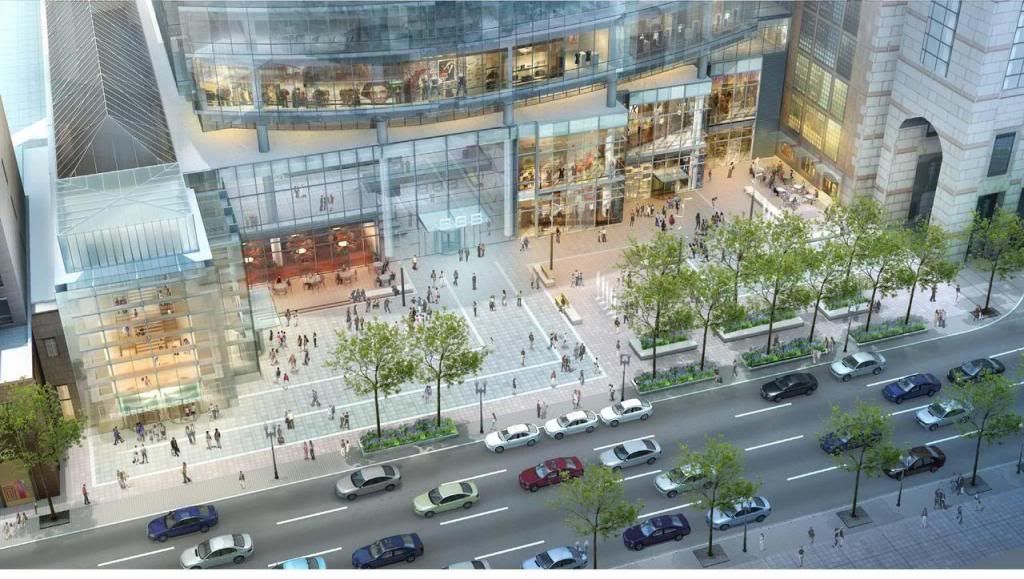
For some reason I was still half expecting the original plaza design.
For some reason I was still half expecting the original plaza design.
There'll still be a decently sized plaza
- Joined
- Jan 7, 2012
- Messages
- 14,062
- Reaction score
- 22,726
- Joined
- Jan 7, 2012
- Messages
- 14,062
- Reaction score
- 22,726


