You are using an out of date browser. It may not display this or other websites correctly.
You should upgrade or use an alternative browser.
You should upgrade or use an alternative browser.
- Status
- Not open for further replies.
BosDevelop
Senior Member
- Joined
- Jul 25, 2006
- Messages
- 1,513
- Reaction score
- 353
Re: W Hotel
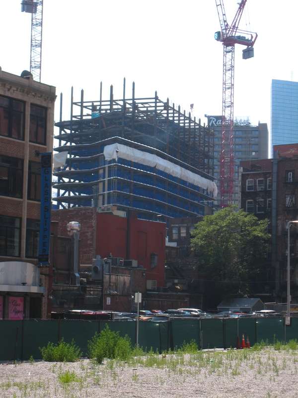
Are we about half way done erecting the steel?
Are we about half way done erecting the steel?
atlantaden
Senior Member
- Joined
- May 31, 2006
- Messages
- 2,606
- Reaction score
- 2,750
Re: W Hotel
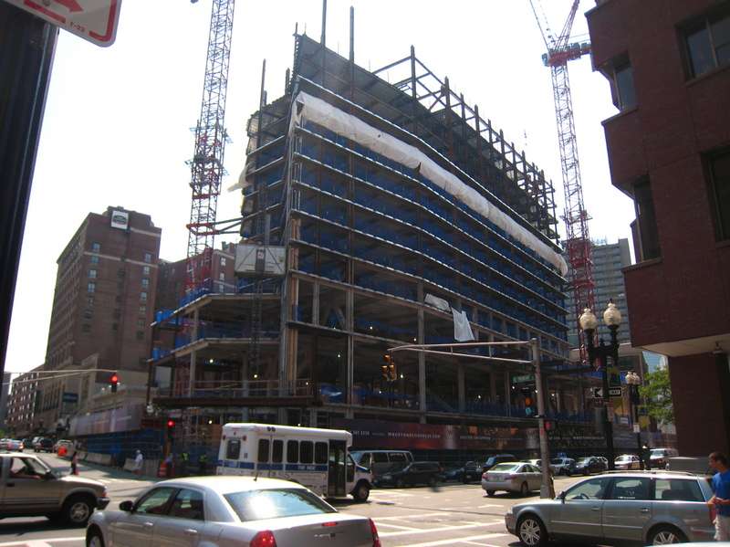
Maybe it's just me but I see the W zigging and zagging. Where on Stuart St. is it not zigging or zagging?
Here is an idea of what The W is going to look like on Stuart St. In Rawn's original design the facade was supposed to zig-zag to help visually break down this, IMO, oppressively monolithic facade. The zig-zag is missing from the final design, likely a victim of value engineering.
Maybe it's just me but I see the W zigging and zagging. Where on Stuart St. is it not zigging or zagging?
kz1000ps
Senior Member
- Joined
- May 28, 2006
- Messages
- 8,983
- Reaction score
- 11,823
Re: W Hotel
atlantaden, the tower portion (not the base) used to have three bends in it (go back to page one of this thread to see), while today the steel makes it clear that there's only one.
And I agree with briv, the tower's mass is much more blunt and boring without the zigzags.
atlantaden, the tower portion (not the base) used to have three bends in it (go back to page one of this thread to see), while today the steel makes it clear that there's only one.
And I agree with briv, the tower's mass is much more blunt and boring without the zigzags.
atlantaden
Senior Member
- Joined
- May 31, 2006
- Messages
- 2,606
- Reaction score
- 2,750
Re: W Hotel
It's hard to get zigs and zags in this town...I guess I'm happy with the zig and zag that did make it on the W. Imagine trying to get one of Ablarc's sliver skyscrapers in this town.
It's hard to get zigs and zags in this town...I guess I'm happy with the zig and zag that did make it on the W. Imagine trying to get one of Ablarc's sliver skyscrapers in this town.
Boston02124
Senior Member
- Joined
- Sep 6, 2007
- Messages
- 6,893
- Reaction score
- 6,639
Re: W Hotel
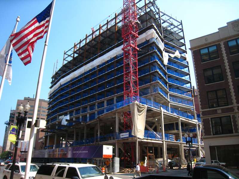
aug 7th 2008 halfway there!
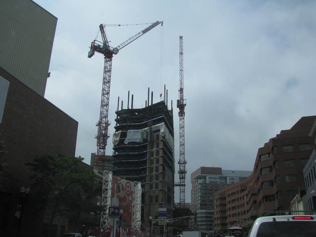
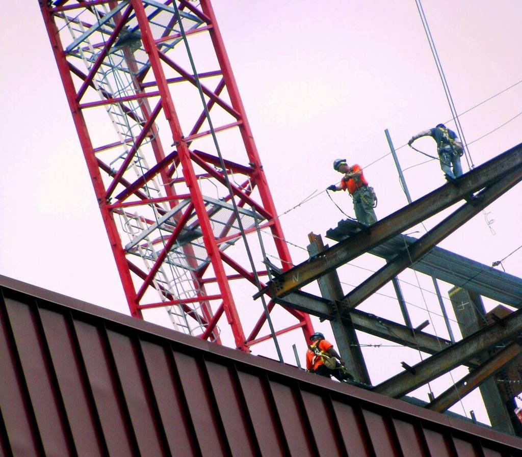
aug 7th 2008 halfway there!


mdd
Active Member
- Joined
- Mar 14, 2008
- Messages
- 805
- Reaction score
- 170
Re: W Hotel
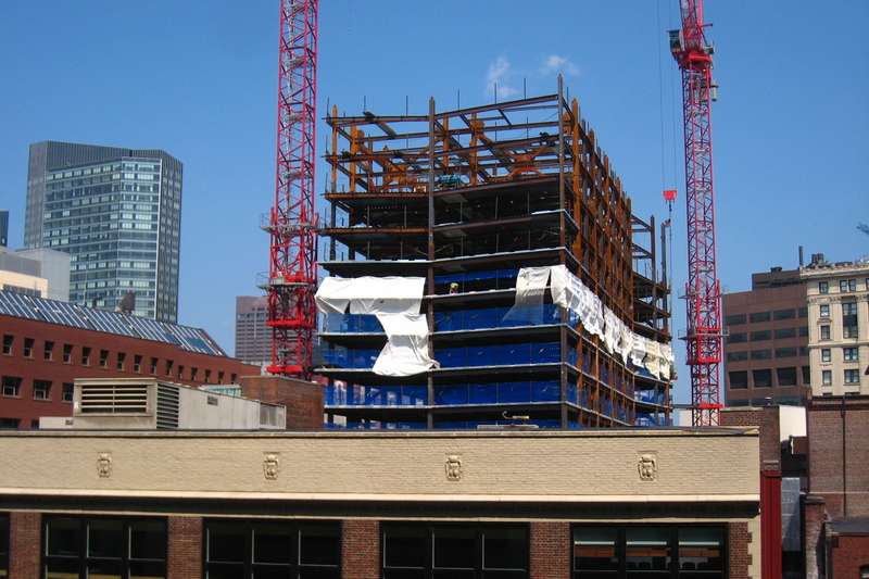
Current view from Kendall Square. It will be almost double its current height correct? If so, it seems the W will make a big impact on the skyline and help to fill in the gap among Copley and Downtown. That is the Tufts addition to its left.

Current view from Kendall Square. It will be almost double its current height correct? If so, it seems the W will make a big impact on the skyline and help to fill in the gap among Copley and Downtown. That is the Tufts addition to its left.

JimboJones
Active Member
- Joined
- Apr 4, 2007
- Messages
- 935
- Reaction score
- 1
Re: W Hotel


atlantaden
Senior Member
- Joined
- May 31, 2006
- Messages
- 2,606
- Reaction score
- 2,750
Re: W Hotel
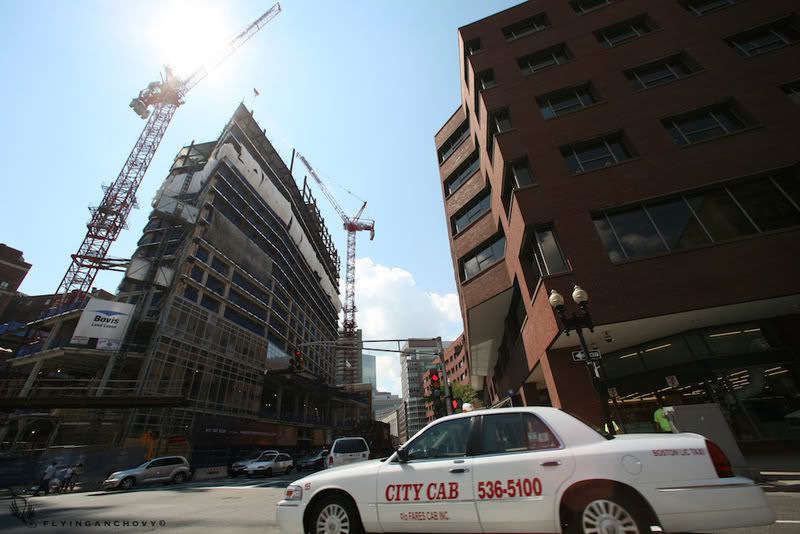
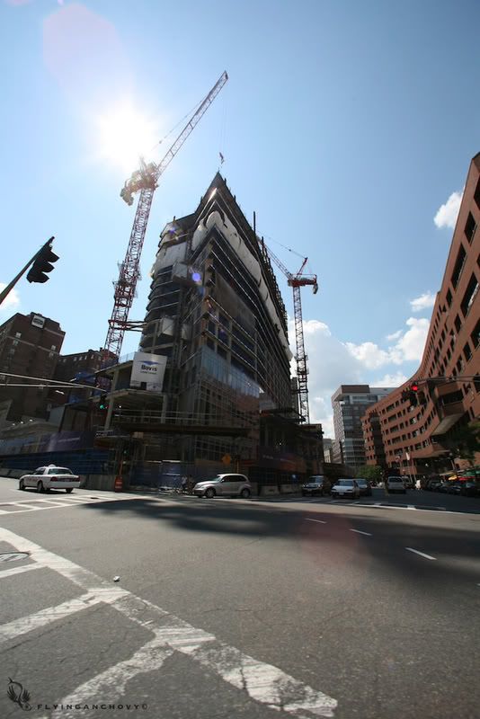
This is some of the most clear glass you can find
The public spaces of the W, possibly the first few floors, are gonna look awesome at night with this very clear glass. Throw a few of these cabs out front...whoo hoo!
This is some of the most clear glass you can find
The public spaces of the W, possibly the first few floors, are gonna look awesome at night with this very clear glass. Throw a few of these cabs out front...whoo hoo!
Boston02124
Senior Member
- Joined
- Sep 6, 2007
- Messages
- 6,893
- Reaction score
- 6,639
Re: W Hotel
looks like two type's of glass are being used here!
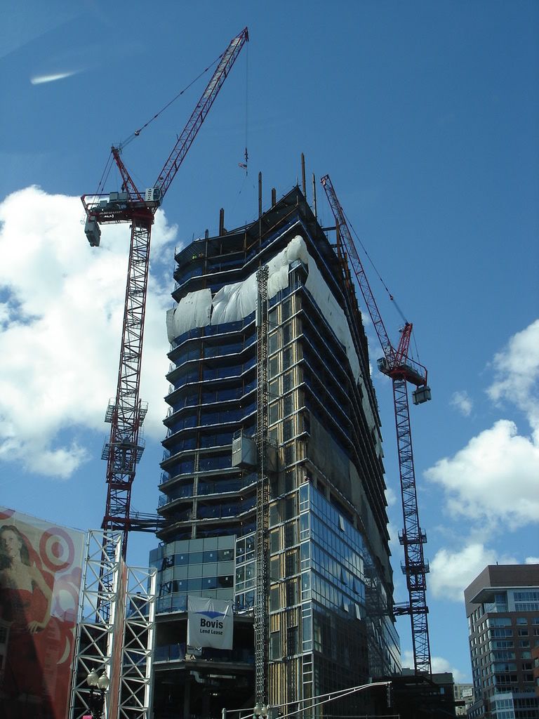
looks like two type's of glass are being used here!

BosDevelop
Senior Member
- Joined
- Jul 25, 2006
- Messages
- 1,513
- Reaction score
- 353
Re: now and then
this pic is VERY old, no? It looks like Millennium Place/Ritz is just being built in that pic.
this pic is VERY old, no? It looks like Millennium Place/Ritz is just being built in that pic.
Tim Jackson
Active Member
- Joined
- Aug 21, 2008
- Messages
- 130
- Reaction score
- 0
Re: W Hotel
That's the point, to show where this portion of the city has come from in terms of skyline and architecture.
That's the point, to show where this portion of the city has come from in terms of skyline and architecture.
bosdevelopment
Active Member
- Joined
- May 26, 2006
- Messages
- 727
- Reaction score
- 2
Re: W Hotel
I don't get it. Isn't all glass "clear"?
This is some of the most clear glass you can find
The public spaces of the W, possibly the first few floors, are gonna look awesome at night with this very clear glass. Throw a few of these cabs out front...whoo hoo!
I don't get it. Isn't all glass "clear"?
- Status
- Not open for further replies.

