You are using an out of date browser. It may not display this or other websites correctly.
You should upgrade or use an alternative browser.
You should upgrade or use an alternative browser.
Avalon North Station | Nashua Street Residences | West End
- Thread starter castevens
- Start date
JeffDowntown
Senior Member
- Joined
- May 28, 2007
- Messages
- 4,795
- Reaction score
- 3,659
That floor plan is idiotic
I had the same thought!
JeffDowntown
Senior Member
- Joined
- May 28, 2007
- Messages
- 4,795
- Reaction score
- 3,659
OK I'll bite. Why? How should have been laid out?
I personally don't know what to do with the clusterf*** of interconnected space they created. It feels like "and here's what we have left over for unit xx10 on each floor".
I mean the 'den' is a friggin hallway. And I personally hate the entry straight into the kitchen like that. But I don't see how to redeem this with the space connection they created -- apparently on purpose?
100% agree - that is one terrible usage/underlying layout of 1,000 sqr ft. I would have done away with the office/"den" hallway all together and made the living room and (very tiny looking) bedroom bigger, or something - looks like a structural pillar maybe by the window making even that awkward.
Maybe walk in, the half bath to the right in that corner, to the left is closet +W/D (making a little entry hallway), put the kitchen on the far left wall (past closest & w/d), and the rest of the space is all open going to the bedroom. I think that flows a bit better, but yeah, that overall floor plan/space isn't great - I have had 800 sqr ft apartments that looked bigger than this...
akmags
New member
- Joined
- Nov 14, 2013
- Messages
- 85
- Reaction score
- 1
The unit is most likely behind an elevator shaft or abuts some common mechanical/electrical space on the floor. Developers and property managers find creative ways to charge more for the unit -- which is why they consider the large hallway a "den".
JeffDowntown
Senior Member
- Joined
- May 28, 2007
- Messages
- 4,795
- Reaction score
- 3,659
The unit is most likely behind an elevator shaft or abuts some common mechanical/electrical space on the floor. Developers and property managers find creative ways to charge more for the unit -- which is why they consider the large hallway a "den".
I get that. It does not mean I am going to bite for that crap.
I live in a 1050 sq. ft. unit in a downtown high rise, and trust me, the layout is way better than that!
Boston02124
Senior Member
- Joined
- Sep 6, 2007
- Messages
- 6,893
- Reaction score
- 6,639
- Joined
- Sep 15, 2010
- Messages
- 8,894
- Reaction score
- 271
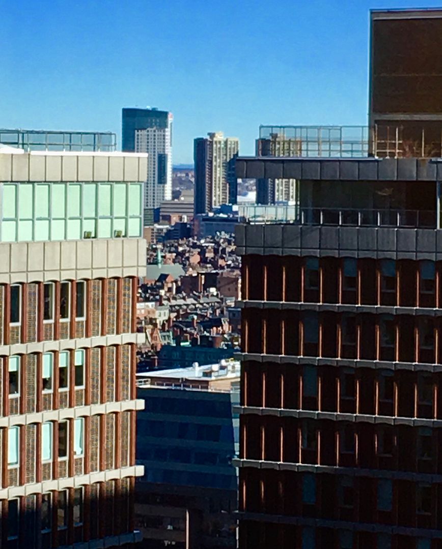
Money shot!
- Joined
- Jan 7, 2012
- Messages
- 14,062
- Reaction score
- 22,729
goldenretrievers
Active Member
- Joined
- Nov 14, 2014
- Messages
- 877
- Reaction score
- 615
Charlie_mta
Senior Member
- Joined
- Jul 15, 2006
- Messages
- 4,560
- Reaction score
- 6,481
Once those concrete panels darken over time, it will be an attractive building.
A light bronze colored metal paneling would have been better in my opinion, but these will do when darker.
A light bronze colored metal paneling would have been better in my opinion, but these will do when darker.
OK I'll bite. Why? How should have been laid out?
This isnt some re-purposed industrial to residential conversion.
This is 100% new build. That clusterfuck should never have happened
stick n move
Superstar
- Joined
- Oct 14, 2009
- Messages
- 12,093
- Reaction score
- 18,872
It looked like in the renders they are going to light the window boxes like city center in vegas. I hope they just keep the side strip because it looks amazing with just that one beam going up the side. Its also pretty cool that the placement of the tower makes it look as tall as 1IP from East Boston. The Hub on Causeway office tower should look even taller than international place when complete. I really like the lighting scheme because its the first of its kind in Boston and really gives the area a sense of place that will only increase with the other towers going up and being lit. This lit up cluster is going to be a beacon that from a distance you'll be able to see that something important is over here.
JeffDowntown
Senior Member
- Joined
- May 28, 2007
- Messages
- 4,795
- Reaction score
- 3,659
This isnt some re-purposed industrial to residential conversion.
This is 100% new build. That clusterfuck should never have happened
That was my point exactly. Some architect actually created that hot mess of a unit layout -- on purpose.
cca
Senior Member
- Joined
- Aug 19, 2008
- Messages
- 1,408
- Reaction score
- 12
That was my point exactly. Some architect actually created that hot mess of a unit layout -- on purpose.
Doubtful ... no architect has any incentive to do something that does not work for the client. An architect to do something bad given there lack of skill, but there is no gain in purposely doing crappy as you say -- on purpose.
cca
JeffDowntown
Senior Member
- Joined
- May 28, 2007
- Messages
- 4,795
- Reaction score
- 3,659
Doubtful ... no architect has any incentive to do something that does not work for the client. An architect to do something bad given there lack of skill, but there is no gain in purposely doing crappy as you say -- on purpose.
cca
I did not mean it in quite that sense. It was a clean-sheet design. They were not forced into that layout by the pre-existing structure of the building. Somehow the team let that floorplan happen.
I didn't mean to imply they did poorly as a purposeful outcome, but rather the outcome was the result of a purpose built design effort.
cca
Senior Member
- Joined
- Aug 19, 2008
- Messages
- 1,408
- Reaction score
- 12
Yup ... crappy things happen. When missions don't align .. bad can happen. The question then is, are the people who paid for the work happy with it ... or not? If not, the designer will not get work any longer. Or more to the point, should not.
cca
cca
stick n move
Superstar
- Joined
- Oct 14, 2009
- Messages
- 12,093
- Reaction score
- 18,872


