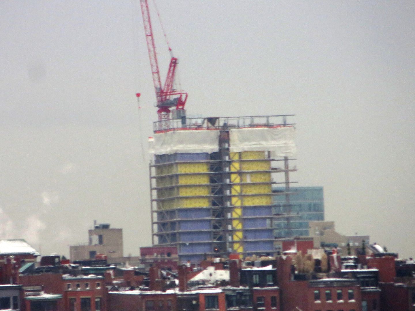
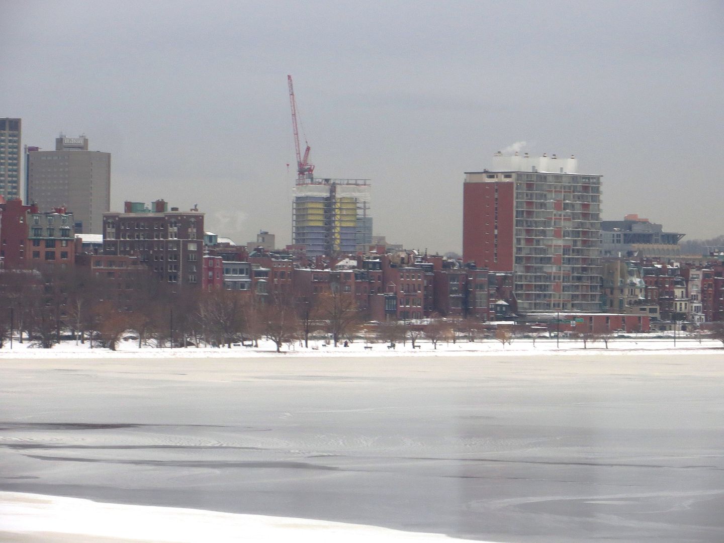
Usually I'm not a fan of excessive overhangs or arcades, but part of me wishes this thing hung over the sidewalk a few feet more. Maybe its the airyness of the clear glass, but I'm really loving the first few floors of this building so far.
You are using an out of date browser. It may not display this or other websites correctly.
You should upgrade or use an alternative browser.
You should upgrade or use an alternative browser.
Berklee Expansion Plans | Back Bay
- Thread starter quadratdackel
- Start date
50s-style paneling fears realized.
I love that style of paneling. It's nice to see it make a comeback.
palindrome
Senior Member
- Joined
- Jun 11, 2006
- Messages
- 2,279
- Reaction score
- 130
^ I don't think half this board will be alive by then so why worry?
AmericanFolkLegend
Senior Member
- Joined
- Jun 29, 2009
- Messages
- 2,214
- Reaction score
- 248
^ I don't think half this board will be alive by then so why worry?
I think it's relevant for CZ to comment on a shitty design feature that will age poorly.
I'm pretty sure when they were building the BPL McKim didn't say, "Oh, and I'll be dead soon, so let's go cheapo on the materials."
palindrome
Senior Member
- Joined
- Jun 11, 2006
- Messages
- 2,279
- Reaction score
- 130
it was an attempted joke...
I think it's relevant for CZ to comment on a shitty design feature that will age poorly.
I'm pretty sure when they were building the BPL McKim didn't say, "Oh, and I'll be dead soon, so let's go cheapo on the materials."
Did Johnson?
I actually agree with you 100% but I never pass up a dig at Johnson for that stinker.
I bet Berklee bit off more than they could chew and have been VE-ing left and right. Which is a shame because the massing and scale are decent in the context of the FCCS and air rights projects. The green panel at the base of the curtain wall is truly awful. I mean was the Pru selling spare parts on ebay?
I bet Berklee bit off more than they could chew and have been VE-ing left and right. Which is a shame because the massing and scale are decent in the context of the FCCS and air rights projects. The green panel at the base of the curtain wall is truly awful. I mean was the Pru selling spare parts on ebay?
What is cheap looking?
I think most of the current complaints are directed at the thin line of spandrel under the glass. I'm going to wait a few months so I can see the main cladding before I start to judge it.
Downburst
Senior Member
- Joined
- Jul 20, 2012
- Messages
- 1,452
- Reaction score
- 347
Honestly, I'm not too concerned about it. It seems to be just one layer, and I've seen other buildings with similar features that aren't too bad.
If anything, I'm more concerned for the metallic cladding yet to go up.
If anything, I'm more concerned for the metallic cladding yet to go up.
- Joined
- Sep 15, 2010
- Messages
- 8,894
- Reaction score
- 271
I don't really like the curtain grid they've established. It seems really sloppy. The smaller the panel, the less expensive it is, but you have to balance design and budget. This looks pretty foolish, as if they just clicked and made random lines. It doesn't appear to be informed by anything.
resisttheist
Active Member
- Joined
- Aug 4, 2012
- Messages
- 100
- Reaction score
- 32
The small opaque panels represent the floor plates in the four-story, curtain-walled base. That is why they have shown up again on just the north corner where the undulating cutaway floor plate for the performance area meets the exterior curtain wall. You can see these in the renderings. I agree though that, while they do look a bit cheap, it is too early to judge without the full palette of materials around it yet.
Boston02124
Senior Member
- Joined
- Sep 6, 2007
- Messages
- 6,888
- Reaction score
- 6,594


