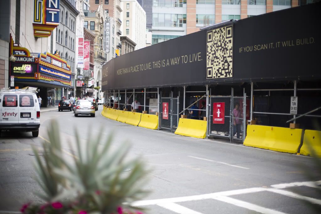
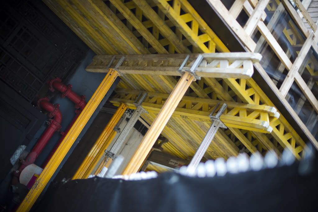
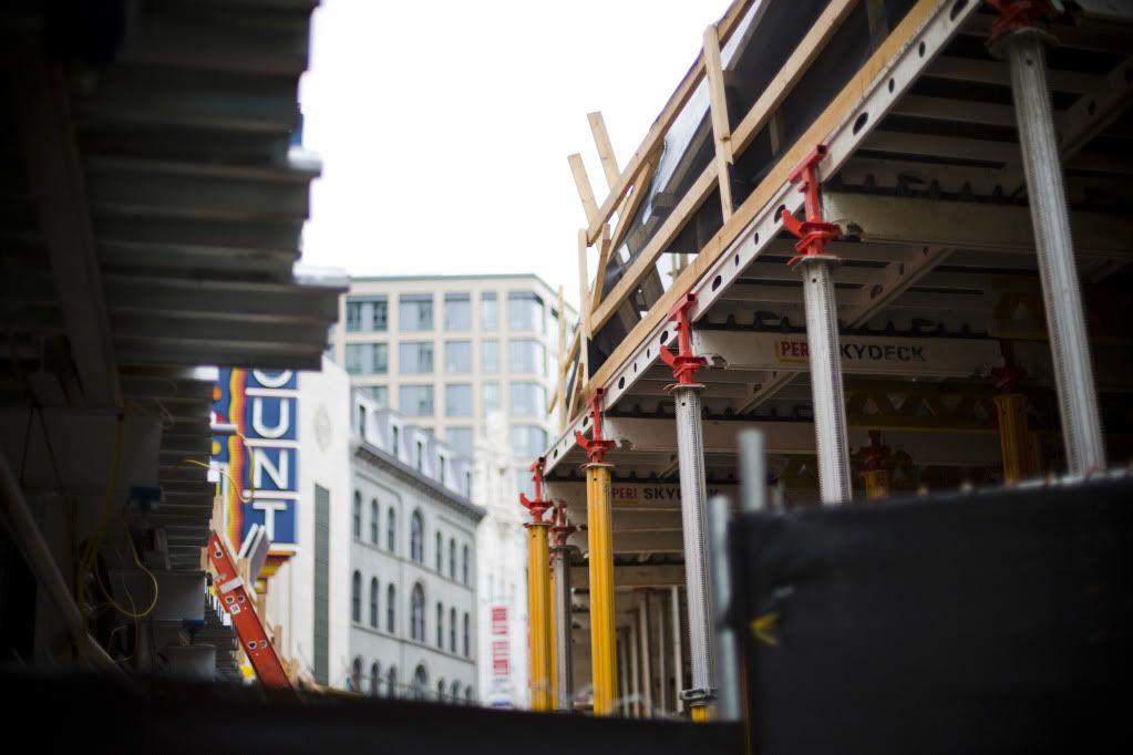
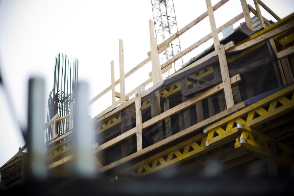
Millennium (Hayward) Place | 580 Washington Street | Downtown

Re: Millennium Place III | Hayward Place

My apologies, but I do feel like this board often uses words like cheap in comparison to other cities in order to make Boston look better. I just don't see much of anything in Boston that is "less cheap" than what's going up in Toronto.

See, now I was thinking that it was refreshing to see the term used about buildings in another city, since it is commonly applied to new construction here in Boston.
 
Re: Millennium Place III | Hayward Place

See, now I was thinking that it was refreshing to see the term used about buildings in another city, since it is commonly applied to new construction here in Boston.

I think Kent is still frustrated the peeps don't share his love for Vancouver.
 
Re: Millennium Place III | Hayward Place

See, now I was thinking that it was refreshing to see the term used about buildings in another city, since it is commonly applied to new construction here in Boston.
I guess you can say that since the board points out precast and alcubond to imply that the project is cheap. Rightfully so however.

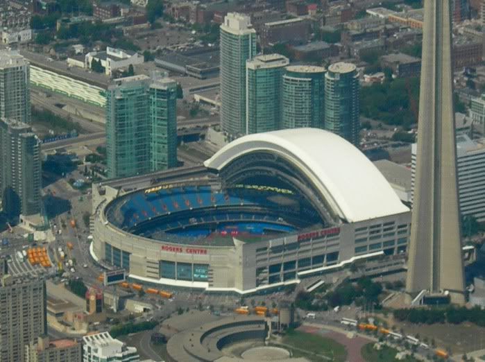
Here's a shot of the area around the Roger Center. The towers are quite bland (I don't know if I would call it cheap unless he meant cheap as in plain design) and unfortunately, aside from the slim nature of the Filene's tower, the current proposal isn't much better. I agree with DZH that they are look similar.

RogerCenter.jpg
 
Last edited:
Re: Millennium Place III | Hayward Place

I think Kent is still frustrated the peeps don't share his love for Vancouver.

Unfortunately, you are wrong. I've been pointing out the fact that Boston often criticize other cities order to make Boston look better since the beginning of the board. You haven't been here long enough but I criticized members for overusing phrases like

"that building or this photo looks like it belongs in Houston, or Dallas, or <insert sunbelt city>" even though most of those cities are only guilty for not having a ceiling on height limit and even then, the architecture there aren't incredibly bad.

I remember raising this issue once when someone posted a photo of 1 Financial Center, shot from the Greenway, and numerous posts went about saying how it looked like it was taken from Houston. In a negative way of course. Personally, I didn't see anything wrong with that photo and others have their own opinions, but saying it looks like Houston, or cheap, without saying anything else doesn't make much of a contribution. It's probably better to say "this shot makes Boston look less dense because of all the parkland in the location" or "the lack of density here resembles Houston" where it's rightfully less dense.

But phrases like the one above really doesn't serve much purpose besides making one feel superior.

But nice try submitting a post using teenage-like language. Unfortunately for you, I don't talk that way and most people don't talk that way anymore either.
 
Re: Millennium Place III | Hayward Place

He's probably talking about this.
Or maybe this.
Or even this.

I like WatersEdge the last one presented for Seaport. That will be a good addition for that area.

I don't mind the Ritz Towers that Millennium built, I just don't want to see the entire area have the same similar style. Like the photo Kentxie just presented near Rogers Center.
 
Re: Millennium Place III | Hayward Place

The larger problem with the Rogers Center towers is that they appear to be in the middle of a largely underbuilt section of the city. They would compare in my opinion to some of what's going on in the Seaport, although the Seaport stumps have greater stylistic variation than this. I agree with Rifleman, that I don't want an entire zone of Ritz looking buildings, but I think there is enough distinctly designed filler between the Ritz/Hawyard Place and Filene's to make this work okay.

Henry -- this morning as i was driving back toward downtown on Summer Street coming from photoing Navy ships leaving from Castle Island -- I did some looking at the whole of the SPID from a different perspective -- a few observations:

1) some pile driving going on near D St. for Waterside Place?
2) Still a lot of parking lots and 1 story trasthy warehouses -- development is just getting started and will continue for many years
3) Already a Very impressive local skyline -- (the so-called stumps)
4) The new video tower gives a real presence to the BCEC even when nothing big is going on inside
5) Summer St. between the BCEC and the Fort Point Channel is very active -- Congress not so much
6) disapointing how the T- Party Museum and ships look from Summer St.
7) The Northern Ave Bridge really needs to be a priority -- as the gateway on-foot for the SPID

also took a few photos through my open roof -- but quality was ??
 
Re: Millennium Place III | Hayward Place

But nice try submitting a post using teenage-like language. Unfortunately for you, I don't talk that way and most people don't talk that way anymore either.

No reason to be so personally defensive Kent. You're reading too much into the post. I have no idea how old you are or how you talk.
FYI, people said "peeps" when I was a teenager 20 yearsago. I didn't think it was still popular.
 
Re: Millennium Place III | Hayward Place

Forget the first pic on this page (looks pretty good actually), but go through the rest and just look at how crappy/flimsy so much of the glass looks. This is what I mean by cheap looking cladding. http://forum.skyscraperpage.com/showthread.php?t=189651&page=3
If Boston built a 600' tower with quality this low I would just die.

Ugh, the density looks absolutely abysmal in those photos. This is exactly why "stretching the skyline" isn't important at all. At least in Boston, the stumps get grouped closely together.

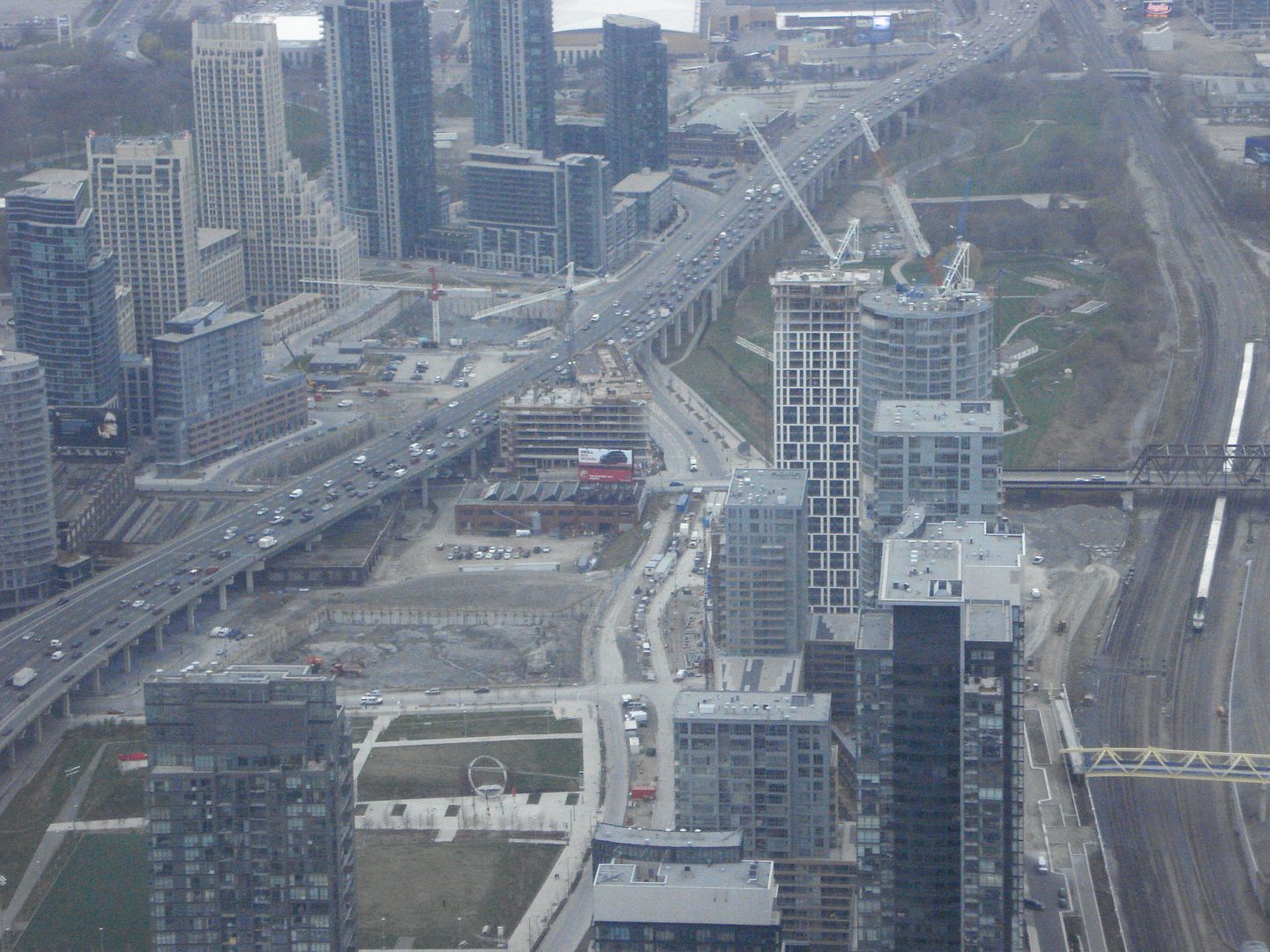
Look at the auto-centric horror:
DSC03779.jpg


It reminds me of Donau City in Vienna.
 
Re: Millennium Place III | Hayward Place

I think the Toronto development only looks like an "autocentric horror" because it hasn't been fully built out yet and because the Gardiner Expressway flows through it.

At full build-out it will, at worst, be like a Seaport with much better-proportioned architecture and, at best, will exhibit better street level activity (the density should help with that).
 
Re: Millennium Place III | Hayward Place

Maybe in a few years, our Inner Belt / North Point area will resemble that...
 
Re: Millennium Place III | Hayward Place

Unlike the Kensington project, this crane is engaged in a game of hide and seek:

7546878666_53f3dcbced_b.jpg


7546876166_911c56a018_b.jpg
 
Re: Millennium Place III | Hayward Place

I think the Toronto development only looks like an "autocentric horror" because it hasn't been fully built out yet and because the Gardiner Expressway flows through it.

At full build-out it will, at worst, be like a Seaport with much better-proportioned architecture and, at best, will exhibit better street level activity (the density should help with that).

Interestingly the bases of these towers all support retail - of the mom and pop variety.

And, there's a rather new median-running trolley along the length of this area.
 
Re: Millennium Place III | Hayward Place

Ugh, the density looks absolutely abysmal in those photos. This is exactly why "stretching the skyline" isn't important at all. At least in Boston, the stumps get grouped closely together.

Look at the auto-centric horror:
DSC03779.jpg


It reminds me of Donau City in Vienna.

Looks like NorthPoint on steroids. The building on the left has nice setbacks though and I definitely agree that stretching the skyline isn't always the best. I love skylines that clump together so it looks overwhelming.
 
Re: Millennium Place III | Hayward Place

^the city it self has excatly 2 million more residents than Boston,that pix looks like Miami North!
 
Re: Millennium Place III | Hayward Place

DSC03779.jpg


It reminds me of Donau City in Vienna.

Looks like if the central artery and the greenway were somehow able to both exist side by each. Just stretched land out into the harbor and built the RKG right next to the CA. Pretty awful the way a somewhat downtown looking area is completely cut off from itself by both of those. And the big squares of grass look so (un)inviting.
 

Back
Top