You are using an out of date browser. It may not display this or other websites correctly.
You should upgrade or use an alternative browser.
You should upgrade or use an alternative browser.
Tree House Residence Hall Tower @ MassArt | 578 Huntington Avenue | Fenway
- Thread starter Boston02124
- Start date
Boston02124
Senior Member
- Joined
- Sep 6, 2007
- Messages
- 6,893
- Reaction score
- 6,639
Re: Mass Art Dormitory
from the T
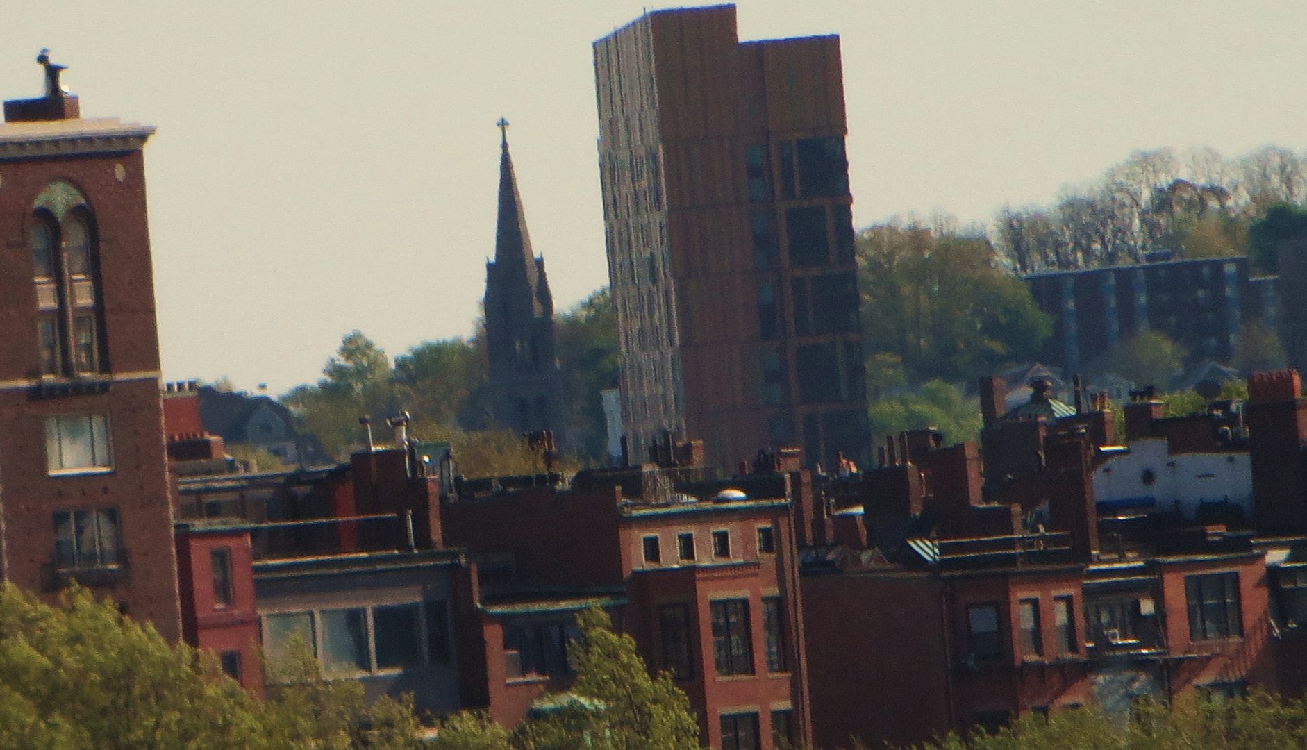
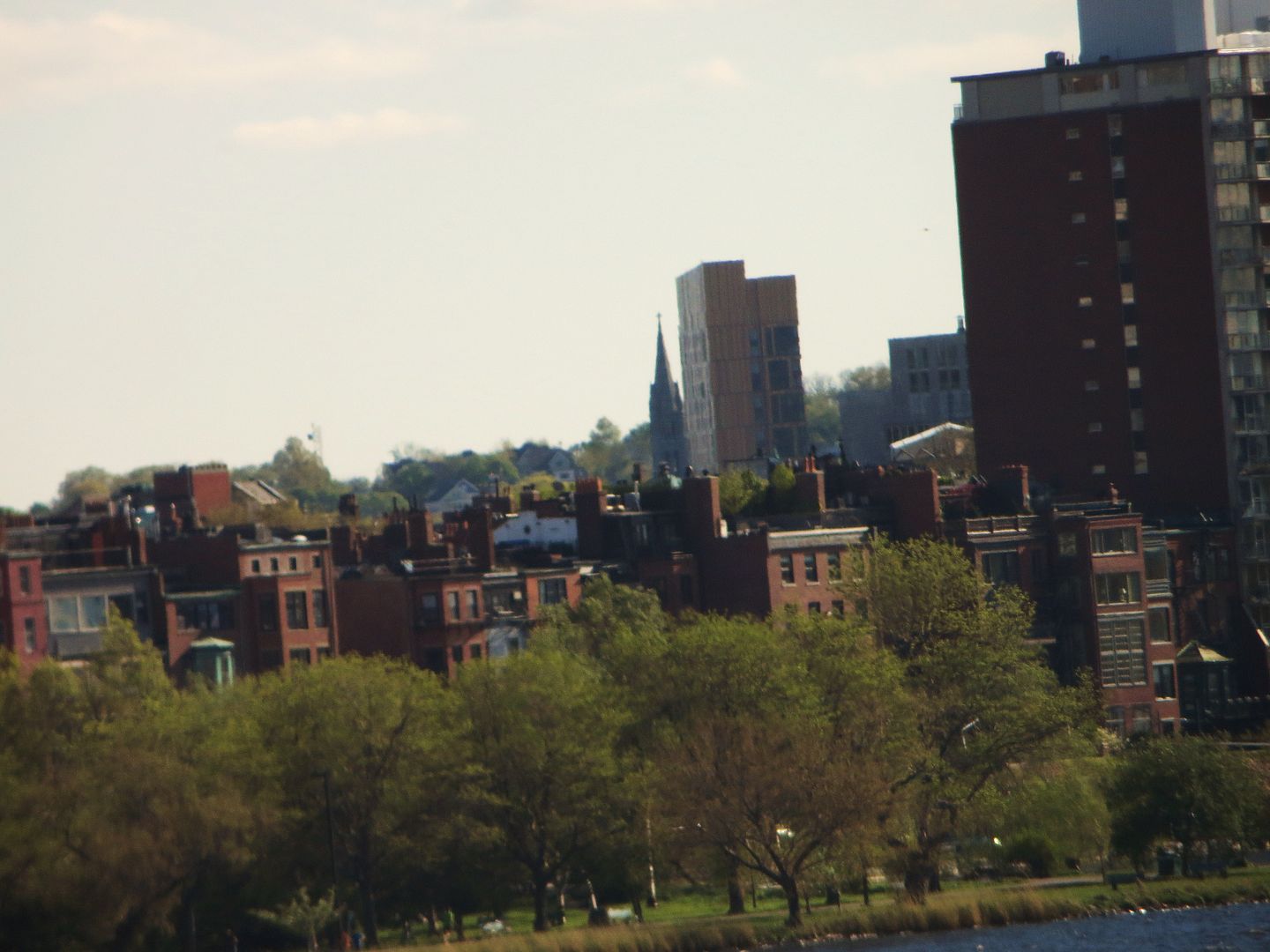
from the T


- Joined
- Sep 15, 2010
- Messages
- 8,894
- Reaction score
- 271
Re: Mass Art Dormitory
He never even comments on the damn building. The article is mostly about how great Piano and Foster are. It's sad to see this project get featured on ArchDaily and then have the worst article you could imagine to accompany it. There's absolutely not a drop of architectural criticism.
Also, re this picture:
This picture shows how detrimental those horizontal breaks on the facade are. They completely skew one's perception of the building in regards to dimensions. Because you can't see the two rows of windows from this view, the tower appears to only be half the size it actually is because one instinctively reads the breaks as floor slabs.
Boston02124
Senior Member
- Joined
- Sep 6, 2007
- Messages
- 6,893
- Reaction score
- 6,639
Re: Mass Art Dormitory
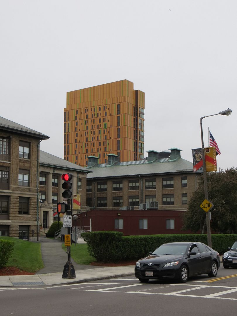
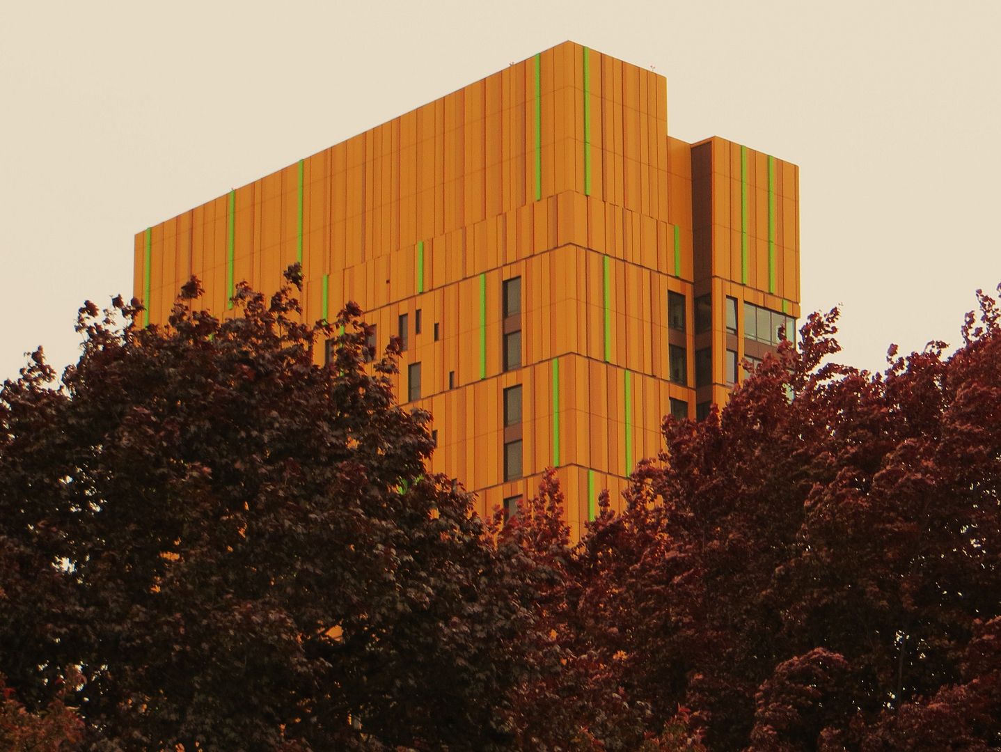 <yesterday


- Joined
- Sep 15, 2010
- Messages
- 8,894
- Reaction score
- 271
Re: Mass Art Dormitory
That last picture is wonderful and really makes the building look contextual.
Excellent job!!
That last picture is wonderful and really makes the building look contextual.
Excellent job!!
whighlander
Senior Member
- Joined
- Aug 14, 2006
- Messages
- 7,812
- Reaction score
- 647
Re: Mass Art Dormitory
CZ -- there will be some couple of weeks each year in October when that building will be very popuar -- how many cities have a Jacolantern building
This will definitely be one of the buildings we're repulsed by in 30 years, but probably one we'll want to save in 100.
CZ -- there will be some couple of weeks each year in October when that building will be very popuar -- how many cities have a Jacolantern building
TarantinoK1500
New member
- Joined
- Jan 27, 2011
- Messages
- 44
- Reaction score
- 0
Re: Mass Art Dormitory
Awesome, awesome shot. It really shows the "earthiness" of the building.<yesterday
AmericanFolkLegend
Senior Member
- Joined
- Jun 29, 2009
- Messages
- 2,214
- Reaction score
- 248
Re: Mass Art Dormitory
My thoughts exactly. I wonder if this was incorporated to make the development more palatable to neighbors (i.e., in renderings the building didn't seem as tall as it is so NIMBY's were less likely to flip out).
This picture shows how detrimental those horizontal breaks on the facade are. They completely skew one's perception of the building in regards to dimensions. Because you can't see the two rows of windows from this view, the tower appears to only be half the size it actually is because one instinctively reads the breaks as floor slabs.
My thoughts exactly. I wonder if this was incorporated to make the development more palatable to neighbors (i.e., in renderings the building didn't seem as tall as it is so NIMBY's were less likely to flip out).
TarantinoK1500
New member
- Joined
- Jan 27, 2011
- Messages
- 44
- Reaction score
- 0
Re: Mass Art Dormitory
It's been a while since I've gotten shots for you guys and they've made a lot of progress, so I got some. They're not the best—I've been busy at the studio and I haven't had much tie to go out and look at things, so these shots were done at night when I was about to head home. And the battery on my SLR died so I just used my iPhone.


Love the continuation of the pattern underneath the roof at the entrance of the building.

Handicap ramp on the side of the dorm away from the Artists' Residence. Love the lighting and how it shows the texture of the granite/stone/whatever the hell it is.

Backside of the building.

I think that this is the café. On the right you can see a glass counter with space inside of it for what I'm going to take a wild guess for and say food.

This is probably how it's going to look when there's students in the building. Every single light on in the dorm at all times.

The only random green outline that I like. This is on the back corner of the building away from the Rez. This is where the elevators are.
It's been a while since I've gotten shots for you guys and they've made a lot of progress, so I got some. They're not the best—I've been busy at the studio and I haven't had much tie to go out and look at things, so these shots were done at night when I was about to head home. And the battery on my SLR died so I just used my iPhone.


Love the continuation of the pattern underneath the roof at the entrance of the building.

Handicap ramp on the side of the dorm away from the Artists' Residence. Love the lighting and how it shows the texture of the granite/stone/whatever the hell it is.

Backside of the building.

I think that this is the café. On the right you can see a glass counter with space inside of it for what I'm going to take a wild guess for and say food.

This is probably how it's going to look when there's students in the building. Every single light on in the dorm at all times.

The only random green outline that I like. This is on the back corner of the building away from the Rez. This is where the elevators are.
TarantinoK1500
New member
- Joined
- Jan 27, 2011
- Messages
- 44
- Reaction score
- 0
Re: Mass Art Dormitory
Oh, and they've been laying out the landscape in front of the building, too. I haven't gotten a shot of that. Hopefully I can get to that today for you guys.
Oh, and they've been laying out the landscape in front of the building, too. I haven't gotten a shot of that. Hopefully I can get to that today for you guys.
- Joined
- Sep 15, 2010
- Messages
- 8,894
- Reaction score
- 271
Re: Mass Art Dormitory
Yes!! Thanks for pointing this out. Bathrooms and ceilings are the #1 way to tell if the architect cared. This a fantastic detail that will likely go overlooked by most.

Love the continuation of the pattern underneath the roof at the entrance of the building.
Yes!! Thanks for pointing this out. Bathrooms and ceilings are the #1 way to tell if the architect cared. This a fantastic detail that will likely go overlooked by most.
TarantinoK1500
New member
- Joined
- Jan 27, 2011
- Messages
- 44
- Reaction score
- 0
Re: Mass Art Dormitory
Here's the view from 12th floor of Tower.

Here's the view from 12th floor of Tower.

- Joined
- Sep 15, 2010
- Messages
- 8,894
- Reaction score
- 271
Re: Mass Art Dormitory
Cool landscaping. I've seen it from the ground, but it's definitely an interesting perspective from above.
Loving this building more and more each day. It's funky as can be. A breath of fresh air for Huntington Ave.
Cool landscaping. I've seen it from the ground, but it's definitely an interesting perspective from above.
Loving this building more and more each day. It's funky as can be. A breath of fresh air for Huntington Ave.
TarantinoK1500
New member
- Joined
- Jan 27, 2011
- Messages
- 44
- Reaction score
- 0
Re: Mass Art Dormitory
It's been getting a lot of hate from a lot of the people on 10th floor of Tower (Industrial Design and Architecture) but I'm one of the very few who loves it. So fitting for an art school, and it's apparently a little bit of a tourist attraction. I've seen a couple people get pictures taken of them with the dorm in the background.
It's been getting a lot of hate from a lot of the people on 10th floor of Tower (Industrial Design and Architecture) but I'm one of the very few who loves it. So fitting for an art school, and it's apparently a little bit of a tourist attraction. I've seen a couple people get pictures taken of them with the dorm in the background.
czsz
Senior Member
- Joined
- Jan 12, 2007
- Messages
- 6,043
- Reaction score
- 7
Re: Mass Art Dormitory
Cool but streetwall-killing.
Still, they could use this landscape architect for all the useless parks insisted upon in the SPID.
Cool landscaping.
Cool but streetwall-killing.
Still, they could use this landscape architect for all the useless parks insisted upon in the SPID.
- Joined
- Sep 15, 2010
- Messages
- 8,894
- Reaction score
- 271
Re: Mass Art Dormitory
I think MassArt needs this kind of public area. I'm pretty confident in saying the plaza will get used by students from all over the CoF. This Huntington Ave presence should give MassArt a true campus identity.
Cool but streetwall-killing.
Still, they could use this landscape architect for all the useless parks insisted upon in the SPID.
I think MassArt needs this kind of public area. I'm pretty confident in saying the plaza will get used by students from all over the CoF. This Huntington Ave presence should give MassArt a true campus identity.

