You are using an out of date browser. It may not display this or other websites correctly.
You should upgrade or use an alternative browser.
You should upgrade or use an alternative browser.
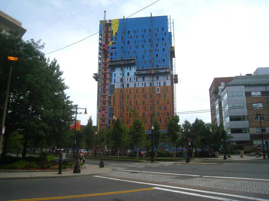
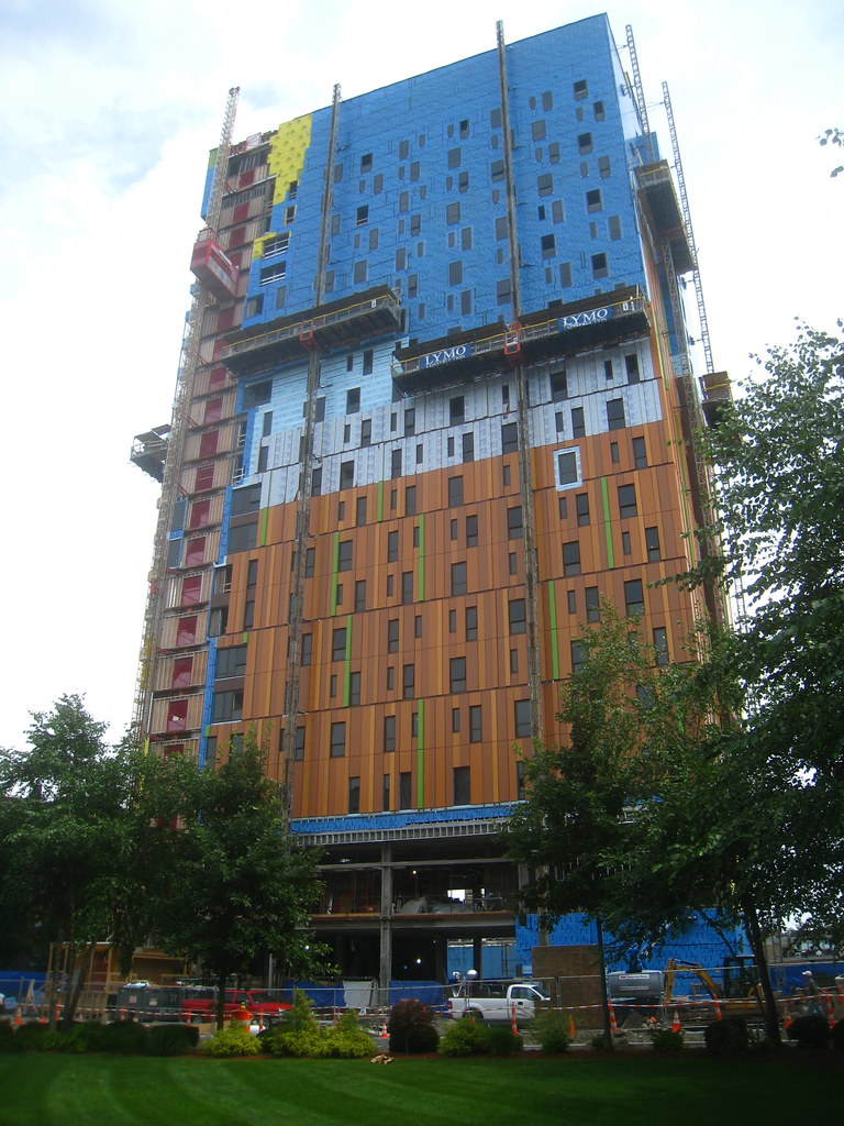
Tree House Residence Hall Tower @ MassArt | 578 Huntington Avenue | Fenway
- Thread starter Boston02124
- Start date
BostonUrbEx
Senior Member
- Joined
- Mar 13, 2010
- Messages
- 4,346
- Reaction score
- 140
Re: Mass Art Dormitory
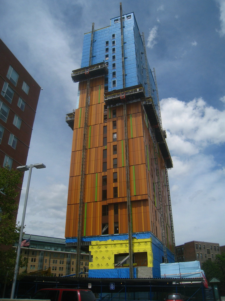
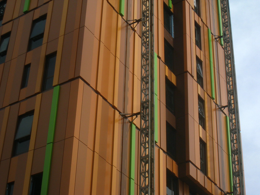
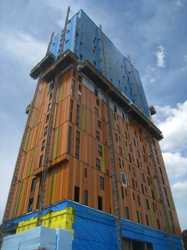
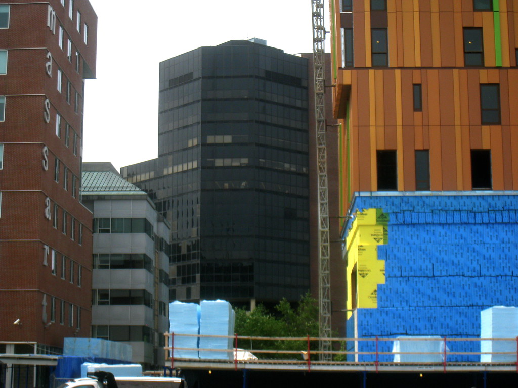
The colors are much more subtle than the renderings from the looks of it so far. Much better this way, IMO.
The colors are much more subtle than the renderings from the looks of it so far. Much better this way, IMO.
kz1000ps
Senior Member
- Joined
- May 28, 2006
- Messages
- 9,187
- Reaction score
- 13,724
Re: Mass Art Dormitory
This building wants to know: do u party?
molly for sale here!
But in all seriousness I'm surprised at how much I like it. I could see this being quite refreshing during the colder months.
This building wants to know: do u party?
molly for sale here!
But in all seriousness I'm surprised at how much I like it. I could see this being quite refreshing during the colder months.
Last edited:
Boston02124
Senior Member
- Joined
- Sep 6, 2007
- Messages
- 6,936
- Reaction score
- 7,088
Re: Mass Art Dormitory
^ thanks 4 posting in all these threads! Looking forward to other's comments!
^ thanks 4 posting in all these threads! Looking forward to other's comments!
armpitsOFmight
Active Member
- Joined
- Oct 10, 2009
- Messages
- 870
- Reaction score
- 13
Re: Mass Art Dormitory
hahahaha....plywood....
hahahaha....plywood....
- Joined
- May 25, 2006
- Messages
- 7,064
- Reaction score
- 1,990
Re: Mass Art Dormitory
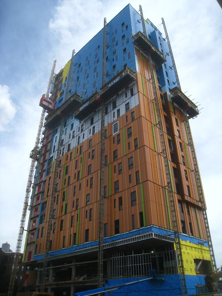
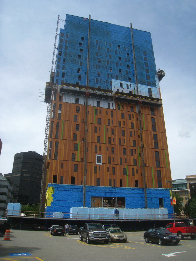
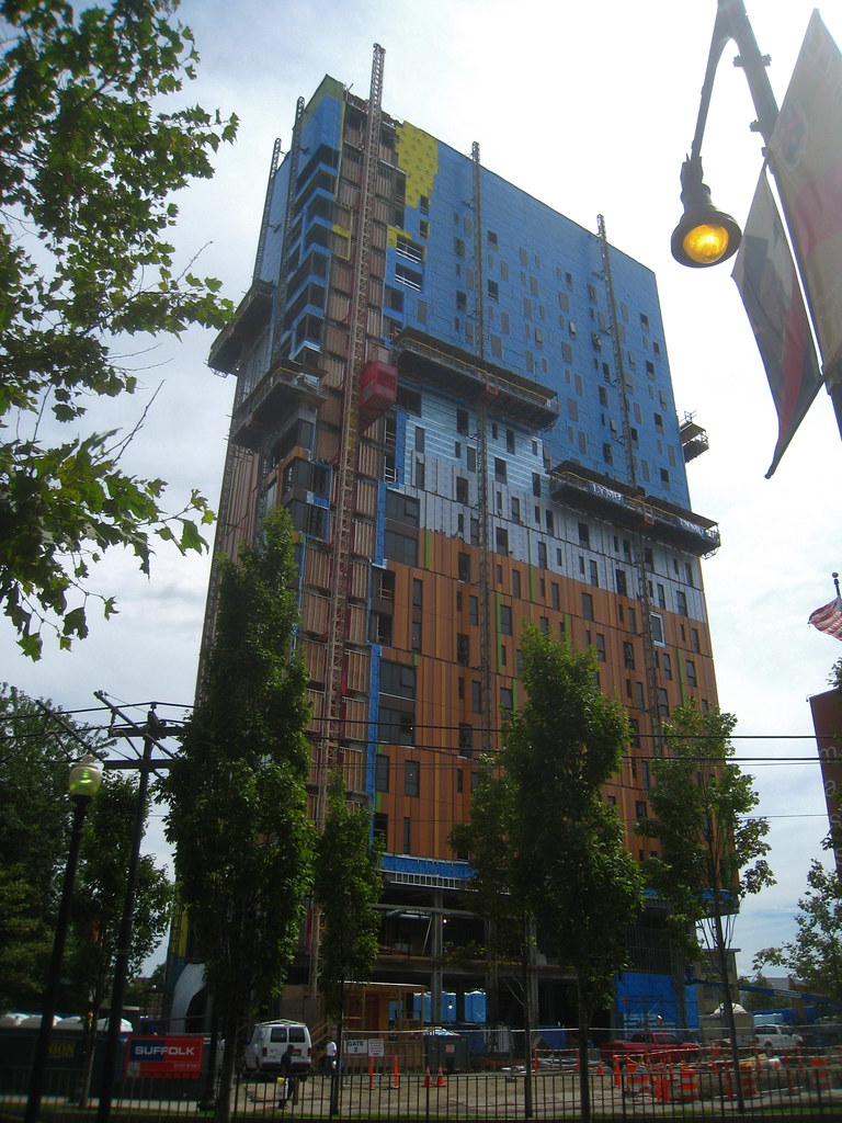
Those horizontal spaces really deaden the vertical design of the facade which is a real shame. If they had made the breaks more seamless then the overall effect would have been stronger.
Those horizontal spaces really deaden the vertical design of the facade which is a real shame. If they had made the breaks more seamless then the overall effect would have been stronger.
Re: Mass Art Dormitory
who the hell gets paid American money to design stuff like this?
it's trying to be bold like MIT's Simmons Hall without pulling off the segementation or grand design.
Give these drafting muthafuckah's some peso's...
who the hell gets paid American money to design stuff like this?
it's trying to be bold like MIT's Simmons Hall without pulling off the segementation or grand design.
Give these drafting muthafuckah's some peso's...
Last edited:
- Joined
- Sep 15, 2010
- Messages
- 8,894
- Reaction score
- 274
Re: Mass Art Dormitory
I agree with your comment about the horizontal gaps. As I've been watching this go up, I've been noticing what effect it actually creates as it goes higher. The facade wants to be about verticality, but those gaps work against the effect.
Overall, I still love this facade and building. In the midst of the boring Perkins & Will Wentworth buildings (610 and 555) and the dated MassArt Tower, this tower makes such a bold, in-your-face statement.
Those horizontal spaces really deaden the vertical design of the facade which is a real shame. If they had made the breaks more seamless then the overall effect would have been stronger.
I agree with your comment about the horizontal gaps. As I've been watching this go up, I've been noticing what effect it actually creates as it goes higher. The facade wants to be about verticality, but those gaps work against the effect.
Overall, I still love this facade and building. In the midst of the boring Perkins & Will Wentworth buildings (610 and 555) and the dated MassArt Tower, this tower makes such a bold, in-your-face statement.
- Joined
- Sep 15, 2010
- Messages
- 8,894
- Reaction score
- 274
Re: Mass Art Dormitory
You know this is not a wooden facade, right? It's Alucobond.
And yes, they axed a lot of the glazed corners, which is too bad.
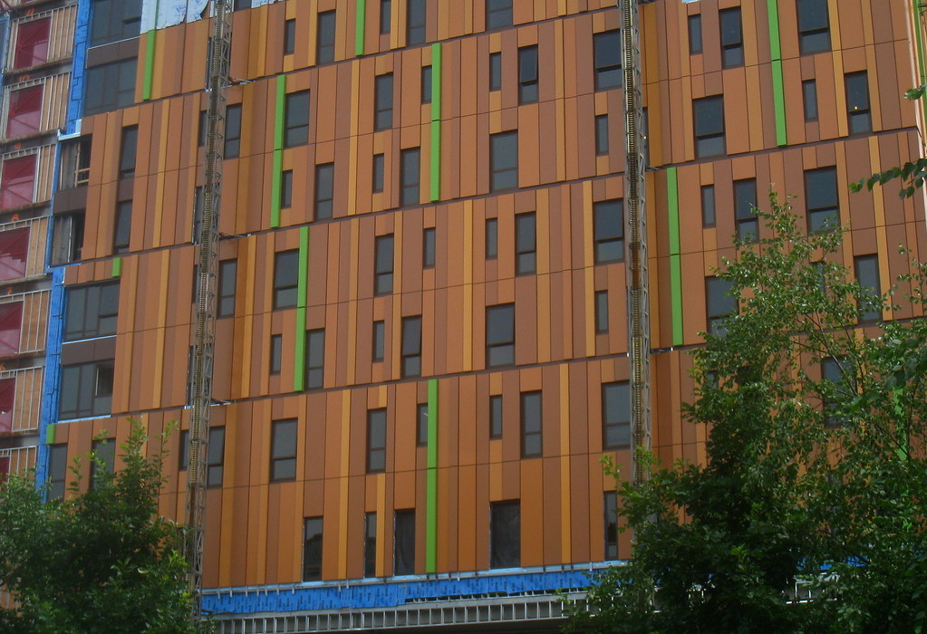
The initial rendering has much more glass than they have here...if they had stuck to that original plan I think this wood (pun, lol) have turned out much better.
There's just...so...much...WOOD!
You know this is not a wooden facade, right? It's Alucobond.
And yes, they axed a lot of the glazed corners, which is too bad.
tmac9wr
Senior Member
- Joined
- Jun 14, 2006
- Messages
- 1,446
- Reaction score
- 68
Re: Mass Art Dormitory
Yea I know it's not really wood (though that would be hilarious if it was)...but that's the appearance it gives.
You know this is not a wooden facade, right? It's Alucobond.
And yes, they axed a lot of the glazed corners, which is too bad.
Yea I know it's not really wood (though that would be hilarious if it was)...but that's the appearance it gives.
Re: Mass Art Dormitory
Yeah, but what really ruins the Carpenter's Center is that the sides facing away from the highway are covered with generic silver / white Alucobond nonsense that's been done to death.
Architects / engineers have gone expansion joint crazy in recent years. Efforts to mask them are usually nonexistent, or just unsuccessful. Case in point.
Isn't this similar to the siding on the carpenters' hall that nobody likes?
Yeah, but what really ruins the Carpenter's Center is that the sides facing away from the highway are covered with generic silver / white Alucobond nonsense that's been done to death.
Those horizontal spaces really deaden the vertical design of the facade which is a real shame. If they had made the breaks more seamless then the overall effect would have been stronger.
Architects / engineers have gone expansion joint crazy in recent years. Efforts to mask them are usually nonexistent, or just unsuccessful. Case in point.
found5dollar
Senior Member
- Joined
- Aug 27, 2007
- Messages
- 1,153
- Reaction score
- 412
Re: Mass Art Dormitory
I'm in love with this facade.
I'm in love with this facade.
BostonYoureMyHome
Active Member
- Joined
- May 5, 2009
- Messages
- 221
- Reaction score
- 0
Re: Mass Art Dormitory
Can't say I love it, but it is always nice to see someone get away with something different in this city. I always wonder how it was pulled off, but don't really care...
Can't say I love it, but it is always nice to see someone get away with something different in this city. I always wonder how it was pulled off, but don't really care...
JohnAKeith
Senior Member
- Joined
- Dec 24, 2008
- Messages
- 4,366
- Reaction score
- 115
Re: Mass Art Dormitory
http://www.youtube.com/watch?v=SAAi_42uIkQ
The initial rendering has much more glass than they have here...if they had stuck to that original plan I think this wood (pun, lol) have turned out much better.
There's just...so...much...WOOD!
http://www.youtube.com/watch?v=SAAi_42uIkQ