Re: W Hotel
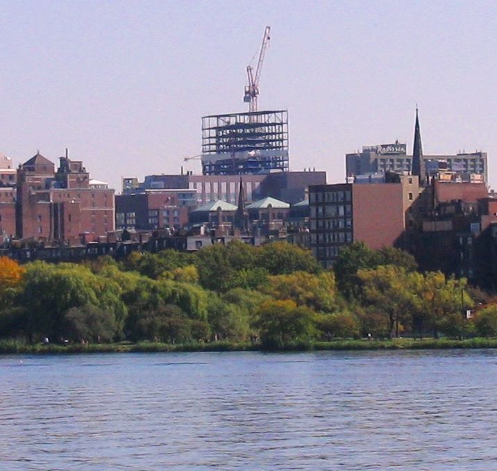
Of course it looks stumpy. It's Boston. Pretty sleek from the side though, although the contrasting facades kind of clash with each other and it doesn't quite look right. Between that and the big black strip on 45 Province, it looks like The Clarendon may end up being the winner out of Boston's 3 new 300 footers.
Of course it looks stumpy. It's Boston. Pretty sleek from the side though, although the contrasting facades kind of clash with each other and it doesn't quite look right. Between that and the big black strip on 45 Province, it looks like The Clarendon may end up being the winner out of Boston's 3 new 300 footers.

